The Unexpected Nursery Paint Color That's An Elegant Step Up From Pastel Hues
Nursery themes and paint colors have come a long way since the days of pastel pinks or blues, but when it comes to choosing the right color for your baby's nursery, there might not be a one-size-fits-all shade. In fact, darker hues seem to be a new trend, and the shift to moodier, more dramatic home interiors is even supported by design experts. During an exclusive interview with House Digest, Sue Wadden, Sherwin-Williams Director of Color Marketing, shared that "during a baby's first few months they have an easier time seeing high-contrast colors." So, a bold hue might be the ideal choice for a nursery.
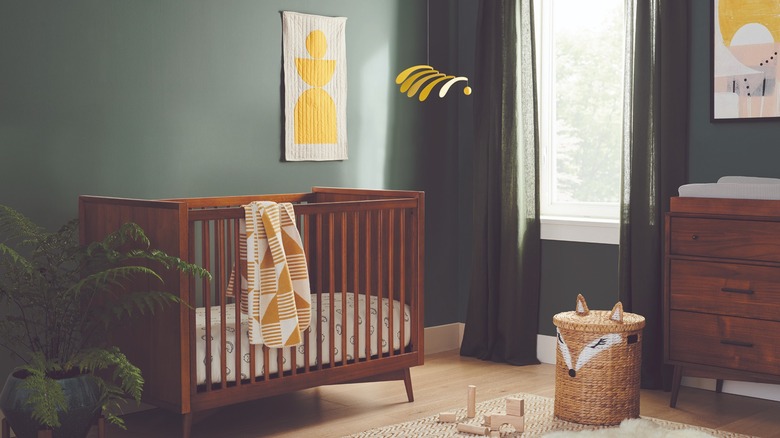
"Having an accent wall in a nursery with a darker color like Hunt Club SW 6468 is a great focal point for a baby," she added. This nature-inspired shade can add a calming element, too. Erika Dale, House Digest's internal design expert and founder of Erika Dale Interior Design, agrees. She noted, "Breaking the mold that your baby's room needs to be a pastel paradise, moody yet serene nature-inspired tones like this one evoke images of a forest wonderland with adventures abound." So don't be afraid to ditch traditional (and dated) colors to match both your home's aesthetic and create a more soothing ambiance.
The ideal dark green for a nursery
Sue Wadden delved deeper into why using darker shades can work in a nursery. "Moody colors and high-[contrast] colors are also considered restorative, thanks to their cocooning effect, which is something all parents strive for in this space," she explained. If you're considering different aesthetics for your baby's room, this particular green also gives you a lot to work with. Wadden added during House Digest's exclusive interview that "darker colors have also been suggested to help with sleep, especially when used on ceilings." This gives you the option to color drench the nursery or even add this as a ceiling accent with similarly hued wallpaper or a variety of other combinations.
Wadden also noted that "when paired with fun and homey accessories, these elements come to life when surrounded by a deep dramatic color." Designer Erika Dale added that "A dark green paint color like Sherwin Williams Hunt Club is a dramatic yet soothing choice for a gorgeous, impactful nursery." Both experts reminded us to consider all aspects of the nursery when decorating.
Test the paint and complement with white or pops of color
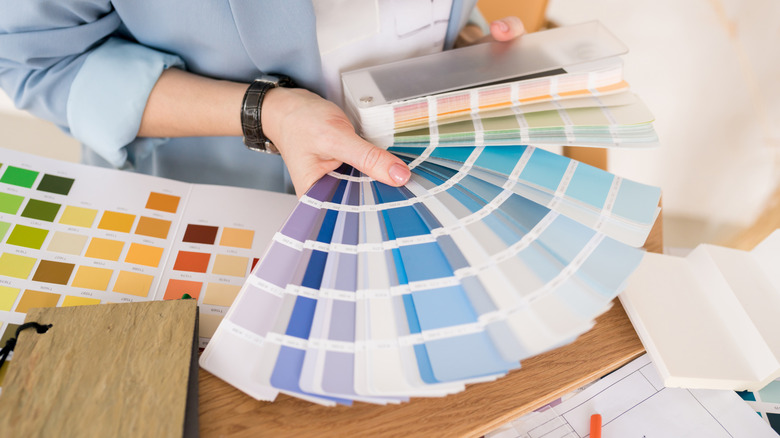
Erika Dale warned that "Depending on the natural light in the room, you may find this particular shade to be a little too saturated once it is in the space." She suggested testing "with a large sample to be sure before committing, and opt for a slightly more muted alternative if necessary." Sue Wadden exclusively told House Digest, "I recommend pairing with either whites to provide some balance, or with a pop of color like Chartreuse SW 0073 or Kingdom Gold SW 6698 for a bit of sparkle." These will work well with any lighting scenario, even in a low-lit room to add brightness.
Dale's idea to test the color is helpful so you are happy with the finished results, and it might also help to compare the paint shade to other items you plan to have in the room (furniture, accessories, etc.). While some say the best colors to paint your kid's rooms or nursery may lay in the beige or lighter palettes, that isn't a hard rule, and darker shades can work too. The overall agreement from both experts is that you shouldn't be nervous to try deeper, moodier, and even dramatic shades within a nursery, as these can help your little one sleep and even help their cognitive color receptors! Plus, earth tones are just so stylish, and definitely not the worst colors for a baby's nursery.