How The Color Wheel Can Help You Choose The Best Curtains For Your Space

When adding color to a room design, many people start with things that are easy to implement, like cloth furnishings, such as cushions or curtains. Curtains sometimes cover a large area and can affect the light in a room when covering windows, so their hue is a significant factor in a room's overall look and feel. Using a color wheel to help you select curtains can be very helpful in making a suitable choice, and we've gathered some tips to help with this.
Humans respond to color both consciously (choosing certain colors of clothing, furnishings, or cars, etc.) and subconsciously, as research has shown that colors in the home can affect mood and even cause physiological responses. Choosing colors is also a matter of practicality and personal taste, and the color wheel can be a very useful tool for creating a cohesive color palette in your home.
You can find a color wheel online, purchase one, or make your own using paint swatch cards. Try to get one with a range of hues from light to dark. Most color wheels have a minimum of 12 colors: three primary colors (red, yellow, blue), three secondary colors (orange, green, purple), and six tertiary colors (red-orange, yellow-orange, red-violet, blue-violet, yellow-green, blue-green). These colors work in six different color schemes: the most commonly used in decor are monochromatic (all one color family), complementary (opposing colors, like purple and yellow), analogous (similar colors, like blue, green, and blue-green) and triadic (equidistant colors on the color wheel like red-orange, violet-blue, and yellow-green).
Use the color wheel to determine what colors will work in your room
The three primary colors — red, yellow, and blue — are the most "pure." Using them in a room looks bold, but can seem overpowering. Some designers suggest having less than 30% of a room's palette being pure primary colors. Primary, secondary, and tertiary colors are not only available in their vivid, saturated versions as seen on a color wheel, but in a wide range of tints and hues, from pastel to jewel tones.
One good approach is to figure out what kind of overall palette you want, based on what's already in the room. Start with the walls: is the color warm, cool, or neutral? Even seemingly neutral colors like gray or beige have undertones: holding up paint or fabric swatches in natural light can help you identify these undertones. A gray with green undertones looks and feels very different from a grey with purple undertones: this awareness can guide your choices. Is the wall dark, light, or in between? With dark-colored walls you may want light-colored curtains for contrast, and vice versa.
Using the color wheel can help you find the perfect color palette, including the tried and true approach of balancing warm and cool tones. Red, yellow, and orange are "warm," blue and violet are "cool." Green, in the center of the spectrum, can be warm, cool, or neutral: it's all about the undertones. The fabric color of curtains can also affect the color of light coming through windows, especially with lightweight or sheer fabric.
Choosing the right color curtains
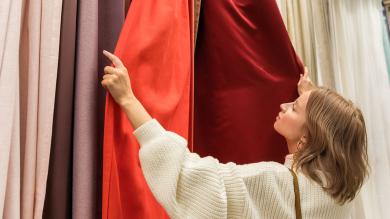
Having given some thought to undertones and color palette options, now you're ready to start experimenting with choices. Let's say you're considering red curtains for your room that has pale gray walls. If the walls have blue undertones, try a cool-toned red option, like neutral pink, dusty rose, or burgundy. Or try a warmer variation like vermilion or terra cotta (the orange and blue tones, being opposites on the color wheel, accentuate one another).
Use your fabric swatches some more: try them out next to furniture, windows, and accessories like artwork and cushions. Maybe you start to notice that the burgundy feels too dark, the rust is warm and pleasing, while dusty rose feels drab and dull. What feels and looks good? The rust-orange curtains are a vibrant yet soothing earth tone, so let's build on that.
For a complementary color scheme, add some deeper blue accents, and a lighter orange-red hue like salmon, or a pastel apricot. An analogous color scheme uses colors next to each other: for example, rust curtains, a burgundy sofa, and cushions in mustard and terra cotta. Applying a triadic color scheme opens up more color combinations: try rust-orange, olive green, and plum, maybe mixing solids and prints. Even a monochromatic scheme allows variations, and a vibrant palette that includes neutral, dark, and bright shades. With warm white walls and a deep blue velvet sofa, for example, curtains in soft blue-gray add a hint of subtle color and tie the dark and light tones together.