Every Pantone Color Of The Year For The Last Decade
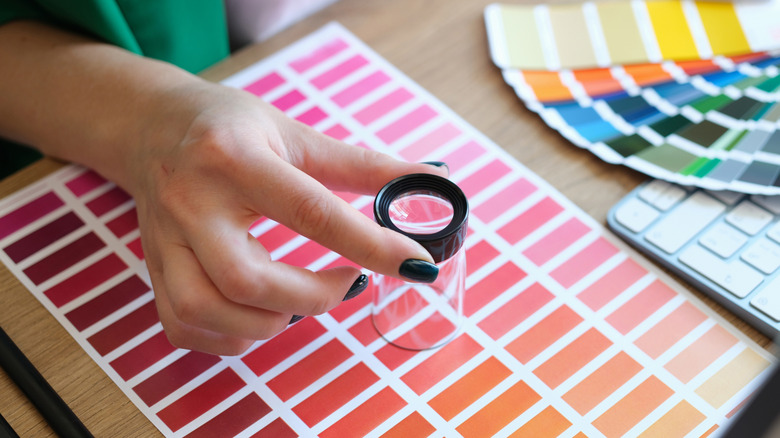
When it comes to trends, what's 'right now' in interior design is woven in with fashion, cosmetics, graphic design, and even the culinary world. And, one big playmaker that clues all of these industries into the current hip hues is Pantone. The brand is iconic when it comes to all things color, and that includes their much-anticipated pick of the year. Each December, a new color is announced for the next 12 months, letting multiple industries know what moods are predicted and what tones they should expect.
The Color of the Year Program has been a driving force in the design world since 1999. Laurie Pressman, Pantone Color Institute Vice President, explained to Time that the yearly program is a way to predict trends and create buzz about how "what's taking place in the world is expressed into the silent language of color." The choices have been shaped by major shifts and world events over the last decade, and each one captures the unique zeitgeist of its respective year. A look back at the last 10 years of Pantone's picks demonstrates that the decade has been anything but ordinary.
2025: Mocha Mousse
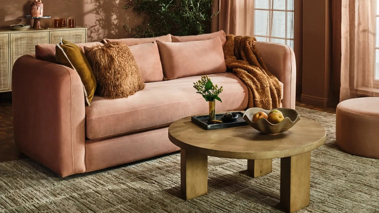
This year's color is a soothing brown hue that makes you want to curl up with a glass of wine or a good book. Inspired by decadent desserts and comfort food, it's meant to mimic "little treat culture," where you gift yourself a cup of coffee or a fancy cupcake during the day "just because," giving yourself a dose of pleasure and altering your mood. "Little treat culture really goes back to boosting our sense of personal comfort and wellness," Pantone Color Institute Vice President Laurie Pressman explained to USA Today.
In addition to echoing guilty pleasures, the experts at Pantone explained that they chose the color to reflect the most important need of consumers right now — balance. The world seemingly got more complicated after the pandemic, and people are looking for ways to turn their homes into quiet, balanced havens. This color can help. Pressmen explained to USA Today, "The overriding theme as we went into looking for this year's color was this whole idea of harmony." She added, "We have enough going on outside of us that we're looking for things that are softer and things that are lighter."
Thanks to its versatility, there are many accessible ways to add a Mocha Mousse touch to your home. It's perfect for color-drenching a room and adding cream and dark brown accents for a quiet luxury immersion. You could also take advantage of one of Pantone's collaborations to add an on-trend piece to your living area. This year, the color experts have partnered with Joybird to create a line of timeless sofas and chairs.
2024: Peach Fuzz
Peach Fuzz, Pantone's color of 2024, was a calming yet cheery peach. Chosen after COVID lockdowns were officially behind us but still fresh in our collective memories, the happy hue represented our need to celebrate that the worst of the pandemic was seemingly over. However, society was still raw from the mental upheaval that the crisis caused, and we all needed nurturing — and that meant reaching out to our community to reconnect and rebuild. This color was meant to help.
"Peach Fuzz is a heartfelt peach hue bringing a feeling of kindness and tenderness, communicating a message of caring and sharing, community and collaboration," the institute shared on its website. "A warm and cozy shade highlighting our desire for togetherness with others or for enjoying a moment of stillness and the feeling of sanctuary this creates, PANTONE 13-1023 Peach Fuzz presents a fresh approach to a new softness." The idea was to use this color in gathering spaces like living rooms and kitchens to create a space to retreat to and heal with your favorite people. And, once you felt nurtured enough, hopefully thrive.
Because of this, it's no surprise that it popped up in a wide range of interior design projects. It was used to color-drench spaces and was accented by furniture and textiles in sugary pastels for a sherbert-y feel. Yet others paired the hue with dark furniture and cooler-toned accents to give the pretty pastel a more modern, toned-down feel.
2023: Viva Magenta
In 2023, Pantone unveiled vibrant Viva Magenta as its color of the year, which was inspired by post-pandemic life. As it became apparent that our digital lives were beginning to take over our physical ones — whether that was due to working from home, going to school via Zoom, or getting sucked into hours of TikTok scrolling — it was around this time that people began to crave surrounding themselves with nature. This reddish-purple hue encapsulated that need, as it was inspired by the red dye from the cochineal beetle, which is one of the brightest natural dyes in the world.
"In this year's Color of the Year selection process, Pantone observed a heightened appreciation and awareness of nature represented by countless lifestyle trends," the brand shared on its site. It pointed to the fact that people were beginning to fill their homes with natural elements like wood, stone, and plants, as well as put a bigger emphasis on outdoor spaces they could unwind in, whether that was on patios or in outdoor steam saunas. There was also a greater push for being in the outdoors, whether that was through hiking, partaking in outdoor sports, or traveling, all of which fell by the wayside during the pandemic. All of these shifts were rooted in nature, and the vibrant red color showed how this shift was about rebuilding and celebrating life again. Pantone's executive director, Leatrice Eisman, explained that the color "galvanizes our spirit, helping us to build our inner strength."
Viva Magenta took the home decor world by storm, influencing home decor trends in 2023, and giving DIYers and designers permission to add unapologetic color to their spaces. It quickly caught on as a way to add a fun pop to neutral rooms, whether with a fun piece of wall art or a few throw pillows. The more daring trend embracers used the dynamic hue to coat accent walls or color-drench whole areas, creating bold statements.
2022: Very Peri
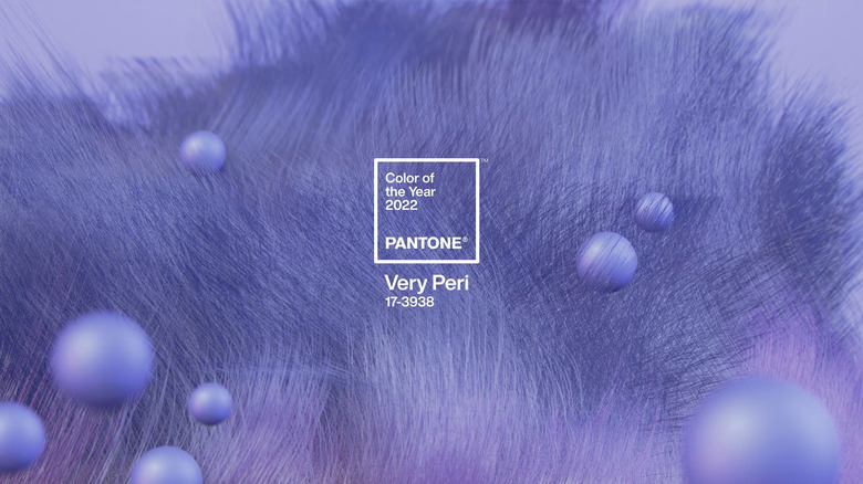
For 2022, Pantone named Very Peri as its color of the year. A unique lavender-like hue energized with red undertones, it symbolized the time's digital trends and how their roles in day-to-day lives increased with the pandemic. However, this merger felt optimistic rather than overwhelming at the time. "As we emerge from an intense period of isolation, our notions and standards are changing, and our physical and digital lives have merged in new ways. Digital design helps us to stretch the limits of reality, opening the door to a dynamic virtual world where we can explore and create new color possibilities," the brand shared on its site.
Speaking of "creating new color possibilities," the Pantone Color Institute invented Very Peri for the yearly honor, creating a never-before-seen hue. Laurie Pressman, Vice President of the Pantone Color Institute, explained in a press release, "Creating a new color for the first time in the history of our Pantone Color of the Year educational color program reflects the global innovation and transformation taking place. As society continues to recognize color as a critical form of communication and as a way to express and affect ideas and emotions and engage and connect, the complexity of this new red-violet-infused blue hue highlights the expansive possibilities that lie before us."
Very Peri paired with a range of colors and was used to add a cool pop of vibrancy to rooms. It was also versatile enough to be used in both casual and formal settings. The cool purple was often used as a wall paint, then balanced by greens and yellows to create a playful palette. However, when paired with gold fixtures and luxe furnishings, it could give rooms a regal vibe.
2021: Ultimate Gray and Illuminating
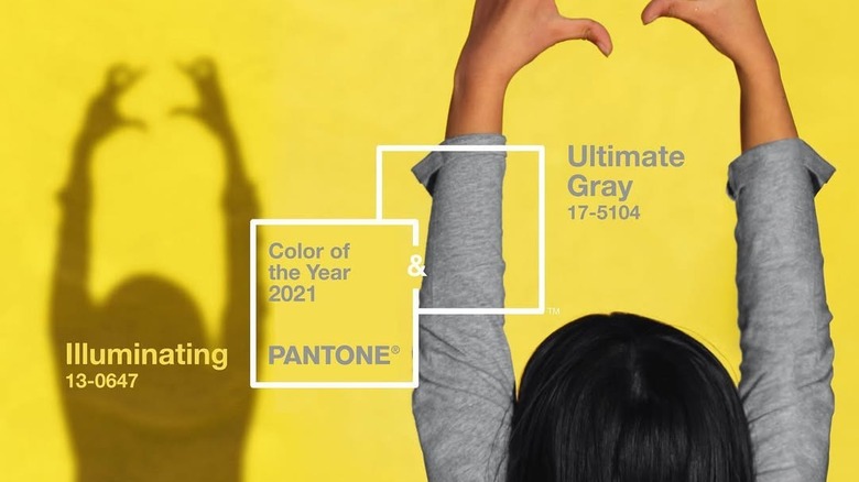
In 2021, Pantone announced not just one but two Colors of the Year. The pair, Ultimate Gray and Illuminating, were as opposite as two shades could be, but the contrast and combined look were intriguing. Ultimate Gray was a mid-tone hue, about as neutral and reliable as colors come. The color of stone and rock, it was meant to inspire feelings of resilience and endurance. However, it was paired with Illuminating, which was a vivid yellow that was bright and cheerful, mimicking the energy of the sun.
The duo was chosen to represent the unique and challenging moment in the world amidst the pandemic. "The selection of two independent colors highlight how different elements come together to express a message of strength and hopefulness that is both enduring and uplifting, conveying the idea that it's not about one color or one person, it's about more than one," Leatrice Eiseman, executive director of the Pantone Color Institute, shared in a press release. "Practical and rock solid but at the same time warming and optimistic, this is a color combination that gives us resilience and hope. We need to feel encouraged and uplifted, this is essential to the human spirit."
The pair of colors were perfect to bring a little life to the homes we've been spending so much time in. Some people coated a room in the neutral gray, then accented it with a citrusy accent wall. Others simply bought accessories like throw pillows and wall art to upgrade their space with pops of the contrasting pair.
2020: Classic Blue
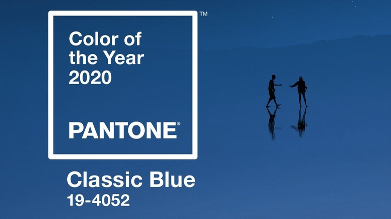
Blue has proven time and time again that it's timeless and versatile. And 2020's Color of the Year, Classic Blue, was an example of how enduring the hue is in home decor, fashion, and graphic design. A reliable, mid-tone blue, it was chosen to instill peace and comfort.
As 2020 was such an unrestful time, Pantone picked a color that was safe and dependable, a feeling so many craved at the uncertain moment. "We are living in a time that requires trust and faith. It is this kind of constancy and confidence that is expressed by PANTONE 19-4052 Classic Blue, a solid and dependable blue hue we can always rely on," Leatrice Eiseman, executive director of the Pantone Color Institute, shared in a press release. "[It] provides an anchoring foundation."
Because it's a middle-of-the-road hue, many people were able to find a way to incorporate it into their home decor. Many used it as a wall paint, pairing it with crisp white couches or plush navy accent furniture. Other people leaned into it as a simple, low-risk way to liven up a neutral color scheme with things like area rugs, curtains, and wall art.
2019: Living Coral
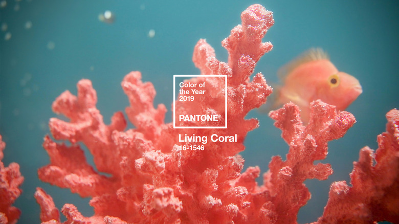
In 2019, Pantone chose Living Coral for its warmth and playfulness. The hue, a bright orange infused with pink, was inspired by its under-the-sea namesake. The cheerful pastel and neon mix was specifically chosen to juxtapose the rise of social media in society, which is a seemingly unreal place with some very real influences on how people act and think. "With everything that's going on today, we're looking for those humanizing qualities because we're seeing online life dehumanizing a lot of things," Laurie Pressman, Vice President of the Pantone Color Institute, told The Associated Press. "We're looking toward those colors that bring nourishment and the comfort and familiarity that make us feel good. It's not too heavy. We want to play. We want to be uplifted." The color was just plain fun, adding some levity to one's room. And since it was inspired by nature, the hope was that the color would pull us out of the digital space and instead focus on connecting one-on-one.
In home design, Living Coral was commonly paired with blue to create a balanced palette, but in versatile ways. The color, combined with lighter blues, gave spaces playful coastal or cottagey vibes. However, for more formal or traditionally styled spaces, cobalt and royal blues gave Living Coral a modern and elevated feel.
2018: Ultra Violet
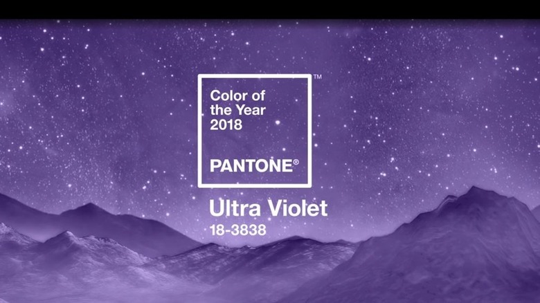
Ultra Violet was named 2018's chosen shade, inspired by everything from pop culture icons to the solar system. The color purple was often used by counterculture icons like Prince and David Bowie, both of whom passed away in 2016, but inspired generations to be boundless and unbothered by labels. It also mimics the color of the night sky, which is equally as limitless.
This rebellious, nebulous color was thought to be chosen as a subliminal message for bipartisanship, considering it was chosen after President Trump's first year in office wrapped. "It's also the most complex of all colors, because it takes two shades that are seemingly diametrically opposed — blue and red — and brings them together to create something new," Laurie Pressman, Vice President of the Pantone Color Institute, told The New York Times. She dove deep into the choice, telling the Associated Press, "We are living in complex times. We're seeing the fear of going forward and how people are reacting to that fear ... I see this as very much an optimistic color, an empowering color. We want to find some peace and calm within ourselves. How do we quiet our minds?"
Violet may be tough to get right in a room, but many people made 2018's pick work for their spaces in unique ways. It was paired with gold accents and layers of plush textiles in deep greens and blues to create luxurious, jewel-toned rooms. However, others used the shade with lavender and lilac elements for calmer, monochromatic retreats.
2017: Greenery
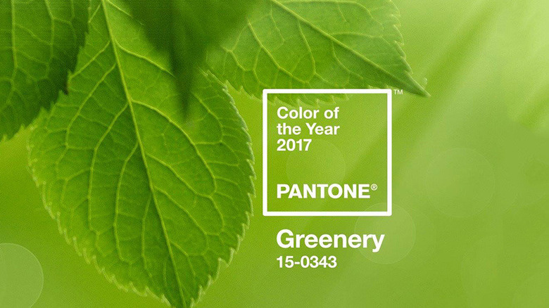
In 2017, Pantone not only revealed its annual it-color, but it did it as a partnership with Airbnb to give people a new way to experience the choice. Greenery was a vivid, citrusy green meant to generate fresh energy, and it was used to drive the interior of a vacation rental in London. The immersive biophilic home was available for rent starting that January, offering a revitalizing break from the city's gray winters.
In a press release, Laurie Pressman, Vice President of the Pantone Color Institute, said that the color "speaks to our desire to disconnect, replenish and energize." General Manager of Airbnb Northern Europe, James McClure, agreed, explaining, "It's hard to think of a more fitting color for 2017 than Greenery, a color that symbolizes new beginnings, growth, and vitality."
Just like Pantone's own Airbnb design, Greenery gave plant and nature lovers ways to create bright and immersive spaces. Some people leaned into it as a base for biophilic decor, coating their walls in the hue and filling their spaces with actual greenery. Others used it more sparingly, hanging foliage prints or adding leafy curtains and printed wallpaper to create a cheery vibe.
2016: Rose Quartz and Serenity
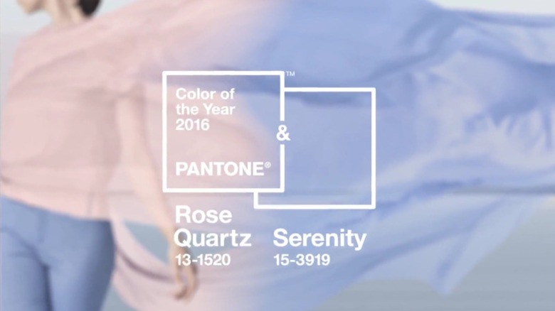
In 2016, the Pantone Color Institute chose its first duo to share the yearly honor. Rose Quartz was a soft, pink hue. To contrast the warmth, a cool sky-like blue called Serenity was added to the pair. Together, the blend of two soothing colors was meant to be a harmonious escape from cultural chaos. The pair were also meant to resist outdated gender-related stereotypes. Eiseman explained, "This more unilateral approach to color is coinciding with societal movements toward gender equality and fluidity, the consumers' increased comfort with using color as a form of expression which includes a generation that has less concern about being typecast or judged, and an open exchange of digital information that has opened our eyes to different approaches to color usage."
The two colors were used both separately and together when it came to home decor. Rose Quartz textiles like throw pillows and blankets added warm and welcoming character to living spaces and bedrooms. On the other hand, walls coated in Serenity gave rooms sophisticated yet tranquil vibes. When the two were paired together as accents against a neutral base, they created a fun and lighthearted look that was still subdued enough to read as grown-up.