14 Yummy Paint Colors To Complement Pantone's New Mocha Mousse Hue
In a year of rich, neutral earth tones dominating home design, Pantone's color of the year in 2025, Mocha Mousse, fits right into the color palettes of the moment. As described by the Pantone Color Institute, Mocha Mousse is a warm brown that evokes the feeling of a latte — not quite the darkness of coffee but a lightened chocolate hue that's been mixed with cream or milk. There are many ways to incorporate Mocha Mousse into your home design, including using Pantone's mocha shade in your garden or choosing a flooring inspired by the rich, luxe brown. But, you can also make a big design statement with Mocha Mousse by pairing it with a complementary paint color to fill out a room. Certain colors will make this Pantone gem pop, whether you're using it in your furniture choice or in accent decor, and the right paint pairing will make your home design feel extremely on-trend.
Pantone chose Mocha Mousse for this yearly honor purposefully to provide a "versatile foundation" for design. And as such, many shades pair well with it because they either bring out the neutral, minimalist nature of the tone or elevate it by providing a powerful contrast. Mocha Mousse is meant to feel indulgent, luxurious, and yet simultaneously grounded, so many of the paint options on this list lean into the elegant fun that Pantone describes.
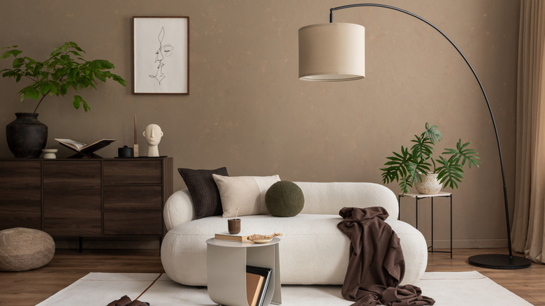
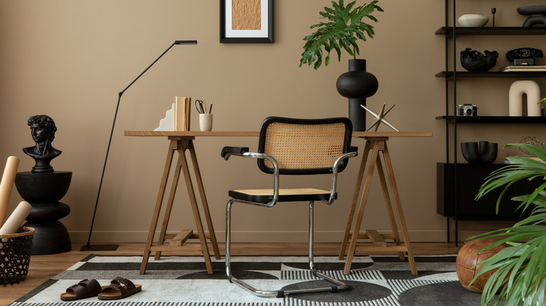
Dark Brown
Pantone's Relaxed Elegance palette includes a variety of complementary browns to Mocha Mousse, including a rich dark brown called Chocolate Martini. Taking inspiration from that color, use a deep brown or dark wood tones on your walls with Mocha Mousse-colored furniture or accent rugs for an exaggeratedly luxurious space. While some designers may contend that dark colored walls make your room appear smaller, in reality dark walls within the same color palette as your decor can be monochromatically elegant rather than limiting. The color Barista from Benjamin Moore, for example, is that deep brown you'll want to pair with Mocha Mousse.
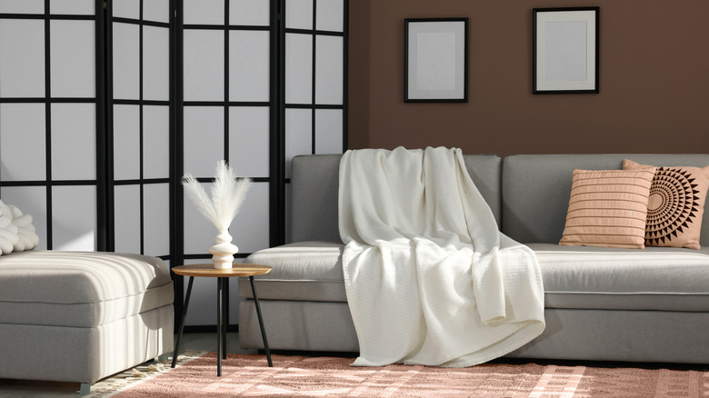
Buttery White
In continuing the theme of a neutral palette, a creamy white color — almost a buttery yellow — would pair well with Mocha Mousse accents for an ultra luxe, yet homey design. These two colors together are an extremely clean pairing, without one color dominating over another. A great translation of this suggestion is Benjamin Moore's Cloud White paint color, described as both soft and balanced for a classic foundation. But whichever brand you choose, opt for a shade that holds a bit of warmth so it will work well with Mocha Mousse's soft brown.
Cornflower Blue
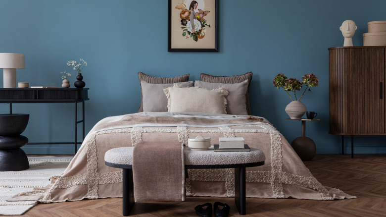
It's not all subtle neutrals in Pantone's color suggestions though, and the institute pairs Mocha Mousse with a number of fun hues in their Floral Pathways color palette. Cornflower blue, a soft, more muted shade of the color, will provide a fantastic pop to your overall design and supply a deep contrast to Mocha Mousse for dynamic visual interest. Think "Bridgerton" Blue as an inspiration shade — this is a color that was popular during the Regency era. Behr's spot-on paint color, Cornflower Blue is a lighter, subtly vibrant option while their China Silk color is a bit more of deeply saturated, blue-gray take.
Khaki
For another neutral color that fulfils the Goldilocks conundrum (not too light, not too dark), khaki could be the optimal choice. Not only will it match Mocha Mousse-coded furniture and decor, it will also seamlessly blend well with other neutral fixtures like black and ivory accents or pops of color from indoor plants or artwork. Benjamin Moore's Glacial Till is a versatile, warm, khaki option, but if you're hoping for a shade darker than color Meditation may work, albeit with a bit more of a green undertone than brown.
Teal
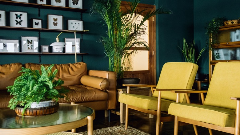
Named in Pantone's Subtle Contrasts palette, teal is a jewel tone that will absolutely jive with Mocha Mousse if you're looking for a more dramatic pairing. Despite the fact that teal is incredibly bold and saturated, for some reason it pairs well with both neutrals and bolder accent colors. Perhaps it's explained by the name of the Pantone palette — teal's boldness is a great subtle contrast to its other color counterparts. For the best greenish teal, try out Sherwin-Williams' Really Teal color choice, and for an option that trends bluer, try Benjamin Moore's classic Teal.
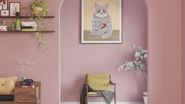
Flamingo Pink
Speaking of dramatic, a flamingo-like shade of hot pink is recommended by Pantone to pair with Mocha Mousse in a palette they call Deliciousness simply because the colors together may remind us of a frosted cupcake. For our rendition, think less confectionary, and more mid-century Palm Springs, when luxe warm, earthy tones, pink, and gold accents came together in an ecosystem of maximalism. This paint color works particularly well when your Mocha Mousse manifests in chocolatey wood features, like hardwood flooring or doorway and window trim. Sherwin-Williams's Pink Flamingo aligns perfectly with the historic vibes of this pairing.
Dark Red
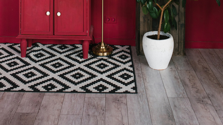
Want to try saturated color but aren't sold on hot pink? Then its color cousin, dark red, may be a better fit. Dark red and brown, paired together, is having a moment right now in everything from home design to fashion. For a burgundy take, try Benjamin Moore's Classic Burgundy, while for a vibrant, berry opt for their Dark Burgundy variation. If you're looking for a truer, dark red then try Patriot Red by Benjamin Moore. Remember, for bolder colors like this, you don't necessarily need to paint entire walls either, but rather you can make it a bold accent.
Terracotta
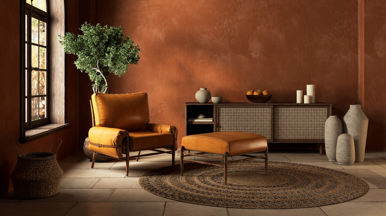
Terracotta, a color reminiscent of its namesake's clay material, is both universally flattering and yet starkly unique. Paired with Mocha Mousse, this color combo can reflect a bevy of design eras and themes from mid-century modern to desert chic. Terracotta is a fantastic foundational color which harmonizes well with a number of other neutrals and bright colors, so if you ever want to swap your Mocha Mousse pieces out at any point, but still want something more interesting than your average neutral, then terracotta might be for you. Sherwin-Williams's Rockwood Terra Cotta is the perfect blend of orange, coral, and brown.
Gray
Say what you will about gray as a trendy color that will make your home dated, but Mocha Mousse paired with a nice gray paint is an enduring, timeless color palette. Gray is surprisingly versatile, and it can work well in both ultra-modern designs as well as more traditional decor. If a cooler-toned gray is your preference then Benjamin Moore's Slate may strike your design fancy with its saturated color, while Nimbus may be appealing to millennials as both an illustrative color of their generation as well as for its name associated with a millennial pop culture icon.
Olive Green
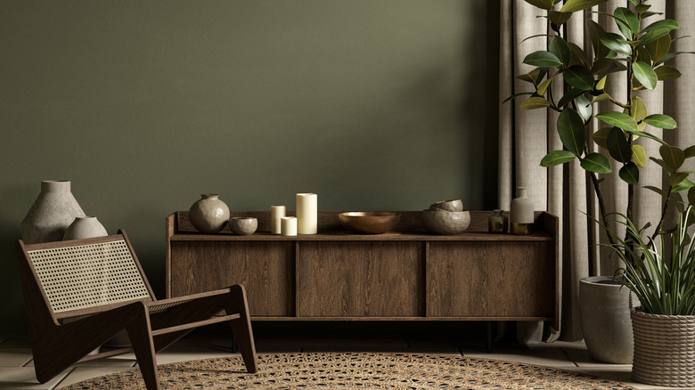
In following color theory's "analogous colors" analysis, colors that are close together on the wheel or share similar properties are ones that fit together in a collective color scheme. Given olive green's warmer, browner tones as compared to emerald green or jade for example, are compatible with the rich latte hues of Mocha Mousse. With that said, pay attention to paint choices that have nutty — rather than pine or forest green — undertones for this pairing to work optimally. Tuscany Green by Benjamin Moore, for example, is as earthy as you get.
Taupe
A brown-gray neutral that is a bit warmer than millennial gray, not as saturated as chocolate brown, and not as green as khaki, taupe is another "just right" neutral that's universally compatible with a number of other colors. With Mocha Mousse, in particular, taupe provides a clean, blank canvas that allows the warm brown to stand out. Virtual Taupe from Sherwin-Williams is a cool-toned, softer choice for this palette, while Intellectual Gray can infuse a warmer, mushroom-like color to your design.
Rose Pink
At the intersection of flamingo pink and terracotta lies this dusty rose hue, a pop of color that serves as more of a neutral than its hotter pink relation. A dusty rose/rose tan that gets a shout out in Pantone's Floral Pathways colorway, this is a bright, happy hue that doesn't stray into tacky color territory. The key here is to lean more towards a tan-based pink than a vibrant one. Pressed Flower by Benjamin Moore gives that muted blossom color, one that works well with the milkier tones of Mocha Mousse.
Charcoal Gray
Another dark neutral, charcoal gray plays with light and shadow more sumptuously than its lighter counterparts like millennial gray, making this a chic paint color choice for those looking to make more of a design statement. Something about the decadent elegance of this color combination gives permission to experiment with silhouettes, textures, and fabrics. Maybe it's the clean, yet statement-building foundation that these two bold neutrals work together to build. For a true charcoal that reads almost black, explore Cheating Heart by Benjamin Moore, a deeply rich dark gray.
Ocher
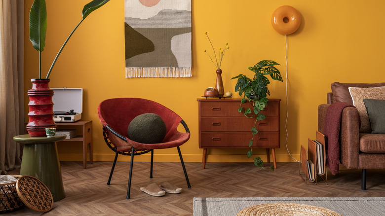
The yellow cousin to terracotta, ocher is another incredibly versatile, yet statement making color. It can be a bit olive, a bit canary, or a bit gold (our favorite). A color that works equally well with antique pieces as well as modern choices, ocher's universal palette doesn't limit your other design choices. Benjamin Moore's on-point paint color, Ochre is a yummy interpretation of the hue, calling on a mustardy (but elegant, we promise) palette that complements Mocha Mousse's warm brown tones well.