9 Of The Best Paint Colors To Brighten Up A Low Light Room
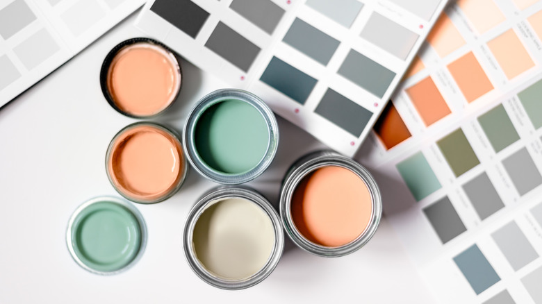
Having natural light in your home is a hot commodity — but sometimes things just don't work out. Even if large windows were at the top of your list, it's not always possible to get a home infused with sunlight. However, whether your entire house is dimly lit or you just have a room or two that lack natural daylight, there are plenty of designer-approved ways to brighten up dark rooms that can help you go from dungeon vibes to a sun-kissed haven aesthetic. One easy way to bring the light in is by opting for bright paint colors in the darker spaces of your home. Colors like yellows, pinks, whites, and oranges will bring a pop of light in even the darkest spaces. We've compiled some of the best hues to look for, along with the exact paints you can buy.
There are plenty of reasons why buyers and renters alike crave natural light. Having sunlight in a room increases positive feelings, makes the space look more open, and can even increase a building's real estate value by a whopping 7 percent. It also appeals to the rising biophilic interior decor trend in which designers use elements of nature to bring the outdoors in, creating a more soothing aesthetic that makes homes feel cozy, light, and comforting. Paint colors that emulate sunlight or even just amplify the artificial lighting in a space will create a more natural feeling and can compensate for darkening effects like a lack of windows.
Warm off-white
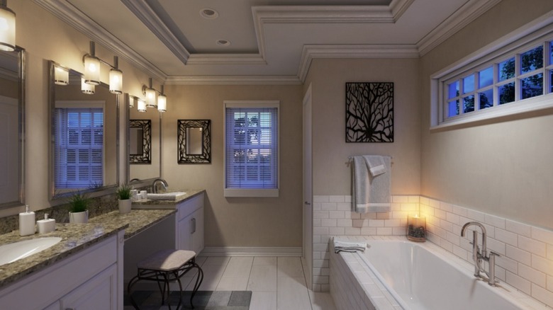
Off-white paint colors are always an easy way to lighten a room, but it's important to look into the paint's undertones to ensure you're not signing up for something that will appear darker without sunlight. Greek Villa by Sherwin Williams (pictured above), which is one of the company's top 50 most popular paint colors, is a cheerful white best used to brighten a space. Benjamin Moore's Acadia White is another great warm off-white option, benefiting from creamy tones that emulate natural light for a brighter feel.
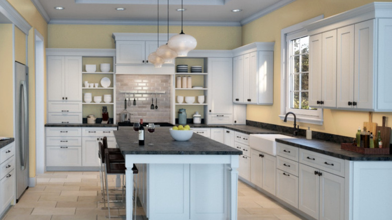
Pale, sun-kissed yellow
One of the best things about paint names is that they often match the exact vibe you're going for. By searching "sunlight" at your favorite paint retailer, you're likely to find plenty of soft yellow hues that will bring sunshine into your space. Benjamin Moore's Morning Sunshine (pictured above) is a creamy yellow shade that is both sunny and soothing. Valspar's Sunglow is another popular pale yellow that will make your dark room feel warm and light. Pair these with crisp white accents and sheer drapes for a breezy, open feel in any room.
Soft pink sunset shades
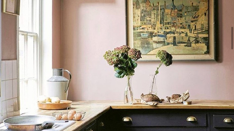
Light pink paints can bring a tropical vibe to your space and can look like a soft sunset, regardless of nearby windows. Some great options to achieve this look include the Sulking Room Pink color from Farrow and Ball (pictured above), which has chic desert vibes. Benjamin Moore's Pink Powderpuff is more of a lighter pink but still pale enough to achieve a natural look. The coral hue in this paint gives it a whimsical touch, making it ideal for bringing personality into a dimly lit space. These go best with light hardwood floors or white rugs.
Peachy hues
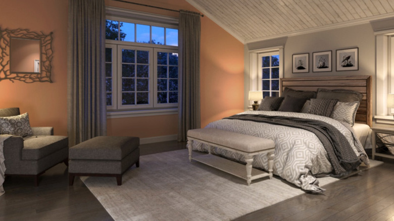
Peach is a blend of pinks and oranges that will create a light look and feel in your dark space. The Sherwin Williams Neighborly Peach (pictured above) is a great option for this effect, as is the Benjamin Moore Daytona Peach, which has warm hues serving to lighten up darker interiors. Peach goes well with a lot of colors and even complements gray. You can lean into the pink and orange undertones by pairing this hue with colorful furniture and decorations. Directing artificial lights toward the walls will highlight the peachy tones.
Terracotta pottery colors
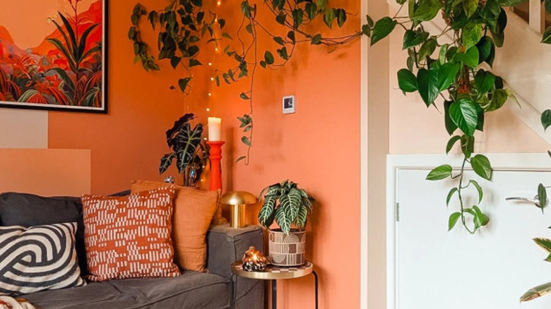
Terracotta is a soft brown color with red undertones, evoking earthy vibes since many classic pottery pieces are made with terracotta clay. This rich hue certainly gives a home a biophilic feel and is reminiscent of Southwest aesthetics. Specific paint options for this color include the Dulux Tuscan Terracotta (pictured above) and Baked Clay from Sherwin Williams. Pair these with tan leather furniture and macramé art to lean into the desert DIY aesthetic — you can also use tungsten lighting and pinks to further brighten the space.
Light mint green
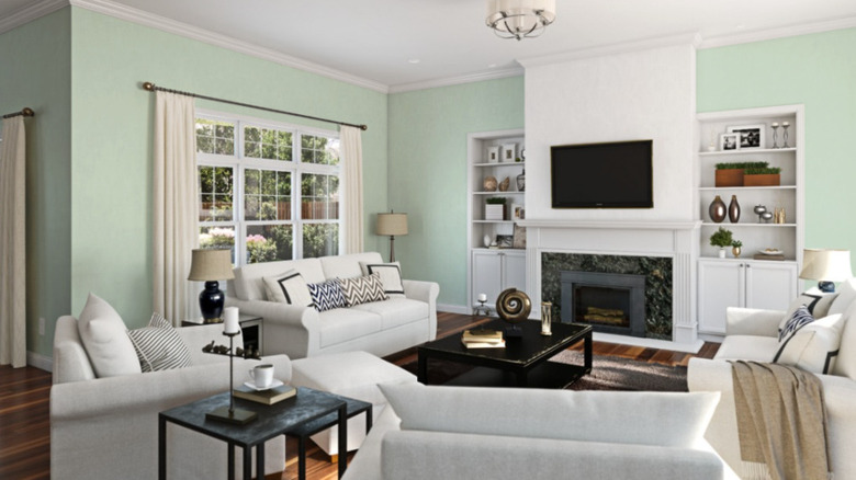
Mint green isn't just an ice cream shade — it's also a fresh, bright hue that can lighten up a room all while making it feel more earthy. Valspar's Quiet Mint and Sherwin Williams' Mint Condition (pictured above) are two great options that will elevate your low-light room. These clean colors have cool blue undertones that can make a space feel refreshing, which is ideal if the lack of light is making for a drab atmosphere. Accent with warm tones such as peach and coral to ensure the overall result isn't too cool.
Light blue
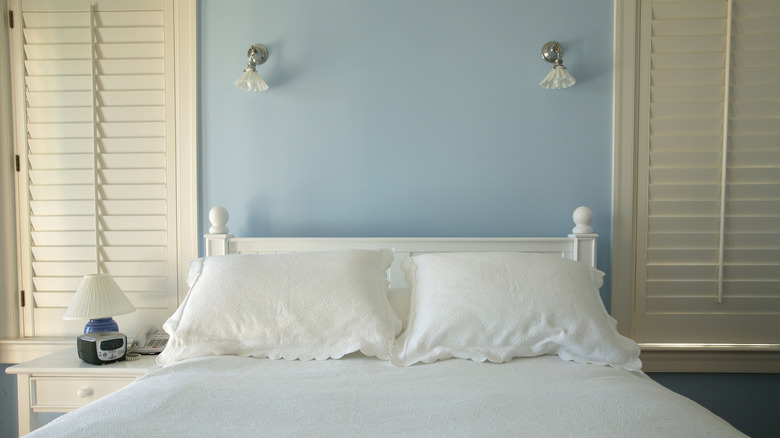
Light blue is another great option for a way to bring the sunny sky into your home, even without windows nearby. This hue can easily be achieved with Valspar's Soft Blue paint color or Aviary Blue from Sherwin Williams. You can pair these blues with white furnishings and bright white lighting, and consider adding plenty of wall sconces for the soft blue to reflect off of. Add gold or brass hardware to the room to add subtle hints of warmth, or incorporate rattan accessories for a modern beachy vibe.
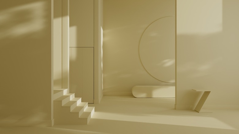
Pale honey
Many light oranges are paired with pink or red undertones, resulting in colors like terracotta and peach. However, when paired with a yellow undertone, light orange can thrive as a warm, honey color. Paint colors like Honeypot from Sherwin Williams (pictured above) or BEHR's Wildflower Honey are soothing and bright at the same time. These colors are great for children's playrooms or bedrooms, but they could also fit a dark space like a basement office or a dimly lit kitchen. Pair this with other warm tones, like browns and golds.
Light purples
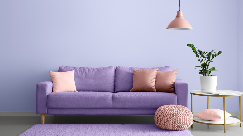
Warm neutrals are ideal for brightening a darker room, but if you want to inject some personality and playfulness, go the soft, pastel route with a nice light purple color like lavender or lilac. Sherwin Williams' Novel Lilac is a fresh and beautiful option, as is Benjamin Moore's Lily Lavender. Because this is a flexible color, you're fine to use navy and other blue shades in the space, but you could also opt for pinks and yellows for a floral country aesthetic. Steer clear of anything too orange or green to avoid creating a Halloween vibe.