The Thoughtful Color Trend That's Replacing Dated Gray And White Bathrooms
Bathrooms are the perfect spot to get playful with your design. They're not the focal point of your home, so why not embrace a more creative color palette? Cold neutrals once set the standard for sleek bathroom design, but now homeowners are moving away from this somewhat basic look in search of something more unique. Criticized for feeling too sterile and cold, white and gray are bathroom paint colors deemed as past their prime, and they're being replaced by their antithesis — contrasting, complementary color palettes.
Designers are noticing a trend where more people are experimenting with color in the bathroom, shifting towards pairing complementary color palettes that create stylish contrasts. You might be picturing something crazy like a neon yellow tub against striking purple walls or a powder room decorated with jolly red and bright green hues — but this trend has a more thoughtful approach. There are plenty of different ways to create subdued contrast using complementary colors with various shade pairings and design methods. When the right colors are carefully chosen to complement and contrast each other, these trendy bathroom palettes will make you forget all about white and gray.
How to incorporate contrasting complementary color palettes in a bathroom
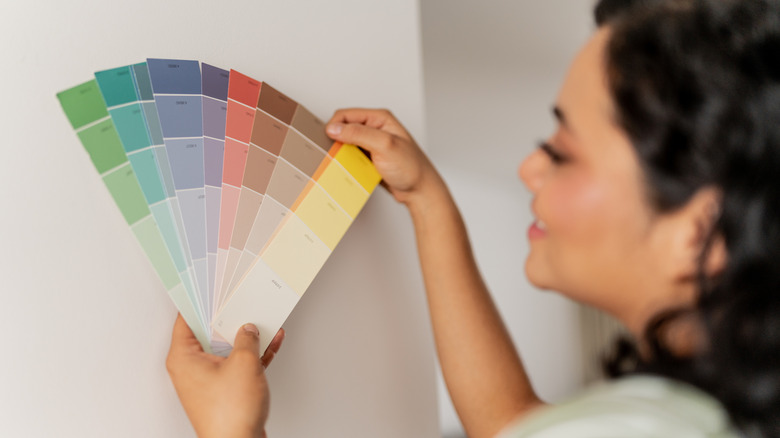
This trend is a great way to bring color into your bathroom design, starting with your choice of complementary colors. These colors are opposites on the color wheel and work together to create a vibrant contrast and emphasize brightness. Within the classic pairs of red and green, orange and blue, and yellow and purple, there are endless possibilities. One of the most important tips for decorating with complementary colors is to play with different intensities and shades. If bright red and green feels too bold, try softer variations like pale pink and spring green. For a subtler take on purple and yellow, consider calming lavender with golden accents. Deep navy and burnt orange or light peach with pale blue can also offer a balanced yet exciting combination.
Start by choosing two complementary colors and explore the various shades within each to find a pair that suits your style. If you prefer bold designs, opt for richer, more saturated tones — and vice versa if you prefer a more neutral look. To find middle ground between bold and understated, pair an intense hue from one palette with softer shades from the contrasting palette to keep the harmony while still adding a strong pop of color. Your choices should reflect your personal taste and the aesthetic you want to create. By starting with two complementary color palettes to explore, the shades you pick are bound to create a balanced and stylish contrast.
Thoughtful ways to decorate with complementary colors
The common mistake everyone makes with color in the bathroom is over-relying on a single shade. Decorating with contrasting complementary colors is a good way to avoid this by balancing two different color palettes. However, it's important to approach this trend thoughtfully to prevent one shade from overthrowing your design. Typically with complementary colors, one shade dominates while the other supports, creating a healthy balance with visual appeal. Choose one color to lead as the focal point by using it for stronger elements like wall paint, tile color, or cabinets and vanities. Use the contrasting shade to play a supporting role throughout with accents like decor, hardware, towels, or various fixtures.
To create a more intentional harmony throughout your color scheme, think about pairing paint colors with the hues in artwork or other decorative elements. This allows the color palettes to contrast but still feel embedded together, so one shade doesn't overshadow another. To prevent the colors in your bathroom from feeling too intense, incorporate neutral tones into central elements like white trim, tiles, or countertops to soften the vibrancy. When decorating with contrasting complementary colors, there's a delicate balance between inviting and overwhelming. Being thoughtful about where and how you use your colors will make all the difference.