Beautiful Cabinet Colors That Complement Gray Bathroom Walls
Bathrooms are perhaps the most intimate and essential room in our homes. So, it makes sense that when it comes to designing and decorating these spaces, we want them to be functional, tranquil, and beautiful. Since gray is an elegant, calming color, and one of many paint shades that will open up a bathroom, it has become almost standard on walls. This is why it's important to choose the perfect cabinet color to complement gray bathroom walls.
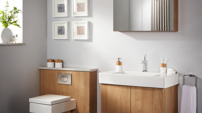
It doesn't, however, have to be complicated. But it does help to use the color wheel and apply a little color design theory. Because gray is a cool-toned neutral, there is a wide variety of complementary color options — and natural wood tones just happen to be high among them. The reason is because many wood tones fall into the orange zone on the color wheel, meaning they are warmer-hued. And because orange sits opposite to blue (an undertone of grey), pairing them creates a balanced contrast. Of course, you could also create that balance with paint. Creating color equilibrium is an essential rule to keep in mind when painting bathroom cabinets. So, lay a nuanced orange or red on your cabinets, or perhaps a deep green or robust blue is more your style. Gray walls give you tons of options, so don't be afraid to play with colors in your bathroom.
How to create color balance in bathrooms
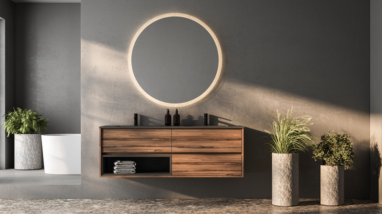
Many designers adhere to a ratio to keep a color balance. The 60/30/10 ratio, for example, is a common one. It's believed that cabinets generally take up around 30% of the visual impact in a room. So, while your bathroom cabinets add storage and declutter your countertops, they are also an impactful part of your décor. Let the natural wood in your cabinetry shine in 30% of the space, and add 10% of a punchy accent color. Or, go for a two-color scenario, giving the dominant shade — your gray walls — 80% of the visual pallet and let the tone of your wood be the complementary color in the other 20% of the space.
Since gray is considered a neutral, it also supports more intense hues, giving you all kinds of freedom to paint your cabinets. Stay in the complementary yellow toned zone of the color wheel and go for a rusty orange or even a jewel toned ruby red. Both options would have an intense, contrasting impact.
Alternatively, you could add drama with analogous colors – those complementary hues that appear next to each other on the color wheel. Lean into the cool side of gray and go for an emerald green or turquoise. Even a deep blue or purple would create a striking effect. Ultimately, gray is incredibly versatile, so the right choice is the color that speaks to you and your style.