10 Jewel Tone And Pastel Color Combos To Enliven Your Living Room

Color is a central element of decor, yet bland palettes seem to prevail these days. White, cream, beige, and pale grey are everywhere, yet bold colors seem relegated to high-end architectural magazines or cinematic sets. But color is such a mood enhancer, and we should indulge a more adventurous approach to it when designing interiors. In living room decor, color can lend real vibrancy to the room where we entertain guests or unwind after a long day. For a fresh new approach combining light and dark hues, try mixing jewel tones and pastel colors to enliven your living room.
Having a neutral color (i.e. one that blends with other colors easily) on walls feels like a "safe" decor choice, but this can easily become an unexciting monochromatic color scheme. Vibrant colors can function in a neutral way if they're a lighter, muted shade (pale sage green, slate blue, or mauve). Pastel walls let you experiment with bolder colors in furnishings. For a showy but neutral colored sofa (pale mushroom velvet?), consider that the best accent wall colors are rich and dramatic, so try a jewel tone behind it (garnet, sapphire, or jade). Smaller furnishings like area rugs, curtains, cushions, and throws also bring in bolder colors to the palette. Combining pastels and jewel tones is a flexible, creative approach to color. You can go for high contrast: think pale turquoise walls and ruby curtains, or pale apricot walls with a lapis blue sofa. For inspiration, search for jewel tone color names like emerald, sapphire, ruby, amethyst, turquoise, and jade. Pastels can include pale blue, lavender, orchid pink, periwinkle, mint, butter yellow, peach, or mauve.
Emerald green with butter yellow
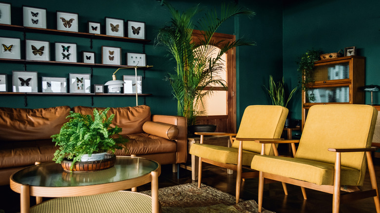
Deep emerald green walls create a richly inviting atmosphere in the living room, invoking nature and a feeling of relaxation. This intense color can easily be warmed up with some light wood tones, a tobacco brown leather sofa, and maybe some butter yellow mid-century chairs. Think warm pastels to enhance the green's cool tones. For vivid shades of emerald that will beautifully accent warm pale earth tones like gold and yellow, try Green Meadows or Absolute Green from Benjamin Moore or Aspen Leaf from Magnolia.
Sapphire blue and beige
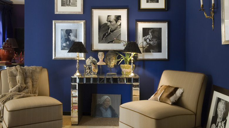
Deep sapphire blue is a powerful color for the living room: its saturated tones are attention-getting, yet, as with most blues, also calming. Deep blues pair well with neutral beige furniture with slightly yellow undertones. This makes for a strong contrasting palette without being too dramatic, and feels very classic and sophisticated. For a deep sapphire blue wall color, there are some alluring choices, like Marine Blue and Delphinium (cobalt blue with a hint of violet) from Benjamin Moore. Or, for an intense shade with subtle black and green undertones, try Hidden Sapphire.
Garnet and taupe
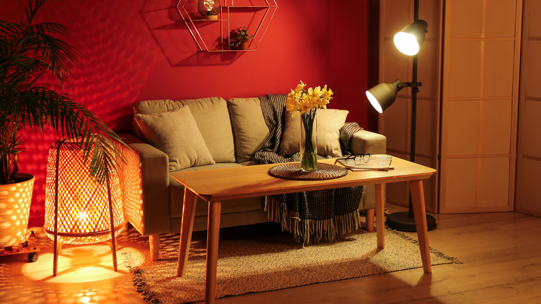
Choosing the right red wall paint means considering the effect you want overall: bold, warm, or sophisticated? A well-chosen jewel-toned red can feel very classic. Deep ruby and garnet shades tend to have a range of undertones from orange to blue, so can work in warm or cool palettes. They pair well with brown-toned neutrals like taupe to balance their vivid intensity, creating a warm, ever-so-slightly glamorous look. For garnet paint colors, try Royal Garnet from Valspar, which features deep plum tones, the brick-red toned January Garnet from Behr, or the lively mid-tone Sparkling Garnet from Glidden.
Cool pastel yellow with deep orange
Can yellow be a "cool" color? Yes! Yellows that don't have orange undertones often look a bit cooler than other yellows: think lemon yellow or a vivid acid yellow. These cool-toned yellows have a fresh, vibrant look, as opposed to the more cozy feel of warmer yellows, like butterscotch. Cool yellows pair well with bright fiery jewel-tone shades of orange and red for a look that's unique and eye-catching. For some pale, cool shades of yellow try Lemon Drops from Benjamin Moore, Friendly Yellow from Sherwin Williams, or Sherbert Lemon from Farrow & Ball.
Turquoise and pale aqua
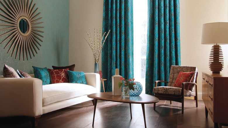
Mixing jewel tones and pastels from the same color family can be a winning combination. The pale aqua wallpaper with a touch of gold is beautifully enhanced with the deep turquoise drapes (textured brocade also with a touch of gold) and the cushions (also veined with gold). The rust colored cushions add a touch of vivid contrast to excite the eye, and the turquoise glass pieces complete the theme with smooth textures and reflected light. For a delicate shade of pale aqua paint, try Blue Ground from Farrow & Ball.
Mauve and cinnabar
Purple walls might seem like a daring choice for any room, but learning how to decorate with mauve can produce wonderful results. Try a pastel or mid-tone mauve with grey undertones, like Mauve Finery from Sherwin Williams, or Hazy Lilac from Benjamin Moore's. Pair this subtle neutral with furnishings in warm bright orange jewel-tones (think color names like cinnabar, persimmon, or vermilion) for an unusual but very attractive color scape. For a vibrant secondary color wheel trifecta of purple, orange, and green, add a few small touches of teal to enliven this color combination.
Deep gold and cream
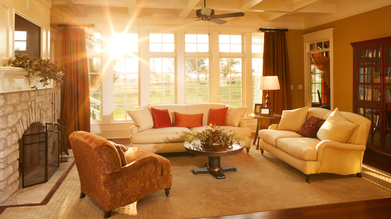
In a sunlit living room, warm colors are a natural choice. Imagine a living room's palette of warm colors includes a beige rug, deep gold walls, cream trim and sofa, tangerine cushions, and copper brown chair and drapes. The bright hues are kept to a minimum to allow the neutrals to really shine. Deep gold walls lend a rich burnished look, echoing the sunlit feel of the space but giving it an earthy solidity. Tapestry Gold, Mayan Gold, and Gold Mine, are some gold shades to consider selecting from Benjamin Moore.
Copper, rose quartz pink, and malachite
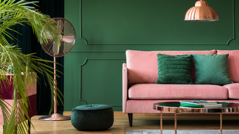
Malachite is a deep green gemstone that is lighter than emerald but deeper than jade. It's a blue-toned green, yet it has plenty of warmth. Medici Malachite from Benjamin Moore is a soothing, versatile shade, as is Malachite Green from Dunn Edwards Paints. This family of mid-tone greens is bold without being garish, and are a good anchor color for warm and cool hues. Try malachite green with cool pinks (like rose quartz or carnation pink) for a stunning combination, and some copper furnishings to add sparkle and warmth.
Copper and dove grey
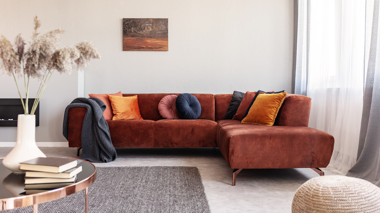
If you prefer rich colors of furniture over boldly-colored walls, good news! This approach makes it easy to experiment with different palettes. The warm copper brown of this velvet sofa makes it the room's main color event, with a cool, neutral backdrop of pale dove grey (like Dove Tale from Farrow & Ball). With a mid-hued grey rug, sheer curtains, and dark charcoal grey cushions and throw, you can add subtle cool contrasts. Also, gold and coral cushions, paired with a complementary painting, can solidify this simply curated palette of warm jewel and cool pastel tones.
Sage green, cream, and deep gold velvet
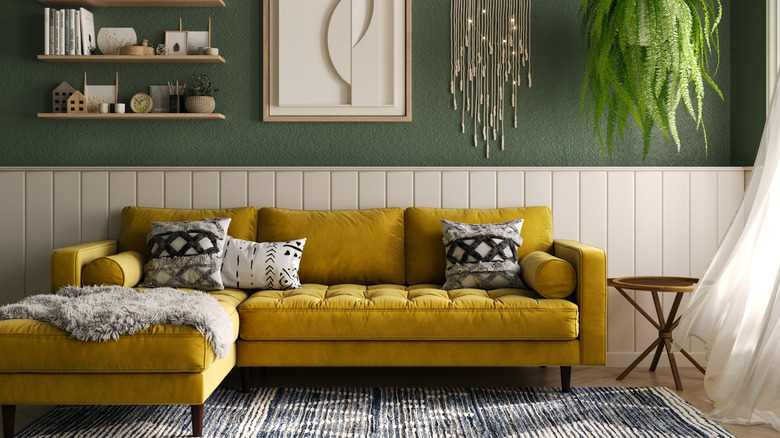
Sage green with white or cream walls has been a popular interior color combination for a while now, but this calm, neutral duo can sometimes seem a bit drab. To enliven this classic combo, add colors that accent the green's undertones, which may be blue, brown, grey, or yellow, depending on the shade you have. Two nice yellow-toned neutral sage greens are Spring Meadow and Seedling from Benjamin Moore. A jewel-tone sofa in gold velvet can add brightness and texture, while the overall look remains neutral and subtle.