The Best Neutral Alternatives To White Paint For A Timeless Living Room
Painting a living room is no small task. So, when you're ready to update the walls of your primary living space, not only do you want a shade that supports your aesthetic but also one that will stand the test of time — which often means going neutral. Neutral colors are a great, timeless choice because they are subtle and play well with a wide variety of more robust shades. However, while white definitely fits the bill, pure white (and variations of the shade with cool undertones) can feel frigid and uninspired.
This is precisely the reason many interior designers and home decorators go for warmer color options like creams and pastels (which also happen to be the best color palette for minimalist homes). However, some designers also go a step further and create calm, stunning, and inviting spaces by bringing in softer and more neutral shades of otherwise vibrant colors — like orange, red, green, and blue. This effect is accomplished by adding a bright color to a true-neutral shade (such as black, brown, white, or gray) to create a hue called a near-neutral. For example, adding a shade of your favorite light green to gray can create a cool-feeling sage green hue. Following this process, we have narrowed down some of the best and most-timeless neutral color choices for your living room that are much more exciting than plain white.
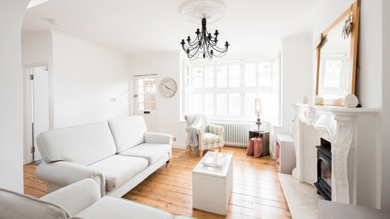
Pastels and almost-white living rooms
Not-quite-white is a popular choice for neutral color palettes because it makes a space feel brighter and really goes with everything. Mixing a little color into a lot of white brings down the sharp, and sometimes flat, feeling of an all-white space — and creates a lovely pastel. Depending on the primary shade of the undertone, pastels can be a great way to bring a little color to your home while staying timeless and neutral (or near-neutral). Another benefit of pastels is that they can make a room feel larger and airier, which is great for smaller spaces.
Because pastels all share a white undertone, layering a variety of pastel shades together in a space will make for a fun and cohesive design. For example, a pale blue wall, a soft pink chair, and a delicate green table will create a sophisticated yet playful environment. Another great advantage of going with pastel walls, is that you can play with a more intense version of your chosen color in other furnishings and accessories. A soft pastel-blue wall would create a magnificent backdrop for a bold blue couch.
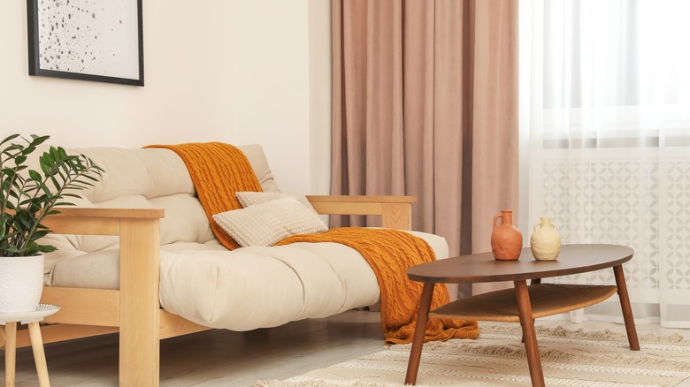
Incorporating warm colors into a living room
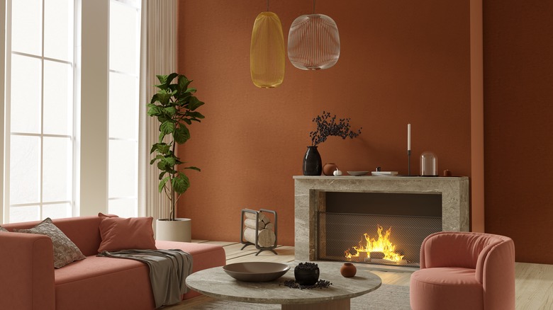
Bright and warm primary colors like red and yellow are rich, fun, and gorgeous; however, they may not be the ideal choice to help you create a timeless living room space because they can quickly feel tired or dated (although there are some creative ways to incorporate red into your home decor). Mixing one of these bright colors with a tried-and-true neutral, however, is a great way to give your space a little spice. Red, orange, yellow, and pink all fall on the warm side of the color wheel and, when toned down with a neutral color, can bring a spirited or energetic vibe while still being timeless.
Mixing an orange hue with a neutral brown will give you something akin to a terracotta color. Additionally, adding in gray or white will help to tone down the vibrancy and give the shade a calmer feel. The same is true of red. Blend it with brown and you'll get a more maroon shade. Since red is such a strong, warm color, adding in some white will give you a lovely, dusty rose (which has a timeless antique charm). Therefore, if you're looking to bring a little flush of warmth into your space, consider painting your living room with a softened mustard yellow, a pared-back terracotta, or a muted maroon.
Bringing cool tones to your living room design
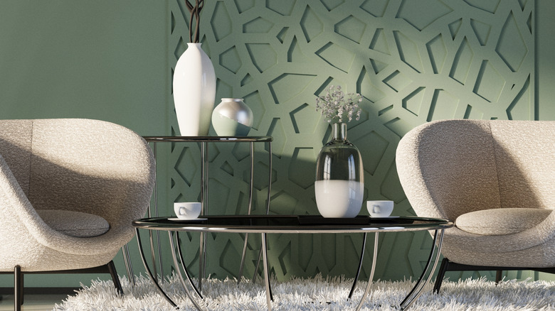
On the other hand, cool-toned neutrals create serene, tranquil, and inspiring spaces. Incorporating near-neutral blues, greens, and even purples into your living room can create an atmosphere of peace and calm. You can also pair your cool colors with dark neutrals (like black) to create a rich and intimate space that looks great in photos. One choice we love is going all in with blue paint shades for a dark and moody living room.
Another alternative would be to slightly warm up your cool tone by mixing in a soft shade of brown. With green, this would give you an olive-hued color that evokes a relaxed, nature-inspired feeling. Earth tones have an inherent timelessness to them and shades of green bring a sense of balance. Interestingly, adding a neutral brown to a gray shade will effectively deepen the gray while also warming it up to create a timeless "greige." While the name of the color doesn't sound that great, the hue itself makes for an interesting neutral that has quiet, earthy vibes and allows your furniture to be the star.
Styling your living room with shades of brown
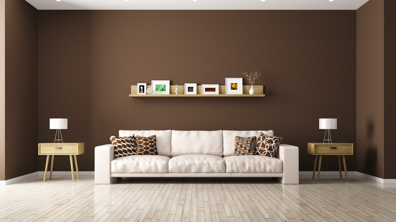
Since brown is itself a neutral color, you can't really go wrong painting your living room this earthy shade. In fact, brown is having a bit of a moment in interior design palettes — to the point that the shade "mocha mousse" was named Pantone's color of the year 2025. And given brown's versatility, you will be able to find the perfect shade of this rich color to go seamlessly with your furniture and other styling choices.
In fact, this earth-based tone is so versatile that it can run the gamut from nearly-white and calming to deep and dramatic. A creamy brown will both warm and brighten up a room, while a more red-toned shade will create a rosy taupe look. Alternatively, a deep, dark chocolate color will feel both classy and intimate. Of course, if you go the dark brown route, to keep your space feeling bright and open, you'll want to be sure to choose light-colored furniture.