Discover Benjamin Moore's Most Soothing Paint Colors For A Comforting Home
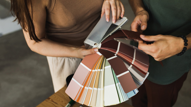
Creating a peaceful home is the culmination of a number of efforts: in addition to wanting to keep your home clutter-free and clean, you'll also want to ensure that your interior decor is on point, incorporating aesthetics that are comforting and calming. One of the easiest ways to achieve this type of vibe is with the use of the right shade of interior paint. The right shade of paint can not only make a space look larger but also can impact your psychology and outlook, with certain colors — like greens and blues — promoting a sense of tranquility and others — such as oranges and reds — creating an increased sense of energy, activity, and passion. If you're looking to create a comforting home, Benjamin Moore has a number of soothing shades that are worth considering.
Benjamin Moore's interior paint is known for being high quality, providing great durability, and offering good coverage, which is a benefit if you're looking to make your money go further. Their available paint shades are also plentiful, allowing you to create your dream space without having to seek out another brand. Neutral shades are some of the best paint colors for a relaxing home, as they are generally complimentary to other colors and can be cool or warm in tone (but never are overpowering). While there may be a dizzying amount of colors to consider, a few choice shades to consider from Benjamin Moore include Smoke 2122-40, Stone Hearth CC-490, Palest Pistachio 2122-60, Simply White OC-117, and Porcelain 2113-60. All of these shades are neutral or naturally inspired colors, which will create a soft and calm environment in your space.
Create serenity with Smoke
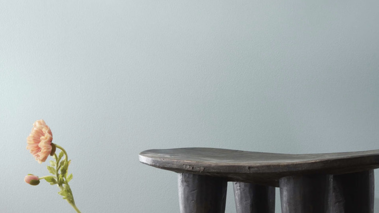
One of the most intrinsically calming colors we encounter as humans is blue. It's present in the sky and the water, natural environments that our species is well-acquainted with. While bright blue is beautiful to behold in nature, individuals who choose too bright of a blue for their walls may inadvertently create an overwhelming interior, which is far from soothing. Because of this, your best bet at a calming blue interior shade is one that is cut with gray hues, which will soften the intensity and provide a more subtle end result.
For a bluish paint shade that works wonderfully to create a soothing interior, check out Smoke 2122-40, which is described on Benjamin Moore's website as a "versatile grayed hue, softened with attractive blue-green undertones." It's one of the brand's best-selling neutral colors as it plays well with a number of lighting dynamics and can create a soothing sense of calm in the home. Since this is such a neutral color, Smoke 2122-40 can be used with a number of complementary materials and colors in your space, making it a winner for a soothing paint choice.
Go natural with Stone Hearth
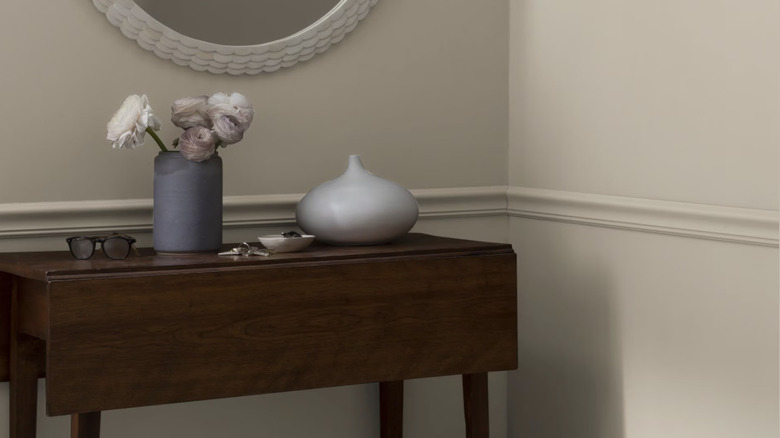
After blue, browns and beiges are another contender for naturally calming colors in day-to-day life. There's something reassuring about stoney colors, as they reflect the earthy quality that you're likely to see in many corners of nature, from a rocky beach to an ash-toned wood. The right balance of coolness in a beige can create a sense of relaxation without feeling sleepy.
For all of these reasons, Benjamin Moore's Stone Hearth CC-490 is a solid choice for a calming interior. It provides the comfort of a warmer brown but still has a gray undertone that helps to keep it feeling fresh. This neutral paint shade is part of the Designer Classics palette by Benjamin Moore, which is made up of over 200 shades that have proven themselves to be well-loved and high-performing over the years in terms of the feel they create in a space. You won't have any problems integrating this calming and earthy shade into your home, and it should play well with other neutral interior decor elements like natural wood, stone, and porcelain.
Bring in a subtle pick-me-up with Palest Pistachio
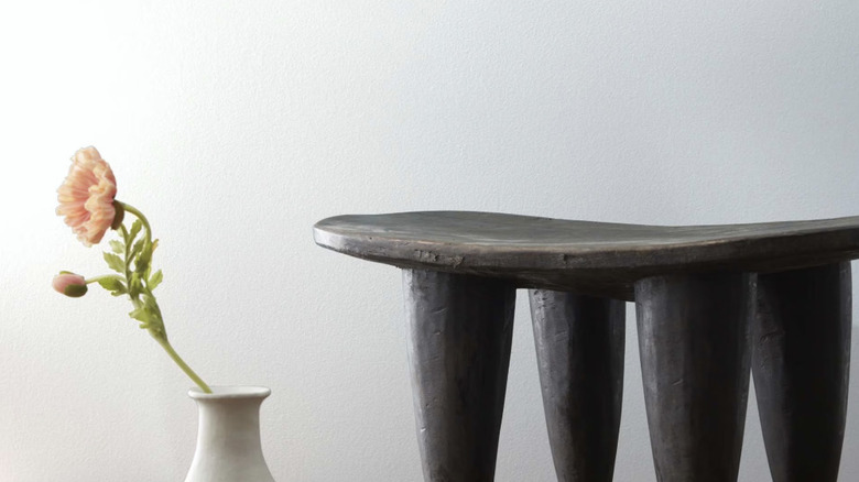
White is somewhat of a no-brainer when it comes to a soothing color, but knowing which white to choose can be somewhat difficult. White reflects light, so if you opt for too bright a white, your space will end up looking sterile. Muddier shades of white, on the other hand, can start to look dingy and discolored under certain lighting. Since white can be so challenging, you'll want to make sure that you get swatches to double check your options before committing to a color.
All that being said, however, if you're wanting to embrace a soothing but still optimistic shade for your home, Palest Pistachio 2122-60 is an excellent choice. It's grouped in with whites from Benjamin Moore, but hints of blue give it a much cooler tinge than the typical creams and ivories. Because of this coolness, this paint color is a perfect choice for rooms that you want to invite brightness into. Thanks to the balance of hues, you'll get the best of both worlds with this paint: that simple, clean appeal of white married with the soothing and hopeful blue.
Keep it classic with Simply White
Speaking of whites, if you're interested in a warmer shade to tie into your home's interior design, Simply White OC-117 by Benjamin Moore might be the perfect paint for you. This shade offers the calming and clean quality of a white paint while still possessing an intriguing warmth. It's classified as one of Benjamin Moore's best sellers, having earned the title of 2016 Color of the Year by the brand. According to a company press release at the time, "The Colour Studio arrived at Simply White OC-117 after careful review of the company's more than 250 white selections. According to the Colour Studio, it was the most neutral, level and constant in the various light sources used in today's design environments."
Simply White remains an excellent choice if you're aiming at creating a soothing environment in your home. Thanks to its versatility, this shade can play nice with a wide variety of different materials, like linen, canvas, leather, metal, wood, and stone, and colors, like deep sage, warm brown, and slate blue.
Go for something unexpected with Porcelain 2113-60
While you might not expect to see a purple paint on a list of most soothing colors, Benjamin Moore's Porcelain 2113-60 offers unparalleled calmness to your space with its subtle tinge of dusty saturation. Though deep purples have been associated with royalty and opulence throughout history, softer purples have a more soothing reputation and are known to evoke calmness and open communication. This makes sense on a subconscious level, as lavender and lilac both are purple flowers that deliver a calming aesthetic and fragrance to many spaces. There's nothing overpowering about this Benjamin Moore shade, and you can easily integrate it into a number of settings, whether that's a spa-like bathroom or a living space.
Since it's so soft in its coloration, you can pair Porcelain 2113-60 with a number of other colors, including whites, grays, browns, and golds, to name a few. You'll also see that this lighter shade of purple is reminiscent of Benjamin Moore's 2025 color of the year, the bolder and more dramatic Cinnamon Slate 2113-40, which offers a subtle statement to whatever space it is featured in. As you set out to create a perfectly soothing spot in your home, remember that in addition to paint color there are a number of other design tricks you can employ to make your home feel more warm and cozy.
