Ditch The White Paint In Your Bathroom For A Timeless Neutral Alternative
In the world of interior design, the era of all-white bathrooms is coming to an end. Some say that white is among the top colors you should never paint your bathroom, and it's easy to see why. Not only does white create an unwelcoming and clinical atmosphere, but it is also impractical. White puts all blemishes and imperfections on full display; in a bathroom, that could mean soap scum, grime, and mildew. As the dustiest room in your home, you can be certain that any lack in routine cleaning will be on full display against your white walls. Plus, white paint is susceptible to turning yellow over time as a result of environmental factors such as high temperatures and excessive moisture. Latex paint offers the best protection against these external conditions, but even still, white paint is said to be among the bathroom paint deemed past its prime in 2025. Thankfully, there are endless neutral colors that will upgrade your bathroom in ways that white paint never could.
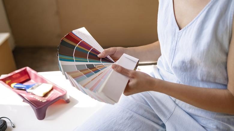
By definition, neutral paint colors are shades without a lot of pigment that are versatile enough to pair seamlessly with other neutrals. These colors are derived from nature which is apparent in the way that they are described, using words like mist, sand, and charcoal. Usually, neutral colors fall on a spectrum of light and dark shades derived from gray, beige, brown, cream, and black. However, other colors like sage green and navy blue can be considered neutral colors as well. Neutrals are celebrated for being timeless, offering contemporary elegance that endures many years of changing trends. They also serve as a canvas for you to play with bolder secondary shades without compromising on visual cohesiveness. When painting a bathroom, opt for waterproof paint such as latex or a waterproof sealer to prevent moisture-related damage.
Choosing the perfect neutral bathroom paint
When choosing a neutral alternative to white paint, it is important to pay attention to undertones. If chosen correctly, the undertones of your neutral paint color will enhance the other colors and natural light in the room, making it appear balanced. However, the wrong paint shade could clash with your existing colors and disrupt the harmony. In general, lighter neutrals such as light beige and heather gray are more versatile than darker shades.
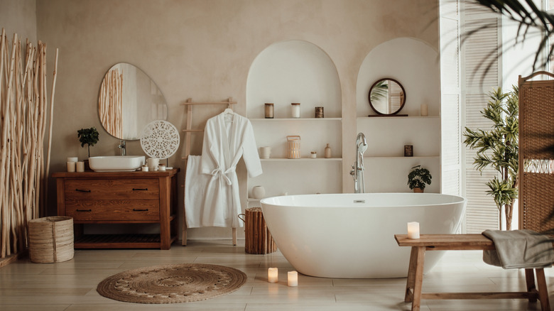
Colors with undertones of yellow, orange, and red will give the space a warm and inviting atmosphere. A great example of this is Muslin, one of Benjamin Moore's most popular warm neutrals. This beige shade with subtle pink undertones is both timelessly chic and practical, masking imperfections while creating an elegant and welcoming ambiance. Warmer temperatures are best suited in spaces with south-facing windows as the gold undertones will enhance them even more.
On the other hand, there is something to be said about the calming sophistication of cool neutrals. These shades, characterized by undertones of green, purple, and blue, contribute to a soothing yet modern atmosphere. They're more popular in bathrooms than warm neutrals as they create a more airy, spacious feeling, according to Benjamin Moore. Cool neutrals also work best in spaces with north-facing windows and certain artificial lighting. If cool neutrals are more your speed, consider Silverpointe by Sherwin Williams, a misty gray with hints of cyan that makes any space feel expansive and peaceful. Alternatively, balanced neutrals offer an even ratio of both warm and cool influences, giving you the best of both worlds. Popular balanced neutrals include Pashmina by Benjamin Moore and Balanced Beige by Sherwin Williams. These shades provide an ideal base for experimenting with a wide variety of other colors and interior design themes.