Add Color To A Neutral Room Without Using An Accent Wall
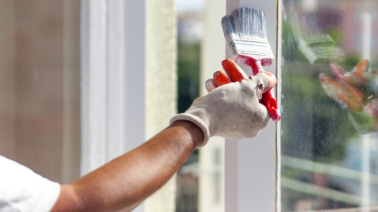
If you've decided to update your neutral-colored space with a punchy accent color, but are a little tentative about covering an entire wall, why not wade gently into the color pool by starting small? Painting just the trim in your room will give your space a whole new look. Plus, you may be able to save a little time and money. The intensity of the transformation will depend, in part, on how much of the visual space will be painted, and which contrasting color you choose. So, we have some tips to make sure you get the combination just right.
Emerging design trends are turning sharply away from cool-toned spaces and toward rich, intense colors. In addition to adding some vibrancy to your space, painting your trim in a contrasting color can help to highlight interesting architecture like crown molding or built-ins. However, since this trim painting technique will make a big difference in your room, it's a good idea to consider how much of the space will carry your accent color before getting started.
Painting contrasting trim
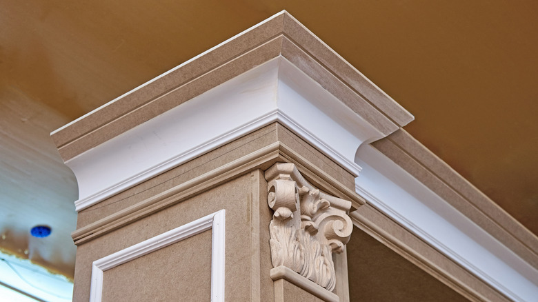
Pulling off the contrasting trim design concept is all about balance — both in the amount of space that will be painted and the balance of your color choices. To maintain a visual equilibrium, designers often suggest using a ratio to guide these decisions. The 80-20 rule is a popular choice, wherein 80% of your space is the primary (often neutral) color and 20% is a complementary, contrasting color. This particular ratio works well because it's unlikely that 80% of your room is comprised of trim, making it easier to strike that balance. However, there are exceptions. A mudroom, for instance, might feature several large doors, cabinetry, and baseboards that — taken together — eat up a lot of visual space. You can mitigate that situation by painting just the trim and not the cabinetry, for instance. Or, perhaps, just the doors.
If you're concerned about how to choose the perfect color for your trim, the color wheel may prove an invaluable tool. To achieve complementary contrasting color combinations that will transform your home's interior, choose colors opposite one another on the wheel. Walls with a blue undertone will make a rusty shade of orange pop, while purple-toned walls will highlight a yellow hue on your trim. If you're after a more analogous look, you can go for hues that are next to each other on the wheel. A rich, emerald green on your cabinetry, for example, would be a charming accent to pale green walls. With some careful consideration, you can bring a flourish of color to an otherwise neutral space — without committing to a whole wall.