These Are The 10 Worst Design Choices Featured On HGTV's Rock The Block

We may receive a commission on purchases made from links.
Even HGTV stars can make majorly questionable design choices. "Rock the Block" is a competition series where top HGTV designers pair up to renovate and add value to plain, builder-grade homes. The contestants compete with no final cash prize, so it's all about the bragging rights. It's a great showcase of each designer's unique style, but because design is so subjective, not everyone will agree with their personal decisions. Because of this, even some of the winning homes didn't win over the viewers or future buyers.
There's a lot to be learned from the mistakes made on "Rock the Block." If you're currently designing your own interior, this series is an amazing resource to learn what works and what doesn't for both living and resale. While controversial design choices aren't necessarily bad, sometimes the cons outweigh the pros. As major HGTV fans ourselves, we've read countless forums and publications that highlight reactions from fellow viewers. Through comments on Reddit, YouTube, social media, and other fan-driven forums, we've ranked the top 10 worst design choices from "Rock the Block."
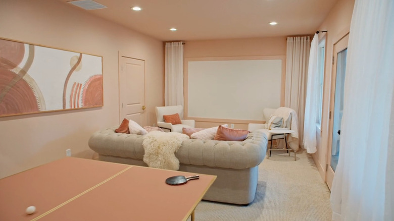
A bathtub sitting inside the shower took fans by surprise
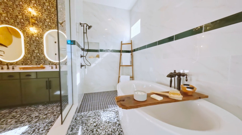
In Season 3, Episode 3, Lyndsay and Leslie Lamb designed a winning bathroom that perplexed some viewers. They decided to place the bathtub inside the shower, a choice that was too trendy for the tastes of some fans. One Reddit user said, "I don't need two washers and dryers and I did not like the tub in the middle of the shower stall ugh." Another viewer agreed, saying, "I hated their bathroom too. The tub in the shower trend is something I really despise." Although many fans were in agreement, some viewers defended the over-the-top bathroom, with one writing, "Aww I thought the twins deserved to win!" Since the bathroom did have some supporters, we've ranked it at number 10.
There are pros and cons to placing your bathtub inside the shower. While a tub-shower combo is a common design choice for small spaces, a freestanding tub inside a large shower is much rarer. A major pro is that it keeps all of the water in one place, simplifying post-bath cleanup –- especially if children are using the bath. However, installation isn't as simple as it seems. Waterproofing and drainage can be tricky when placing a freestanding tub inside the shower, which is why it's best to consult an experienced contractor. The tub can also take up valuable shower floor space if you're not working with a huge area. So, this unique concept only works if you still have plenty of space to walk around in your shower. If you're curious about other bathroom layout options, we've settled the debate on whether a separate tub and shower is a bad idea.
A bowling alley that was deemed deeply unnecessary
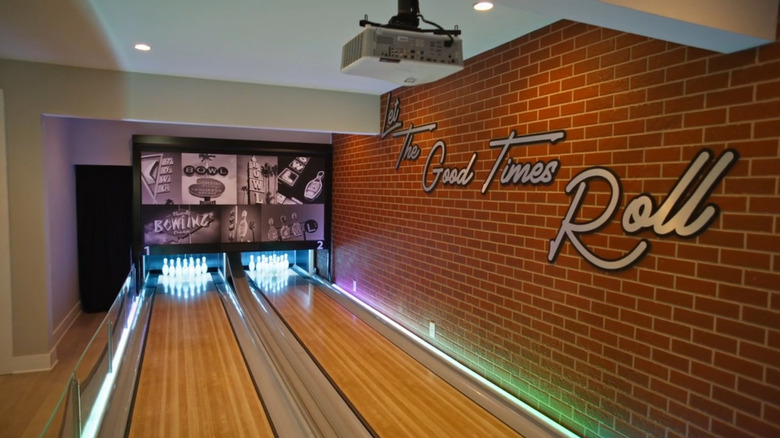
Brian and Mika won Season 2, but the viewers weren't enthused with their quirky addition in Episode 4. The duo chose to add a bowling alley to the basement, which didn't go over well with the fans. One Reddit user wrote, "The worst house won ... It looked like a cheap flip with a couple of crazy expensive, garish items (bowling alley) thrown in." Another viewer added, "The winning house is insane to me. I can't imagine who would want a mini bowling alley in their house. Yeah, it would be great for kids' parties, but your own kids are going to get bored of it." However, one fan was less harsh, stating on another Reddit forum, "I actually preferred Brian and Mika's kitchen and the only thing I hold against their house is the bowling alley." While the consensus on the bowling alley was mainly negative, several fans liked other elements of Brian and Mika's home, which puts this space at number 9.
If you're enticed by the idea of an at-home bowling alley but you're worried that the renovation is unrealistic and detrimental for resale, there are some equally fun alternatives to consider. Instead of turning an entire basement into a bowling alley, design a home game room that can appeal to a broader range of guests and future buyers. Include classic games like pool, ping-pong, and even foosball. You can even purchase a statement piece like Barrington's Shuffleboard Table that allows for basement fun without any renovating.
Paint colors that were too bold for resale purposes
Although fans seemed to love Keith and Evan's home in Season 3, their bold choices didn't fare so well when it came to selling the property. While all of the other competitors had homes under contract, Keith and Evan's house was still sitting on the market. Reddit users speculated why it was taking so long to sell. One suggested that the contrasting exterior hues and the not-quite-airy interior paint colors might have been off-putting for luxury buyers in that price range. A fan revisited the discussion a year later, noting it finally sold after being taken off the market and repainted, sharing, "There are still pics of Keith and Evans up on Redfin and it looks like they repainted the bottom half of the exterior and toned down the colors in the living room." Even though it didn't have as much success with buyers, many fans still liked the property, so we're ranking this home at number 8.
While bold design choices aren't always bad, it's a delicate balance if you want to appeal to a wide range of potential buyers. Using too many vibrant colors and patterns can turn buyers off, but that doesn't mean you have to swear off visual interest altogether. Pieces like wall art are a great way to add personality to your space that future buyers can still see past if it's not their style. Cushions, textiles, and artwork are other great ways to incorporate vibrant hues without hurting resale potential. Just try sticking to two major accent shades against a primarily neutral backdrop. If you want to go bold with the exterior, choose one statement color and keep the rest of the facade neutral to retain a refined look. This could mean going with colorful siding like the design duo's but sticking with a fresh white hue for the rest of the surfaces for balance. Or, keep your exterior neutral and add a pop of color to the front door.
A urinal in a luxury bathroom conjured up mixed reactions
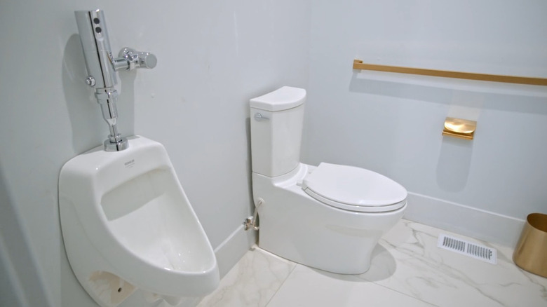
In Season 4, Episode 3, Michel Smith Boyd and Anthony Elle made a risky decision to add a urinal to the high-end bathroom redesign in their mountain estate. Their vision was to turn this home into a sleek bachelor pad, but some "Rock the Block" fans were divided on the placement of the urinal in the luxury bathroom. Judge Lyndsay Lamb said, "I don't know if I would want to sit next to a urinal if I was going to the bathroom." One YouTube viewer agreed, saying, "Hated the urinal!!" and another responded, "A bidet would have been nicer." However, some fans thought it was a genius upgrade. One explained, "Let me tell you something- A forever dry and down toilet seat in exchange for a urinal?! Sign me [...] up!!!!" Because this addition still won over some viewers, we're ranking this home at number 7.
For homeowners who have dared to add a urinal to their residential interior, some have said that the reception has been overwhelmingly positive from family and guests. From a practical standpoint, it can also be easier for some people to use with certain mobility issues. However, there's no doubt that the stylistic aspect is a challenge. The key is to choose a urinal that doesn't look like a commercial urinal. Instead, look for sleeker, more streamlined designs like Kohler's Contemporary Urinal.
A basement that wasn't so pretty in pink
In Season 2, Episode 4, David and Tiffany's basement renovation resulted in an unpopular design choice. They didn't just add a touch of blush — they color-drenched the entire space pink. One user commented on the YouTube clip, "I loved the blush color, it was just a bit overdone. Like walls, and ceiling, and cabinets, and pink and blush furniture/decorations?" Another viewer agreed, saying, "I'm sure a girly-girl would love the pink basement, but that would make every non-girly girl go 'not for me!'" The fans were right about the polarizing color choice. In fact, the basement was repainted in a more neutral hue for the home's listing photos. The choice was largely panned by viewers (and apparently the future listing agent), but because it was just paint, this space is ranked in 6th place.
This renovation is another example of how a paint color can hurt the future value of your home. In fact, pink is known to be an interior paint color that can devalue your property. Although David and Tiffany did opt for a relatively subtle blush shade, the issue was the overwhelming amount. If you absolutely love a rosy hue and don't want to give up the playful, romantic look, there are several concepts to consider that won't take over your space. First, try painting just an accent wall rather than the entire room. You can also use an easy-to-remove wallcovering, like Sevalo's Light Pink Peel and Stick Wallpaper, on a single wall for added texture and visual interest.
A butler's kitchen that had major practicality issues
In Season 4, Episode 1, Jonathan and Kristina designed a kitchen — with another kitchen! They turned the room behind the kitchen into a second meal prep and cleaning space, or scullery. However, it was missing a major functionality element — a dishwasher. Because these spaces are usually used for heavy prep work and cleanup, it was strange that it was missing such a key appliance. The fans agreed that this was a huge oversight. One viewer commented on YouTube, "The butler's kitchen should have the dishwasher and all the 'wet' kitchen and appliance stuff in one place." Another agreed, saying, "I never heard of a back of the kitchen-kitchen ... but yes it should have a dishwasher!!" The main kitchen got a lot of love, but the major ding in functionality makes this back kitchen land at number 5.
Deciding whether to embrace or avoid the luxury two-kitchen trend comes with with a lot of considerations. You can use your back kitchen to store items that aren't as aesthetically pleasing, allowing you to showcase your best dishware in your primary kitchen. This layout also allows you to keep your countertops and main fridge clear of clutter by utilizing the additional food storage and cabinet space in the back. However, utilitarian elements like dishwashers should definitely be a priority in the back kitchen. If you don't have space for a large dishwasher, even a compact version like this 18-inch Honeywell Dishwasher can be helpful if you have to split the load between both kitchens.
A minimalist master suite that made fans cringe
Leanne Ford is known for her modern, minimalist designs, but fans thought she went too far on her master suite re-design in Season 1, Episode 1. It leaned too luxury rather than livable, and many viewers agreed that it wasn't a cozy or realistic space. One wrote on the Primetimer forum, "That bedroom/bathroom design by Leanne Ford looked too minimalist and a lot of wasted space." Another took it a step further and criticized the functionality in addition to the aesthetics, explaining, "I've always disliked Leanne Ford's 'designs.' I'm so not a minimalist. But I thought this design was not just minimalist but dumb. Isn't anyone else as sick of barn doors as I am? And her bedroom wasn't minimalist...it was sad and bare and cheap-looking." Echoing everyone else's sentiments, one member said, "Leanne's was a huge waste of space and so cold and impersonal." The fact that more than several fans had the exact same feedback earns this space a spot at number 4.
There are a few things many people get wrong about minimalist interior design and decor. If you agree with the fans about the lackluster appearance of a pure white, empty space, that doesn't mean you have to swear off minimalism altogether. The principle of minimalism is all about being thoughtful with the pieces you choose. While Ford's interior may feel unwelcoming due to the neutral color scheme and sparse design, you can still incorporate warmth, color, texture, and livability in a minimalist space. Consider functional yet sleek and cleanly designed pieces, like Prepac's Simply Modern Bedside Table, to add much-needed bedroom storage. And, add a bit of texture to your space with bedding and window treatments in a monochromatic color scheme that still creates calm vibes.
An outdoor shower and a platform bed had viewers venting
In Season 5, Episode 3, Page Turner and Mitch Glew reimagined a luxury condo with a few unconventional additions. The first piece that had viewers scratching their heads was the retro platform bed. One viewer posted in the Facebook group "Rock the Block" HGTV Fans, "Seriously? A raised platform that only the bed is on. I'd break my neck if I woke up to use the bathroom! I can't believe they won!" Countless fans were in agreement in the comment section. Another element that caused controversy was the outdoor shower. Another fan commented, "Judging was awful; an outdoor shower on the 2nd floor?" Because the home won the challenge, fans were even more irate. This places the controversial suite at number 3.
An outdoor shower on the balcony is a bold move, but it's not for everyone. A balcony is a luxury, which means it's important to make the most of the limited space. If installing a shower means you eat into the outdoor living area on your balcony or terrace, it's probably not ideal for maximizing the feature. If you want to upgrade your balcony before selling, try incorporating lush greenery, potted flowers, and moveable screens that maximize privacy. As for the iffy bed choice, look for options that have the same retro vibes but are still functional and designed to accommodate standard bedding. For example, this Platform Bed Frame with Arched Headboard has a curvy silhouette but a rectangular sleeping surface that's easier to get in and out of.
A wellness center with a questionable target buyer
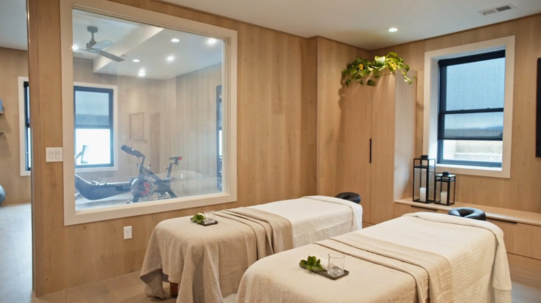
Sarah and Bryan Baeumler turned a basement into a luxury wellness center in Season 4, Episode 4. However, many fans were perplexed about the lack of practicality and the type of buyer they were targeting. With two massage tables and a gym, sauna, and soaking tub, many viewers felt that it was simply too outlandish for a livable space. One viewer wrote on YouTube, "Wellness center?? Who is going to buy that?" Another echoed her sentiment, saying, "Wouldn't you have to have a massage therapist on hand to give you a massage in the wellness center? I think that design was a waste." One HGTV fan even took to Reddit to rant about the choice, posting, "I'm a maximalist design-wise, but if I'm buying a house, I don't want to have to maintain a wellness center in my basement. Does this bother anyone else?" Because of the uproar across different social media platforms, this home is ranked as the 2nd worst.
If you're a wellness fanatic and you want to give your home a spa-like vibe, there are other low-maintenance options to consider. For example, creating a sensorial experience in your basement or bonus space is simple. Consider a diffuser with essential oils and glowing lamps for a warm, zen-like vibe. A decorative water feature like the Alpine Corporation Mirror Waterfall Fountain is another great addition to create a peaceful (yet low-maintenance) interior.
The controversial fireplace that obstructed a stunning view
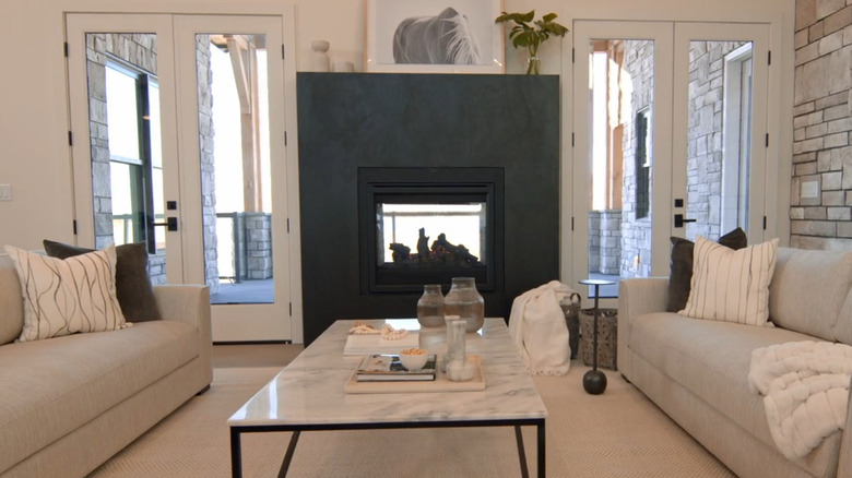
There were more than a few controversial elements in the Baeumler-designed home. This one, featured in Season 4, Episode 2, was a dual-sided fireplace that added character but obscured the stunning view. Guest judge Mina Starsiak Hawk was skeptical about this floor plan rearrangement, saying, "You have to peek around it to see the view, and I don't know, for this market, how that's going to play out." Fans on YouTube echoed her sentiment, with one writing, "I don't like the double-sided fireplace. So sad to lose the view." A Reddit user noted their dissatisfaction with the feature, saying, "The outdoor 2-way fireplace was a fail, right in the middle of the view." Because this feature isn't as easy to remedy as taking equipment out of a basement or changing a paint color, this lands as the number one worst design on our list.
Although a scenic view is not usually taken into account by an appraiser, it does have some serious benefits for resale. One major pro is that homes with a view tend to appeal to more buyers, and that proves especially valuable in competitive markets. If you're lucky enough to have a nice view, there are some things you can do to maximize it. For example, consider upgrading your home with floor-to-ceiling windows or sliding glass doors. You should also take care not to block or distract from any views with large furniture pieces.
Our Methodology

In order to rank the list of worst design choices on "Rock the Block," we researched fan reactions on both top forums and social media platforms. We took a look at which designs garnered the most negative attention, choosing those with the most comments. To rank them, we then weighed whether there were multiple things in the room the fans disliked, and whether or not they were easily remedied. As major fans ourselves, we knew there would be certain spaces that perplexed viewers, and that turned out to be an understatement. From YouTube to Reddit, HGTV fans are always a refreshingly honest resource.