13 Unique Kitchen Color Combinations To Try Out In 2025
Kitchen design and decor are often the most attention-getting images in magazines and on websites, and for good reason. The kitchen is often the center of our homes, and a room many of us spend a lot of time in, for food preparation, meals, entertaining, or just enjoying our morning coffee. The kitchen trends we saw a lot of in 2024 primarily focused on muted, timeless designs, but it looks like the new year is ushering in some saturation. With the seemingly endless parade of white kitchens with brushed metal appliances that have been popular for years, it's exciting to see color being emphasized for kitchen decor. Trying out some striking and unexpected color combinations is a surefire way to bring visual interest and energy to your kitchen space.
There are numerous ways to make changes to your kitchen's color palette. Some involve major renovation and expense, while others are as easy as displaying some colorful thrift shop items or linens. Repainting your kitchen is a great way to change the feeling of the entire space, but you can start small with trim, shelves, or a wooden table.
If you're unsure about committing to an expensive or time-intensive new design, start small with new color ideas for your kitchen decor. If you already have one bold color, try adding a few items like dishes in contrasting or complementary colors to see what you like. Your floors and cabinets may provide a base of color to experiment with, as well as doors or rooms connected to your kitchen.
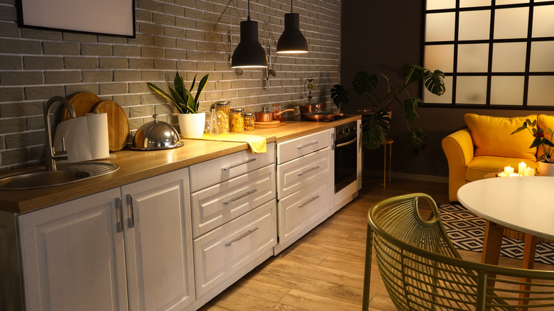
Mustard and black
Mustard yellow is a warm, rich color that is a good choice for those who find other yellows too bland or too bright. It pairs well with earth tones and with black, and can help to bring out warm tones in natural wood counters. As a mid-range neutral yellow, mustard also looks great with natural greens (like houseplants or herbs growing in your kitchen windows), and with cool metallic shades like silver and nickel. Mustard paint colors to try include "Goldfinch" from Sherwin Williams, "Benjamin Moore's "Spicy Mustard," or "Sudbury Yellow" by Farrow & Ball.
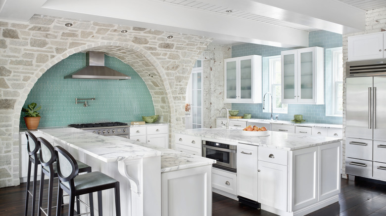
Pale aqua and white
Once relegated mainly to bathrooms and guest bedrooms in ocean cottages, aqua is now considered a versatile shade to paint any room in the house. Pale aqua and white together in the kitchen creates a breezy, open feeling, great for lightening up rooms with small or limited windows. This cool, refreshing hue contrasts well with bold, warm accent colors like orange or gold, as well as deeper jewel tones like violet or ruby. Try Farrow & Ball's "Blue Ground," reminiscent of robin's egg blue, or bright, cheery "Jamaican Aqua" by Benjamin Moore.
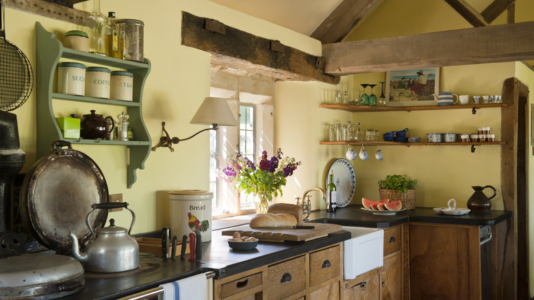
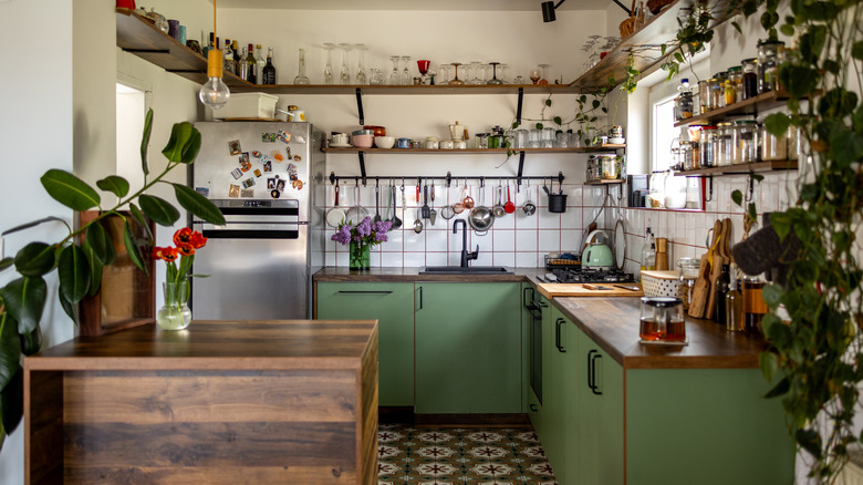
Butter yellow, muted green, and natural wood
In older homes with natural wood cabinets and floors or rehabs using salvaged wood, a warm rustic palette works well in the kitchen. Butter yellow can make rooms look bigger and is more versatile and neutral than brighter yellows. It pairs well with muted greens for a country look that is understated and charming. Benjamin Moore has several wonderful options including radiant "Sunshine on the Bay," peachy-toned "Golden Honey," and of course, the delicate and creamy "Butter." Pair it with a muted green that conjures nature, like Farrow & Ball's "Pond Green," or Benjamin Moore's "Everglades."
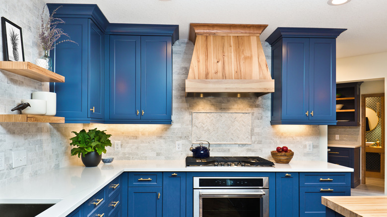
Dark blue, grey, and white
Dark blue may seem a somewhat cold color for kitchens, especially paired with ubiquitous white. But blue is a classic, calming color, making it a good choice for this room where we spend so much time. Pairing marine or navy blue with white and pale grey creates a dramatic backdrop that can be warmed up with touches of natural wood or bright linens. Benjamin Moore has some great deep blues: try "Van Deusen Blue" for a neutral blue, "Mistral" for a vivid marine blue touched with green, or the bold navy hue, "Starry Night Blue."
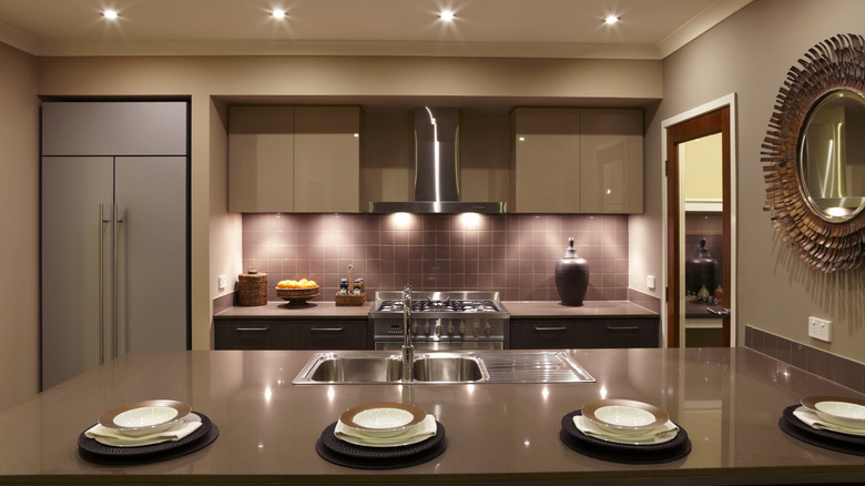
Mocha and mauve
Pantone's 2025 Color of the Year, Mocha Mousse, is a stunning neutral for home decor. Mid-range browns are very inviting for interiors and a great base to pair other colors with. Mauve is a neutral pink with a range of grey and plum tones that combines with mocha for a subtle, sophisticated look. For mocha walls to complement mauve accents, try Behr's "Modern Mocha," a warm, plum-toned neutral, or Benjamin Moore's pink-toned "Cafe Mocha." For mauve paint colors that pair nicely with mocha shades, try Benjamin Moore's "Deep Mauve" or the paler, slightly pinker "Mauve Mist."
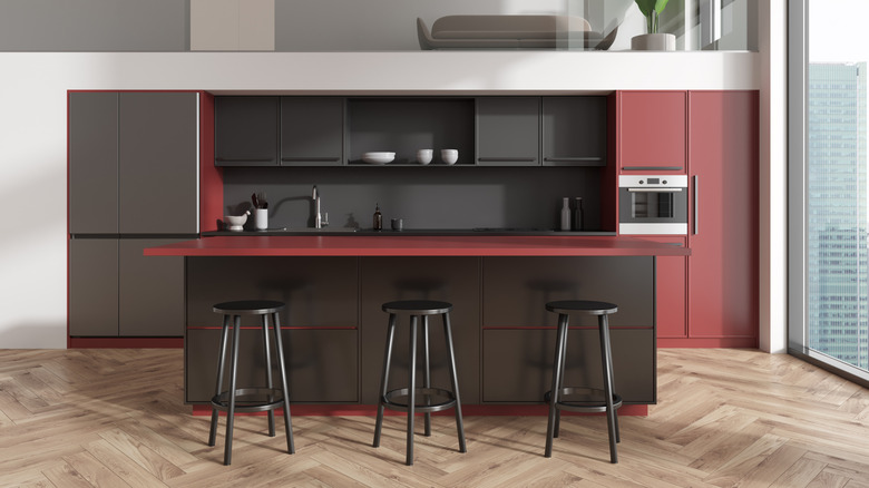
Black, white, and red all over
For a bold, dramatic look, you can't beat the combination of black and white with bright red. This very contemporary kitchen palette is stylish, though not for everyone. Bright red is stimulating, especially warm shades like tomato or cinnabar. You can also try a blue-toned red that is more understated, like cherry or raspberry. "Raspberry Pudding" from Benjamin Moore is a berry red that is vibrant but not too intense, while "Umbria Red" is dark and sophisticated. Farrow & Ball's "Incarnadine" is a rich, slightly muted red, perfect for pairing with bright white.
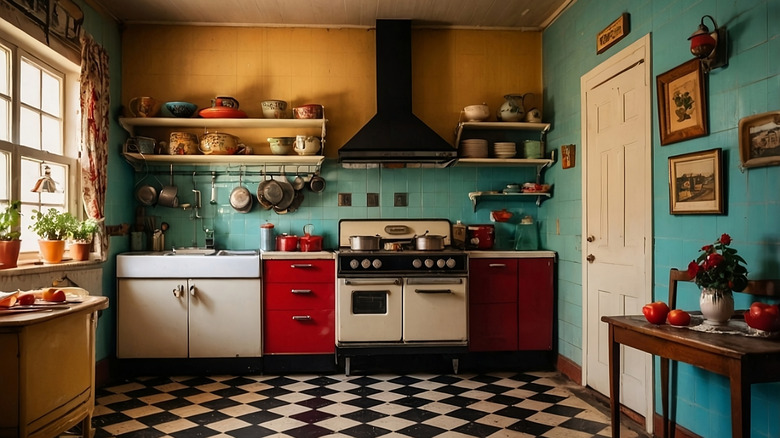
Turquoise, cherry red, and gold
A color palette of red, yellow, and blue invokes crayon shades that are saturated and bombastic. But a muted palette of these primary colors makes for a vibrant contrast that still has a cozy, vintage feel. The combo of gold and turquoise walls and backsplash with cherry red cabinets is stylish and eclectic, confident yet comforting. Try a pale shimmery turquoise like Benjamin Moore's "Mexicali Turquoise" or "Clearlake." Farrow & Ball's "Romesco" or Glidden's "Calypso Berry" are terrific cherry reds. For rich butterscotch gold, try "Glen Ridge Gold" or "Golden Groves" by Benjamin Moore.
Olive green, charcoal, and dark wood
If you have dark wood cabinets or countertops in your kitchen, it may be tempting to paint your walls with lighter colors. But bold darker colors enhance dark wood tones beautifully. A rich olive green lends a warm natural vibe, while deep charcoal grey uplifts the warm reddish tones of dark wood stain. With good natural light, darker colors create a cozy, earthy feeling. A creamy white ceiling also keeps things from looking too dark. For warm, rich olive try Farrow & Ball's "Bancha" or "Sap Green." For charcoal, try Benjamin Moore's "Witching Hour" or "Flint."
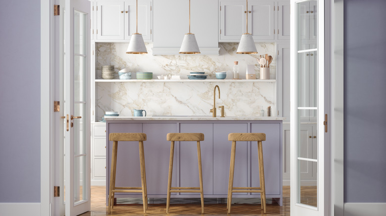
Periwinkle and white
Periwinkle is a unique color that hovers between lavender and mauve (but bluer than both). It's calming yet mysterious, conjuring dusky skies and morning clouds. It is a rather unexpected color for the kitchen, but paired with white it creates a serene yet striking atmosphere. Contrast its coolness with warm shades of wood or metal, or pair it with pale neutrals like dove grey for a gentle vibe. Keep to more muted shades to make this palette more flexible. Glidden has some beautiful periwinkle paints including "Roslyn's Periwinkle Blue," the slightly deeper "Fresh Hyacinth," or the soft pastel "Pearl Violet."
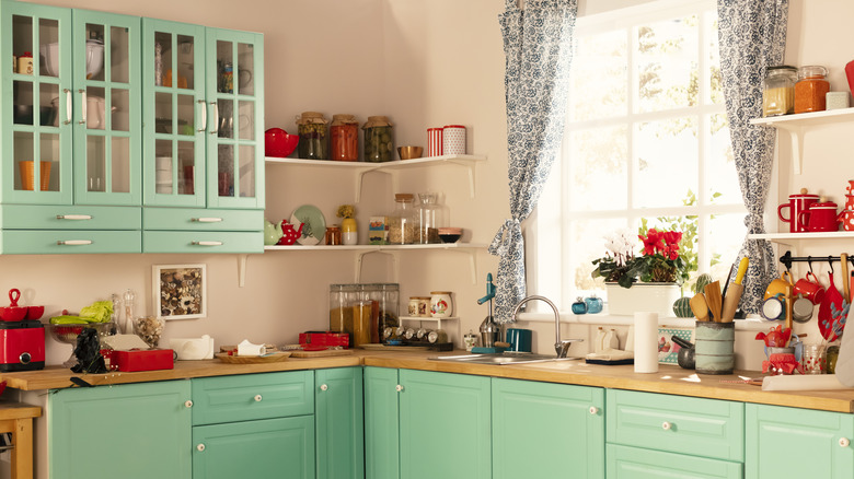
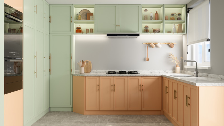
Peach and mint
With kitchen cabinets available in so many colors now, why not try something unusual? This pale mint and peach combo (or pistachio and apricot if you wish) is eye-catching and stylish, yet delicate and subtle. Pastel colors are a refreshing alternative to all-white kitchen interiors. Pastels are also more versatile than bolder, more saturated colors. Paint is a less expensive color remodel option than cabinetry, so try this palette out with paint first. Benjamin Moore's "Juno Peach" and "Peach Cloud" are lovely peach shades to try. For mint green, try their "Soft Green" or "Reflection."
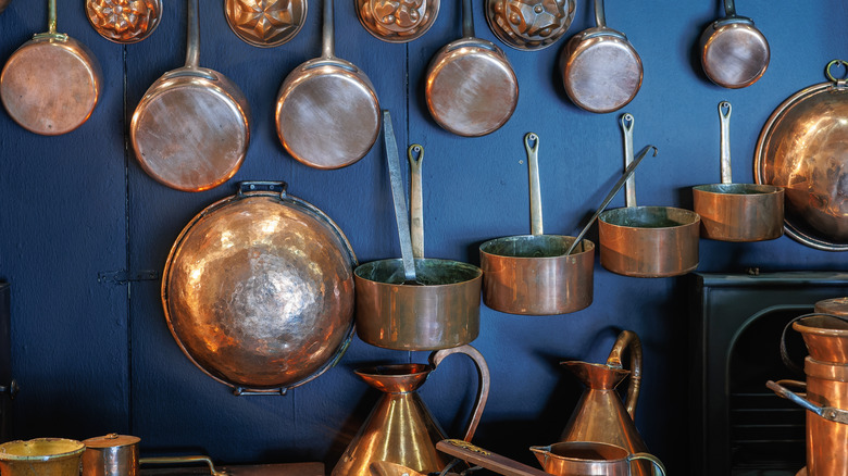
Dark blue and copper
If you're lucky enough to have a collection of copper cooking pots or copper accents in your kitchen, consider a deep blue wall for a stunning color display. Metallic finishes are often considered somewhat neutral in decor, but of course they have color: silver, nickel, platinum, and chrome are cool, where gold, brass, and copper are warm. Pairing the warm tones of copper with a deep cool blue enhances their complementary colors. Try "Loyal Blue" or "Endless Sea" by Sherwin Williams (both with a hint of teal), or the elegant indigo-toned "Serge" from Farrow & Ball.
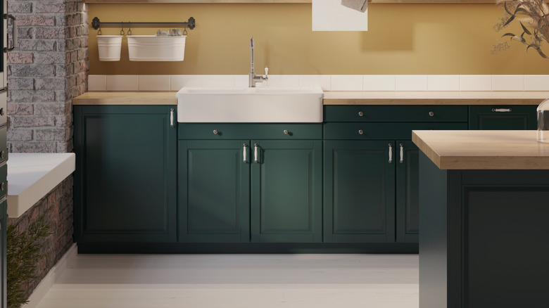
Emerald green and taupe
Emerald green is a very versatile color in decor, with shifting and harmonizing effects depending on the other colors in its vicinity. In a cooler palette of pale blue and lavender, it can have a regal or soothing quality; paired with deep orange or rosy pink, it is bold and inviting. But this cool, dramatic jewel tone also enhances warm neutral colors like beige or taupe, adding depth and subtle energy. Try Benjamin Moore's "Rainforest Foliage" or "Absolute Green," (both lush and deep classic emeralds), or "Green Bay" with a hint of teal.
Rose pink and gray
Rose pink is an uplifting color for decor. It avoids the princess vibe of paler pinks, and has a comfortable warmth that is more subtle than hotter pinks like fuchsia or magenta. Pairing this mid-tone pink with a pale neutral like gray tile flooring or backsplash creates a feel that is inviting, charming, and modern. Add warmer accents like oranges or earth tones to balance this pink's blue undertones. Great rose pink paint shades to try include Benjamin Moore's "Genuine Pink" (a muted rose pink), "Paradise Pink" (slightly cooler), or the rich but soft "Deep Carnation."
