The Best Before And After Home Makeovers From HGTV's Property Brothers
Drew and Jonathan Scott have hosted many HGTV shows over the years, but are best known for their hit "Property Brothers." The beloved series has been running for more than a decade and has had its fair share of fantastic home makeovers, and we're about to breakdown a few of the very best. Sure, there might have been some bad home advice dished out on the "Property Brothers" show from time to time. But these before and after home renovations showcase just what impressive results the twins can create.
The realtor and contractor duo are known for really listening to their clients to create chic, functional spaces that suit their unique needs. These makeovers highlight this focus, from a soundproofed hobby room for a hardworking dad to a kitchen large enough for a family with eight kids. We've even included the very first home makeover the pair ever completed on the show because it still looks fantastic — which is more than we can say for many other designs from 2011! So, here are the Property Brothers' best kitchen makeovers, living room revamps, and even basement and office overhauls.
The house with the linoleum kitchen turned open, modern wonder
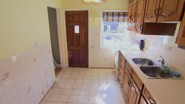
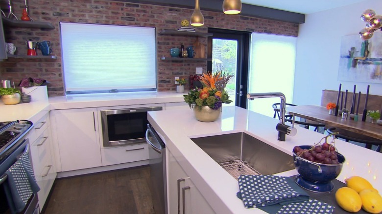
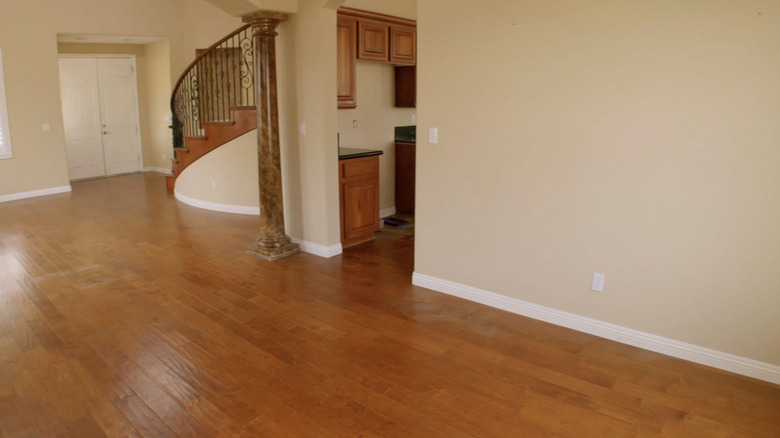
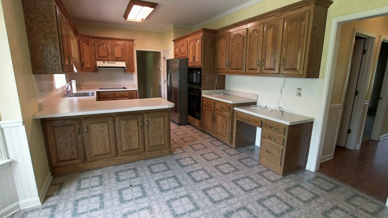
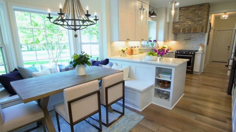
In Season 7, Episode 11, "Ready for Happily Ever After," the kitchen was an absolute mess before the brothers got ahold of it. It was old, ugly, and closed off, making it essentially non-functional due to its strange shape. Worst of all, it was completely covered in linoleum. The new homeowners weren't so sure about the space, but Jonathan was quick to remind them that if a wall isn't load-bearing, there is no reason it should stay. "If only we could remove a wall! Oh wait, we can!" he joked, pounding on the kitchen's far wall.
Luckily for the homeowners, the brothers took down that wall and all other non-load-bearing ones on the first floor. By doing this, they created an open, less boxed-in feel. This allowed more space for the family to grow into, while creating a chic, modern look. "The kitchen is huge. I did not think you guys would be able to get such a big kitchen in this space," one homeowner said during the big reveal. With the new flexibility, the brothers moved the kitchen to the other side of the house. By repositioning the appliances and taking down the wall, they were also able create a dining space with great flow.
The home office that changed everything
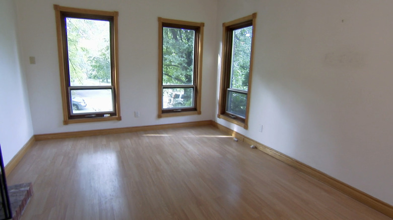
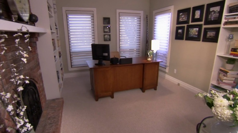
In Season 1, Episode 1, "Family Fixer Upper," viewers get to see the renovation that started it all in 2011. A lot of trends have changed significantly since then, but luckily their design preferences still hold true — even all these years later. The office was originally a dining room, with wooden floors that looked decent and a large fireplace along the far wall. However, its acoustics were nowhere near suited to what the homeowners wanted for their work-from-home space.
To make the room more work-friendly, the brothers added French doors for privacy. The couple had a young family and the mother wanted to be able to work from home with a little soundproofing. However, since the doors had glass panels, there was still plenty of natural light available and she could keep an eye on her little ones. The brothers also added built-in blinds on the windows, just in case she needed a touch more privacy. They styled the room around her original desk, but added carpet for sound reduction and softness underfoot, as the wood was lovely but a bit stark. They even added built-in bookshelves for functional storage. It's a classic style that still works today, and having a home office is even more relevant now than when the episode first premiered.
The large dream kitchen for a big family
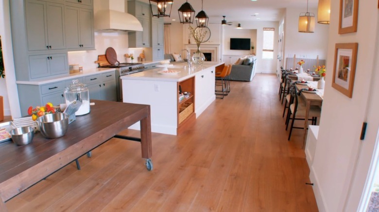
In Season 14, Episode 12, "Strength in Numbers," the brothers were designing a home for a family of ten. It's one of their best makeovers because of how expertly they used the limited square feet available to them. The kitchen was of particular note, as not having enough room in the space for the entire family was a huge issue. Before, it was closed off by a large, non-load-bearing wall. This dissected the kitchen and living room, creating a pinch point in the form of a tiny doorway that the family had to shuffle through before and after each meal.
To fix the space the brothers took down the wall. And when the owners expressed surprise that they were even in the same house, the pair couldn't be more pleased. "Well, that's the advantage of moving walls and changing things and pulling things back. It allows you to completely reconfigure," they said. In addition to creating more space, they added features to the kitchen to suit the family's specific needs. The new hub included a sizable oven, an industrial fridge to hold enough food for the large family, and even a separate baking station because it's a hobby the family enjoyed doing together. The updated space had the breathing room and style to make mealtime easier, especially as the new dining area gave everyone enough room to sit around the table.
The closed-off living room transformed into a naturally-lit oasis
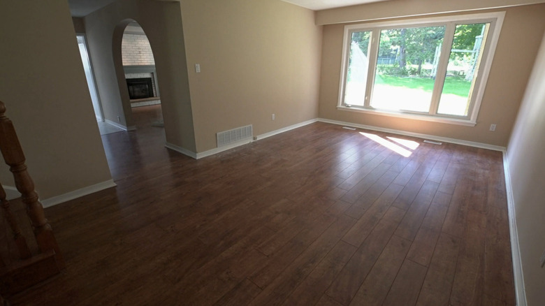
In Season 11, Episode 5, "Miles Apart," the brothers did the impossible when they successfully renovated a house that was riddled with asbestos. The living space was dark, closed off, and allowed in very little natural light. In another masterclass on how taking down just one wall can change the entire feeling of a space, they removed the barrier between the living and dining rooms to create an open, bright continuous space.
In addition to pulling down the dissecting wall, the duo took out the fireplace that the homeowners were not planning to use. They utilized the extra space this created to move back the edge of the living room by a couple of feet. This gave them just the right amount of space to put in another window along the back wall. "Windows! So many windows! Just the fact that there is so much light coming into the home. Wow," the homeowner said during the big reveal. The new space allowed the owners to add better seating options, which was important as they loved to entertain. Finally, the Scotts repainted the living room in cooler tones to contrast with the warmth provided by the natural light and added a white shiplap accent wall to firmly anchor the room.
The formerly rundown rental made into a family home
In Season 13, Episode 10, "Making Momma Happy," the brothers created an extra bit of renovation magic by revamping the family's original home. While they lived in the suburbs, the clients held onto their former place in the city and rented it out. They wanted to return to the city, but the home's layout wasn't functional and it had become quite run down. To recreate the magic of its early years, there was a lot of work to do. The brothers had to completely redo the electric and HVAC systems, and move the basement stairs to a safer and more functional location. This is one of the best makeovers on the show because so much of the budget went to non-flashy structural improvements, which are truer to real life. These changes don't look like much, but they are what really make a house liveable.
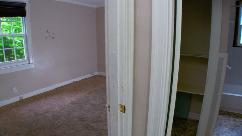
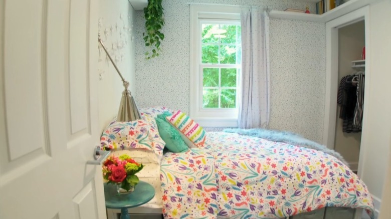
There was another big win for the family, however, as the Scotts added a new bathroom for the kids to use. They also readjusted the footprint of the youngest child's bedroom so it was no longer a hallway towards the bathroom and other bedrooms, but a room unto itself. "For this bathroom, we had to steal a little bit of space, as we had a hallway going down to the room at the back," Drew said about the structural changes.
The cramped, dark patio turned lush outdoor space
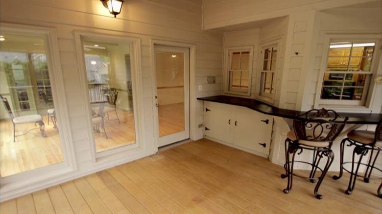
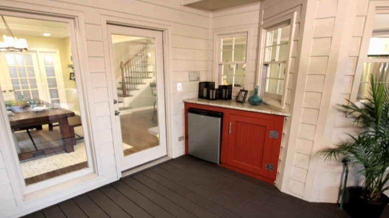
In Season 6, Episode 2, "Maria and Dave," the brothers took a couple from a cramped hotel to a home with a fantastic outdoor space. The homeowners liked to entertain, so having a great mix of indoor and outdoor space was an absolute must for them. Before, the closed-in patio was fine, but nothing show-stopping. It felt a little too somber and dark for the homeowners' tastes.
To change the space, the brothers started by getting rid of the current built-in features that were overcrowding the already limited space. "You didn't need that wrap-around black granite. It took up way too much space and just seemed like an afterthought. Now, there is way better flow to the design," Drew said. The shortened countertops gave the new owners more space to actually exist in the outdoor area, while the lack of bar seating made it more of a functional drink nook, which the husband was thrilled about. "Very inviting, very relaxing," he said. "I love this furniture. I love the color. I like the countertops." Drew couldn't agree more, adding that the additions they made "just give a certain elegance to this space."
The kitchen without much space, that still became big and bright
In Season 13, Episode 15, "A Little Bit of Home" the brothers did one of their best makeovers for a large family where the father had a job that involved lots of relocating. When they were finally ready to put down roots, it was important for the space to suit their busy lifestyle (and many family members). The home's original kitchen was drab and cramped, with dark cabinets and old-fashioned linoleum floors. There was no way the entire family could enjoy a meal together in the space.
After the brother's hard work, the space was brightened with prefabricated bright white cabinets. They go all the way to the ceiling and draw the eye upwards, giving the illusion of the space being bigger than it is. While the Scotts didn't change too much about the kitchen's general shape, they also swapped the floors for the more modern, durable option of LVP — one of the beautiful hardwood flooring alternatives that HGTV stars can't get enough of. They also added a purpose-built dining space that was large enough for the entire family. "This is meant for family-style dinners. I know you're not formal, and you didn't want a traditional dining room," Jonathan said. "This eat-in kitchen suits the way your family lives. It's set up for serving, too."
The basement bachelor pad turned family game room
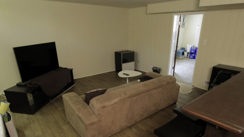
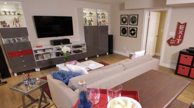
In Season 5, Episode 9, "Kari and Boris," the Property Brothers proved that you don't have to love your hobbies behind the scenes. Instead, they deserve a special place in your home. The twins took a dark, abysmal basement and turned it into a bright, functional space for interests and entertainment. The best use for a finished basement might be a matter of personal preference, but one thing is clear — it adds value to your home! The more square feet you have for living, working, and enjoying, the more you might be able to entice future buyers one day.
This is one of the best renovations that the brothers have completed because of the care they took to mold the room around the homeowner's interests. Because he enjoyed playing video games and would be using the space for that and movie nights, they put extra effort into soundproofing the basement. "I had a lot of fun designing this room and just creating these displays for all your favorite action figures. And now, it's all soundproofed, so you can crank up the volume when you're playing games," Jonathan said. "There are even built-ins everywhere for your collectibles." The homeowner was thrilled. His interests were no longer hidden in the dark basement, but instead proudly displayed in the new space.
The poorly colored townhouse that got a grown up coat of paint
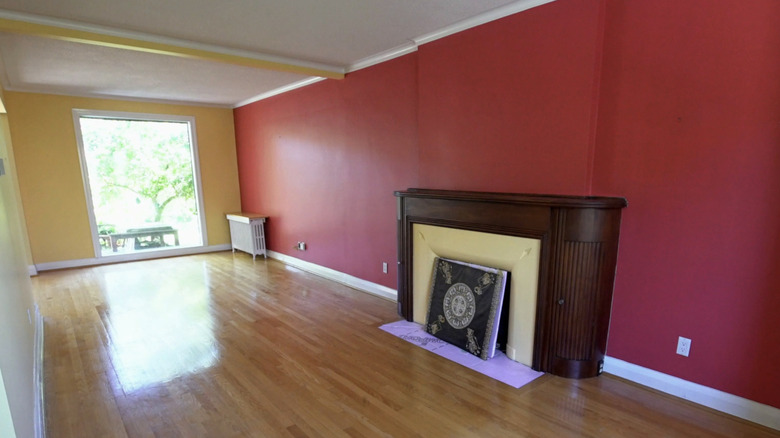
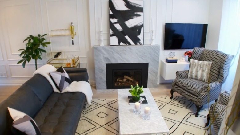
In Season 10, Episode 13, "Modern Masterpiece for Two," the Scott brothers worked some serious magic. The episode contains some of their best work because this living room quite literally looked like a McDonald's dining space before they arrived. The far wall was firetruck red, which clashed horribly with the classic wooden fireplace. Not only that, but the back wall being a soft shade of lemon really cemented the fast food vibe. The buyers wanted something that was soft and cozy — not so loud and bright.
Luckily, this is exactly what they got. "Well, I knew you didn't want the ketchup and mustard walls," Jonathan said. "This room is so much larger and more sophisticated now with the gray, black, and white color palette, not to mention these beautiful light floors." While he replaced the wooden fireplace with a grey stone, the white walls still have plenty of character because of the added trim details. In addition, the brothers gave the illusion of even more space by styling the large room into two distinct sections. One is a casual dining area, and the other is a cozy seating spot anchored by an area rug.
The entryway that will actually make a good first impression
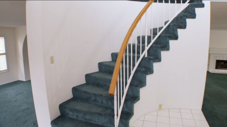
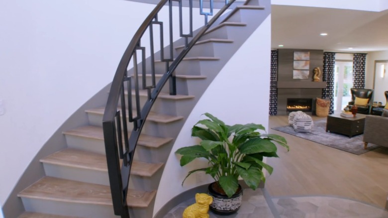
In Season 14, Episode 11, "A Home to Hug," the Scotts proved that first impressions really do count. This is one of their best makeovers because remodels invariably focus on rooms like kitchens and bathrooms, so secondary spaces like entry halls might be overlooked. But not in this case! The original entryway was extremely dated, with emerald carpet wrapping up the stairs, paired with stark white tiling for the foyer floor. It looked like more of an office space from the '90s than a cozy modern home. These bright colors were the star of the show and styling around them would have been difficult.
When renovating the space, the carpet was the very first thing to go. "This is amazing, man. I am so — this is almost bringing tears to me. Look at these stairs," the homeowner said during the big reveal. The brothers traded the carpet for a wooden stairway that was much more functional. They also changed the white square tiles for a darker, hexagonal set. The muted colors seem much more mature and don't overwhelm the eye when you first enter the home. "Very different first impression," Jonathan said, admiring his work.
From outdated to bright, themed family home
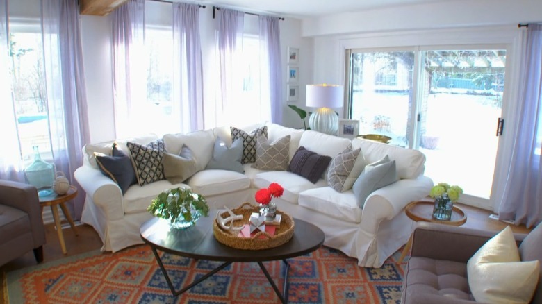
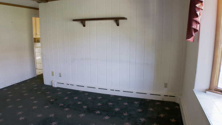
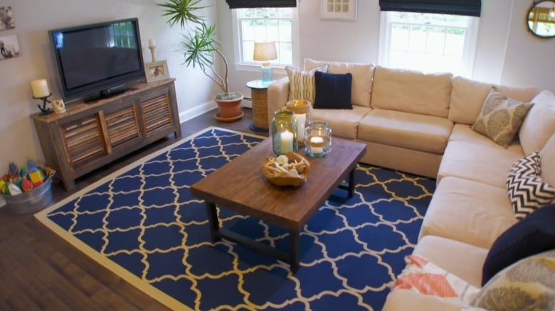
In Season 10, Episode 1, "Navigating Rough Waters," the Scotts showed viewers what it really means to stick to a theme. To transform this space, Jonathan and Drew made it brighter, whiter, and wider. First, they took down a wall to open up the living space. This gave the young family room to grow, which they were delighted with. Next, they got rid of the worn-out, patterned carpet and dated white paneling on the walls.
Interestingly enough, the brothers don't typically design with a theme in mind as it can easily become kitschy. However, for this property, most of the decor elements have a nautical slant because the family owned a boat and really enjoyed being out on the water. The reason this ranks as one of their top home makeovers is because they used furniture the couple already owned to save money on the renovation. While the brothers typically stage homes with new options, this way of doing things proves how well major pieces like sofas can be taken into new spaces and styled differently.

