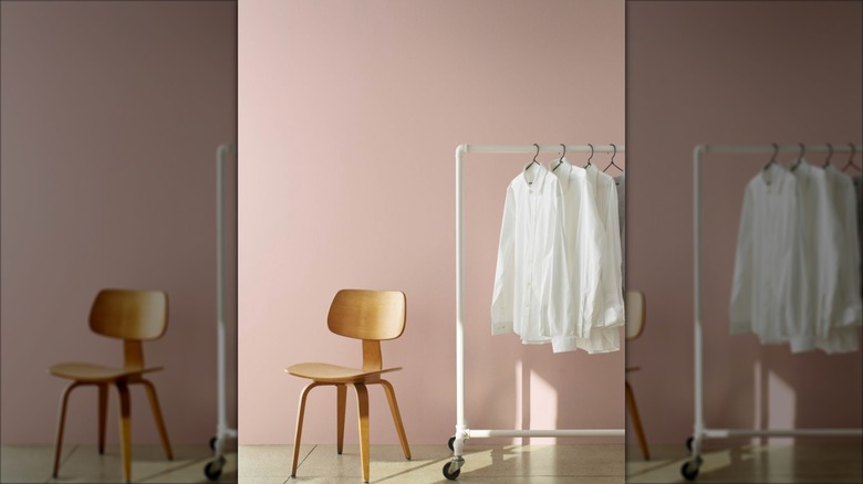
The 12 Best Wall Paint Colors To Complement Your Gray Floors
Gray floors have been all the rage over the last few decades, and while they can offer a modern, chic look, they can also create some obstacles when it comes to home decor. Some design experts advise against gray wood flooring for various reasons, including the fact that they can be hard to liven up with color because gray isn't as easy to complement compared to hardwood floors or carpet. That doesn't mean it's impossible, though. Here, we've put together a list of a dozen colors that work well with gray floors, from coral to navy.
If you're researching for a house that hasn't been built yet and are considering gray floors because of the recent trend, consider this a gentle warning that gray is actually going out of style. Maggie O'Hare, senior marketing manager of color and design for Sherwin-Williams, told Hardwood Floors Magazine that she expects gray to decline in popularity in 2025. "We are absolutely seeing that gray is taking a back seat," O'Hare said, noting that many homeowners and designers are opting for warmer colors now as cooler tones dip in the trends. However, if you love your gray floors or are dedicated to upholding this trend in your new home, these living room paint color ideas will still offer plenty of fun ways to add warmth, vitality, and dimension to your space.
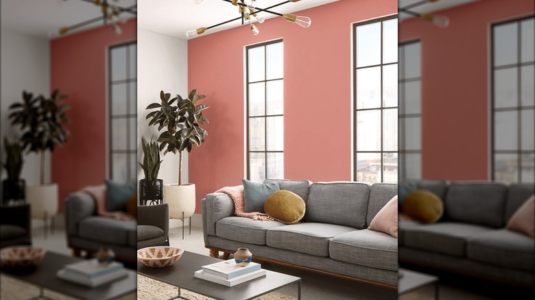
Coral Clay from Sherwin-Williams
If you're looking to warm up a gray room, consider something like this Sherwin-Williams Coral Clay color. It clearly complements gray in the Sherwin-Williams home view and can help to break up a space that leans too cool or sterile. This color is technically a shade of red, and would go well with rich textiles and pops of orange and yellow, offering a warm overtone to any space. At the same time, the color is not so bright that it overpowers the gray; instead, the gray floors will feel cozy up next to this rosy hue.
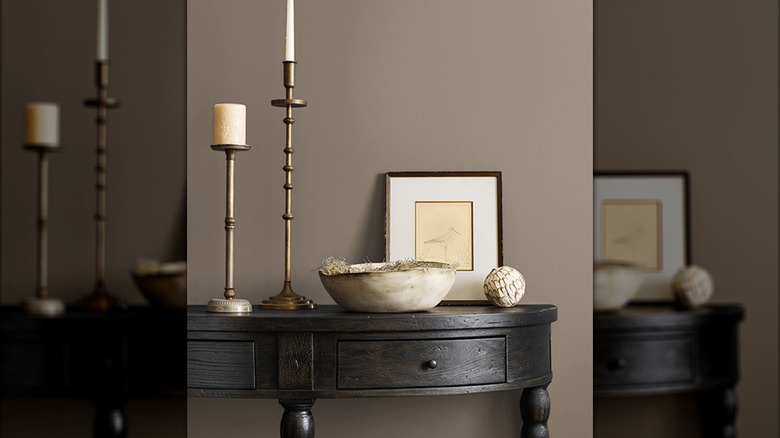
Warm Stone by Sherwin-Williams
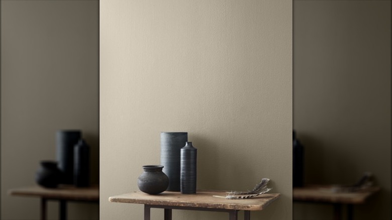
Another Sherwin-Williams color, Warm Stone, gives a chic, neutral feel that goes well with gray. In fact, the official Sherwin-Williams site recommends pairing Warm Stone with gray and off-white hues, so this option is clearly expert-approved. The color is described as deep gray and is on Sherwin-Williams' Colormix Forecast 2025 collection, indicating that it's likely to trend in the coming years. It can help bridge the gap between cool-toned gray and other warmer accents, helping to give you more flexibility when it comes to the furniture and decor your choose.
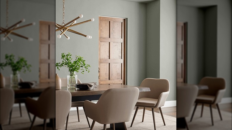
Evergreen Fog by Sherwin-Williams
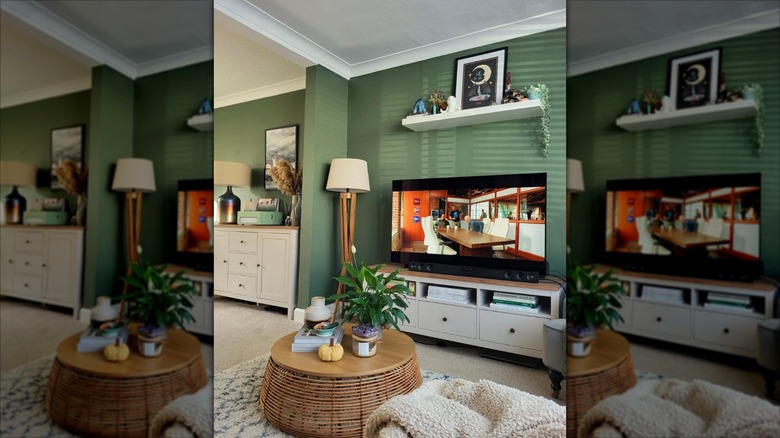
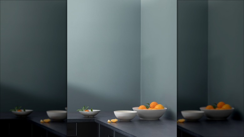
If you want to bring in some color without stepping too far out of neutral territory, consider painting your walls a shade like Evergreen Fog, which is described on Sherwin-Williams' site as a "versatile, chameleon color [that] will breathe a calming freshness into your space," and a "green-meets-gray" option for home design. The "evergreen" title seems fitting: just as evergreen trees stay green throughout seasons, this hue will likely be on-trend for a long time to come, as it's simple enough to pair well with just about any neutral tone.
Hale Navy by Benjamin Moore
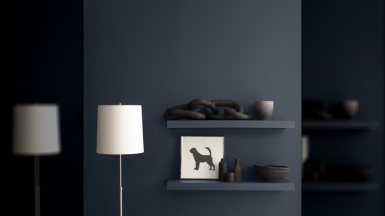
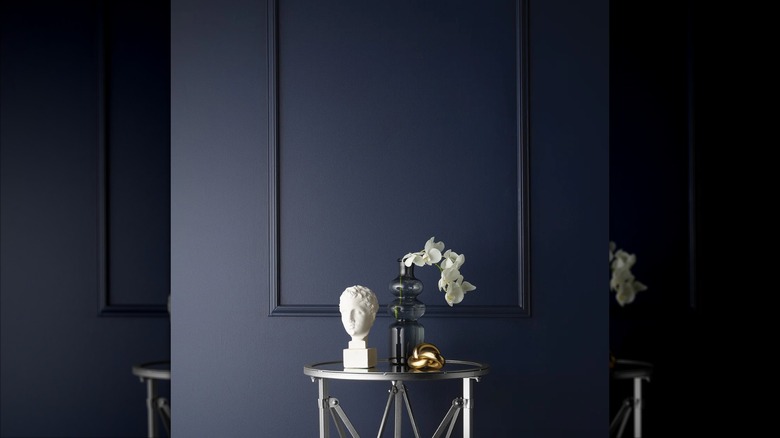
Navy blue paint colors are dazzling for homes and could be a great color to pair with gray in your house. Benjamin Moore's Hale Navy, for example, can add plenty of depth and interest to your home. According to Benjamin Moore, the color is a "use-anywhere shade of navy with a classic maritime feel" and is a best-seller for the brand. It's paired online with other shades of gray and blue, so you could easily add other blues into your living room after adorning the walls with this navy.
Pashmina by Benjamin Moore
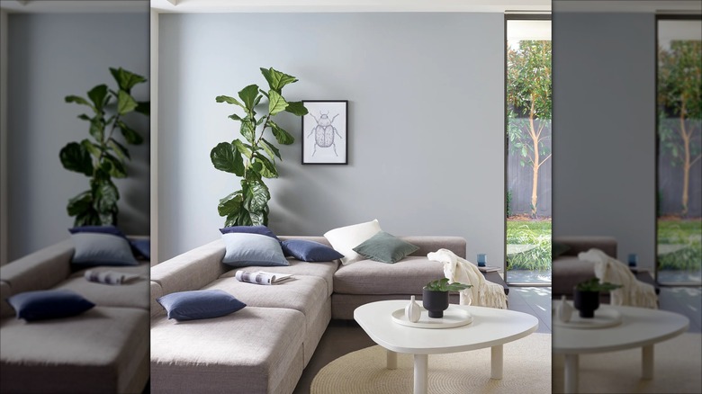
Pashmina is another cozy neutral shade, described on the Benjamin Moore site as "perfectly balanced between warm and cool, light and dark — a sophisticated neutral that you can use anywhere." It's a lighter green-gray hue that is an earth tone as much as it's a neutral, and would pair perfectly with most shades of gray flooring. Depending on the level of light in your space, this color could feel light or dark, so it might be best to buy a sample and watch the tone shift throughout the day to be sure it works in the space.
Frosted Jade by Behr
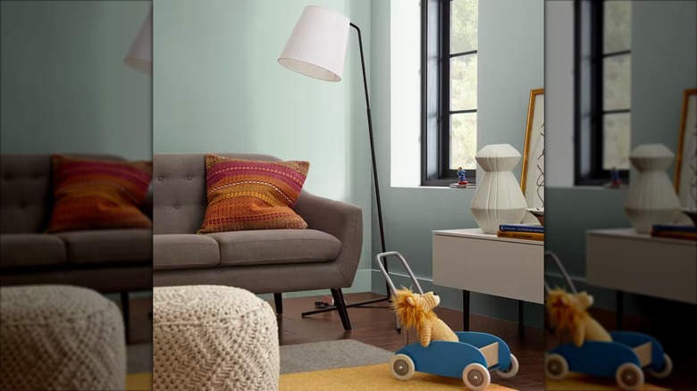
The Frosted Jade color by Behr is a lighter green with a gray undertone, so it'll go well with gray floors of any hue. Behr labeled this as one of the top 2025 color trends, and the brand's website calls this color "a soft, green-gray encouraging calm and relaxation." You can pair this with other shades of green, blue, and teal in your home decor to tie the entire room together, giving somewhat of an ocean and beach look that will evoke a vacation feel.
Private Affair by Valspar
The Private Affair paint color from Valspar is another green-ish option that will give your room an earthy and cozy feel. The darker, more saturated shade is a great complement for light gray floors. Like many of the other colors on this list, this paint changes hue as the daylight levels change throughout the day — it even looks far different on the Valspar site compared to photos shared by customers — so it might be a good idea to paint a sample of it on your own wall before committing to the full look.
Yacht Race by Porter's Paints
The Yacht Race navy blue color from Porter's Paints is a sharp, deep hue that would pair well with any type of gray flooring. The two color families create a maritime look that feels put-together and fresh in just about any household, whether you're remodeling an old home or sprucing up the walls in a new build. It can also provide a solid base for a wide array of different accent colors, from other blues to subtle pinks. Porter's Paints even opted to place this hue into their Capsule Collection due to its trendiness and popularity.
Brewster Gray by Benjamin Moore
Brewster Gray is yet another hue from Benjamin Moore that pairs nicely with gray flooring. The Benjamin Moore site describes this paint color as "a handsome, blue-tinged gray that recalls regal, ivy-covered stone buildings," and it certainly meets those expectations in real, user-posted photos. The color complements gray while bringing in an earthier tone, making everything feel much more grounded and intentional. It's also light enough to make the room feel airy and breezy, but unexpected enough to give you a break from boring off white.
Newport Blue by Porter's Paints
Blue and gray are a timeless color combination, especially when the blue has some undertones of gray in it already. This Newport Blue color from Porter's Paints' Revive Furniture Paint collection is a great way to lighten your space without clashing with the gray flooring. If you cannot find a Porter's Paints retailer near you, you can color match this hue with your trusted paint suppliers — think of using something like Benjamin Moore's Fantasy Blue, which is "an effervescent light blue with crisp hints of gray," according to the retailer's website.
Encore by Valspar
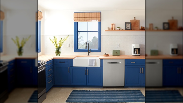
The Pantone Color of the Year may be Mocha Mousse, but Valspar named its very own 2025 color by selecting a hue that they expect to see more and more of in the coming year. Encore is a deep blue that's not quite navy; Valspar describes it as an "atmospheric blue [that] is at home anywhere." The brand recommends pairing this color with violet and sage decor, to bring out the hints of violet in the paint itself. All three of those colors pair well with shades of gray, making for a comfortable and vivid space.
Just Beige by Benjamin Moore
While blues and greens are some of the easier options for complementing grays, pink can be a great pick, too. One such example is Just Beige from Benjamin Moore, which is described by the brand as a pink-based tan. The "hint" of pink certainly shines through, even in the site's walkthrough of the color, and you can bring that out more with pink decor elements. Because this shade has a primarily brown base, however, it's much more subtle than a true bubblegum pink, making it significantly easier to style.
