Common Design Mistakes HGTV's David Bromstad Wants You To Avoid
We may receive a commission on purchases made from links.
When it comes to creating a stylish and functional home, few know the dos and don'ts better than HGTV star David Bromstad. As a design expert known for his vibrant aesthetic and actionable advice, Bromstad has helped countless homeowners achieve their dream spaces across his many shows. However, even the most enthusiastic DIY decorators and contractors alike can fall prey to common design pitfalls.
Instead of blowing your budget because you decorated in the wrong order or accidentally ruining your home's historic character, let Bromstad's tips help keep your design plan on track. His advice emphasizes blending creativity with practicality, encouraging homeowners and renters alike to embrace bold choices while keeping functionality in mind. Whether you are currently planning for a redesign or just dreaming of the day you can, these are the most common design mistakes HGTV's David Bromstad wants you to avoid.
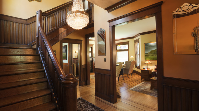
Creating a haunted house by pairing dark millwork with dark paint colors
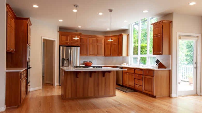
Pairing a dark wall color with dark woodwork is a common design mistake Bromstad sees people make, but not for the reason you might think. Although some people think trim is dated, Bromstad doesn't seem to agree. "Dark woodwork can be incredible, but only if the wall color majorly contrasts with it; otherwise, it'll look like a haunted house," he told HGTV. Meaning that yes, it can be done well — but you have to choose the right color combo.
Millwork is another name for the wooden accent features along the wall, around your staircase, or on your built-ins. Instead of the dark, spooky vibes created by going all-in on deeper colors, Bromstad suggested something else entirely if you don't want to be celebrating Halloween all year. "That's why I would go with white," he continued. "(Yes, Mr. Color Splash loves white walls. Shh!) The lighter the walls, the more high-end the trim appears."
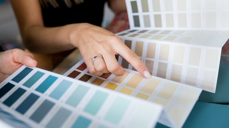
Choosing a paint color before selecting your furniture
In Bromstad's opinion, it's a mistake to buy your furniture after you've already selected a room's paint colors. This can really box you into more expensive design choices, as you scramble to find a couch or dining room table that complements the paint, instead of the other way around.
Instead, hit the furniture outlet first, then stop by the paint store next to keep things cheaper. "I pick my color last," he said in an interview with ABC15 Arizona. "Because you have to find the furniture that's within your budget. You have to find all the accessories that you really, really love ... Paint is the most inexpensive thing that you can buy to transform a space." A few cans of paint could be thousands less than a new dining room set or new bed. So, to save yourself from forfeiting the furnishings you really want for a "meh" paint color, be sure to swap the order to keep costs down.
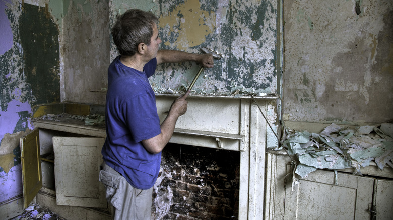
Removing interesting architectural features just because they're dated
If you're renovating an older home, be sure not to rip out major character features just because you think you need to modernize everything. Bromstad thinks this is a huge design mistake because it's these older, sometimes odd features which really give a space personality. "I love the fireplace," Bromstad said during Season 12, Episode 10 of "My Lottery Dream Home," per Realtor.com. "I don't know about you, but I think it's super interesting. It's super weird, which I love." While the homeowner originally thought it might need to go, Bromstad kept it as a touch of soul for the space. He simply repainted the fireplace instead of tearing it out.
Old plaster crown molding, a wood-paneled wall, or a bay window might look like a relic at first glance, but it could end up being your house's stand-out feature. Save the things that give it character, like large mid-century windows, or a beautiful brick fireplace. If you want to follow Bromstad's lead, here's how to paint your brick fireplace for a more modern look, while still retaining architectural interest.
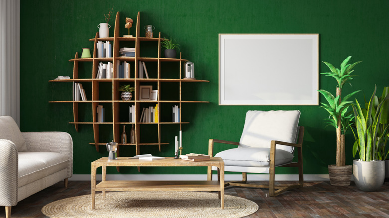
Adding feature walls to small spaces
If you've been browsing accent wall ideas to liven up your home or add interest to a small room, this one might come as a disappointment. Feature walls are an alluringly easy upgrade, but in Bromstad's opinion it's a mistake to paint just one wall in smaller spaces as it can make things feel claustrophobic. In an episode of his hit show "Color Splash," he told the audience that "a feature wall is great because it can give a big, bold punch, but what it does to smaller rooms is that it chops it off a little bit — makes it look disjointed and a little bit smaller. You notice all the corners," per HGTV.
Instead, when painting smaller spaces like reading nooks, half baths, or even the dining room in a tiny apartment, opt for a cohesive color on each wall. Even better, choose lighter colors over dark when creating your dream home. This is because whites, pastels, and other paler options tend to make a room look even bigger because they aren't as bold and imposing. Even though Bromstad himself is a fan of all colors, darker paint in small spaces can further pinch things.
Leaving cabinets plain is boring
When designing your kitchen, Bromstad thinks it's a mistake to leave the cabinets bare — or even worse leave them a boring color. Bromstad recommends painting your cabinets to create a splash against a neutral backdrop. "Personally, I love to add color to my kitchen by painting the cabinets ... It's not gonna cost you an arm and a leg, and it's definitely going to make a huge impact," he told Apartment Therapy.
Wondering what paint to choose? Bromstad is a known fan of louder, unexpected colors. His recommendations are to stay away from boring stained wood and opt for something distinctive instead — such as green. Unsurprisingly, Bromstad even makes a solid case for pink kitchen cabinets. These colors are probably outside of most people's comfort zones, but rest assured that paint is a safe way to experiment: you can always paint over it. For those who might want to still play things a little safe, Bromstad recommends black cabinets — a chic and classic option that's still bold.
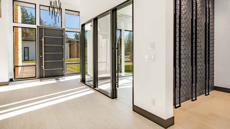
Stay away from black trim and floors, as it's so hard to take care of
While the designer might love black cabinets, he thinks it's a terrible design mistake to put the color anywhere near the molding in your home. "Black may be neutral, but it's actually the toughest color to take care of," Bromstad told HGTV while discussing his molding mistakes. "I put black floors in my house and, honey, I'll never make that mistake again! They show every footprint, paw print, and piece of lint."
Instead, he recommends reaching for white trim. While this colorless choice isn't his typical advice, it works much better in an area that is so hard to clean, such as the floor. "White trim, on the other hand, hides dust and is easier to touch up," he said. However, he also knows that people sometimes just love the contrast of something darker. So, "if you're set on darker trim, try an espresso stain," he advised. "A stain seeps into the wood, so you're less likely to see dirt on it."
Sticking with basic wall decor
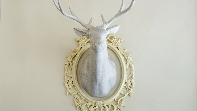
It's great to have art in your home, but Bromstad thinks too many people stick to simple canvases and framed art. He feels this is a real design mistake because it can limit your artistic expression and hold back how cool your space looks. Instead, reach for things like "an art installation of [imitation] animal heads. Chic and unexpected!" he told Cleveland.com. "Hang your bike over your couch like you would a painting. Don't hide it, showcase it! Art comes in many forms. You just have to own it!"
If you really don't feel like you want to branch out, Bromstad recommends another take on wall decor: Paneled art. He shared with the Today Show that this type of art is a great way to break up the monotony and create a perfect gallery wall. First, you can download free artwork from places like Canva, Unsplash, or even some museum collections. From there, go to a local craft store and print it extra large. Next, cut the photo into three equal sections. You can also snag matching frames at a relatively affordable price, such as these Elsker&Home 24x36 Poster Frames from Amazon for $16.99 each. This triptych effect creates something that's visually interesting and looks deceptively high-end.
Buying too small of an area rug for the room
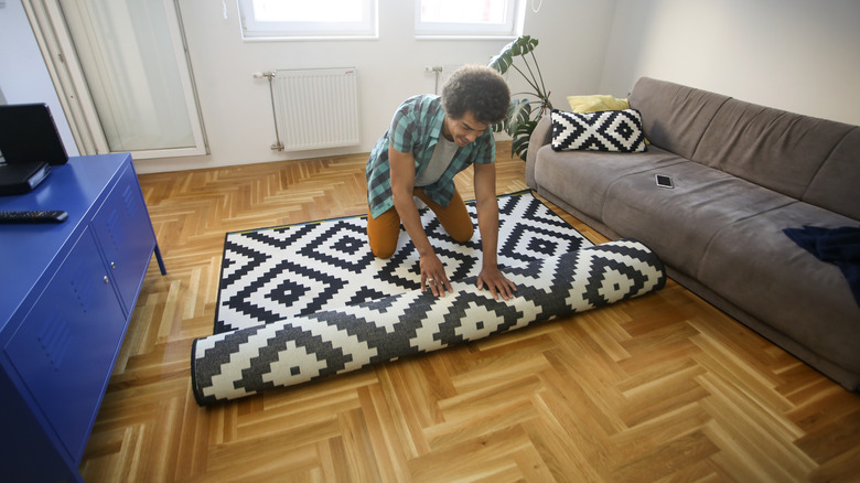
Nailing the size of the rug in relation to a room's square feet is essential. Plus, it's a great place to add a touch of style. The mistake here is a room with an awkwardly-sized rug. The key is to choose a rug that's at least big enough to run underneath each piece of furniture. In an interview with Pretty Handy Girl, Bromstad went into further detail about the sizing. "When you are choosing a rug, it should be larger than the largest piece of furniture that you have going into the space. So, if you're using a couch that's going to be 8 feet wide. You should have an 8-by-10 rug, so you have some overlap," he said. "My biggest pet peeve is when you have a rug and it's floating in the middle of the room. And it's 5-by-7, the couch is 8 [feet] long and things aren't touching. The rug should be under each piece of furniture, at least by 2 inches."
Plus, he told the Los Angeles Times that you can even use this trick on floors that already have carpet, as a rug still disrupts "the wall-to-wall monotony" of a room. And if you're wondering is it actually necessary to get a rug pad, he votes yes, and suggests investing in a pad so your rug keeps its shape — as it can easily become a tripping hazard without one.
Leaning too hard into any one theme
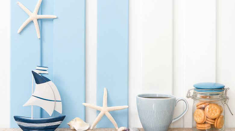
This design mistake is one Bromstad often sees in second homes, or properties people buy in a specific location. Things like beach and lake houses, mountain getaways, and homes in famous cities. He warns that leaning too hard into any one theme can really back you into a corner and create a kitschy house.
Instead, choose to be a bit more subtle. "Choosing the appropriate home colors, material, textiles, and art can create a beach look without doing the theme," Bromstad told HGTV. "There are many different styles, from nautical to more contemporary, for a beach home. It all works when done tastefully and doesn't go crazy on the 'themed' look." As far as specific things to avoid in a beach house, for example, he shared that, "Having seashells everywhere, fish netting, and every sheet and blanket covered in shells or some type of sea life is old news." For a mountain cabin, anything featuring bears and forestry might also fall into the same niche. Instead, reach for things inspired by the feeling of the place, instead of decor that's stereotypically centered around its location.
Sticking to neutral colors for your entire space
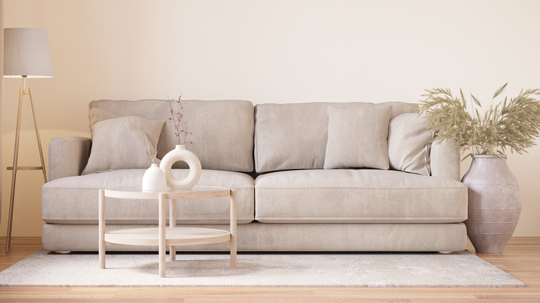
It's no secret that Bromstad loves color, so one of the most common design mistakes he points out is when people are too scared to introduce color into a space. Whether it's from fear of committing to shades that might soon go out of style or being stuck with a color they hate, many people choose blank, bland living spaces filled with what Bromstad considers to be boring neutrals.
Luckily, the designer has a great solution to this problem that can be completed in just a few minutes: Adding throw pillows. "Throw pillows are the easiest way because you can bring them into your bedroom or your living room," he told Pretty Handy Girl. "And they are so usable. So, you just have to start slowly." If you buy different colored covers, you can even swap out the vibe of the pillows as the seasons (or your tastes) change. Yet, Bromstad doesn't want you to stop there. "Once you get involved with your throw pillows, then you can go back to the same store and buy some accessories that are the same color and spread them around the room," he continued.

