5 Times The Property Brothers' Designs Mixed Patterns With Color And Nailed It
We may receive a commission on purchases made from links.
No doubt that the Property Brothers have built a design empire across several television shows, blogs, and product lines, but we haven't always agreed with the advice they dished out on their shows nor loved the final products we've seen on screen. However, Drew and Jonathan Scott have lately embraced a design aesthetic that is making a bigger and bolder punch, and we're not mad about it. Known for loving their gray and white neutrals, the Scott twins are playfully embracing quirky decor, and nowadays they aren't afraid of mixing prints and patterns with epic splashes of color. It's a timely move, since bold design in color and pattern are on a categorical rise as big home decor trends, and now lovers of the flashy don't have to choose bold patterns over bright colors (or vice versa) anymore.
Their distinct take on the fun, loud, and patterned isn't reserved for one singular space in the house, either. They've taken these trends and incorporated them throughout each room in the house in ways Property Brothers audiences haven't seen before, even extending these new playful looks into outdoor spaces in some cases. So, in rounding up some of their latest television design reveals with even some rooms spotted in their very own homes, these are our favorite times the Property Brothers have mixed patterns and color and absolutely nailed it. Perhaps there's some inspiration here for your own home, too!
The hillside living room
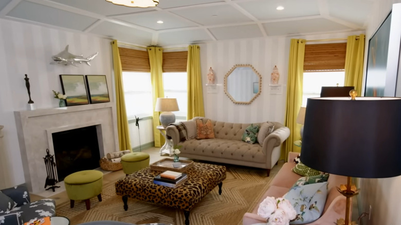
In season eight of "Brother vs. Brother," the Scotts agree that there are no rules to this season's competition of seeing which twin could outdo the other. Both purchased and renovated Los Angeles houses, and with no budget limitations, no neighborhood parameters, and no design prompts, the twins wielded their expertise in a competition of best sales profit for their flips. Drew Scott's hillside house was nothing short of mid-century Hollywood glam, embracing its iconic location with a whimsical design aesthetic. His masterful blend of subtle patterns and pops of color got him the living room challenge win that week of the show's competition.
The wall's tonal striping and the ceiling's playful grid and shape set the perfect backdrop for Drew Scott's furniture choices. Mixing colors, textures, and patterns — even throwing in a leopard print as an old Hollywood homage — the duo's realty expert understood that impactful furniture is a great way to sell a home. Most of the pieces Scott chose had at least one other piece in the room that complemented it somehow, a trick to avoid too much clashing. Utilizing furniture to play with print and color is a smart choice, since none of it is permanent, and it won't affect home value in the long run. If new furniture seems daunting for those wanting to upgrade their decor style, never fear, the Property Brothers have some tips to upgrade your furniture for cheap.
The pink she-shed
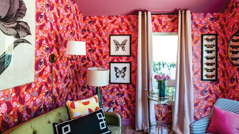
Drew Scott leaned even further into the splashy, mid-century beachy glam look in this outdoor "she-shed"/designer studio he created also in Season Eight of "Brother vs. Brother." While it may look like it's a mini-house unto itself, this flexible-use space is actually situated in this house's backyard, at the top of a three-tiered, landscaped hill. In their blog, Scott hoped that this space could act like a secondary "retreat" for the owners, rather than your run-of-the-mill outdoor shed space. And with this colorful patterned wallpaper and luxe velvet couch to match, Scott definitely achieved the ultimate staycation spot.
Though it is a compact space, the patterned wallpaper with the ceiling painted in a matching tone makes the shed feel much more spacious than it is in reality. Painted ceilings can make your room appear larger, a trick of the eye that makes you perceive that it is farther away from you. And though it may go against your instinct, bold patterns on wallpaper can serve the same purpose, just be sure to choose larger, more distinct patterns rather than smaller, repeating designs. Throw in some sumptuous pieces of furniture like the couch Scott chose and the gold accents that play off the wallpaper, and you'll have the most stunning statement-making space, like this one!
A woodland guest room transformation
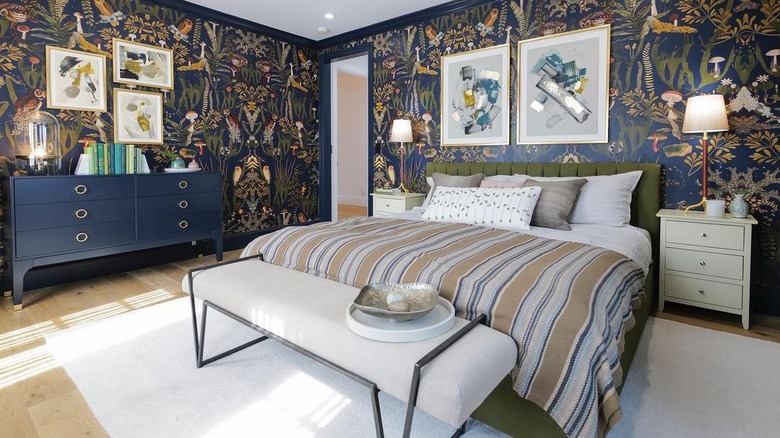
Not to be outshone by his brother's grand and bold design style, Jonathan Scott also showed on season eight of "Brother vs. Brother" that he, too, could love a statement pattern and rich color. During the guest bedroom challenge, the design twin hoped to make this bedroom feel like its own woodland oasis, as said on the Drew & Jonathan blog, and so he pulled out all the stops with gold accents, deep navy blues and greens, and an arts & crafts reminiscent wallpaper featuring magical forest critters. Scott even decorated the room with original prints from artist friend Anna Ullman so that the space truly had one-of-a-kind, unique touches. While staying sort of true to his bread-and-butter design aesthetic, leaning into a more classic vibe than Drew Scott's buzzy shed getaway, this look definitely was bigger and bolder than the twins' more signature neutral style.
The Property Brothers' latest line of Scott Living Wallpapers (available on Amazon and other retailers like Lowe's) also provides the same effect — a classic feel with a fun print. While there isn't a version of their product on Amazon that closely resembles the woodland-scape of this room, there are options that evoke the same sort of whimsical, story-book feel like the June Indigo Ogee Wallpaper ($89.98). For a look that blends this classic, rich color palette with the mid-century, Palm Springs glam from Drew Scott's "Brother vs. Brother" property, try the Balboa Indigo Botanical Wallpaper ($129.78), a chic monstera-patterned design.
A pattern ceiling and saturated walls
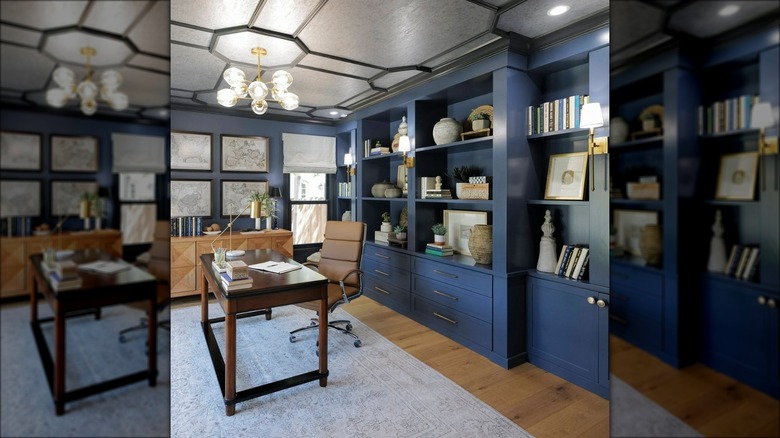
Taken from their eponymous television show "Property Brothers," the twins worked together on this renovation in a mission to utilize patterns, textures, shapes, and colors to bring these rooms to life. In this classic study/den, the Scotts went for a statement with their navy walls, but sassed it up with a few patterned moments throughout the room. The largest pattern is on the ceiling itself, reminding us that this part of the room is yet another wall that can be utilized in design. With some distinct molding reminiscent of a London hotel lobby, it creates an eye-catching focal point. Since the walls are also one color, albeit a bold one, this was a prime opportunity to further play with patterns in furniture selection, something the Scott twins did with the geometric marquetry in the credenza at the far side of the study.
If you're hoping to emulate this pattern and color combo, don't be afraid of choosing standout fixtures. Since the color itself is somewhat safe, this is your chance to let those accent pieces shine! In the Property Brothers' design, they went with varying shapes in their light fixtures, for example, though they do all tie together in the same brushed gold finish. Pick some monochrome books as the final touch in this moody, yet vibrant sort of space.
A starry green kitchen in Jonathan Scott's home
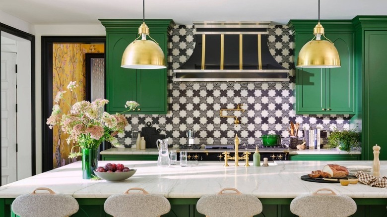
Green has certainly been a top design color in the last few years, with various shades of this vibrant hue named top dog by the likes of industry giants Benjamin Moore and Sherwin-Williams. In his take of green is king, Jonathan Scott makes the cabinets of his own kitchen, as featured on the twins' joint Instagram page, a colorful accent against a star-pattern tile backsplash. Embracing the geometric nature of the tile, the green cabinets somehow both complement and contrast the pattern. While a warm color, like orange, may have clashed with the gold fixtures and a neutral palette like black or gray may have been lost in the pattern, the green simultaneously stands out against the backsplash without overwhelming it and plays against the tile nicely.
While color and pattern are rightfully the centerpiece of this kitchen, the Scotts went with a more neutral countertop choice, but that doesn't mean they skimped on the detail. The cabinet doors and the sides of the kitchen island mimic a cathedral window shape, playing into the antique tile choice and the elevated hood vent above the stove. These details all tie together in a very "Old World" design concept where color and pattern co-exist in the absolute best of ways. This design aesthetic might be a great option for those with older, antique homes to modernize it without compromising the house's character. The Property Brothers have some priceless advice for maximizing an older home's value, and a colorful, charming kitchen like this one may be a design idea to follow.

