HGTV Stars Share Their Favorite Ways To Make The Most Of A Small Entryway
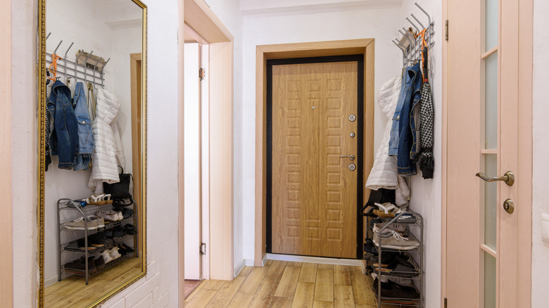
If you are stuck with a small entryway, there are several expert tips that can enhance the compact area. Your entryway is arguably one of the most important areas of your home, as it's the first space guests will notice when they step inside. First impressions are imperative, which is why you should put effort into making your foyer feel welcoming, no matter the size. Luckily, the stars of HGTV have a handful of brilliant ideas for optimizing your entry space.
From Joanna Gaines to the Property Brothers, every HGTV star has a unique perspective. It's possible to find a solution or tailor one of these ideas to suit your style and functionality needs. Whether your budget is limited or generous, there is a wide range of concepts to consider. These can help you create an entryway that you (and your guests) feel welcomed into, no matter the size.
Joanna Gaines suggests using a table to carve out a foyer where there isn't one
When showcasing her own previous home on YouTube, Joanna Gaines described how she created an entry space with thoughtful furnishings, even though the floor plan itself didn't include a grand foyer. TODAY interviewer Jenna Bush Hager said, "This isn't a huge space, but you've made do with what you have." Gaines elaborated, saying, "Some people don't have this carved-out entry space. So, even if that means a table ... it doesn't have to be a foyer. It's just the idea that, 'Hey, I can set my keys down.' It's just that nice, warm welcome." In summary, Gaines used an entryway table to make a small entrance feel welcoming.
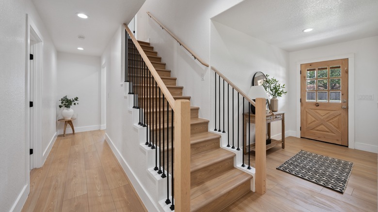
One of the key pieces in Gaines' space is the console table. The beauty lies in the simplicity of the shape, proving that you can change the feel of an entryway with minimal decor. Plus, you don't want the furniture to take up too much space if you're already dealing with a narrow area. You can find a compact option like this Rustic Hallway Table from HokyHoky on Amazon. Gaines topped the table with a large book, a few plants, and a key bowl.
Hilary Farr uses light paint to make a small entryway feel bigger
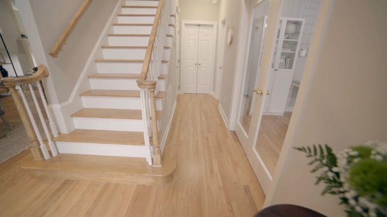
Sometimes, it only takes a subtle adjustment to change the feel of a small entry space. In Season 13, Episode 3, of "Love It or List It," Hilary Farr transformed a small, unwelcoming entryway with a simple coat of paint. She said, "Let's start with the fact that the whole color is different. It's lighter and brighter and still neutral. And it really sets off your floors."
It's common knowledge that a fresh coat of light paint can open up any room. If your walls are currently a deep shade, there are ways to paint over your dark walls and lighten up your space. While it might take several coats, sanding the surface and using primer can be a great way to start with a clean slate. If you're searching for the perfect shade for your entryway, you can easily find a color similar to Farr's like Prestige's Interior Paint and Primer in One in Antique. Farr kept the trim in a pure white shade to add contrast to the beige wall color.
Leslie Davis and Lyndsay Lamb suggest making the small space more memorable by creating a unique feature
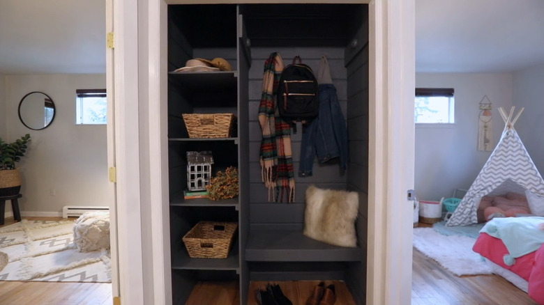
On "Unsellable Houses" Season 1, Episode 8, Leslie Davis and Lyndsay Lamb turned a modest entry area into a standout feature. Rather than keeping the conventional entryway closet, they crafted a distinctive niche with open shelving and a bench, creating a compact mud room area. "I was super excited about this closet, " Lamb shared. "Removing the doors, building some shelving in here, a bench. It really turned it into a unique piece that we're not going to find in other homes."
Converting your foyer closet into a space with shelving and seating is a popular technique for maximizing your entryway. As demonstrated by Davis and Lamb, a coat of black paint can provide the perfect contrast to make your built-in storage stand out. And if you're not the handiest when it comes to carpentry, there's no need to worry. You can easily opt for a ready-made set like the Tribesigns Industrial Hall Tree Set for a similar effect.
Tiffany Brooks makes the most of a tiny space by making it pretty
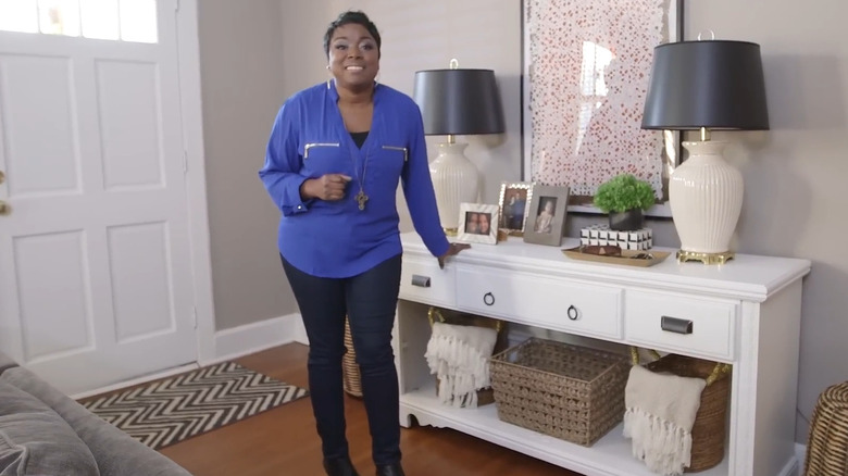
Just because your foyer is small doesn't mean it can't be special. One of the easiest ways to make the most of your compact entryway is to focus on making it design-forward. If you feel like you're stepping into a magazine each time you unlock the front door, you won't care how much square footage it has because it makes a statement regardless. This is exactly the advice Tiffany Brooks echoes in a clip for HGTV. "Speaking of pretty, make sure you stylize it up," she said. "You're going to want to have artwork out, your family photos out, have actual decorative trays that function well." By making it beautiful and personal, it will still be a memorable part of the house.
In the video, Brooks styled a white sideboard with tons of details. She added two matching oversized lamps on either end, creating drama and immediately attracting the eye. A large piece of artwork hung in the middle, further emphasizing the space. The surface was artfully curated with picture frames, decorative catch-alls, and plants, adding texture, color, and busyness. To further exaggerate the design, she artfully displayed woven blankets on the sides of the storage baskets underneath the sideboard, ensuring there was just as much decor on the lower half of the unit as there was on the upper half. Combined together, she made a memorable vignette out of a space that could have had nothing more that a boring coat rack and welcome mat.
Carley Knobloch makes the most of an open floor plan entryway by using pillars to create definition
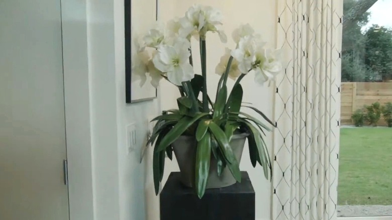
It can feel awkward to have your front door lead directly into your living room or kitchen, making it feel like there's no feasible way to carve out a foyer. However, Carley Knobloch has a great idea. You can create a room divider that separates the entry from whichever room it bleeds into by utilizing a vertical decorative piece like a pillar, which is compact enough for those extra-tight spaces. She shared her genius hack with HGTV, explaining, "With the right space planning and a few select pieces of furniture, though, you can really take a space like this and create a bonafide entryway. The first cool thing we have here is this pillar that sort of acts as a half-wall and separates the front door from the kitchen." While this doesn't block the kitchen from view like a normal wall would, your eyes will register a line, indicating a separation. And since it has such a small footprint, it won't make the space feel crowded.
Adding a pillar is a unique way to make your foyer stand out. If you're bored of the traditional options, this can be a great way to create a visual separation without a conventional piece of furniture. You can shop for a similar pedestal stand, like this Matte Black Display Pedestal, or choose one in a more rustic material if it matches your decor better. When it comes to what to set on top of your decorative stand, there are several possibilities. The first is to take a cue from Knobloch and display a large, leafy potted plant. If your entryway is lacking natural light, a decorative vase with high-quality faux greenery can achieve the same look with no maintenance.
Jenny Marrs emphasizes how a new front door can transform your entryway
In an exclusive interview with House Digest, Jenny Marrs highlights the importance of replacing your front door to transform your lackluster entry space. She explains that a new front door comes in many different styles, elaborating, "From paint color, glass accents, double doors, hardware and accessories, there are many things to look for when choosing a door."
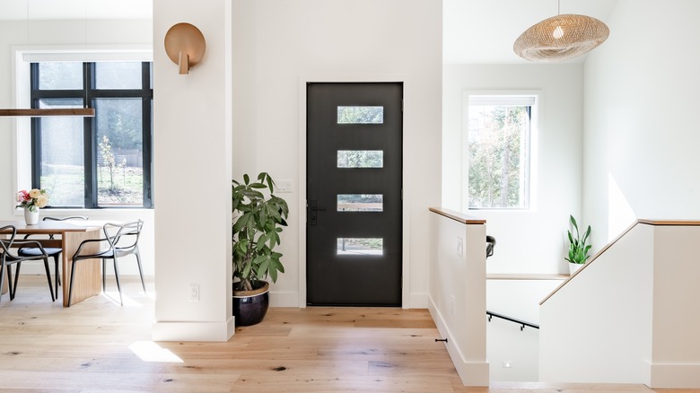
While her tip wasn't specifically about small entryways, you can still implement it to make your tiny foyer feel more special. Rather than relying on a regular wooden door without much detailing, invest extra in a showstopping piece. For instance, if you have modern decor all throughout the living or dining room the entryway opens up into, have the door be a focal point by choosing a black contemporary model with four horizontal windows. Even if the space doesn't have any other decor or furniture in it, the entrance will be memorable enough to make the tiny entryway feel designed, making the most of the area. Similarly, if you have a rustic aesthetic, splurge on a restored antique door, or if you're eclectic, paint the interior-facing side a bright red or unexpected powder blue.
The Property Brothers suggest brightening your entryway with recessed lighting
Drew and Jonathan Scott of "The Property Brothers" shared their tips for making your entryway feel larger and more functional with a few key upgrades. When assessing a dark and outdated foyer in a clip for AARP Answers, they shared, "You want to make sure your house is well-lit. One, that's a safety thing. But also, two, just for function. We would definitely put recessed lighting throughout. Lighting is important for safety and can make a space feel larger. It's very easy to run recessed lighting." According to Drew and Jonathan, it can completely change the atmosphere of your small entryway.
For a versatile space, you can add recessed lights that feature several lighting and dimming options. These Amico LED Ceiling Lights include a night light mode if you don't want the harsh look of overhead LEDs. However, some designers consider recessed lighting to be outdated. If you prefer a more modern look, there are several alternatives. Flush or semi-flush-mounted ceiling lights can offer the same type of illumination while still adding a touch of style. Consider Bargeni's Flush Mount Ceiling Lights with a low profile and a modern matte black look.
