Once-Trendy Paint Colors That Will Make Your Home Look Dated In 2025
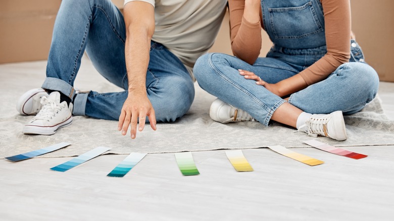
We hope the last time you did any interior updating you chose wisely and went with paint colors you actually adore, rather than trends that were hyped during that particular period. Interior design trends move along — not as fast as fashionable clothing comes and goes, but fast enough that many styles once thought to be innovative are just phases that don't withstand the test of time.
First, we want to look at trends that have either played out or are coming to the end of their lifespan, including a certain dusty pastel and an overused neutral. Listen, if you love it, keep it. But if you're itching for a change, look forward, not back, as we move into the new year — focus on decorating movements hitting the scene or coming soon. HGTV Home by Sherwin-Williams has already predicted its paint color trends for 2025, and we're here to further guide you on what once-trendy paint colors you should leave in the past.
Cold neutrals are dated
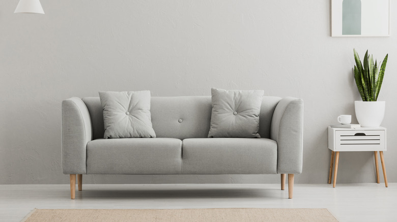
Our first overplayed trend is one we can't get rid of fast enough: cool gray. Clinical and cold, it once might have come off as clean and orderly, especially when paired with white or black. But now it's just overdone. If your rooms are painted with these cool, mid-tone grays, and painting over them isn't possible at the moment, do what you can to introduce natural tones, including deep brown and green, as well as florals, to offset the chill of an all-gray room.
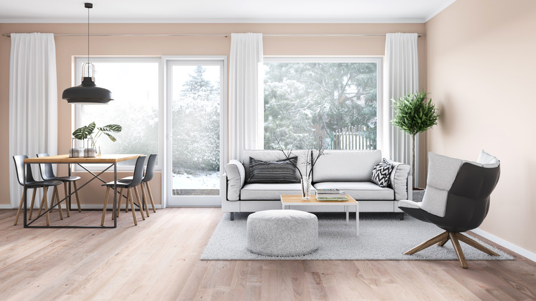
While we're dealing with neutrals, all-white, especially a chilly, bright space with whites that have blue or gray undertones, is also a paint color we're waving goodbye to. The quick fix about two years ago was to add texture to an all-white or all gray space, but now what's favored are whites with warmer undertones, such as yellow and even pink. The next trend for interior palettes overall is turning towards warmer, natural colors in all shades.
Stay away from greens and blues with low vibrancy
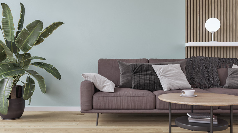
Designers argue that this shift from sterile, cooler colors simply reflects our desire to get home and get comfortable. We want to reconnect with nature and we're bringing the tones of the forest, meadow, and ocean into our rooms. When borrowing from trees, for example, use browns not grays as the primary neutral. Adding serene blues and blue-grays that aren't cool-toned is another. You'll also want to ditch the so-so greens, like mint or institutional green-gray. Instead, opt for greens that are either very bold, like forest green, uniquely their own shade, such as moss green, or a green with blue undertones.
The term for this nature-inspired trend is biophilic design, which is the desire to bring all the elements of nature indoors. Color is just one element when it comes to creating an interior environment that works on biophilic principles. There are guides to biophilic interior décor, which help with bringing the great outdoors into your living space. Factors include bringing in exterior light, adding curved, organic shapes, and using natural materials, like wood, stone, cotton, and rattan. Designing in this style and using botanical-based colors not only refreshes your living areas, but also offers a comfortable, contemporary look with an appeal that will last for years.
Don't think pink
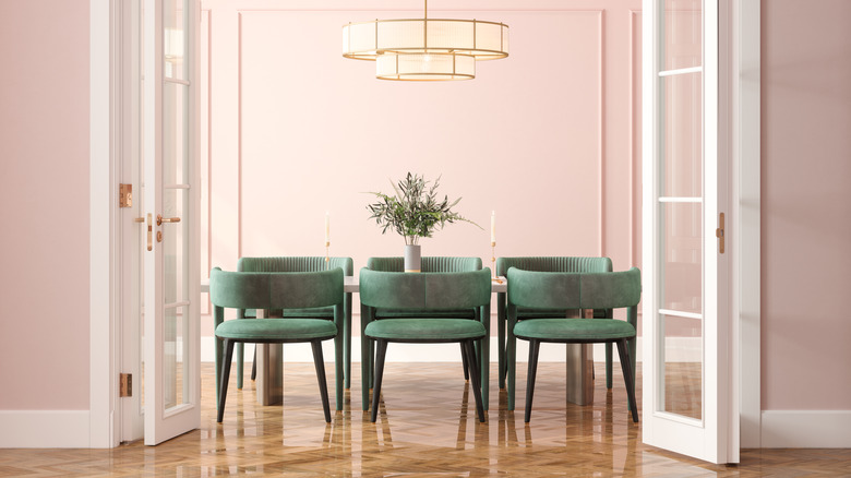
The pastel indulgence in all things pink has also run its course. While you can include nude pink tones and corals as accents, pink walls and furniture don't blend with the growing earth-tone vibe. Super bright crimson is also in this category. So, instead of using a fire-engine red or startling magenta, think about the lush, muted tones of deep cinnamon, cider, brown-red claret, or deep orange.
Since it verges on red, we'll also throw in deep purple, similar to the color of eggplant, into this mix. Many people enjoy lilac, but again, pastels are not the trend right now, so think about something just as appealing, but a little darker and a little more restful. When it comes to warm tones, we're thinking about colors that are more like a banked heat source, and not a full flame. Eggplant is the perfect mix of deep purple with both red and brown undertones; it will go beautifully with greens and blues, but also with neutrals like black or beige.
Natural earth tones, not earth movement tones
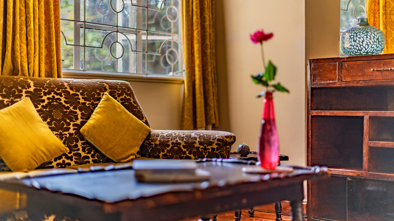
One of the possible downsides when we circle back to color palettes that were popular years ago is that we may repeat the same awful trending errors. So, it's important to understand we're not talking about bringing back the lurid colors popular in the mid-1970s. Those colors such as mustard yellow, burnt orange, and avocado green were referred to as earth movement colors, an offshoot of the psychedelic 1960s. Today, you can forget about avocado appliances, orange shag rugs, and nearly florescent gold velvet upholstered furniture coming back into vogue.
Instead, think softer, more natural earth tones — colors that blend and complement each other. When designing, don't separate tones one by one, as it can create a stale enviornment. Instead, envision color groupings or palettes like a soft dark brown paired with a warm green-gray, or blue with a touch of ivory or coral. And while you're thinking of your interior, think beyond the color of your walls or furniture. Think along the lines of an inviting space where the colors are muted but also layered in the room with cozy textures and nubby fabrics.
Ditch the beige
Another trend that is outdated is saturating a room in nothing but beige. Call it stone, ecru, champagne, or any creative names paint companies use, but an all-beige room is a style that on the surface may look sophisticated, but really lacks commitment or inspiration. Sometimes referred to as millennial beige, this is one paint color that designer Jeremiah Brent is tired of seeing.
A more progressive and inviting direction to take is using whatever beige you have, but breaking it up. If you're stuck with beige walls, enliven the space with curtains, carpet, throw rugs, upholstery, and art using colors that complement the neutral walls. Try various medium to dark browns, terra cotta, smoky blues, and sage greens to warm up the space. Beige walls with black furniture or accents create drama. Meanwhile, beige walls with white trim are still a bit bland, but can also be soothing, especially if you layer the room with crisp textures like linen and cotton, mixed with nubby fabrics like tweed and wool.
