The Home Design Tip That Makes A Plain Wall Look More Expensive
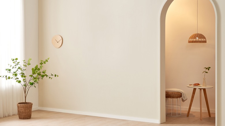
Like a blank page, a plain wall can be daunting to fill. If you're as obsessed with home decor as we are, you likely scour design articles and scroll through countless home decor photos, hoping inspiration eventually strikes. Rooms utilizing exquisite artwork often catch your eye, but recreating that look in your own home is easier said than done.
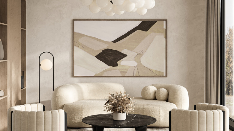
How do you find that perfect work of art to transform your plain wall into an elegant design feature the way they do in interior design photos? The answer, it turns out, comes down to a simple rule of thumb for sizing artwork for a plain wall: The artwork should fill between 60-75% of the blank wall space. This measurement range takes the guesswork out of choosing your art. By sticking to this rule, you're covering enough of an empty wall to look balanced without overpowering the space by being too big. This makes selecting the right artwork for your space much easier. The rule also works for any type of wall decor, even when you want to decorate your wall without using framed art. Whatever your design, the result is an elevated look in any room of your home.
How to size plain walls for art like an interior designer
Measuring 60-75% of your plain wall only requires a few measurements and a quick calculation. Just measure out the height and width of the wall, then multiply both by .6 and .7. This will give you the size range for the ideal artwork to fill your wall.
You can use it as a guide for all those trendy wall art ideas for your home, like a gallery wall or mix-and-match shelving, mounted plants, and even unconventional objects. While the ratio remains the same, you can take extra liberties when filling out ⅔ to ¾ of your plain wall with various decor items. Spacing them out to fill the area is really a matter of preference, and anywhere from 2 to 6 inches in between pieces is standard. What matters most is consistency so your items look evenly spaced and balanced within your coverage area.
When filling a plain wall above a prominent piece of furniture, the ratio still applies, but instead of accounting for the entire wall, you can measure 60 to 75% of the furniture width and wall height from the top of the furniture to the ceiling. This will create balance in the space while leaving the rest of the wall open for other design elements.

