Design Mistakes HGTV's Jasmine Roth Thinks You Should Avoid
We may receive a commission on purchases made from links.
Jasmine Roth knows a thing or two about common design mistakes. In her smash HGTV hit, "Help! I Wrecked My House," the California-based designer is often seen rescuing homeowners whose DIYs and contracted work have gone completely haywire. While we might selfishly hope that these blunders keep coming for the sake of entertainment, Roth sees things differently. Instead, she actively offers advice to help amateur home designers out before they even get to the point of needing to call in reinforcements. She often gives interviews and writes blogs to steer homeowners in the right direction and solidly away from design disasters.
Whether it's a significant decision like choosing a tile color for a bathroom remodel, or something smaller like sourcing the wrong vintage items or picking an unsuitable rug, Roth highlights key design mistakes to avoid. Steering clear of these hiccups will help you create a chic and functional home. Here's a closer look.
Creating modern spaces in traditional homes, or vice versa
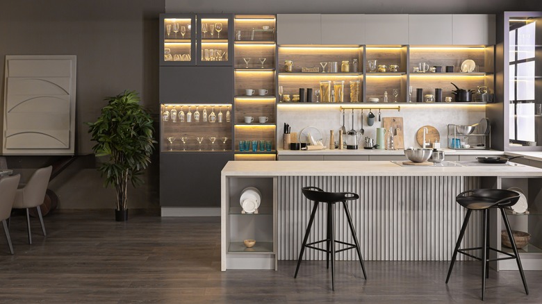
When sprucing up your home, don't just think of your redesigns as a room-by-room ordeal. Instead, you need to think of your home as one big, cohesive unit. Because of this mindset, Roth insists that the choices you make in each room should honor the entire aesthetic of the house, including the architecture. "If you have a Spanish Style Tudor, don't ignore that fact when designing your kitchen and put an ultra mid-mod style kitchen in," she wrote on her blog. "It just won't feel right!"
Instead, consider leaning into your home's overall style and harnessing that. For example, when designing a kitchen, this might look like a deep basin sink in a modern farmhouse or terracotta tile countertops in a villa-inspired home. Finally, consider that if you drastically change the appearance of one room, it will have knock-on effects throughout the house. In the end, you want to make sure they're all in the same theme and not experimenting with drastically different styles. "Also, your kitchen should be part of the same design aesthetic as your bathrooms," she continued, pointing out that it's important that the two wet spaces of your home match up. Having a farmhouse kitchen but an eclectic bathroom will feel disjointed rather than designed.
Shag carpets, or any textiles that shed, don't belong in your home
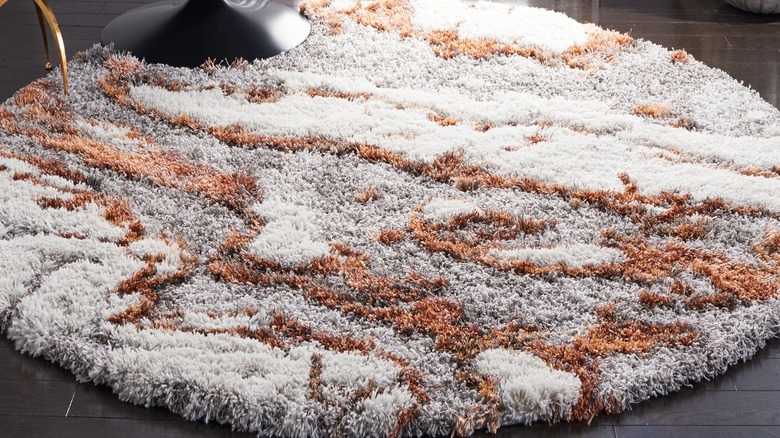
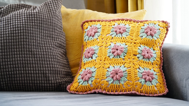
Shag carpets, characterized by their thick, furry fibers, were once all the rage, particularly in the 1970s. Yet Roth is desperate for the design world to move on already. "I can't even tell you how many times I've bought a really cozy shag rug, moved all my furniture to get it in place, then found myself regretting it because IT SHEDS!" she ranted on her blog. "If I wanted another pet, I would get one. Make sure your rugs don't shed before buying." The worst part is, however, that sometimes rugs that aren't even advertised as shag tend also to shed a lot. For example, wool rugs shed. The only way around this, she says, is to have a good look at the reviews before purchasing.
An option that's a safe bet almost all of the time is a jute rug. "I have yet to meet jute rug that's gone out of style," she continued in the post. "My suggestions: get a large inexpensive jute rug (This is my favorite from Amazon) and layer it with fun, colorful rugs in a smaller size. This way you spend less and have more options." Bright, fun carpets that don't make you vacuum five days a week are really the way to go.
Leaving the appliances visible
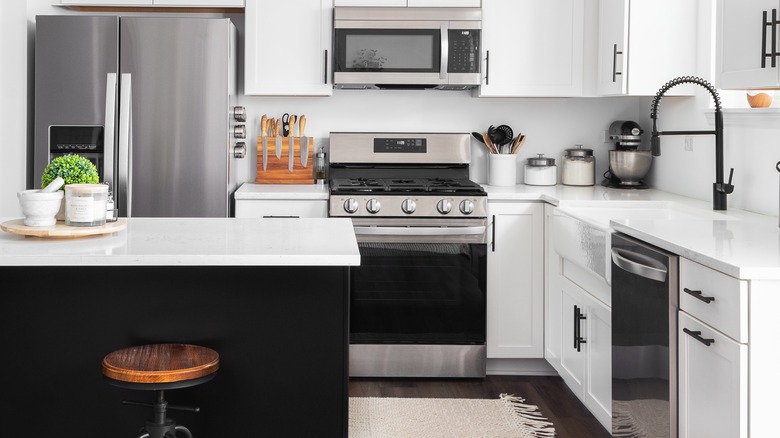
If you've never liked the look of stainless steel or bright white appliances against the aesthetics of your kitchen, you're in luck. Jasmine Roth thinks that leaving things like your dishwasher and microwave completely in view might be a massive mistake in design. "Panel-ready appliances are a kitchen design trend that allows your appliances to blend seamlessly with the rest of your drawers and cabinets. Guests might come over and even find it a guessing game!" she wrote on her blog. "Panel-ready appliances are a way to give your kitchen a clean, crisp, cohesive look while elevating the overall design aesthetic. These have been a game changer in a handful of my recent projects."
The good news is that most big brands sell these options, so you don't have to sacrifice any functionality at all to lean into the style. Trusted companies like Fisher & Paykel, Bosch, ZLINE, Samsung, Sub-Zero, KitchenAid, and JennAir all have different models to choose from. The only downside is that because these appliances are so customizable, they can be quite expensive. For example, a simple fridge might run as little as $500, but a paneled one will be a minimum of $5,000 — and likely much more with all the tweaks you can make to it.
White kitchens aren't the end all be all
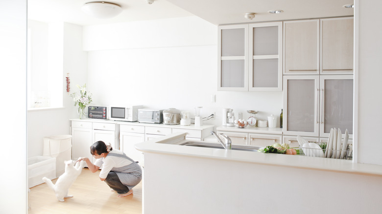
All-white kitchens have long been considered the ideal classic design. Roth agrees with this, but only to a point. In her opinion, if you try too hard to keep things timeless, you can actually end up really limiting yourself. "I would say getting too caught up on having a 'white kitchen' because their last kitchen was dark," she wrote on her blog, describing design mistakes she often sees people make in their homes. "You want your kitchen to be bright and airy, I get it, but you still want to have a little something going on..."
Instead of all-white everything, which can easily begin to feel a bit sterile or washed out, Roth recommends simply using white as your base and developing your design from there. "With other textures, (think butcher block or reclaimed wood shelves), colors (think about painting your island a fun color), or with materials," she continued. "There's more to life than just plain white countertops — I promise." By doing things this way, you can still reap the benefits of a more timeless space without running the risk of creating a sterile and uninspired space.
Knocking out walls just because
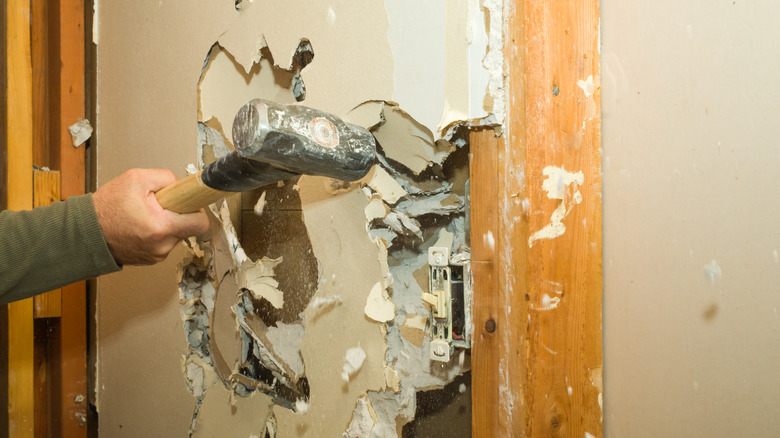
Most people won't regret going with an open floor plan in their homes. However, if you don't already have one, you can't just go around knocking down walls willy-nilly to get the home of your dreams. Instead, it takes so much more planning and plenty of skill, too. "People open up the wall and then realize that there is so much more that goes into taking down the walls," Roth told Realtor.com when asked about horrible renovation mistakes. "I feel like that's what I see the most of, where I show up and drywall has been pulled off of a wall in the home, and it's like, 'OK, well, what happened here?' And they're like, 'We were trying to see if we can take this wall down.'"
Instead of just going for it, take a moment to check a few things. First, you should determine if the wall is load-bearing. This means the roof or second story won't stay up without it. In some cases, you can leave a pillar if you still want to take out most of the wall. Second, discover if any essentials in the wall need relocating and what it would cost to do so. These would be pipes, HVAC components, ethernet hookups, etc. Your contractor will be able to run these tests for you in most cases so you don't end up on Roth's show.
Vintage textiles should be left in the past
Sourcing vintage decorations can be one of the most fun parts of designing your home. You can use Facebook Marketplace as the ultimate shopping tool, or even rove your local flea markets and estate sales for the best finds. However, "there are some things that you definitely do not want to buy vintage," Roth said in an interview with HGTV, per YouTube. "Like a mattress, couch pillows, or a new comforter for your bed. Probably not the best things to buy vintage."
This is because fabrics can hang onto a lot of bacteria, sweat, dust, mildew, and other gross things over time. While you can certainly reupholster vintage chairs, things like couches will need major TLC to be workable. If you don't have the time or skills to commit to such a big project, search for things that might just need to be repainted or polished instead. This would be the likes of bed frames, dining room tables, and even paintings, sculptures, and bar carts. If you aren't having much luck, you can try manufactured furniture. This is new work designed to look exactly like vintage pieces, so it can remove the need for any restoration.
Going over-budget on wood flooring
Choosing a great flooring material lays a solid foundation for the rest of the room. However, Roth thinks it would be a big mistake to blow out your budget just because you have your heart set on a particular option, like wood. This came to a head during a Season 4 episode of "Help! I Wrecked My House" when the clients had unrealistic design aspirations, making it difficult to choose a within-budget flooring option. "You can't do any other design choices until you've chosen a floor because the floor is the base of the design," she told her clients, per Realtor.com. "If we pick some floors that you guys like, that will be a really good starting point."
While the couple wanted wood, it just wasn't going to work. "To save money, we'll use luxury vinyl plank," Roth said. Later in the episode, the audience also discovers that the couple only paid $5,000 instead of the $15,000 that they might have for hardwood — making this by far the smartest choice. If you are wondering if vinyl plank flooring is right for your space, ask yourself these questions: Do you want something cheaper than hardwood, easier to take care of, and extremely easy to customize? The only downside is that heavier furniture or hard wear and tear can more easily ruin the planks — but the pros often outweigh the cons for most.
Relying solely on wall sconces in bathrooms
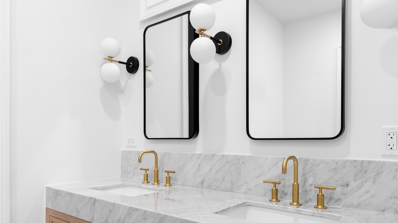
It's a fact of life that bathrooms need great lighting options. You need the right amount of light to see properly while you are getting ready for work and plucking splinters from your children's hands, as well as for relaxing in a warm bath. Roth insists that to achieve this balance, you can't rely on wall sconces alone. "Wait! Before you stop reading, I'm not saying not to use a wall sconce — I love a good wall sconce!" she wrote on her blog. "But make sure it's either bright enough, or install can lighting as well. Nobody wants a dark bathroom."
Canned lights are simply lights that are recessed in the ceiling. It's just another way of saying overhead lighting. If you find yourself applying the wrong shade of foundation or not getting as close of a shave as you want to, it's likely you've made this lighting design mistake because you can't see. To fix it, work with an electrician to set up light directly above your sink, OR swap out the bulbs in the sconces for a brighter option, like LOHAS Super Bright White LED light bulbs.
Neglecting your outdoor spaces
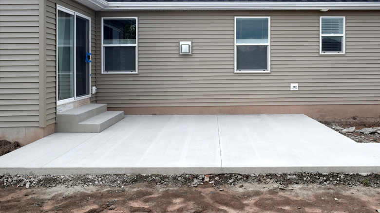
One of the worst things you can do for your home's design is to forget that extremely livable portions of it exist and choose not to incorporate them. "If you do it right, patios can feel like you're adding an entire room to your house," Roth told HGTV when redesigning a patio with her mother. To achieve this, the star took some key steps. First, she defined the space with click-in wooden tiles, similar to these 12x12 Acacia Wood Tiles. They give the patio a nice ambiance and make the flooring seem much more elevated than just bare concrete — without the need for adding a dirty outdoor rug to the mix.
Next, she added greenery in the form of a few pot plants. Flowers and plants are a great way to transform your patio, especially if you style them correctly. Consider placing different colored flowers on multiple levels of a shelf, ladder, or even tabletop to create more visual interest. If you are worried about keeping them alive, start with succulents, as they tend to be resilient even if you don't have the greenest thumb.
Colorful bathrooms are a trend that's been over for a while
When designing your bathroom, be careful not to fall victim to passing design trends. Instead, go for something a bit more classic that will last you longer — especially with how expensive bathroom renovations can be. "The biggest mistake I see homeowners (and designers) regularly make when updating their bathroom is trying to be too trendy," Roth warned on her blog. "There's nothing that dates a bathroom quicker than trying to do what's 'in' during the renovation."
A great example of this would be the colorful bathrooms from the 1970s. The baby pink and powder blue tiling, tubs, and bathrooms might have been all the rage upon completion, but modern homeowners can't wait to get rid of them. "We've all seen a pink sink in our day and even though it might be funky, it's not timeless," Roth continued. Instead, she suggests focusing on solid bones — things like good storage solutions, great lighting, and a nice rounded mirror to easily see what you are doing. Sticking to neutral colors doesn't have to be boring either, as you can add color with plants, artwork, and brightly colored towels.
Not being intentional when mixing wood tones
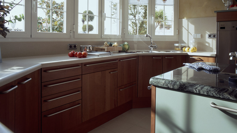
Having two different types of wooden accents in a space can easily turn into an eyesore. However, Roth thinks that it can be done — just carefully. It would be a mistake to forge ahead with this option without careful planning first. "It's not every day that we mix wood tones, but if you are going to mix wood tones, you have to do it intentionally," Roth shared on the Season 4 episode of her show, "Hello High Water," per Realtor.com. "You can see, white oak is very light, the walnut's very dark. Obviously, you're doing this intentionally 'cause you have two very different colors."
In this instance, the cabinets are walnut and the drawer pulls are white oak. This creates a nice visual contrast because the lighter element is easy to see. Yet to keep things chic and not mismatched, all of the drawer pulls are uniform. And, the colors are just different enough that the pattern seems intentional. No one will ever be left wondering if the choice was an accident or just a trick of the light. So if you want things to stand out, plan ahead so that it will be noticeable.

