The Kitchen Makeover On HGTV's Brother Vs Brother That A Pro Designer Called Bland

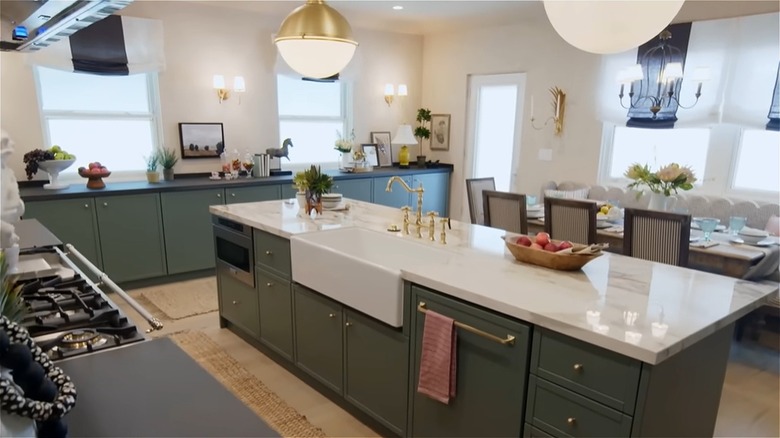
Many of the swanky kitchen makeovers featured on HGTV's "Brother vs. Brother" are so stunning that they serve as inspiration for homeowners looking to revamp their own kitchens. However, some of them almost entirely miss the mark. That was the case for a kitchen redesigned by Drew Scott on Season 8, Episode 2 of the show. Scott added striking blue-green cabinets, light wooden floors, and cream-colored walls to the space. House Digest spoke to Bilal Rehman, CEO and Principal Designer of Bilal Rehman Studio and Founder of Bilal Rehman Gallery, about these design choices. The expert confessed that he finds them to be "bland."
"Drew Scott's choice of blue-green cabinets, lightwood floors, and whitewashed walls feels disconnected and lacking in cohesion," he explained while speaking exclusively to House Digest. "The blue-green cabinetry, while vibrant, clashes with the lightwood flooring rather than complementing it. The warmth of the floors is diluted by the overly neutral, whitewashed walls, which come across as bland and uninspired." Rehman went on to share that Scott's design choices feel mismatched, failing to achieve balance. It's clear that the expert would have taken a different approach to this kitchen remodel idea. Let's dive into the changes Rehman would have made for a more visually pleasing outcome.
The pro designer would have taken a more cohesive approach
Speaking exclusively to House Digest, Rehman shared that he would have opted for a monochromatic color scheme. "While I appreciate the design, I tend to favor a more monochromatic approach to color," the expert explained. "Personally, I would have embraced a bolder vision by enveloping the entire space in a deeper, more seductive tone, allowing it to feel more immersive and cohesive."
As you can see in a YouTube clip featuring the kitchen remodel, Scott went in the opposite direction, installing blue-green cabinets that add a pop of color to the space. The blue-green color is used on the cabinets and baseboards, but the look lacks cohesion since it's not repeated anywhere else within the kitchen. Rehman shared some better ways to add color to a kitchen to help you avoid making this mistake. "Incorporating veined marble adds organic color variation, infusing the space with natural elegance," he explained. "Muted art pieces and ceramics introduce subtle hints of color, while colored glass or metallic lighting fixtures bring warmth to the kitchen." Rehman went on to reveal that you can use velvet, leather, chrome, or brass bar stools to finish the look.
Avoid trendy colors and other mistakes when designing a kitchen
If you are interested in finding creative ways to add a pop of color to your kitchen, there are a few mistakes you will need to avoid. The first, courtesy of the colored cabinets Scott incorporated in his "Brother vs. Brother" kitchen, is knowing which colors look trendy rather than timeless. "Colored cabinets can indeed be timeless, especially when they feature muted, nature-inspired tones or are styled monochromatically within the overall space, complemented by appropriate finishes," Rehman explained while speaking exclusively to House Digest. "However, it's important to remember that introducing a pop of color can easily veer into trendy territory, leading to a look that may quickly feel dated."
This is closely related to another common mistake Rehman mentioned. He revealed that homeowners can easily find themselves caught up in following trends that will eventually make their living space look old – if they're not careful. This could lead to paying for pricey remodels when the trend passes. "The key is to respect the architectural integrity of the space and ensure the design feels cohesive, rather than forcing a style that disrupts the overall aesthetic," Rehman said, revealing why chasing trends is not a good idea.