The Dying Kitchen Trend HGTV's Erin Napier Is Happy To Put To Rest
We all know trends come and go, some rightfully so (we won't miss Formica countertops). All-white kitchens dominated for some time, but now it's a once-popular kitchen trend that won't be coming back anytime soon. People are opting for more color and personality in their home's design, and the backsplash is one of the easiest ways to pour color on an all-white kitchen. HGTV's Erin Napier is already on board. In several of her remodels, she has traded traditional white subway tile in the kitchen for bold colors and patterns, bringing life and character into the space.
Now, we love white tile because it's neutral. It complements every kitchen and creates an airy, clean feel. However, it's bland — literally a blank canvas. The backsplash has so much potential to be a focal point and add visual depth to your space that it's a wasted opportunity to only design it with plain old white tiles. Adding color, texture, or patterns (no matter how slight) will lead to a more dynamic backsplash and kitchen. We're leaning on Napier's "Home Town" designs for creative backsplash ideas and to finally put the all-white kitchen to rest. We've highlighted three looks: one with a pop of colors, another with subtle vibrancy, and a complete showstopper, to get the wheels turning on options that aren't basic white tile.
White tile is out, colorful backsplashes are in
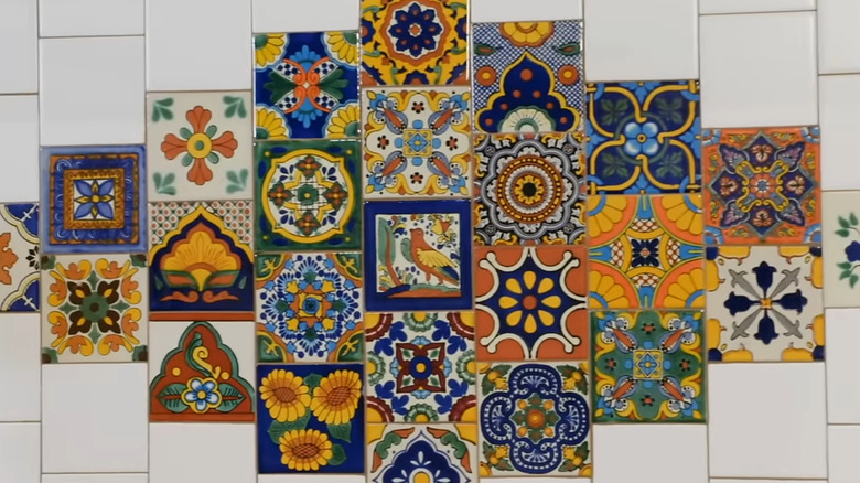
First up is the Donnelly-Livingstone home remodel. In "Home Town" Season 6, Episode 6, Erin Napier put a twist on white tiles by peppering colorful Talavera tiles throughout. It was a much-needed pop to add vibrancy and show off the homeowner's personality. Napier even laid some of the Talavera tiles in a whimsical diamond pattern to create a focal point in the backsplash.
The Donnelly-Livingstone's renovation inspired another colorful backsplash design. For Tena and Bob's house, Napier chose terracotta-colored tiles for the walls, each with a unique pattern. The decorative pieces were randomly placed throughout the field of plain tiles. It created an organic look that appeared effortlessly stylish. Earthy tones are a great way to add color without straying too far from neutrals, and the hand-painted tiles added delicate detailing. So no white doesn't mean loud and bold.
Speaking of loud and bold, how about dark green shiplap walls for the kitchen? That was the design Napier pulled off for her brother and sister-in-law in Season 5, Episode 13. The dark green backsplash was the same shade as the cabinets, color-drenching the kitchen in the rich hue. Talk about a far cry from all-white. Tying in the color of your cabinets or opting for shiplap instead of tile are a couple of ways you can mimic Napier's look. Truly, it's all about incorporating hues and patterns you love. The kitchen is the heart of your home and should reflect what's in yours.

