Bright And Playful Paint Colors Are Making Their Way Back Into 2025 Home Trends
If you've been keeping an eye on popular paint colors over the last few years, you've likely noticed a trend. Whether it's Sherwin Williams' 2023 Paint Color of the Year, Redend Point, Behr's 2024 Color of the Year, Cracked Pepper, or Pantone's 2024 Color of the Year, Peach Fuzz, it's clear that complex, layered neutrals, especially on the warm end of the spectrum, are having a moment. Now, however, it looks like a few brave souls are gearing up to break the mold. Sherwin Williams recently released its 2025 Colormix Forecast, and, while several of its palettes still focus on cozy earth tones, its eclectic Paradox palette is chock-full of vibrant candy colors.
Sherwin Williams' Colormix Forecasts are developed by a team of in-house trend forecasters. While these forecasts are not quite as focused as the officially-declared color of the year, they represent a wider range of potential trends that will likely find their way into our interiors over the next year or so. The Paradox palette, in particular, is an eclectic blend of colors from across the spectrum, from vibrant coral to breezy lilac. While the 12 colors in this palette represent just about every part of the color wheel, they all have one thing in common: they're not afraid to have fun.
What colors are expected to trend?
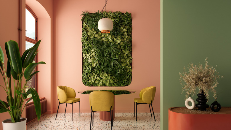
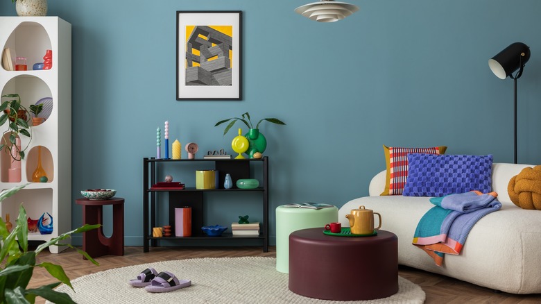
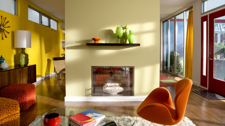
Sherwin Williams' 2025 predictions include several specific colors that the brand expects to trend, including a vibrant blue, cheery gold, and electric pink, but these shades are just examples of an overall shift toward more saturated tones. Pantone's Fashion Color Trend Report for 2025 also focuses on colors in the same wheelhouse, noting that many of its selections are playful and energetic while still maintaining a base in colors found in nature. Greens, both muted and ultra-vibrant, are taking the stage as one of the most popular selections, though yellows, blues, and pinks are notable inclusions across the board as well.
With such a bold collection of colors, however, it's also important to bring in some balance. A room full of exclusively vibrant shades can quickly feel cartoonish or childish, but trend forecasters offer a solution: brown. Both Sherwin Williams and Pantone include brown as an anchoring neutral in their palettes, and, after several years of warm colors rising in popularity, this should come as no surprise. It's unlikely that the entire world will embrace this trend, but don't be surprised if you notice a spike in popularity in colors that might have seemed a bit too "out there" a few years ago.
How to incorporate these colors into your home
Using bold colors in your home can understandably be a bit intimidating, but if you're looking to make a statement, there's no easier way to completely transform your space. The most foolproof way to guarantee you'll love the result is to start simple. Play around with bright accents that can be easily be replaced or repainted, like accent walls, décor pieces, and vibrant lighting. These little inclusions will quickly add up, but if it feels too overwhelming and you find yourself missing a more neutral palette, you can easily revert back without spending a ton of money.
There is, however, the chance that you'll absolutely love having a colorful space once you dip your toes in. Continue bringing in vibrant pieces until you've created the technicolor space of your dreams, but make sure you stick to a palette with similar undertones to ensure your picks don't feel mismatched or random. If you want to really control the look, it can also be helpful to create a palette of specific colors online or with samples to guarantee that you'll find a perfect match when styling. It's also a good idea to keep some neutrals in the mix to prevent things from looking like a playground. Wood furniture, neutral flooring, and natural accents can go a long way in grounding an otherwise vibrant space, so don't be afraid to pick the "bland" option from time to time.


