Good Bones: The Riskiest Home Design Ideas We've Seen From Mina & Karen
We may receive a commission on purchases made from links.
Sometimes taking creative risks can pay off, and Mina Starsiak and Karen E. Laine are no strangers to daring design ideas. On their hit TV series "Good Bones," Laine is an unapologetic fan of DIY arts and crafts. She is constantly finding ways to repurpose unconventional materials as decor. This eco-friendly, fearless outlook on design is what has made Laine and Starsiak's designs so popular. From bright colors to unexpected textures, they've tried it all.
However, because taking risks is such a huge part of their renovation process, the transformations are often met with mixed feedback from fans. While some fans love their commitment to trying new techniques, others are skeptical whether the results will yield real-world profits. We'll take a look at both the winners and the misses. Starsiak and Laine have a solid track record of flipping houses, but each restoration is entirely unique. There's never a dull moment between this mother-daughter duo. Discover their riskiest design ideas and learn how to incorporate them into your own home — if you dare!
A daring, bright purple exterior
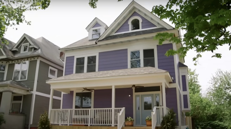
Laine and Starsiak often explore vibrant design choices and DIYs, but this exterior paint color had some viewers scratching their heads. In Season 3, Episode 13, the duo decided to paint the outside of a historic home a bright lavender color. Upon the reveal, Starsiak exclaimed, "It's definitely purple!" Although it was a risky choice, the reason they chose the hue is because it was the client's favorite color. The client confirmed, "It looks gorgeous." However, some YouTube users like disagreed: "Really love what you guys did. Remarkable Reno. But I can't get my head around the purple exterior," one commented.
If you're intrigued by the idea of a purple exterior but you're nervous about resale, there are several ways to take a subtler approach. First, consider a slightly more palatable purple shade. For example, Behr offers a soft, dusty purple shade called Foxglove M550-3. Typically, the closer you move towards blue, the more mass-appealing the hue. Blue is one of the colors that work best to make your house look inviting. For a more understated alternative, painting just your front door is a subtler way to incorporate purple into your home decor.
Dark kitchen cabinets with a bright blue island
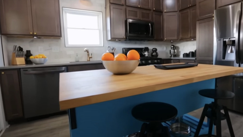
The "Good Bones" pair has plenty of experience with bold kitchen cabinet colors and funky kitchen decor. In Season 3, Episode 4, Starsiak and Laine chose to mix a few unexpected features in their renovated kitchen. They went with dark, moody cabinets and a bright blue kitchen island. The island was a former vanity, and with a piece of butcher block on top it became the perfect island substitute. However, viewers were torn on the contrasting colors. One follower commented, "Don't like the island color..." Another added: "I didn't like the dark kitchen cabinets — would've preferred something lighter."
While repurposing a vanity or sideboard as a kitchen island is a solid idea, it's the color combo that can be tweaked for mass appeal. Rather than a turquoise tone, try a muted shade in the same color family like Mystic Lake CSP-745 from Benjamin Moore. For the cabinets, you can match the lower cabinets to the kitchen island, and leave the upper cabinets neutral to mimic the modern, trendy two-toned cabinet look. Alternatively, simply staining the cabinets with a lighter oak shade can complement the kitchen island without competing with the striking shade.
Floor grates turned into loft railings
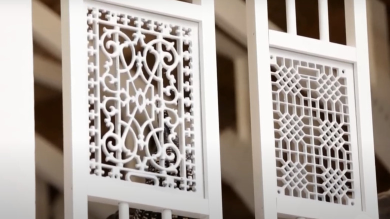
Season 3, Episode 9 featured one of Laine's most successful DIY endeavors. She used the original vintage floor grates as loft railings. Although it was risky stylistically, this risk definitely paid off! With the fans, the choice was a huge hit. One viewer commented: "The mom hit it out of the park with her antique iron grates turned into the railing in the loft — what a fantastic idea!" Another agreed, "The grille railings are sheer genius."
If you don't have access to vintage iron grates, you can purchase Nuvo's Iron Insert Gate from Amazon for $93.39 to capture the ornate look. These Minuteman Cast Iron Floor Gates for $48.93 are another vintage-inspired Amazon option. For a DIY-inspired approach, you can also measure panels of thin plywood and stencil a similar design. Finally, carve out the details and spray paint the pieces in matte black. This will add a unique look to your railing without breaking the bank.
Textured wallpaper tiles on the living room wall
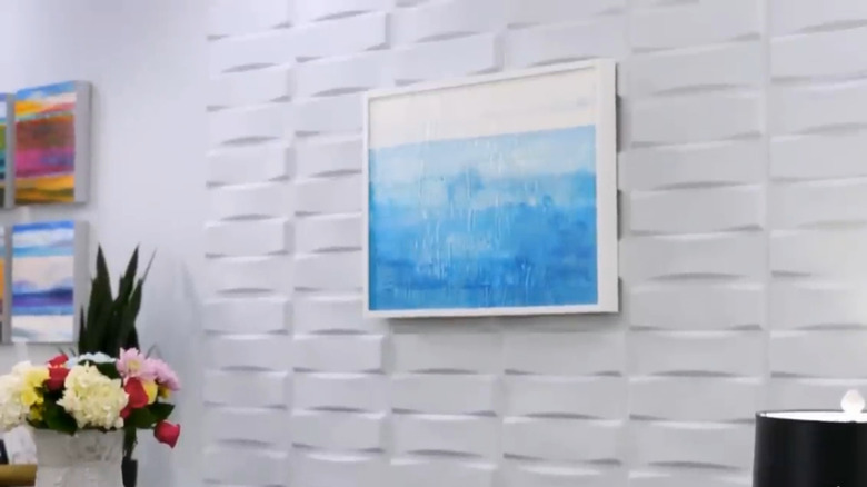
In Season 3, Episode 10, Laine and Starsiak faced a unique challenge: They were unable to insert any windows in the main wall that stretched across the living room. The duo chose to use this opportunity to get creative with the wall decor. They covered the empty space in wallpaper tiles with a funky brick-like texture. While some viewers loved the change — see one fan's comment, "Excellent makeover, the place appears so much bigger" — others were skeptical about the daring wallpaper idea. One viewer posted, "Ok, but how much dust will that funky wallpaper collect?"
For those who admire Laine and Starsiak's geometric choice, there are several wallpaper tiles you can use to recreate this look in your own home. Not only is it a great way to add visual interest to a blank wall, but you can cover imperfections. For example, if you have nail holes in your wall or other imperfections, you can cover the uneven surface with wallpaper tiles for an easy fix. Amazon offers a very similar 3D Diamond Wall Panel from Art3dwallpanels. For a look that leans less modern and more traditional, you can opt for their 3D Brick Wallpaper in White.
A privacy fence with a green, vintage-style wash
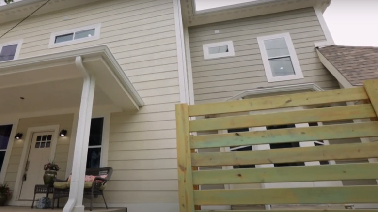
While Laine is always experimenting with DIY decor, Season 3, Episode 12, featured a fence that divided the masses. The client was a major fan of the color green, which is why she chose to incorporate green into the interior and exterior of the home. Laine painted the brand-new privacy fence in a green, distressed wash in an effort to give it visual texture. The client exclaimed, "I love it!" when she saw the fence. Some viewers weren't in agreement: "Not a huge fan of the green staining on the fence (looks like mildew)," one posted.
There are more uniform, crowd-pleasing ways to paint your fence and achieve a shabby chic look. To create a vintage appearance that looks intentional rather than truly shabby, experts at Star Paint recommend using furniture wax on the areas where you want the paint to appear distressed. When it comes to selecting the right shade, there are other variations of green to consider. Rather than a green that could be perceived as mildew, choose a soft sage tone like Saybrook Sage HC-114 from Benjamin Moore.
An accent wall with decorative doors
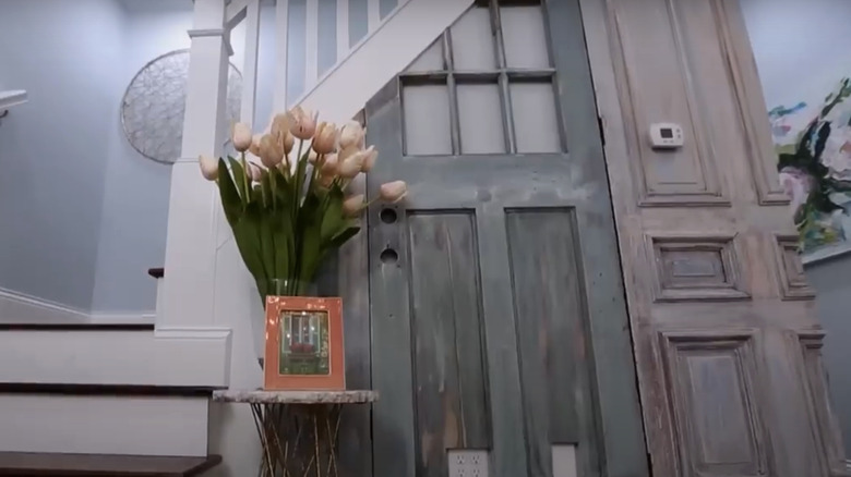
In the original home of Season 4, Episode 12, there was a wall made up entirely of old doors. Laine wanted to pay homage to this bizarre, charming feature and cover a partial accent wall with decorative wood doors. While this funky choice added a lot of character to the home, some viewers were unsure whether the potential buyers saw its value. One viewer offered a suggestion, "Should've gone with shiplap on the stairs instead of the doors."
If vintage doors are too quirky for your personal taste, there are several other ways to use wood to create an eye-catching accent wall. For example, try peel-and-stick oak slate panels from AboutWall4 on Etsy. These modern strips will give your wall visible texture while still keeping it contemporary. If you want a soundproof variation, the BUBOS Acoustic Wood Wall Panels from Amazon are a great way to reduce noise throughout your living space.
Walking straight into the dining room
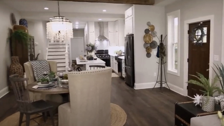
In Season 4, Episode 7, even Starsiak and Laine admitted it was a risk to place the dining room directly in front of the home's entrance. However, there were few other options for a formal dining area in such a small space. One viewer commented, "That dining area is a little awkward, but with a shotgun house, you have to work with the bowling alley floor plan." However, the prospective buyer said, "It's different, but I like it!"
Maximizing a small dining room can be tricky. If you're working with a compact space, you should avoid trying to create a space that appears too cluttered. With an open floor plan, it's important to ensure you have enough space in between designated areas. By putting your dining furniture too close to the kitchen or the living room, you can make a narrow area feel even narrower. There are several space-saving techniques, including opting for a corner-style dining space rather than placing your table and chairs in the middle of the room. Consider a compact dining nook with bench seating like this banquette set by Baxton Studio from Amazon.
Using fish in your wall decor
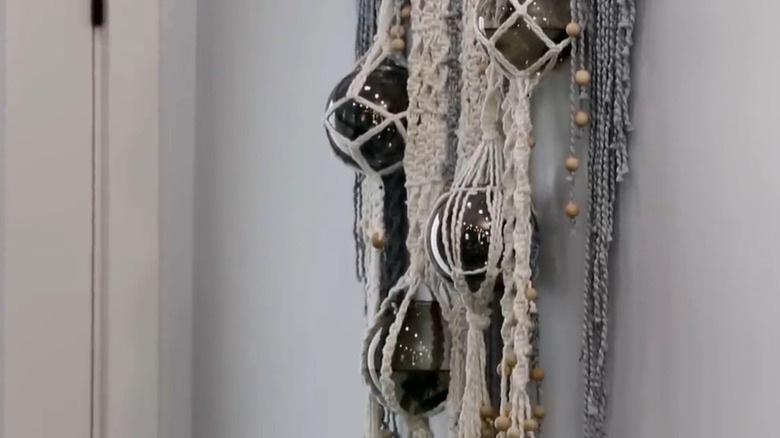
Season 4, Episode 8 was risky for a variety of reasons, but the most daring was undoubtedly using beta fish as wall decor. Laine chose to create macrame wall hangings with vintage globes. While viewers loved the globes themselves, they didn't love that she filled them with live fish. One fan explained: "Nice glow up for the kitchen, with a good color scheme. But ... [what] were you thinking using fish as 'decor'?" Another viewer agreed: "The macrame with just the globes (no fish) would have been WAY better. That's a cool wall hanging."
The solution for making this hack eco-friendly is simple — don't use live fish! You can purchase almost identical wall hangings by NauticalPlace on Etsy, called glass fishing floats. The lack of fish won't minimize the visual impact. For a more botanical approach, consider the impact of air plants in a glass sphere. Caring for your air plants is easy, and they can give your living space a bohemian touch.
