7 Kitchen Cabinet Trends That Are Predicted To Blow Up In 2025 (& 4 We'd Skip)
Kitchen trends don't move as quickly as other design trends in the home, and for good reason. Remodeling a kitchen can cost tens of thousands of dollars, so no one is going to rip out their cabinets or counters and replace them with new ones every other year. Because of this, the trends usually last 10 years or so. However, we're starting to see a tide change, where the standard all-white kitchens with sleek, white subway tiles and white quartz countertops no longer feel right. Instead, they're beginning to feel a bit dated. So what is taking their place? We reached out to two interior design experts to find out.
In an exclusive interview, we learned that while neutral kitchens aren't necessarily untrendy, they're now being infused with more color, texture, and earthier elements. This not only makes them cozier and more lived-in, but also adds a unique touch. The issue with everyone having bleached-out kitchens is that each one begins to look like a carbon copy of the last. The trends in 2025 focus on making them more distinctive. Here is a closer look at what's in store.
Bold colored cabinets will replace all-white kitchens
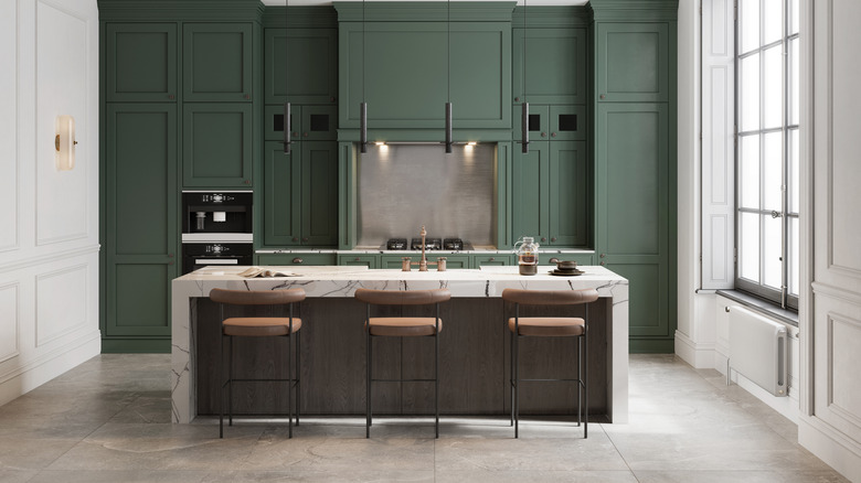
After a decade of white kitchen cabinets dominating the scene, people are now craving some color in their culinary spaces. Some are opting for two-tone cabinet designs that mix white with wood, while others are embracing more saturated shades. These deeper hues are inspired by the biophilic design trend, which draws inspiration from nature. "Bold-colored cabinets are set to make a big statement in 2025, bringing a refreshing and vibrant energy to kitchens and bathrooms. Earth tones are at the forefront of this trend, with rich shades like hunting green, deep blues, and rusty terracotta becoming popular choices for those looking to add depth and warmth to their spaces," Amanda Wyatt, interior designer and founder of Design Insider, an inclusive community dedicated to democratizing the interior design industry, exclusively tells House Digest. "These colors are not only timeless but also evoke a sense of grounding and connection to nature."
Biophilic design has been slowly taking off since the pandemic, and it highlights a need for people to be connected with nature, bringing the outside in. As more people work from home, we are living increasingly digital lives. To make up for that, we want our living spaces to be grounded with the outside, bringing us out of our computers and grounding us in something more tangible. Because of this, earthy cabinet colors are on the rise.
Mid-tones are also on the rise
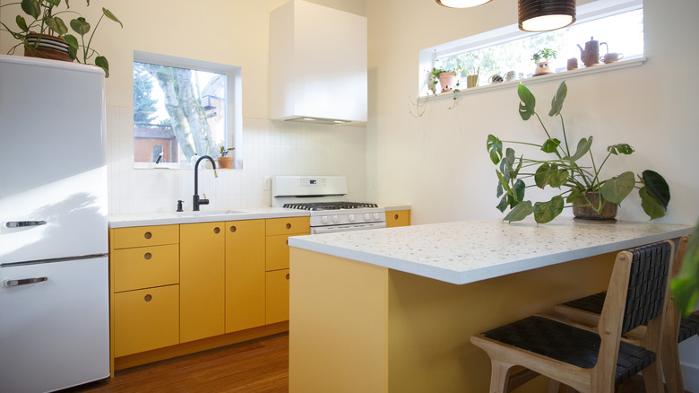
However, if you're not one to create a moody space, that doesn't mean you can't experiment with colors in 2025. For those who want more middle range colors, the trending mid-tone design might be more up your alley. "The color doesn't doesn't stop there — we'll also see homeowners and designers experimenting with mid-tones, such as dusty pinks and pretty marigolds, which offer a playful yet sophisticated touch to cabinetry," Wyatt shares. "These colors add a unique character to a room, allowing for more personalized and expressive design choices."
This particular trend is on the rise for two reasons. The first is that people are tired of the showroom-like spaces of neutral and easy-to-replicate kitchens seen on Instagram and Pinterest. Instead, they're craving something that's truer to their unique tastes. And these colors are a great backdrop for bolder details. "They pair beautifully with fun tile backsplashes (think hand-painted) and accents, enhancing the overall look with layers of color and texture," Wyatt points out. Secondly, these colors make a home feel a little more idiosyncratic since it won't be embraced by a wide range of people — only those who truly love yellow kitchens will put one in. Because of this, the kitchen feels less staged and more homey. "The trend embraces an 'imperfectly perfect' aesthetic, where cozy pattern layering creates a lived-in, eclectic vibe that's both stylish and approachable," she explains.
Marble to contrast with these new shades
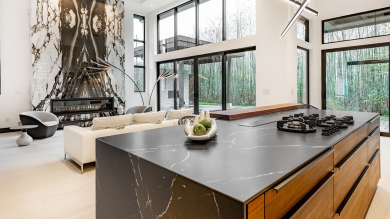
Since people are getting bolder with their cabinet colors, it only makes sense they're looking for more eccentric countertops. And there is no faster way to infuse the space with some character than with a loud slab of marble. "To further elevate these bold cabinet colors, we're also likely to see a lot of bold marble with plenty of movement," Wyatt notes. "These dynamic marbles, with their striking veining and dramatic patterns, will amp up the cabinet colors, adding another layer of visual interest and luxury."
You would think that a forest green or dusty pink cabinet would be enough drama. However, wanting to contrast the colors with an equally loud stone shows how people are craving more creativity in their designs. There is more of an onus to do something unexpected and fresh rather than neutral. "Combined with daring hardware choices that act like little jewelry pieces, these elements work together to create spaces that are both visually stunning and full of character," Wyatt explains. "The interplay between the rich hues of the cabinets and the bold patterns of the marble will make for some unforgettable design statements that I'm already much anticipating."
British designs are on the rise
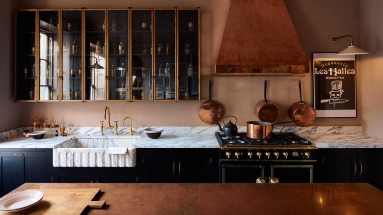
Anglophiles rejoice because, in 2025, cabinet design are pulling inspiration from across the pond. There will be elements mimicking traditional English kitchens, which not only add a touch of vintage charm, but also focus on practicality. "We're seeing a resurgence of freestanding cupboards, reminiscent of curiosity cabinets and classic larders. These pieces not only add character and a sense of history to a kitchen, but also offer incredible versatility and storage solutions," Wyatt notes. It's an easy way to bring English country style into your home. "Hidden spice racks keep countertops clutter-free, while exposed plate racks, vegetable boxes, and pot racks add a touch of old-world charm that's both stylish and highly functional." Some more British-inspired examples are having rolling ladders to reach the uppermost cabinets, and a freestanding antique wooden island rather than a cabinet-based one. Wyatt notes that you can see this trend in action in designs by deVOL, which is championing dish racks, curiosity-case-like cabinets, and freestanding islands with marble tops.
These cozy kitchens are in line with 2025 trends catering more towards lived-in, personal aesthetics rather than mass-produced and minimalist ones. "The reason this approach works so well is that it strikes the perfect balance between charming aesthetics and practical use. Kitchens designed in this style feel warm, welcoming, and lived-in, yet every piece has a purpose, making the space both beautiful and efficient," Wyatt explains. It also allows you to customize certain things even further. "For example, I love seeing the backs of glass-door cabinets painted in a custom color or wallpapered with a quirky pattern. This adds a layer of personality and unexpected detail, making the kitchen feel uniquely yours."
Metal cabinets are going to have a moment
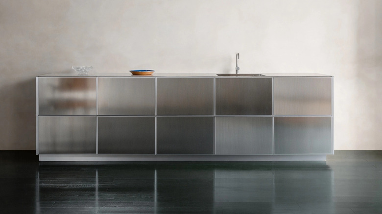
Metal cabinets are beginning to creep into the zeitgeist, whether they're stainless steel or aluminum. We have seen stainless steel countertops begin to take off, and it seems that some people want to experiment with their whole kitchen being wrapped in a metallic sheen. "Stainless steel cabinets bring a sleek, industrial vibe to any kitchen, often evoking the feel of a professional, commercial space," Wyatt confirms. "From a functional perspective, stainless steel is hard to beat. It's inherently anti-bacterial, making it an excellent choice for maintaining a hygienic environment—perfect for food preparation areas where cleanliness is paramount. The material is also incredibly durable, standing up well to heat, moisture, and daily wear and tear, which is why it's a staple in professional kitchens." However, they can also tend to look cold and sterile, which is why, in 2025, they're combined with the biophilic trend to soften their appearance.
They're becoming more popular because they're yet another "natural" element you can mix and match to bring the outside, in. Rather than wrapping your entire kitchen in aluminum or steel and calling it a day, people are pairing them with marble backsplashes, terracotta flooring, and other warmer accents to give the design some balance. "They pair well with other materials, such as warm wood accents or colorful tile backsplashes, which can help soften their appearance and add warmth to the space," Wyatt notes. It also tips its hat to European designs, since countries like Italy and France have been championing metal kitchens and islands for decades.
Textured cabinet finishes
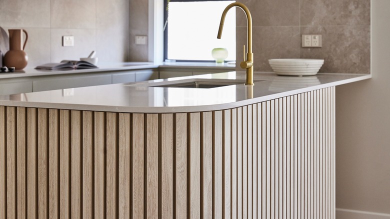
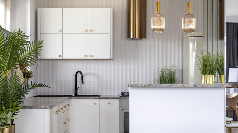
If there is just one takeaway you can take about 2025 kitchens, it's that people no longer want cookie-cutter designs. Instead, they now want something you will be hard pressed to find in your neighbor's kitchen. Which is why fluted textures are beginning to take off. "Beyond the usual smooth surfaces, textured finishes like ribbed or fluted cabinetry are set to gain traction," Janice Page, owner and interior designer at PKsurroundings, exclusively tells House Digest. "These add visual interest and a tactile element that can elevate the entire kitchen space." You're beginning to see fluted islands and ribbed cabinet fronts, like this one from Reform, adding an extra layer of interest to the kitchen space.
The reason it's taking off is because it feels new and different. "The trend aligns with the growing preference for bespoke, artisanal touches that make a kitchen feel more personalized and unique," Page notes. People are becoming less afraid to venture outside of the box and create something never seen before (or at least not very often.) After a decade of safe beiges and shaker style cabinet fronts, there is now a push for more creativity, and thus, more contrasting texture in the space. After all, it's not every day that you see ribbed cabinet fronts.
Matte black cabinets
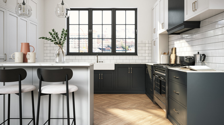
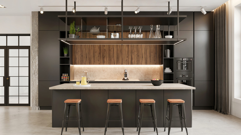
Speaking of being "different," there is no faster way to make a statement than to go in the opposite direction of the all-white kitchen. And that's creating an all-black one. "While richly hued cabinets are already on your list, the matte black finish offers a sophisticated, modern twist," Page notes. The matte paint also makes the black color more approachable, making it feel less in-your-face. We have already seen people toying with this trend for a few years now, but not quite this extreme. For example, it has been popular to create a "tuxedo kitchen," where the uppers are painted your typical white but the lowers are painted a contrasting black, adding depth and dimension to the space. HGTV's Breegan Jane said to ditch the usual cabinet trends for that classic alternative. In fact, it became so popular that a 2018 Zillow report found that tuxedo kitchens sold for a little more than $1,500 compared to similar one-color kitchens.
But going all-black and matte takes this style one step further. "This trend reflects the continuing demand for bold, statement-making kitchen designs," Page explains. It also feels sophisticated and elegant thanks to its sleekness. However, one thing to keep in mind is that it's going to be pretty high maintenance. While the matte color won't make fingerprints and smudges as noticeable as high-gloss options, the dark color will make dust, hair, and other light-colored messes easily visible.
Avoid: Open shelving overload
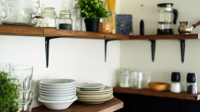
Now, let's take a look at what to skip! Open shelving is still going strong in 2025, with some completely replacing their uppers with one long, clean, floating shelf. This is especially popular if you want a full-slab marble backsplash. A matching marble floating shelf is added to the top of the slab, creating a minimalist and elegant look. However, Page recommends skipping this one. "While open shelving offers a clean, airy look and is great for display purposes, it's not always practical for everyday use," she notes. "Open shelves can quickly become cluttered and require constant upkeep to maintain a tidy appearance."
This option will only be useful for people who don't use their kitchens often and instead want to use it as a design space rather than a practical cooking area. If you frequently use it, you will need the extra storage space and will quickly swap out your curated displays in favor of more utilitarian storage. Which will make your kitchen feel less elegant and more cluttered. In fact, leaning into open shelving is one thing the Property Brothers would never do when designing a kitchen. Jonathan Scott notes that whenever a client chooses this option, they come back to reverse their choice. "You have to have upper cabinets, unless you have a huge abundance of storage in a pantry. But for families, for people in real life, anytime I've had a client who forced me to design a kitchen with no uppers, everyone has come back in six months saying they regret it," he told Apartment Therapy. However, if you want to tinker with the trend without all the regret, Page has a compromise. "A balanced approach that combines closed cabinetry with selective open shelving is more functional for most homeowners," she notes.
Avoid: High-gloss cabinets
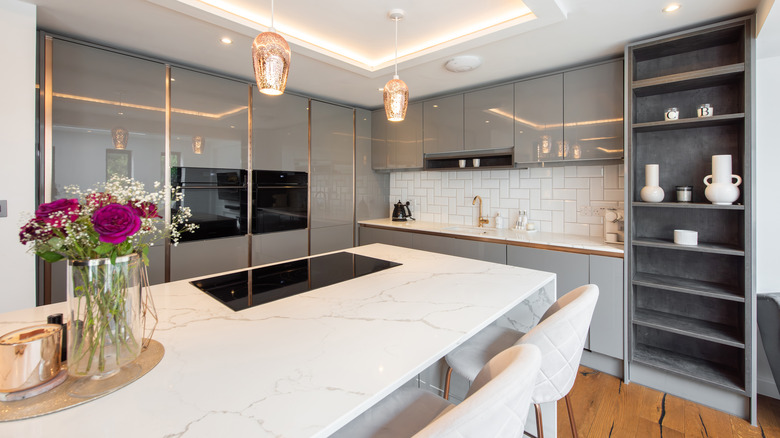
While matte black kitchen cabinets might be in, that doesn't mean high-gloss is out. It's still going strong in 2025, but you might want to skip that trend when remodeling your kitchen. "Although high-gloss finishes can make a bold statement, they are often high-maintenance, showing fingerprints and smudges easily," Page warns. "Additionally, this look can feel a bit too sterile and impersonal for many home environments, lacking the warmth that makes a kitchen inviting." You can warm it up by mixing it with natural accents like marble or wood, but it often clashes with those touches thanks to its ultra-modern aesthetic.
Instead, if you want a similar look, consider investing in semi-gloss cabinets or uppers with glass fronts. This will give you a similar sheen and reflectiveness, without veering into the extreme. Plus, they're less high maintenance as smudges and fingerprints won't be as visible on them. If you use your kitchen frequently or have a large family, this is the more practical pick. High gloss might be beautiful, but it won't look as elegant when it's consistently dirty. While you might be careful not to leave prints when you open a door or drawer, the same can't be said for your partner or young kids. If you don't want to be chasing smudges with a rag every hour, it's best to skip.
Avoid: An overly contrasted hood
In tune with wanting to create an original kitchen design that isn't often seen, people have been experimenting with contrasting hoods. For instance, if the entire kitchen is white, the vent hood is a hammered copper, immediately catching the eye. Or perhaps the hood is an unexpected shape, such as a sleek but industrial cylinder rather than a clunky box. While it can be a fun element to toy with, Wyatt recommends skipping this trend. "One area I tend to be cautious about is the design of the kitchen hood. While I believe a hood can be a great place for a design moment, I'm wary of making it overly decorative or distracting," she shares. "The hood doesn't necessarily need to match the cabinet door designs exactly, but it should feel like a cohesive part of the kitchen. My goal is to keep it in balance, so it complements rather than overshadows other elements."
Doing this helps the kitchen appear harmonious rather than off-kilter. It shows that each detail is chosen to create one cohesive design, whereas a contrasting hood might feel like you randomly chose it for the shock factor. Of course, it depends on how far you want to go with your design. If you like contrasting elements, feel free to experiment with them. But if you prefer more balanced looks, this might throw off your aesthetic too much.
Avoid: Too much cabinet lighting
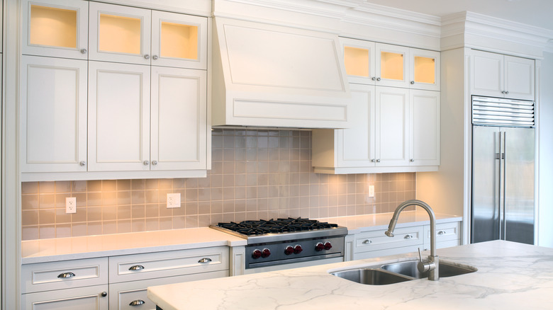
As more and more people join the smart home movement, they begin to experiment more with integrated lighting. And one way this appears in kitchens is with cabinet lighting. This can be under-cabinet lighting, under-toe kick lighting, and even inside the actual cabinets, especially if you have glass front uppers. However, you might want to skip leaning too heavily into this trend. "One design choice I often advise against is the use of excessive cabinet lighting. This includes downlighting inside glass door cabinets with built-in puck lights or an overabundance of under-cabinet tape lighting," Wyatt notes. "While some lighting can be functional and add ambiance, too much can feel overwhelming and take away from the overall aesthetic of the kitchen. I prefer a more balanced approach where lighting enhances rather than dominates the space."
Try to only choose one or two of these options rather than bundling all of them into one design. For example, under-cabinet lighting is useful because it's task lighting that helps you see more clearly what you're doing on the countertop. However, toe kick and downlighting inside cabinets are more for aesthetics and can easily be skipped. Similar to this, another cabinet trend that is taking off is adding a table lamp in your kitchen for added soft lighting, but if you already have a lot of elements in your space, this can seem like overkill. Make sure you're constantly seeking balance rather than overload.
