Beautiful Paint Colors That Are Perfect For A Cottage Kitchen
The kitchen is usually considered the heart of the home, but if you're looking to make it feel even more warm and inviting, then consider giving it a cottage spin. Cottagecore decor took off in 2022 as people looked to make their spaces homier, more lived-in, and just a little more aspirational. To make it feel nostalgic and cozy, you need to focus on rustic elements like worn wood pieces, antique finishes, and touches of meadow-like flowers. But most importantly, you have to get the color palette down. This trend uses neutrals and pastels, and what you paint the walls and possibly cabinets matters. That's why we asked an expert which colors to use to decorate with a cottagecore aesthetic.
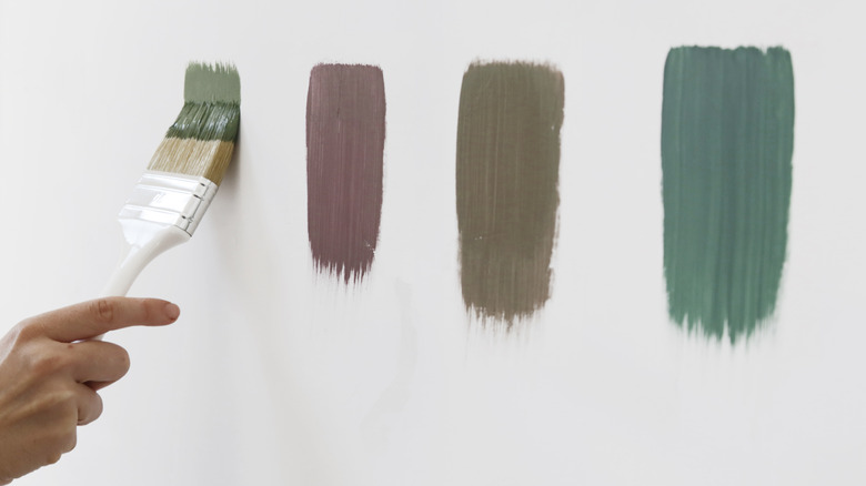
According to Erika Dale, interior designer and founder of Erika Dale Interior Design, you should focus on neutrals and pale colors. For neutrals, she exclusively tells House Digest to try Benjamin Moore's "Natural Cream," which is a light greige that can easily blend in with both warm and cool colors in the kitchen. She also suggests trying Farrow and Ball's "Hardwick White," which isn't white but rather a traditional, chalky gray formulated for historic homes or classic designs. As for pops of color, she suggests Sherwin-Williams' "Dutch Tile Blue," a grayish-blue, and Farrow and Ball's "Vert de Terre," a light, earthy green.
Why you should try using these colors
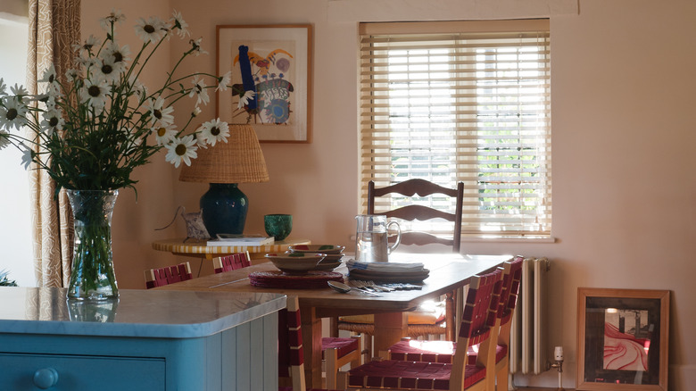
When choosing your cottage kitchen colors, Dale recommends picturing an authentic countryside kitchen and thinking of what key elements makes it feel provincial and nostalgic. "The charm of a cottage kitchen comes from its humble yet quaint historical roots, bringing to mind a picturesque old English cottage surrounded by greenery and garden roses," she exclusively tells House Digest. "Calling back to its pastoral origins, cottage kitchens look incredible in historical hues that honor a bygone era and are a mix of earth tones, garden greenery, and blue skies." If you add those greens, blues, and whites to your own space, you will mimic the outside inside. (Which also lets you play with the trending biophilic design that's taking off right now.)
"For a more neutral palette, I love soft creamy whites, like Benjamin Moore's Natural Cream, to give that light and airy feeling that contrasts beautifully with natural wood finishes," Dale explains. But to keep the kitchen from being washed out or one dimensional, she suggests also bringing in a mid-tone neutral like Farrow and Ball's Hardwick White, which will bring " a sophisticated depth while feeling right at home in a quaint cottage kitchen." If you want to introduce color to the space, then you can't go wrong with earthy greens and blues. "Look to nature with a muted sage, such as Vert de Terre by Farrow and Ball, or soft gray-blue, such as Dutch Tile Blue by Sherwin-Williams, for a look that would flow seamlessly to the outdoors," she explains. And as a bonus, these work both on walls and cabinets alike.
How to choose the right color for your own space
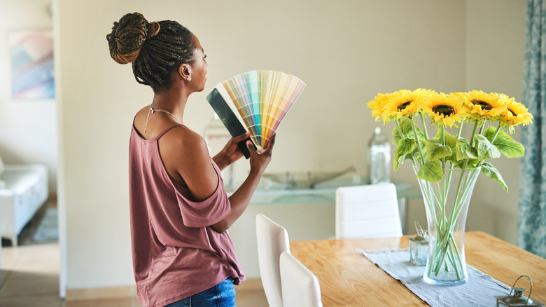
Do you like Dale's suggestions but want to try to find some more shades? If you don't trust your eye when looking at paint chips at a hardware store, then there are ways you can narrow down your picks before heading to the paint aisle. You need to look for inspiration first, and then pinpoint what you like about it. "For choosing the right paint color in any space, look to social media or magazines for style inspiration," Dale exclusively tells House Digest. "For historical styles like a cottage kitchen, do a little research on the hues original to that time for inspiration from the past. Most of the major paint companies actually have a historical colors section with various eras so it is a great starting point." Looking at all three of these avenues will help you find some more shades that might be in line with your preferences.
However, once you narrow down your shades, make sure you go home with more than just a paint chip. You also should get a small paint sample you can put directly on the wall. "Finally, keep in mind that colors will look different on the swatch than they will on the cabinets or wall, so be sure to paint a large sample in your space and view it in the natural light throughout the day to be sure it's the one before committing," Dale points out. The color will look different in the morning versus peak afternoon versus early evening, so painting it on your wall will help you decide if it's a good fit.