The Best Blue Paint Shades For A Dark And Moody Living Room
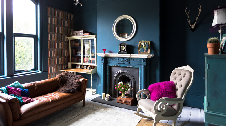
Don't you just love a moody room to embody all the cozy fall vibes (and keep them, even during the spring and summer seasons)? If you're trying to get those intimate, dark feels all year long while finding new ways to incorporate blue into your home, painting your living room walls a tasty shade of this color can help turn your space into the ultimate respite for dark academia vibes. Choosing the ideal shade can be tricky, as blue paint can easily lean into navy reminiscent of coastal decor, and too soft of a blue will take you into pastel territory. With so many different choices, which one do you want for the moody aesthetic of your dreams? Darker blue shades with green or gray undertones are great examples of the palette that can evoke the aforementioned vibes, and you can play with similar colors to capture the result you want.
For moody backdrops it's fun to play around with different undertones in your blues. If you're leaning more into a dark Gothic vibe, why not try out paints like Farrow & Ball's Inchyra Blue, which, depending on the light, has a green or gray tinge that leans into a chic, rich aesthetic. Complement this shade with black, brass, leather, or pops of green throughout the room. Incorporate rust and crimson for a rich layout that is both inviting and stylish. Still Water by Sherwin Williams offers the same undertones but in a slightly different tone, but both paints will create a similar moody aesthetic perfect for your living room. Gray also helps ground a space and bring a timeless essence, keeping your room moody but not gloomy.
Accent your blue walls to keep the moody vibe
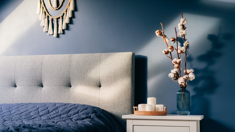
Your living or family room are among the best places to use dark blues in your home, which is why you could choose to go with a true blue/navy palette. Just make sure you decorate properly to enhance the moody vibe rather than introducing a coastal feel, which can happen with too many whites, creams, and beige accents. Benjamin Moore's Gentleman's Gray is a mixture of black and teal tones, making it more of a solid, deep blue that exudes a traditional finish. To avoid turning your aesthetic into a sea captain's delight, use cool, classic neutrals to create dimension in the room. You can apply small additions of cream and beige, which complement any shade of blue in a soothing and timeless way.
For a nice mix between the green/gray undertones and the black and teal mentioned above, try a shade like Farrow & Ball's Hague Blue, which still has a touch of green but still gives a polished and refined look to the room. Because of the balance, you can use greens, tans, browns, rusts, ochres, and even black decor around the space, bringing out the intimate tones associated with a dark but welcoming interior design.