The Bright & Bold Color Trend You'll Be Seeing More & More Of In 2025
Color trends of 2024 were all about muted shades and earthy tones. These are classic colors that fit almost any interior design style and appease the masses. Well, say goodbye, because we're leaving all that behind. Bright, bold, and eye-catching color is what 2025 is all about, with deep reds setting the pace. This time around, you'll see warm reds sprinkled throughout the room in the decor, furniture, and paint. Think reds saturated with deep brown, purple, or orange tints, not the blinding firehouse hue.
The deep ruby red paint color Rumors is Behr's 2025 Color of the Year. This is a sign that shades of the primary color are going to dominate. It's not only trends in interior design that come into play but also consumer buzz in other spaces like fashion and travel that determine the winning hue. Red coming out on top proves that people don't just want neutrals and earthy tones that everyone will favor, but they want to showcase character and warmth that truly speaks to them.
Furthermore, the popular "unexpected red theory" is all about adding red to spaces where it doesn't seem like it would belong. This viral TikTok decor trend is polarizing the internet, and we expect that it will only continue to grow in popularity in 2025. Fortunately, there are lots of creative ways to incorporate red into your home decor. Even if it's not your favorite hue, a deep red tone can be tailored to your unique style so you can embrace this new season of bold personality.
Get ready for red
If deep, warm reds really speak to you, then the best way to add them to your design is with wall paint. Coat all four walls for a cozy hug, choose a lucky side for a focal point, or layer wallpaper with red accents. Alternatively, adding red decor is the easiest way to enjoy the trendy shade without making too much of a commitment, especially if you don't like decorating with dark colors. Pillows, curtains, and books are simple pieces that will bring a stylish pop. Even adding a bowl of apples or a vase of roses will have you on trend.
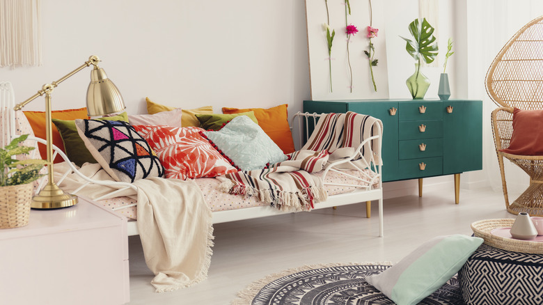
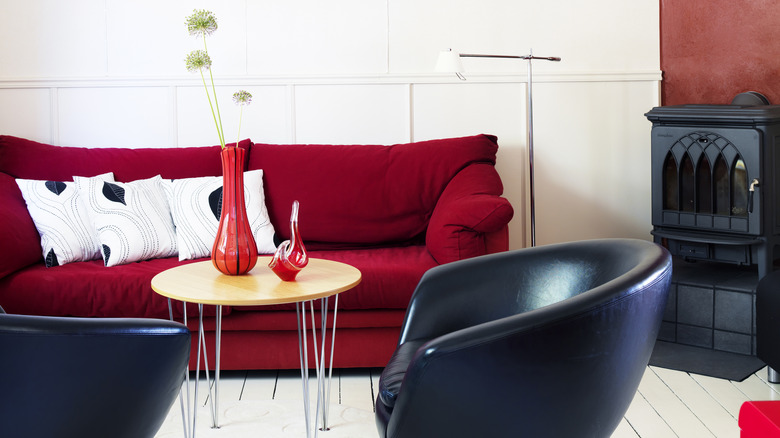
Red might be one of the main colors in your design, but it shouldn't be the only hue. Regardless of whether you color-drench the room with paint or just add some decor elements, you should still include different shades to break up the design. There are several color palettes to use if you're featuring red. For fans of neutrals, stick to warm whites, grays, and golds to carry out the cozy feel of this rich primary color. Red will be the main pop, but you'll still have a classic feel with your timeless neutral shades. If you want the red to stand out along with other vibrant hues, deep green could be included. These shades are opposites on the color wheel, so they'll contrast, but it'll be a good fight. Finally, to make the red harmonize rather than be the lead singer, pair it with other warm colors like yellow, orange, and pink — all the shades of a captivating sunset.