The Bathroom Design Rule Hilary Farr Doesn't Always Stick To
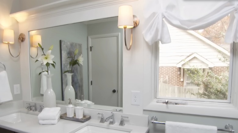
There's hardly a more trusted name in the world of interior design than HGTV's Hilary Farr. Starring in the hit series "Love It or List It" and "Tough Love with Hilary Farr," the designer has made a name for herself because of her ability to create havens that homeowners love with timeless, functional designs. Knowing exactly what her clients will love and executing it sometimes means that Farr isn't afraid to break established design rules in the name of creativity and cohesive design. One HGTV project that showcases Farr's rule-breaking streak comes from Season 11, Episode 2 of "Love It or List It," where Farr goes against conventional design norms to make a small bathroom look larger. Hilary Farr opts for a single mirror set in the middle over a double vanity and two wall sconces for lighting on either side in the cramped space.
Conventionally, the general rule about the right size for a bathroom mirror over a double vanity is to either use one large mirror that spans the width of both sinks or two separate mirrors with a gap between them. This is a rule Farr ignored, as the one large bathroom mirror doesn't quite span the length of the double vanity. Instead, there are a few inches of space on either side where the wall sconces are installed. Below, we break down Farr's rule-breaking bathroom vanity mirror design choice and help you decide whether you should adopt a similar rule-breaking streak.
Hilary Farr makes the most of a small bathroom
In this episode, Farr's task was to renovate a tiny bathroom to make it more livable for a family of four. "That master bath is a joke," said client Greg before the renovation. "It's kind of like a water closet." Thankfully, Farr was able to come up with a workable solution. She replaced the single vanity with a dual vanity and created a much bigger shower and a separate water closet for the toilet. Instead of the traditional two mirrors (one above each sink) or one long mirror that spanned the length of the entire vanity, her singular mirror left a bit of room on either side for wall lighting. But, breaking this design rule didn't seem to bother her clients.
"It is nicer than I even imagined," said client Jamie. Sharing excitement about the new double vanity, she added, "Two sinks which is wonderful." Unfortunately, Farr's fans didn't all have the same response. One YouTube commenter said, "The mirror in the bathroom with the two sinks is too short or rather not wide enough...It should line up with the end of the sink." This isn't the first interior design rule Hilary Farr ignores, but it also isn't a rule that she always ignores, having opted for dual mirrors over double vanities in other projects. In this case, Farr made the best of a small space, using one mirror to make the bathroom look bigger while leaving space for ample lighting to keep the bathroom bright.
You should consider this rule-breaking bathroom design
Fans have learned many bathroom design tips from Hilary Farr, and this rule-breaking two-vanity-one-mirror design is certainly one of them for a small bathroom. This design choice simply breaks one rule in favor of another one. It's a design rule that large mirrors reflect and bounce light, making small spaces look bigger. Farr used this steal-worthy trick instead of using two smaller mirrors, which could have made the bathroom look cramped. Secondly, the HGTV designer's choice to leave room on either side of the vanity for wall sconces was smart to keep the space well-lit and add some glowing warmth to a cool color scheme.
The crown molding on top of the mirror didn't leave space for above-mirror lighting, and the wall on the left of the vanity and window on the right didn't leave room for wall lighting if the mirror extended the width of the vanity and stuck to the conventional bathroom "rule." Since custom-size mirrors can be costly, using a slightly smaller one like Farr did can also be a money-saving trick. Also, because she broke the rule and used a smaller mirror, she was able to include not only ample lighting but also an extra outlet on the right side of the vanity. This is a practical design choice if you have a similar small bathroom, but still want to ensure you can comfortably fit two sinks, a large mirror, enough lighting, and wall outlets as well.


