12 Clever Home Design Tricks The Property Brothers Swear By
We may receive a commission on purchases made from links.
Everyone's favorite real estate and design twins, Drew and Jonathan Scott, know a thing or two about decorating a home. The pair has revamped hundreds of houses across their many long-running HGTV shows, including "Brother Vs. Brother" and "Property Brothers." With their keen eye for design and no-nonsense approach to what works and what doesn't, viewers trust the Scotts to offer them tried-and-true design tips.
There are a few things the brothers would never do, like randomly hang a gallery wall without doing a little bit of planning first. They would also never want to match every single décor item in an open-plan house. However, loyal fans also know the boys would be the first to tell them to go for it, if it's what they really wanted. Through years of experience (and plenty of trial and error), the Property Brothers have narrowed down their list of clever home styling tricks that they absolutely swear by. These are a few of their favorites.
1. A fun gallery wall can go a long way
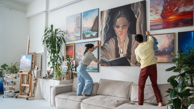
One of the best ways to add personality to your home is by hanging up art that you enjoy. Whether it's a print of a famous work, family photos, or even a sketch you created yourself — there is no better way to show off what is important to you. "Whenever anyone puts décor or artwork on the walls, it's always personal," Drew Scott told NBC News. "You want people to come into your home and see something that reflects your personality."
Something that's easy to struggle with, however, is how to arrange the frames. A large wall with just one frame might look worse than an empty one, while a crowded wall can easily become cluttered. Luckily, the brothers have a few tips to make things look professional, fun, and stylish each time. "When hanging wall art, the layout and spacing is art in itself," Jonathan Scott told Bustle. To get the right look, he has two main rules. "Leave two inches between frames no matter what your formation," he said. This way, there is never any crowding and you can make the frames seem uniform. Next, the HGTV host says you should "make sure the proportion of artwork to wall is balanced. Artwork that is too small makes your wall look sad!" If you have a larger wall, you will need more art to fill it, so there isn't any awkward space around the edges.
2. Painting brick can add a fresh look
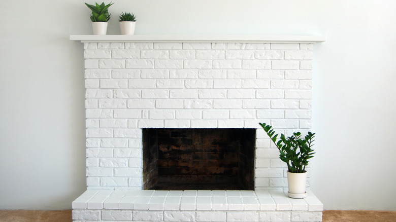
Changing the vibe of an entire room is sometimes as easy as buying a few cans of paint. This is especially true when updating brick. Whether it's a fireplace, or an exposed wall in a more rustic loft, if you don't like the ruddy red hue of natural brick (or the builder-grade feel of concrete bricks), it's easy enough to change it. "Paint lets you freshen up brick the easy and inexpensive way," Drew Scott told HGTV. "Try white, off-white, or a pale gray and your room will instantly look bigger and brighter." Painting brick is an easy DIY project that even the most inexperienced home decorator can complete. Something to keep in mind, however, is that brick is porous, so you might need to add a few more coats than you were expecting, and it's also a good idea to apply masonry primer.
However, painting might not be enough to get the look you really want. "Painting brick can be a great option if you like a rustic style. But the paint isn't going to hide the brick, so if you don't like the way brick looks, it won't help," Jonathan Scott added. "Instead, consider covering it with tile. Never keep a material you hate just because you think it has character." Luckily, installing tile on your fireplace is also a relatively straightforward task.
3. Don't be afraid to mix and match
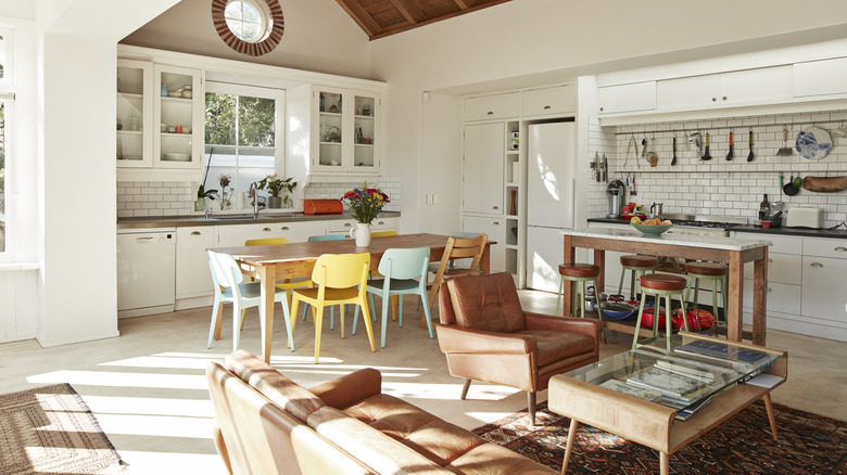
Many enjoy homes with open floor plans, as eating, living, and working spaces flow into each other without anything in the way. However, decorating these homes can be stressful as you attempt to keep everything in the space on theme. For instance, if you can see the living room from the dining room, then you might think each item in the two areas must be uniform. However, this doesn't always have to be the case. "People think you have to match things in open floor plans," Drew Scott told Good Housekeeping. "Matchy-matchy is really boring."
Instead, the best thing to do is to "find things that complement [each other] and even [introduce] some nice contrast throughout the space to bring more personality," he continued. To put this in context, however, Scott is speaking about furniture and accessories. It's a good idea to start by creating a cohesive backdrop with the same color on the walls and the same type of flooring. From this base, you can branch out to add some flair. This might be mixing mid-century modern décor and furniture in the dining room with a farmhouse sink and Art Deco drawer pulls in the kitchen. It could be a bright, loud rug in the living room with more somber textiles in the office — or simply mixing in vintage and thrifted finds to create a collected feel. When building off a balanced base in an open floor plan home, the décor combinations really are endless.
4. Sprucing up your porch is like adding another room
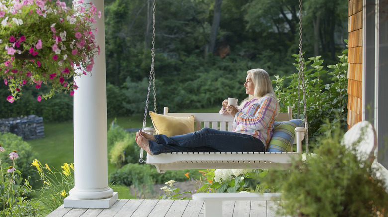
If you never feel like you have enough entertaining space inside, one of the brothers' favorite decorating tips is to simply make your porch feel more like an interior room. "People don't know how to utilize a good outdoor space to maximize its potential," Drew Scott told C'mon Get Crafty. "The outdoor space is a way to add extra square footage without having to do a hard renovation. So I like that. To be able to design an outdoor space that feels like comfortable indoor living? It's fun."
In the episode "Perfect Master Suite," of "Property Brothers: Buying & Selling" Jonathan Scott gave viewers a good place to start. "Seating and planters boost curb appeal," he said, per Realtor.com. Planters can be attached to your windows, or be freestanding, but they always add a nice touch of lively color to a porch. If you don't have much of a green thumb, avoid flowers and consider planting succulents. They tend to be a touch easier to take care of. As for furniture, what you choose depends on your preferences, and the climate. A porch swing might be nice for moderate climates where you spend lots of time outside. If you are only going to be out during the summer, a lightweight, easy-to-move (and store) table and set of chairs might suit you more.
5. Built-ins solve your storage problems (and keep things stylish)
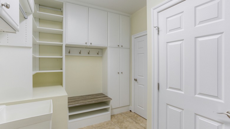
One of the best decorating tricks in the Property Brothers' arsenal is actually built-ins! Typically used to talk about shelving or cabinets, the term covers so much more, including benches and other seating options, too. Built-in furniture works well because it keeps a space more visually streamlined as everything is uniform, instead of a mismatch of different shelves, cabinets, and bins. Having built-in features may also bolster the price of your home when it comes time to sell. "Built-ins in my opinion are the way to go, you're adding value — if you do it right — you're adding value to the home," Drew Scott told C'mon Get Crafty. "It could be low profile and decorative, it could look great."
The best part is not only does the uniform look of built-ins help to keep an uncluttered, seamless feeling as far as décor goes, but they also have practical, clutter-busting benefits. For instance, a built-in bench can provide you with bonus storage space, leaving you with less clutter laying around and more room for attractive décor. As Drew Scott aptly observes, "You're hiding all the kids' toys inside." While we're on the topic of toys, it turns out there's another smart Scott-approved option that can help hype up the style of your home and secretly store miscellany. The HGTV host says that cubes are "basically like an ottoman or small poof, they're just actually hidden storage as well. Comfortable for seating if you have more people over or if the kids are there. Plus you get storage inside, so it's two for one." A storage solution that functions as personality-adding décor and stylish seating in your home is a win/win.
6. Make a home look bigger by keeping things to scale
A key design feature in many homes is making sure the items in each room are to scale. If your furniture is too big, it can swallow up a room. This makes it hard to move around freely and will visually overwhelm a space. If furniture pieces are too small, things will feel awkwardly empty. Instead, it's important to match larger items like your couch, bed, etc. to the available square feet in the room. This can make even smaller rooms seem larger. "Switch out bulky furniture with multifunctional, properly sized pieces," Jonathan Scott told Bustle. "For example, your coffee table and ottoman can double as storage units."
By combining storage with moderately sized furniture, you can free up a lot more space in each room for purely decorative items, like paintings, throw blankets, and even sculptures and plants. If you find that there are still too many things on the floor, Scott advises you "add a pop of color and some cool shelving to move things off the ground." This trick not only removes clutter, but tall shelves can also move the eyes up and away from the floor, making the room appear bigger.
7. Use natural light to make a space look bigger
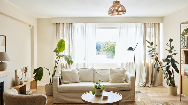
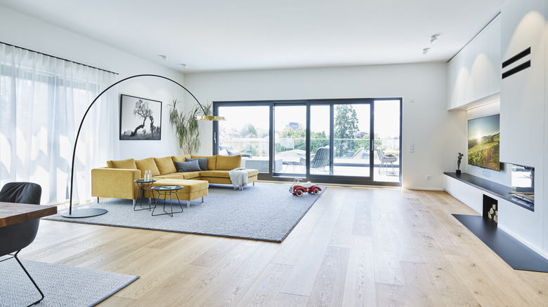
Even if your living space is quite large, if it's dark and dingy, it's going to seem a lot smaller than it actually is. Because of this, the brothers encourage everyone to leverage natural light to their advantage. While heavy, dark curtains might fit in perfectly in a spooky castle, or oak-paneled library, the average family room could do with something a little bit less dramatic. "Make use of any natural light by replacing heavy drapes with lightweight panels that let in the sunshine, but can still offer privacy," Drew Scott told Bustle.
The curtains don't need to be completely transparent to get the job done. Instead, look for lightweight options like cotton, and other linen blends — and even some forms of polyester. These are just thick enough to keep out prying eyes, but will still let the sunlight filter through, even when shut. If you are not sleeping in a space, then it usually doesn't need to be completely blacked out. Typically, a thin (but not sheer!) curtain panel will do the trick. If you do need to thoroughly block out light at times, you can still avoid heavy drapes by buying or DIYing some roller shades for your home that can discreetly tuck away at the top of your windows when not in use.
8. Wooden feature walls can add character
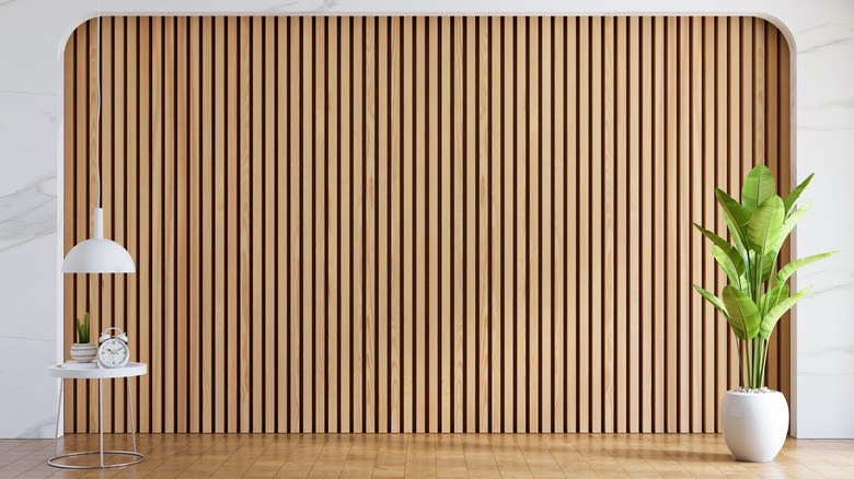
An interesting way to add visual detail to a living space is by adding a wooden accent wall. It's similar to painting the wall a bold color, but it brings even more life to the room because it adds texture, too. This is great for a farmhouse, or anyone trying to recreate the modern farmhouse style in their own home. The best part is that this can be a quick DIY, so your home could have a new décor feature in just one afternoon.
"It's so easy," Jonathan Scott told PopSugar. "There is a product now that's amazing — it's like a veneer with adhesive on the back. You just cut the boards, and stick them on your wall the way they are. It gives you that whole barn board look. I love reclaimed wood and I love reclaimed rustic pieces." The HGTV host didn't give the name of the product, but stikwood sells real reclaimed planks with self-adhesive strips at $15.50 per square foot. If you're after a cheaper solution or want something low commitment, you can simply grab wallpaper that looks like wood on Amazon ($24.99 per roll). For a higher price point, you can pick up acoustic wooden panels from somewhere like WVH ($249.99 for two panels). This takes a bit more savvy to install, but will get you that authentic look and make your space less echoey.
9. Keep close to the classics for big-ticket items
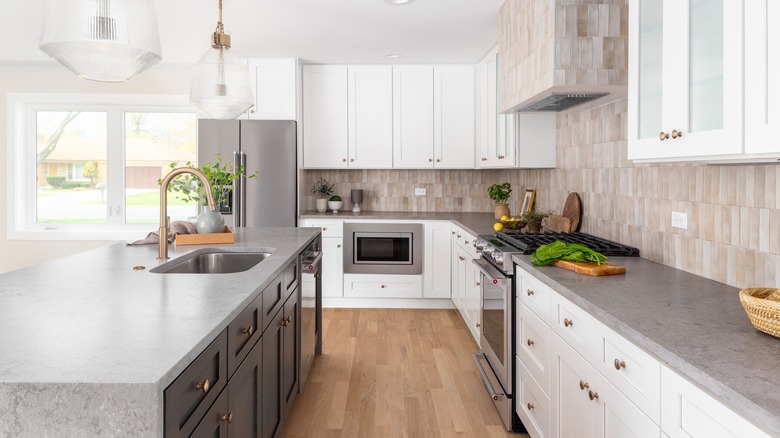
A great tip for a well-decorated home is to keep things simple ... at least when you are buying something expensive. "Try not to go too bold on the more expensive items like counter tops because the more bold you go, the quicker they'll go out of style," Drew Scott told NBC. This is good advice for all décor items that can fall in and out of fashion, like bathroom tiles, cabinet colors, trendy (but pricy) knickknacks, and even appliance finishes. The same goes for larger furniture items like couches and bed frames, too. Is what you're eyeing still going to look good ten years from now? A great way to test this is to think back to ten years ago. Was the countertop you want to install popular then? If it was, and it's still stylish and popular today, you will likely have more luck.
If you're stuck, stick with the classics. Scott argues that you should stay away from dated items like laminate and go for timeless selections instead. "I can't think of a single kitchen design where laminate would look better than stone, butcher block, or a solid surface like Corian," he told HGTV.
10. Hardwood flooring isn't the only chic option
Once thought the end-all and be-all of luxury flooring, hardwood might actually be on its way out as the best decorative option. "There are much better products that are far more durable," Drew Scott told Good Housekeeping. "Luxury vinyl is an example [of a material] that can look like hardwood, but it's way more durable." With luxury right there in the name, this option is hard to beat — especially at its price point. You can typically find LVP for almost half the cost of traditional hardwood. While there are a few mistakes to avoid when installing vinyl plank flooring, it is typically a project that determined DIYers can complete themselves.
A quick tip if you do choose LVP, however: You have to stick with it. "I have a rule: You should never see more than two types of flooring from any one place in your home," Jonathan Scott told viewers in the "Finding a Positive Balance" episode of "Property Brothers: Forever Home," per Realtor.com "So we're laying the luxury vinyl flooring throughout the entire main living areas."
11. Use fruits and vegetables as linen stamps
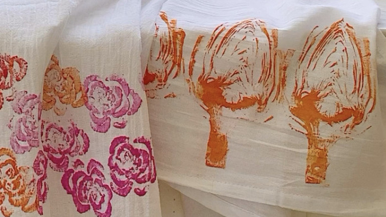
If you're feeling crafty, the Property Brothers have a DIY kitchen towel trend you might want to try, which will give a pop of personality to your space. This easy DIY involves using fabric paint and cut fruits and vegetables as stamps to add color to plain dish towels. The Scotts posted the fun hack to their Instagram, saying in the caption "Fresh off the (veggie) press: your next summer DIY." This is also an easy project to get the kids involved in, and the Scotts humorously add, "This is one way to get them to have fun with vegetables...What would you print on your kitchen towels?"
The trick is simple enough to follow. Use a clean, white kitchen towel (Amazon sells flour sack kitchen towels in packs of 14 for $16.99) and have fabric paint or acrylic paint nearby in a few fun colors. Next, select your favorite fruits and veggies. Drew and Jonathan used an artichoke, onion, celery, and a radish. You could even reach for citrus fruits for a fun, star-shaped pattern. Simply cut the fruit or vegetable in half, apply the paint of your choice to the cut surface, then press it firmly onto a clean, dry towel. After drying (and ironing — so the paint sets) you have a fresh, bright decorative dish towel that's ready to use.
12. Follow your taste, not trends
The most important home décor trick from the Property Brothers is to decorate your home how you want to, not just how you think you should. "It's so important for people to have a space that they love, and that you wake up happy every morning in your house," Drew Scott told NBC. "A big part of that is what you have for your furniture, your art, your décor. If you're not stressing in your home, it will help you live many, many more years because you're happier where you live." It's essential that you choose things that light you up, and not worry that you have to stay on trend to be stylish.
If you enjoy things like open shelving, which the Property Brothers are known to hate, install it in your house, anyway! If you want every single décor item in your open-plan house to match, do it — it doesn't matter what anyone else says. Ultimately, the Scotts understand that having autonomy over your home can heavily influences overall happiness, and at the end of the day, it's your space. If wildlife warms your heart, go ahead and incorporate an animal theme through your home. Or maybe you're still very much into minimalistic décor, while the rest of the world seems to be going in the opposite direction. Don't feel you have to become a cluttercore design trend convert, or do dark academia décor when you love light and airy.

