The Bold Design Element Christina Hall Uses To Make An All-White Kitchen Pop
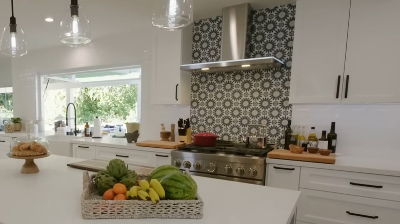
Interior designers know that when it's well done, an all-white kitchen is anything but vanilla. An all-white color scheme works with farmhouse, cozy cottage, contemporary, minimalist, and transitional styles. The timelessness, versatility, and serenity invoked by this pearly palette are just some reasons why white kitchens will always be in style. Unfortunately, a poorly executed white kitchen can look cold and clinical, so you'll want to plan well to make sure you can pull off the look. If you're dreaming about a cloud-colored kitchen that's far from dreary, you'll want to take a look at Christina Hall's coastal kitchen makeover from "Christina on the Coast" Season 4, Episode 4. To make an all-white kitchen pop, the expert designer used a navy blue, gray, and white sunburst pattern tile backsplash to add a subtle pop of color and brighten the space.
Although every element of Christina Hall's bright and airy coastal kitchen makeover is worth stealing, this backsplash design stands out as a unique design choice that can really elevate a kitchen. Since, on average, homeowners pay $26,945 for a kitchen remodel, but a backsplash addition only costs around $1,000 to update, Hall's idea can be an affordable way to bring some brightness and visual interest to a white kitchen. Below, we break down how Christina Hall uses this backsplash to liven up an all-white kitchen and how she complements it with her other design choices. Plus, we share tips on how to steal the look for your own home.
Christina Hall's bold backsplash design
For this "Christina on the Coast" makeover, Christina Hall designs an all-white kitchen for her clients that still opens up and brightens the space without making it feel austere and boring. She does so by using a clean creamy white for the upper and lower cabinets, white stone countertops, shiny white tile backsplash behind all the cabinets, and the star of the show — the blue, gray, and white sunburst backsplash behind the chrome range. This elegant and airy design in a formerly cramped space makes it one of the best kitchen makeovers from HGTV's Christina Hall.
"The colors that we chose — the light flooring, the white cabinets, the beautiful counters, the white backsplash, everything just makes it feel very warm and very bright," said Hall, describing the kitchen. And her client added, "This backsplash is just gorgeous," about the sunburst design. Hall pulled this bold backsplash off by incorporating other similar tones throughout the kitchen and the rest of the house so the kitchen design was cohesive and harmonious with other rooms, and the bold backsplash didn't look out of place. For example, for the middle island cabinets at the center of the kitchen, she used a light gray instead of white, which complemented the backsplash and added some more subtle visual interest without detracting from the otherwise all-white color scheme. Christina Hall also pointed out that this backsplash plays off another outdoor tile backsplash that uses the same colors in a different pattern.
How to steal the look for your all-white kitchen
The best part about Hall's creative kitchen backsplash idea is that you can steal the look without breaking the bank and personalize it by finding a tile that's harmonious with your desired design style. We recommend looking for tiles that fit your preference and budget and seeking to create warmth and light as Hall does. Floor and Decor sells a similar pattern of porcelain tile for $7.17 per square foot, but on Wayfair, you can find geometric patterned tiles for $4.69 per square foot. The HGTV designer chooses a variety of patterns and colors for her bold backsplashes in all-white kitchens, so don't be afraid to get creative. For example, in an ultra-modern all-white kitchen with chrome touches, she used a dark chrome, handmade subway tile backsplash behind the range to perfect the look.
Our other tip is to ensure you have other points of visual interest. Although Christina Hall uses white as her base color and uses it very liberally, she also chooses various shades and textures of white. For the cabinets, she uses matte white, and for the counters, a creamy white stone with a subtle gray marbling. For the cabinet backsplash, her white tile is shiny and textured, which adds both visual and tactile appeal. Finally, she's not afraid to work in other colors, like gray island cabinets and black hardware, to complement the bold backsplash and add subtle visual appeal, and you should do the same.


