13 Things The Property Brothers Would Never Do When Designing A Kitchen
We may receive a commission on purchases made from links.
There are some things Drew and Jonathan Scott would just never do when designing a kitchen. The brothers have dreamed up, torn down, and then gone on to remodel hundreds of kitchens over their expansive careers. So when thinking about the ultimate dos and don'ts of kitchen design, they are some of the top experts in the field. While some of their tips might seem like common sense (after all, who could possibly still be using laminate countertops), others are more niche and might not have occurred to those who don't live and breathe HGTV.
Even if you do, the brothers have a lot of advice out there — you might have missed it! So, whether you are designing your very first kitchen and don't want to make a mistake, or you just enjoy knowing what's in and what's out, the Scott brothers never hold back when giving design advice. These are things they wouldn't be caught dead doing with one of their kitchens.
1. Use laminate countertops
There is no one right answer for what material makes the best countertop, as what "best" really means can change depending on a person's needs. However, the Property Brothers are certain about one thing: There is a choice that will be wrong every single time. That choice is laminate counters, and they advise consumers to avoid them during kitchen renovations. "I can't think of a single kitchen design where laminate would look better than stone, butcher block, or a solid surface like Corian," Jonathan Scott said in an interview with HGTV. "Yes, laminate is cheaper, but in many cases, you can actually take value away from a house by installing it."
This decrease in value comes from the perceived cost of having to do a kitchen renovation to remove them. For many buyers, as soon as they see laminate counters during a house tour, they're immediately viewed as a future expense. While the cost depends on the size of your kitchen and what material you use, the average homeowner usually spends $3,133 on new countertops. Because of these prices, buyers might try to lowball you due to the amount they'll have to pay to get rid of the dated, unattractive laminate. To avoid disappointment, just stay away from it in the first place.
2. Create a peninsula with a countertop
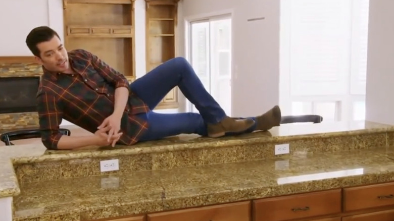
During Season 14, Episode 17 of "Property Brothers," Jonathan Scott wasn't shy about his hatred of designs that take up way too much room. When he entered the kitchen, he hopped up on the counter and laid down, showing just how much space was being wasted by the feature. "This closes off the flow to the kitchen so bad. I hate, hate, hate, peninsulas overtop of islands when you have the space," he declared.
The issue here is that because there is an island in the center of the kitchen, there is already more than enough extra counter space within the room. All the breakfast bar is really doing is using a multi-level obstruction to separate the food preparation area from where it might be served. The extra steps needed to get around the awkwardly-shaped peninsula could quickly become exhausting. Instead, the brothers warn against this popular feature and instead urge viewers to consider both functionality and flow when laying out their kitchens. If your home has a peninsula, it would require a major renovation to remove it. So, if you're designing a new kitchen, the brothers suggest you simply don't include one in the first place.
3. Make it all white
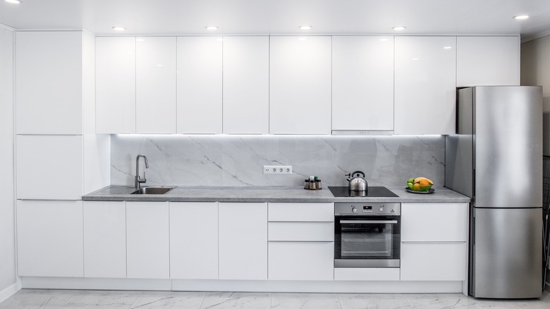
All-white kitchens have long been cheered as the ultimate kitchen design. This color palette is seen as classic, modern, and progressive, all in one. However, the Property Brothers have a different take on what actually works. "If people are going modern, they think of white everywhere, but maybe some contrast is good," Drew Scott told fans during their Room X Room series, which was live-streamed on the platform Bright, as reported by The Kitchn. The main downside of an all-white kitchen is the lack of contrast, which can add much-needed character.
How to achieve said contrast, however, is up for plenty of interpretation. Luckily, the brothers can offer a good starting point. "For the longest time, it's been white cabinets in white kitchens. Lighter colors help bounce light around and feel cleaner and brighter," Jonathan Scott added. "But I love a little color — stained wood, blues, greens." When designing your kitchen, plan for smaller pops of color, even if you plan to incorporate mainly white. Whether this is through bolder backsplash tiles, interesting window curtains, or even bold, brassy drawer pulls, take a moment to pause and consider just how blinding too much white really can be. If you don't incorporate colorful accents in the design phase, be sure to make them a priority in the decoration phase. Things like bright tablecloths, lush plants, and bold storage solutions can also do the trick.
4. Spend too much money on custom cabinets
Kitchen remodels can be very expensive. Custom cabinets often contribute quite a bit to the total price tag. In fact, the national average for custom cabinetry for a medium-sized kitchen is roughly $7,300 — and it only gets more expensive the bigger your kitchen is. Luckily, ordering custom cabinets when designing a kitchen is something the Scott brothers would never do. Instead, they suggest using prefabricated options wherever possible to save money without sacrificing any quality. "The quality of pre-fabricated cabinets is way better than it ever was in the past," Jonathan Scott revealed to NBC News. "And if somebody doesn't have the budget to do a custom kitchen, we actually will do prefab and finish it with details like molding to make it look custom."
Custom cabinets are one of the main design mistakes the Property Brothers avoid. To find quality prefabricated options, you don't have to look far. Many big box stores like IKEA, Home Depot, and Lowe's offer cabinets at different price points and materials, so you can find what works best for your budget and aesthetic. If the cabinets don't come in the color of your choice, follow the brothers' advice and make them your own. You can paint them, restain the wood, or add molding to fit them into your space better.
5. Install open shelving
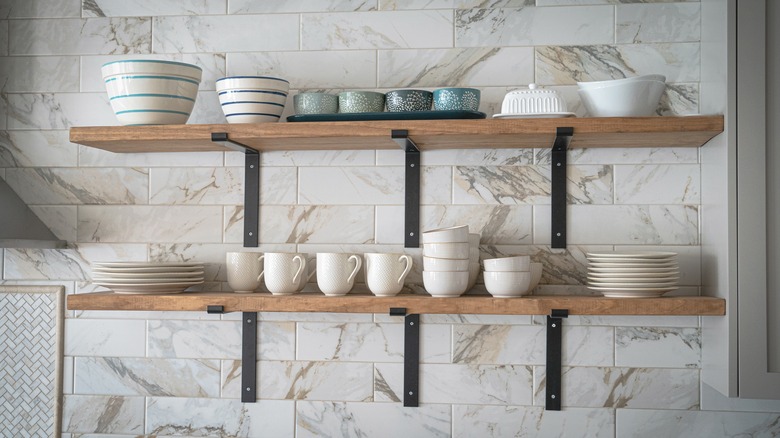
Open shelving can be a controversial choice within the design space, but the Property Brothers are the first to tell you to stay away from it. "Let me just say nooooo [to open shelving]," Jonathan Scott told Apartment Therapy. "You have to have upper cabinets, unless you have a huge abundance of storage in a pantry. But for families, for people in real life, anytime I've had a client who forced me to design a kitchen with no uppers, everyone has come back in six months saying they regret it."
The reason for this regret is likely not only about minimal storage space, but also about visual aesthetics. If you use it like actual storage and not decoration, open shelving can quickly look cluttered. If you can't store everything you need for the kitchen out of sight in the pantry, it's going to pile up on the open shelves. However, if you struggle with an "out of sight, out of mind" mentality when it comes to what's available, glass cabinet doors are a great compromise. This way, you can still take a visual inventory of your kitchen shelving without it being exposed to grease, crumbs, and dust as it would be on an open shelf.
6. Add glass block windows
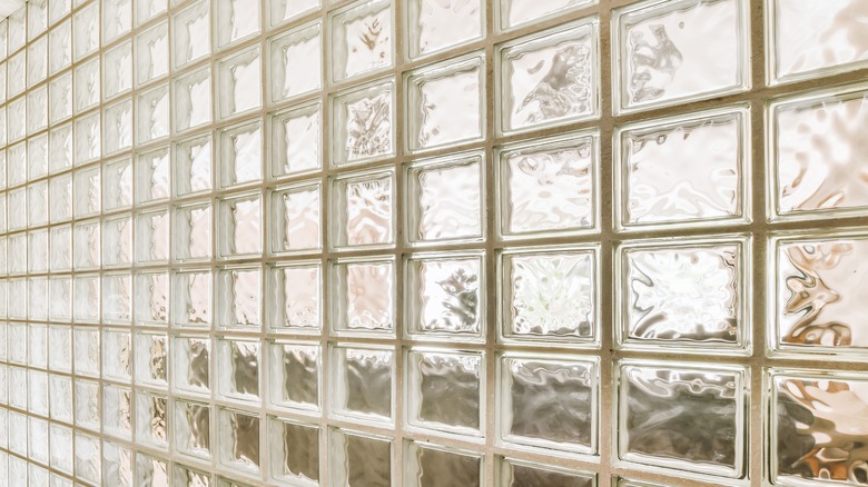
Kitchen trends come and go, but one that has been gone for a long time is glass block windows. These thick, clunky cubes were once very popular, but the brothers are quick to pass on them. "A huge hole in the front of your house would look better than these '80s-style windows," Jonathan Scott told HGTV, quick to make his distaste known. "I've also found that many are improperly installed, which makes them a major safety hazard."
To save your kitchen from being a dated eyesore from day one, don't install them. However, if you already have them in your home, all hope is not lost. "Remove any glass blocks immediately and sell them online — you can get serious money for them if they're in good condition," Drew Scott advised. "Then, if you want a window with detailing, install one that's frosted or has stained-glass panels." By taking this approach, you can even finance a portion of your windows' remodel with the cash you earned from selling the blocks. While eBay is always an easy choice for selling things online, FaceBook Marketplace has also gained popularity as a great place to buy and sell home design items.
7. Use gas appliances over induction options
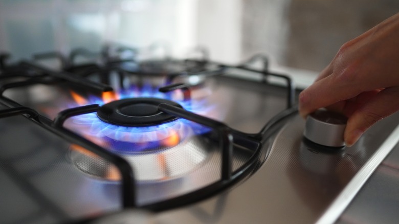
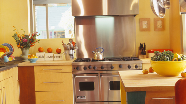
There was a time when gas appliances were preferred over electric options. However, the most convenient, energy-efficient choices continue to evolve. Now, the brothers prefer induction stove tops, and they aren't shy about their reasoning. "In addition to the new Energy System with the home, we also decarbonized by getting rid of the old gas range that we had, and put in this beautiful induction range," Drew Scott told fans during a YouTube tour of his new house. "I love this because it cooks a pot of water in half the time that it did with the gas range, and it's even heating."
Induction stove tops are three times more energy efficient than stove tops, according to the U.S. Department of Energy. That's because gas tops heat both the pot and the air around it, but induction ones only heat the pot, minimizing energy loss. This leads to a lot of energy saved, plus food that takes less time to cook. "Technology nowadays is so much better," he continued. "It can make your life easier than trying to struggle with old appliances." So before you splash out on the appliances you think are best, double-check to make sure there isn't a format that is better (and greener!).
8. Leave storage space unused
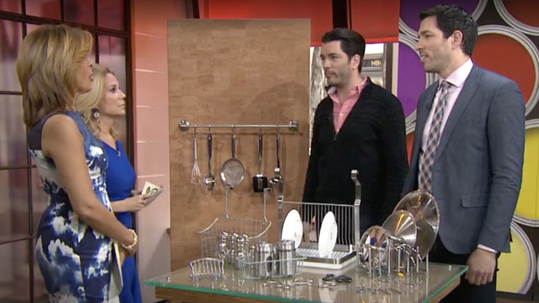
The Scotts are careful to expertly use all available space when designing a kitchen. They would never leave dead space when there is a chance it could be made useful. "In the pantry, you've got a space between the door and the shelves, usually," Drew Scott pointed out in a Today Show segment. He goes on to explain that by attaching a rack to the back of the door with screws, you can transform the formerly dead space into helpful storage. All you need to do is add S-hooks to the rack, and then hang everything from spatulas to strainers to spoons.
The brothers also emphasize an easy way to save money when using this hack: Don't shop for custom items! Instead, branch out a little and look outside the kitchen storage section. "You can use a towel rack, which is cheaper than most purpose-built kitchen items, to use the area for storage," Jonathan Scott shared. "A lot of bathroom accessories are cheaper than kitchen accessories." The same can be said for hanging baskets, racks, and other organizational items. If you can get creative and use things where they might not have been designed to go, but still work, your budget will thank you.
9. Allow the floor to be a slipping hazard
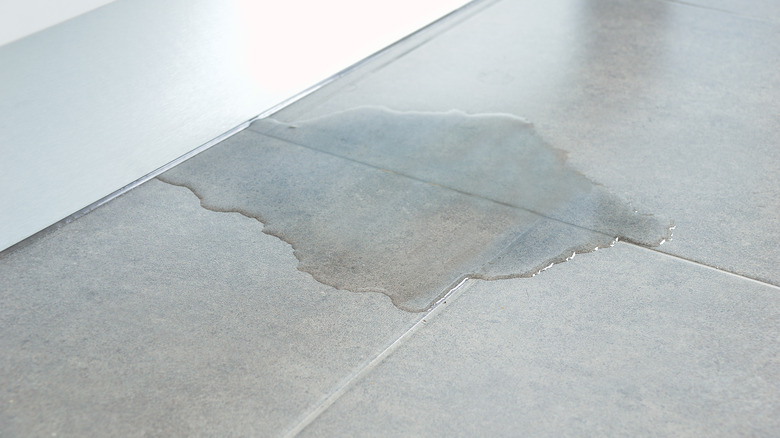
One of the things the brothers would never do when designing a kitchen is allow the floor to be dangerous due to its materials. Kitchens typically have slick surfaces for flooring due to them being a "wet" space. If you have carpet in the kitchen, it would quickly become gross due to dropped food, spilled liquid, etc. However, for many, these slicker surfaces can pose a fall hazard. To avoid this happening, especially in such a busy room, the brothers suggest a few design tweaks. "A kitchen is a place for get-togethers and talk and family meals," Jonathan told AARP, indicating that the room should be both functional and fun. "A little non-slip rug with a pad underneath is better than having slick tile everywhere," he continued.
Non-slip rug options come in many different shapes and sizes. You can purchase them from online retailers like Amazon or most home-focused stores like Home Depot, Home Goods, etc. There are two main options to choose from. The first is a non-slip pad that goes under a rug of your choice, like this one. The second option is a non-slip pad with a design printed directly on it, like this one. Either option provides the element of safety that the brothers suggest; the best option for you simply depends on your personal style. Just make sure you buy a machine washable rug so it can quickly be cleaned if there are any inevitable spills or messes.
10. Use tiling on preparation surfaces, as it gets too dirty
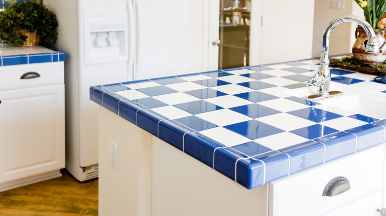
The kitchen is one of the busiest rooms in the home. As such, when designing the space, the Scotts are careful to include features that either stay clean or are easy enough to get clean. Tile countertops are definitely not on this list. During Season 7, Episode 13 of the hit show "Property Brothers: Buying and Selling," Jonathan Scott was quick to point out his distaste for the choice when surveying a client's home. "I hate tile counters ... They just suck up all of the grime and the grease," he said, wrinkling his nose in disgust. Drew Scott also chimed in, exclaiming, "That food that you see? Pick it out!" when taking a closer look at the countertops.
Because of this, be sure to add tile to the list of design trends to avoid in the kitchen. Instead, the brothers are big fans of more classic options. Their book "Dream Home," shares a few of their favorites. "We love materials like quartz and Neolith for durability and no maintenance, but other products add beauty and value too, like marble and granite — they just need more maintenance," they wrote, as reported by The Boston Globe. "Try to avoid materials that scratch too easily, because you'll shed a single tear when you scuff them up within the first week."
11. Keep the microwave on the counter
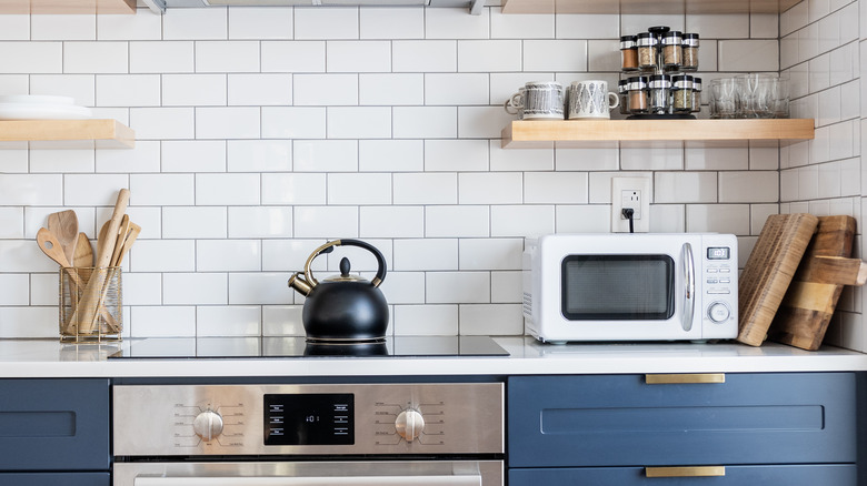
Kitchen counter space is always at a premium. So when the Property Brothers design a kitchen, they never leave the microwave out. They think it's a waste of space, and if you plan ahead, it can easily be hidden. If you need more room in your current kitchen, it's a two-step process to free up a spot for your microwave. First, take out a drawer or two from a cabinet you can easily empty out. For step two, hire an electrician to install a plug in the hollowed-out space. Once done, "the units are pretty plug and play," Jonathan Scott explained to Architectural Digest.
If designing a kitchen for the first time, consider skipping microwave storage altogether and instead adding an integrated microwave drawer. This is a microwave that slides out like a drawer, and it's an appliance Jonathan likes to use for pretty much all of his clients. "If you put a regular microwave below the counter, it's very hard to get to because it's so low," he told Delish. "With a drawer microwave, you press a button and a drawer comes out that you can drop food into."
12. Go overboard with color when not needed
The amount of color a kitchen actually needs is highly contested within the design world. While the Property Brothers are not firmly pro or against, they do have a few guidelines to steer you in the right direction when including it. In the "Las Vegas Classic" episode of "Property Brothers: Forever Home," Drew Scott tells viewers, "The kitchen backsplash is a vibrant opportunity to add pops of color." However, he doesn't think the color should take over the entire space. "Make your statement behind the range," he continued, indicating that the spot between the stove and the extractor was perfect for something loud. However, the rest of the backsplash should be relatively plain.
The other misstep with color that the brothers often see is layering too much of it. This can be particularly noticeable in smaller kitchens where the eye doesn't have as much space to go. "If you're thinking of having colorful tile and cabinets, we want to stay relatively neutral for the countertops," Drew went on to share. In this instance, his brother Jonathan chose to add white quartz countertops to the kitchen. This way, the louder color of the backsplash is nicely anchored by the countertop, instead of overwhelmed.
13. Use fancy lighting over simple and effective options
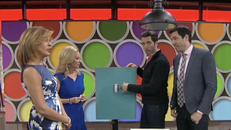
While the brothers are careful to combine the best options for budget and aesthetics for their clients, they also recognize that looks aren't everything. Because of this, the Scotts are big fans of using what works instead of splashing out when it's not really needed. "You know, pendant lights can be a lot less expensive than some of those blingy chandeliers," Jonathan Scott said in a Today Show segment about lighting up a kitchen. When looking for a way to illuminate your breakfast nook, cooking island, etc. reach for something simple. "And if you want to set the mood, add a dimmer," Drew added.
As with any DIY project involving electricity, the brothers advise caution. While both of them are seasoned contractors who feel comfortable changing out lighting, not everyone might be able to do so. While hiring an electrician is a great idea for this task, the Scotts advised those in the audience to turn off the power for the impacted outlets if planning to do it on their own.

