Outdated Cabinet Trends That HGTV Stars Are Ready To Put To Bed
We may receive a commission on purchases made from links.
In the ever-evolving world of home design, what was once considered chic and stylish can quickly become outdated and just plain ugly. Cabinets, whether they are in the kitchen, laundry room, or bathroom — are no exception to this cycle. And there are certain cabinet trends your favorite HGTV stars just can't wait to see the end of. In fact, some of these trends were once favorites of the likes of Jasmine Roth and Christina Hall, but now they advise most people to stay far, far away due to them aging poorly. Since these stars at not only setting the trends, but also helping those who have fallen for poor design in the past update their homes, it's best to trust their judgement.
Whether it's about the overuse of dark, heavy cabinetry that makes kitchens feel cramped, or the once-popular but now-tired idea of open shelving, we've rounded up the best advice from these designers for your home. So if you're considering a property renovation or simply want to stay ahead of the curve just in case, read on. We're diving into which styles are making an exit (and what you should be embracing instead)!
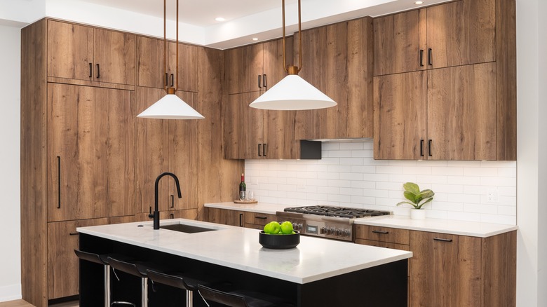
Hilary Farr dislikes stained kitchen cabinets
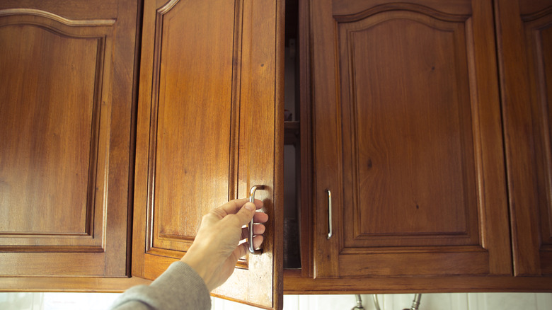
Hilary Farr is a longtime HGTV icon and host of shows like "Love It or List It" and "Tough Love with Hilary Farr." So, she's been in the game long enough to know when a trend has run its course. When it comes to cabinets, that trend for Farr is stained kitchen units, as they often don't look like they belong in the space. In fact, Farr went so far as to say that this trend can actually distract the eye from other, better parts of the kitchen. For this reason, she suggests skipping it going forward.
Yet with all great trends, there is one exception to Farr's distaste. This is a "super cool walnut that is repeated and reflected somewhere else" within the space, Farr told Apartment Therapy. So if you have your cabinets stained this color, consider tying it all together by having a matching kitchen table, chairs, or even a drink cart. This way, according to Farr, the color doesn't look out of place.
David Bromstad thinks deeper shades of wood age a home
David Bromstad of "My Lottery Dream Home" is typically known for his immense love of color. However, when it comes to cabinets, there are certain shades of wood stain that he is always more than happy to get rid of in a home. If it is too dark, he is more than happy to see it gone. "I would strip all that down and then bleach it, and it will come out almost white," he said while examining outdated cabinets during an episode, per YouTube. "And, you'll have a natural look that's casual, and you'll see the wood grain, and it's absolutely stunning."
Luckily, stripping wood is a relatively simple DIY process that many people can handle. A chemical stripper, like Citristrip from The Home Depot, works to remove the layers of dark stain, revealing the lighter tones underneath. Then, you can use a wood bleach, like this option from Amazon, to brighten and lighten the surface of the cabinets.
Jonathan Scott thinks open shelving is always a mistake
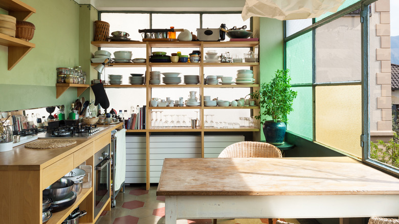
Open shelving seems to have always been a controversial design take, but one half of the "Property Brothers" duo just can't wait to finally see the back of it, once and for all. "Let me just say nooooo [to open shelving]," Jonathan Scott told Apartment Therapy. "You have to have upper cabinets, unless you have a huge abundance of storage in a pantry. But for families, for people in real life, anytime I've had a client who forced me to design a kitchen with no uppers, everyone has come back in six months saying they regret it."
This is advice to heed, as when watching the big reveal on design shows, viewers typically only get to see happy clients in the moment. There is no telling what the homeowner thinks down the line ... unless you are the contractor, like Scott is. Instead, it's wise to use upper cabinets. This way, your kitchen remains clutter-free and maintains a classic look. Plus, as Scott pointed out, maximizing space with open shelving can be quite hard. If you're still craving that open look, consider glass fronts instead. You'll get a more airy vibe without sacrificing storage space.
Bobby Berk thinks wooden cabinets of any shade are a bad idea
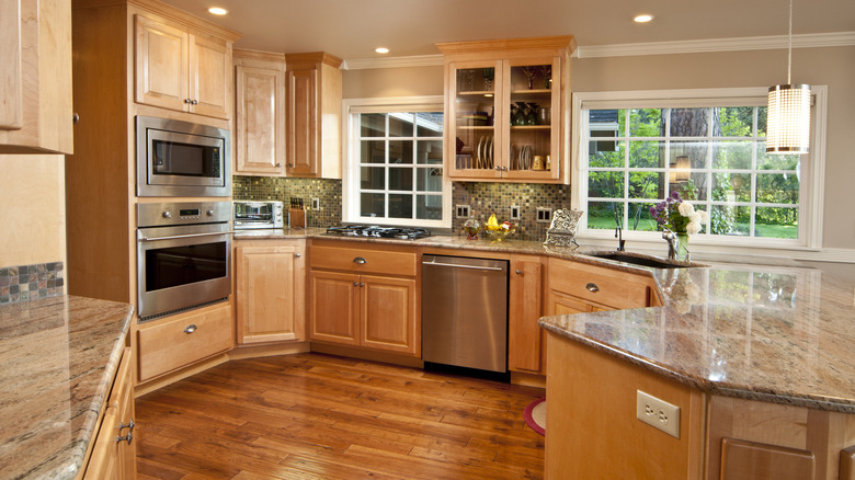
While some designers have favorite shades of wooden cabinets, others would advise homeowners to avoid natural wood in all of its forms. Someone firmly in this camp is Bobby Berk, beloved member of the Fab Five from "Queer Eye." According to Berk, it's best to leave this trend in the past. "Some people would say wood kitchen cabinets are timeless, but I disagree," he told Homes & Gardens. "Some wood tones are very decade specific."
It doesn't matter if you go with chestnut, mahogany, or a versatile oak, per Berk, because your home is eventually going to turn into some sort of time capsule. Instead, he recommends a color that to him, will never go out of style. The answer is black cabinets, as Berk thinks that hue goes with everything. "The thing about black cabinets is you're able to change the other things in the space without major disruption," he shared. "For instance, if you have a trendy kitchen countertop now, in 10 years you can change your countertop and things are still going to go with black cabinets."
Christina Hall isn't a fan of dark wood
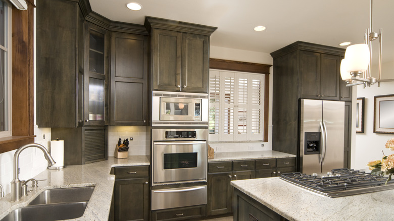
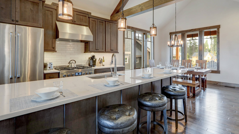
Dark wood was once a staple of American kitchens, but famed HGTV designers like Christina Hall are starting to move away from dark kitchen cabinets. Fans of the show might notice that she hardly ever features the stain in the show in recent episodes of, "Christina on the Coast," while it might have been one of her favorites on older episodes of "Flip or Flop." When asked about her changing allegiance to cabinet trends, Hall told Realtor.com, "In order for all the wood to work, all the stains need to complement each other. Otherwise, it's going to feel random."
Plus, lighter shades of wood stain are brighter and more modern. The key to keeping them timeless is to be careful about matching the shade. This means that when you order your upper and lower cabinets, as well as any to cover the exterior of appliances, you should make the purchase together. This way you don't run the risk of the manufacturer running out of a certain shade, or discontinuing it — leaving you with awkward, visually disjointed cabinetry.
Leanne Ford is done with decorative flourishes
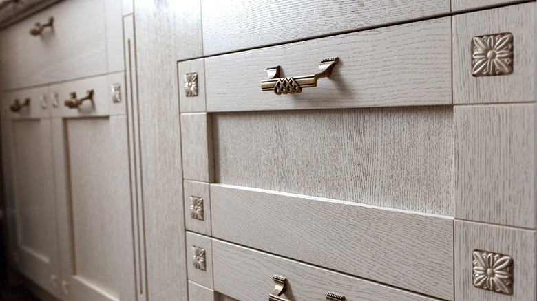
Leanne Ford of "Restored by the Fords" is widely known for her love of using white in her designs. So, it's no wonder that when it comes to cabinets, she is also a fan of keeping things simple. In fact, Ford thinks that inlays or decorative carvings can overwhelm things visually, as well as really date the design of the space. This means that your cabinets will become outdated a lot quicker than you would ever want them to.
Luckily, the HGTV star has an easy solution for those remodeling or designing their spaces. "I really like to keep simple, clean lines on cabinetry, and that goes back to long-lasting," she told Apartment Therapy. "Kitchen renos is such a massive to do, so I feel like clean, simple lines, you'll love it longer, which is the goal." Following this advice can save you from a massive headache. If you jump on microtrends, you might find one you like even better six months down the line. Instead, keep it simple, which Ford thinks will stand the test of time.
Jasmine Roth thinks green should replace gray
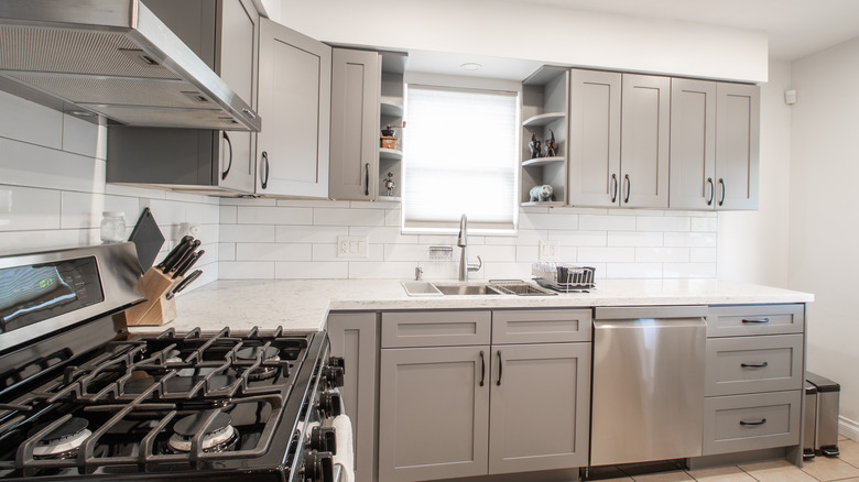
Many designers can never seem to get enough gray, yet Jasmine Roth of "Hidden Potential" and "HELP! I Wrecked My House" believes that gray as a neutral color is something on its way out the door. "Anywhere I would have typically used gray in my design projects, I've been using a shade of green instead. And the result is always awesome! " she wrote on her blog. "Using a green tone as a neutral in a larger application is such a refreshing feature for any room ... It's just different than the same old, same old."
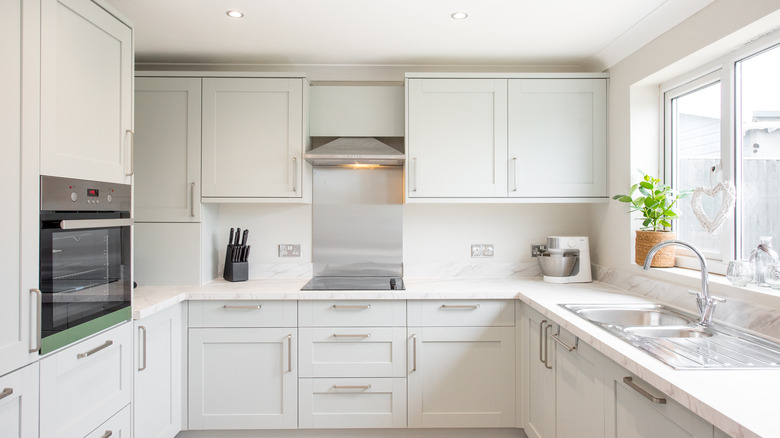
So instead of bathing your cabinets (no matter in the kitchen, bathroom, or even laundry room) in another shade of gray, consider changing things up. Because soon, gray paint will scream "I designed this house in the 2010s!" turning the space into a blast from the past. Roth's favorite shades of green include the likes of Sherwin-Williams options Rosemary, Evergreen Fog, and Laurel Woods. According to Roth, shades like these for cabinets are rich, fresh, and will be style for a long time.
Egypt Sherrod doesn't prefer raised panel cabinets
In an episode of "Married to Real Estate," Egypt Sherrod shared which cabinet trend she wishes would disappear. "Raised panels can date a kitchen," she told viewers when assessing a client's property, as reported by HouseDigest. These panels on kitchen cabinets have popped up in many styles from as far back as the 1920s. They are a popular design choice, but because of their constant inclusion in design, they can come across as a little overdone.
Instead, Sherrod is a champion of another type of cabinet that is just similar enough to provide a familiar look — but different enough not to be boring. "It just so happens a shaker style can almost go with any aesthetic," she continued, confirming to viewers her preferred cabinet aesthetic. When following her lead, be sure to opt for cabinet doors with simple edges, but avoid an elevated central section with slopes. Instead, go with shaker cabinets that are simpler with a flat center and no intricate designs.
Emily Henderson thinks everything doesn't need to be lined up
When designing or renovating your kitchen, you might worry about getting everything to line up perfectly — especially your cabinets. Yet, Emily Henderson of "Secrets from a Stylist" wants you to know that being obsessed with a symmetrical kitchen is a thing of the past. "Now this one might drive people NUTS, but it's true that back in the day they didn't obsess about everything 'lining up'," she shared on her blog. Instead, she advised readers that the seams of your upper cabinets don't really need to match that of the ones below. In fact, being too matchy is a trend of the past.
The important caveat here, Henderson insisted, is that this needs to be done correctly. "I would have thought it a big 'no-no,' but seeing it done so well it doesn't look like an accident, it just looks like it's there," she wrote. "It's hard to notice because the kitchen is so beautiful, but you can see that the on-counter cabinet is not lined up vertically with the lowers. It's just a slight quirk that makes a difference." The key to pulling this off is to make the misalignment subtle. This way it looks visually interesting and not just like you measured wrong.
