The Essential Rule To Keep In Mind When Painting Bathroom Cabinets
Updating your interior design can be a big undertaking, and bathrooms are all too easily overlooked during that process. Thankfully, you don't need to search high and low for easy creative bathroom ideas that make a big impact. You can transform the entire look of your bathroom by choosing a contrast color for your cabinets. Ideally, this contrast color should be similar to your walls, but slightly darker, making your interior design appear both effortless and intentional at the same time.
The key to perfectly painting your bathroom is to create a harmonious color palette. You may have heard of the 60-30-10 color rule, which means dedicating 60% of the space to a dominant color, 30% to a secondary contrast color, and 10% to an accent shade. In most bathrooms, cabinets take up roughly 30% of the real estate, making it the perfect opportunity to play with contrasts.
However, choosing a contrast color is an art form in itself. The contrast should be subtle enough to appear cohesive and dramatic enough to stand out. If you're a rule-follower, you're in luck because there is one important rule to follow when it comes to choosing the perfect contrast color for your bathroom cabinets. Rules exist for a reason, they say, and by following this one you will be rewarded with a seamlessly stylish bathroom.
The rule to painting your bathroom cabinets the right way
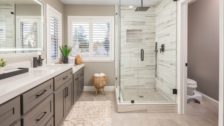
In most bathrooms, the cabinets are located underneath the sink or mounted on the wall, meaning that they are not at eye level. If your cabinets are painted the same shade as your walls, they practically blend into the background — boring, if you ask us. To infuse your bathroom with instant style, create contrast by painting your cabinets slightly darker than your walls.
According to Sharper Impressions Painting Co., cabinets can add a subtle pop of color to your bathroom design. Given that cabinets are not typically a visual focal point, choosing a darker shade can give the space visual dimension without overwhelming the eye. The rule is to paint your cabinets only one or two shades darker than your walls for the best results.
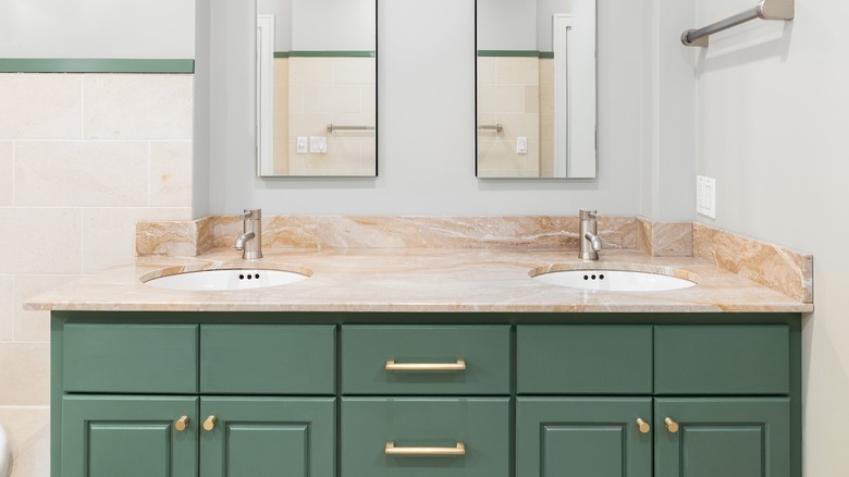
For example, if your bathroom has a light gray color scheme, dark gray cabinets can really bring the "wow" factor. Slate blue like Poolhouse 7603 and Daphne 9151 by Sherwin Williams coordinate beautifully with off-white tones. Blue shades are also among the paint colors that will make your bathroom look more expensive. The key is to create a contrast that is intentional without being too dramatic.
Give your cabinets a glossy finish to reflect more light and protect it from scratches. To honor the 60-30-10 rule, dedicate 10% to your accent shade. This can be as simple as installing new metallic or brass hardware for your cabinets with a matching light fixture or decor piece.