Our Favorite Master Bedroom Makeovers From HGTV's Hilary Farr
Hilary Farr is well known for her time both on HGTV's "Love It Or List It" and "Tough Love with Hilary Farr," where she goes into dated or unfunctional homes and gives them a facelift. She's a genius at remastering floor plans in particular. By removing a wall or opening a space, she completely changes the flow and functionality of a home, making it feel like an entirely new space. While her kitchens and living rooms usually get all of the attention since they're the main places families gather, her master bedroom makeovers are just as impressive. She has flipped her fair share of cluttered and clunky bedrooms, but some are more memorable than others.
Whether she's working with a half renovated room that is still down to the studs or a tiny, closet-sized room that needs to be opened up, these bedrooms showcase how well she can reimagine a space for frustrated homeowners. Some of these rooms required construction magic to make them more useable, while others just needed an experienced designer to rearrange the furniture. Both are equally amazing at how radically the room changed. Below are some of Farr's best primary bedroom makeovers in both series.
An empty, blank room got loads of personality
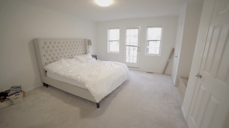
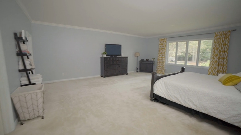
In Season 19, Episode 8 of "Love It Or List It," Farr worked her magic on a builder-grade home to make it feel more designer. Before the HGTV star arrived on the scene, homeowners Anju and Kieran were living in an uninspired master bedroom. It had beige carpets, stark white walls, and barely more than a bed in the space, despite having lived there for two years. Anju, in addition to disliking the scanty bedroom design, was also dissatisfied with the limited closet space. The two separate closets on the opposite wall of the bed created a his-and-her wardrobe that was less functional than it sounded. "The closets are small and also separated. It's just a strange layout and design to me," she said in the episode.
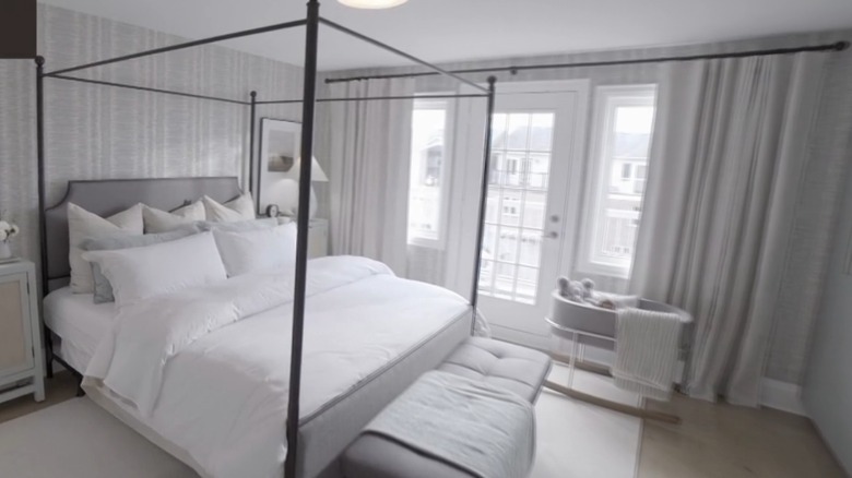
To remedy the situation, Farr added a huge dose of personality to the space. She got rid of the sterile white walls and replaced them with blue ikat wallpaper that gave the master suite depth and dimension. Specifically, she used the "Danube Ikat" pattern in aqua from Thibaut. Window treatments were added to the naked windows, and to make the room feel more grandiose, the tufted headboard was swapped out for an iron canopy bed. But that wasn't even the best part. Even more impressive was Farr's decision to remove the two tiny closets and install a full-wall wardrobe with mint colored doors — which added another pop of color to the space.
A cramped room with no closet space was reimagined into a master suite
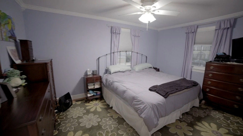
In Season 17, Episode 6 of "Love It Or List It," Farr was brought into a house that felt too cramped for a family with two teens. The episode, "Decades-Long Debate," introduced Wendy and Bill, who had run out of room in their ranch and needed her to create more space. The master bedroom had so little closet space that Bill had to store most of his wardrobe in his son's closet. While it was the biggest bedroom in the house, it still felt cramped due to the multiple bulky dressers in the space and furniture blocking windows.
To remedy the issue, Farr removed the wall separating their master bedroom and son's room to create one massive space. This bedroom makeover was one of her most impressive due to the sheer amount of reimagining she had to do to make a completely new floor plan. She moved the son to the other side of the house and then used the extra floor space to create a walk-in closet that led into a giant en-suite bathroom. The bedroom itself was small, but the walk-in closet was big enough to have a his-and-her setup, which negated the need for multiple dressers. The side of the closet then had a door that led to the en-suite bathroom, which was half the size of their previous bedroom.
A vaulted bedroom got a loft makeover
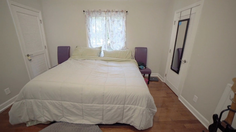
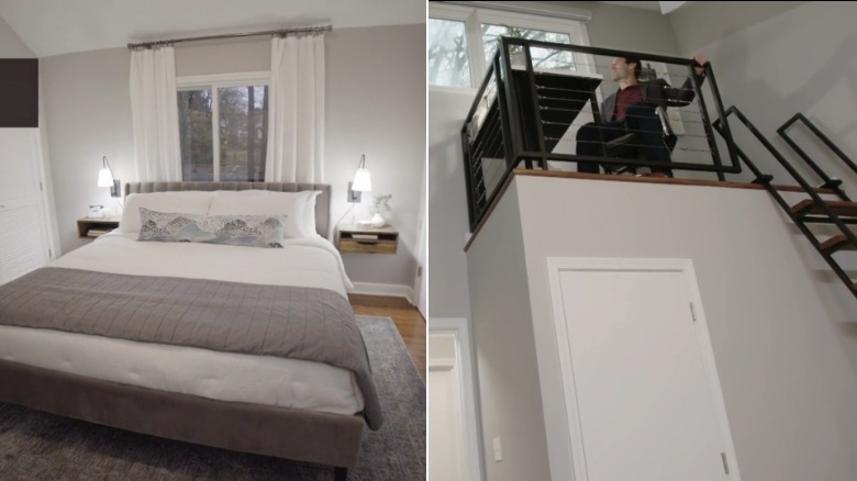
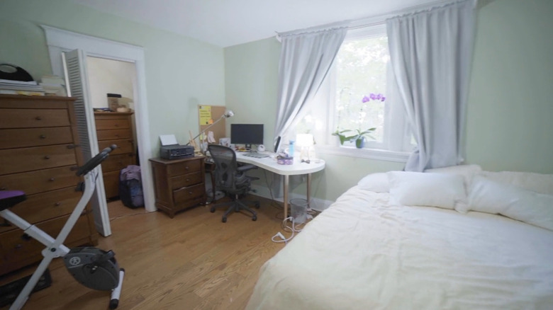
In Season 18, Episode 4 of "Love It Or List It," Farr was called in to remedy a home that was shrinking. In the episode entitled "A Tale of Two Davids," Maria and David first thought the house was massive for their family of four. But as the kids grew, the space seemed to shrink, making them feel cramped. The main bedroom had little personality, featuring white walls, a headboardless bed in front of a window, and two purple chairs acting as nightstands. While it seemed small at first glance, it actually had massive, vaulted ceilings, which felt like wasted space.
But, of course, Farr found a way to use that space. David was especially frustrated that he didn't have a dedicated office in the house, so Farr reclaimed unused loft space by building an office above their bed. To make it feel like a work area and not a random nook, she also installed a window so he didn't have to stare at an empty wall. Underneath the loft were new built-in closets, which made up for the fact that she shrunk the wardrobe on the right side of the bed to expand their en-suite bathroom. She did so so it could be big enough to hold a two-sink vanity instead of one single basin.
A whole apartment was transformed into a primary suite
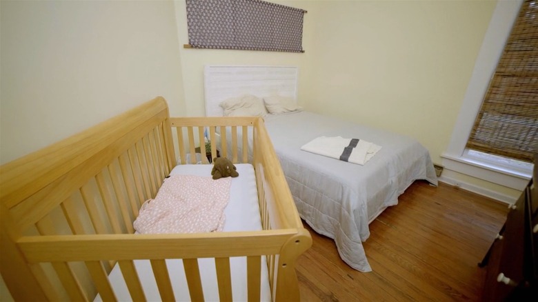
In Season 17, Episode 7 of "Love It Or List It," a growing family purchased a century-old triplex with the idea of renovating it. However, they couldn't carve out enough time or funds. Called "Triplex Troubles," homeowners Dana and Dave were struggling to find a way to combine the three separate apartments into one cohesive home. They had owned it for two years when Farr swooped in and were currently living in the first apartment with their young daughter. Their master bedroom was a strange trapezoid shape, making it difficult to arrange furniture inside it. In addition to its troubled floor plan, it also had little closet space. Dana utilized the closet in the room, but Dave's clothes were stored in the baby's room.
Farr's job was made slightly easier since the triplex wasn't vertical but horizontal. Meaning that all the apartments were on the same floor. This meant that all she had to do was tear down walls to make the floor plan bigger. To tackle the oddly shaped master bedroom, she moved the couple out of the first apartment and into the second one, transforming the entire space into their oasis. The previous entryway was transformed into a bedroom hallway flanked with walk-in closets, the kitchen was turned into their en-suite bathroom, and the living room became their bedroom. And as an added special detail, Farr used the old floorboards from the apartment to make their headboard. She had to rip out the century-old wood for demo, which Dave was disappointed about.
A cramped bachelor's bedroom transformed with thoughtful details
In Season 18, Episode 8 of "Love It Or List It," Farr was tasked with making a bachelor pad more inviting for a family. When homeowners Derek and Catarina got married, Catarina moved into his house, which wasn't built to accommodate a growing family. However, their bedroom needed an extra amount of help. For instance, in the episode, Catarina joked that they had a "step-in" closet. She demonstrated by putting one foot into the closet and keeping one foot outside in the bedroom. "You step in, choose what you want, and then you leave."
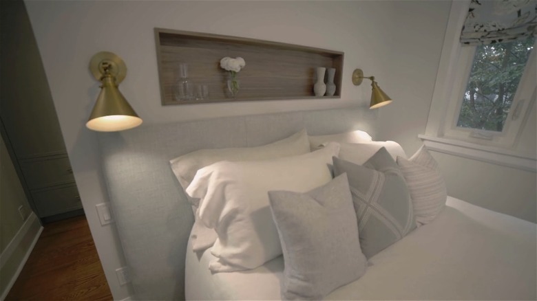
To increase the size of the closet, Farr brought the wall of the closet forward three feet and moved the door to the side. This was no easy feat, as the wall was load bearing and required a steel beam to be installed in the attic. The couple didn't have the budget to pay the $3,000+, so Farr instead kept the original wall inside the enlarged closet and created a his-and-her type of space. This might have made the room smaller, but it created some much needed storage space. While the primary bedroom might have shrunk, it was still filled with thoughtful details that made it stand out. For example, while there wasn't enough room for nightstands, Farr made a walnut-lined niche in the wall to make up for it.
An empty McMansion bedroom got a boutique upgrade
In Season 18, Episode 1 of "Love It Or List It," a blended family invested in a sizable but outdated house. When homeowners Lisa and Josh first bought the house, they thought they could do a couple of quick renovations to make it more livable, but the projects snowballed. One of the biggest items on their to-do list was to make the primary bedroom more useful, but they didn't know where to start. Not only was the bedroom the size of a penthouse hotel room, but it also had two large bathrooms, one regular walk-in closet, and one walk-in closet the size of a small bedroom. However, it felt empty, outdated, and like the people living there hadn't fully settled in yet.
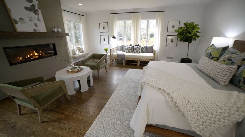
To transform the suite, Farr completely revamped the floor plan of the bathrooms and closets. She knocked down all of the walls to work with a clean slate, and created one giant bathroom ensuite and one large walk-in closet with a boutique island. As for the suite, Farr added more windows to make the space feel less like a cave and a fireplace for extra coziness. Since it was so large, she also created extra places to gather. For instance, there were two chairs and a coffee table in front of the fireplace and a small couch in front of one of the windows.
Work-centered bedroom transformed into a luxury suite
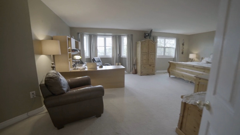
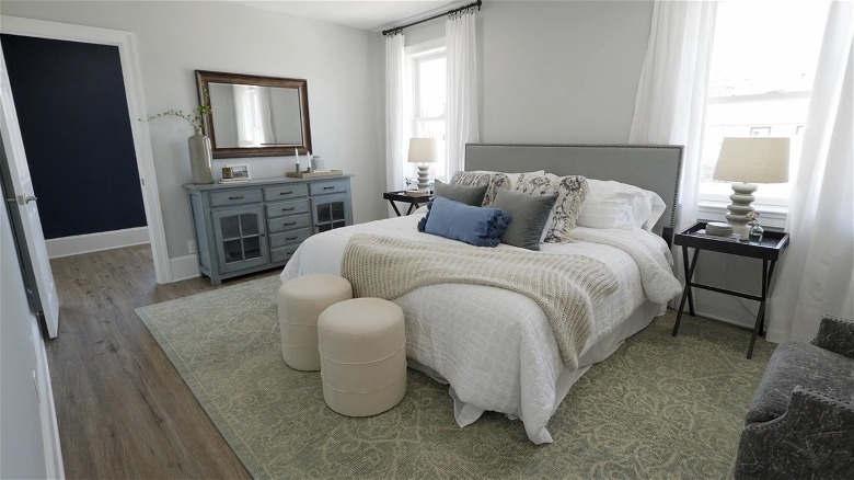
In Season 18, Episode 10, a couple struggled with making a home theirs even after decades of living there. Peter bought his mother's house when he got married, but even after 20 years of living there, Sheryl hadn't been able to make it fully hers. "It was always my mother-in-law's house; it's never really felt like our home," she said in the episode. The main issue was that the house was stuck in the 1980s with a pine cabinet kitchen, stuffy rooms, and a massive primary bedroom that was anything but cozy. While it might have been sprawling, Peter set up a large L-shaped desk in the space, bringing the boardroom into the bedroom.
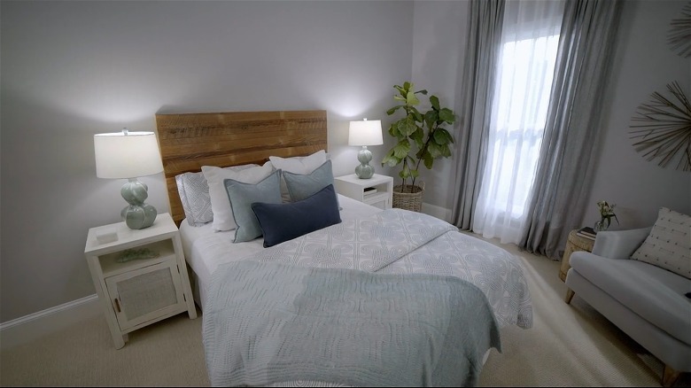
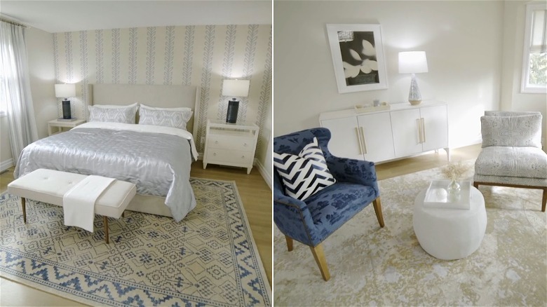
Putting your home office in your bedroom is usually a bad idea, so Farr did away with that setup. The end result was a modernized bedroom that perfectly showcased her design skills. Other than tearing out the carpet, Farr didn't have to do much to this particular space. She did enlarge the ensuite bathroom in order to install a shower and a luxurious soaker tub, but even more impressive was the way she styled their new oasis. The room was divided into two sections, each part anchored by an area rug. One half was dedicated to the bed, and the other housed a type of sitting room. She also made the theme blue because it's "one of the most calming colors," according to Farr in the episode.
A bedroom with little storage got a massive upgrade
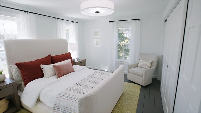
In Season 19, Episode 3 of "Love It Or List It," homeowners Kevin and Hailey couldn't agree on whether or not they should leave their starter home for something bigger. Hailey thought they were only going to stay for five years max, but they had been there over a decade and now have three kids. Their main bedroom was just as outdated as the rest of the house, featuring one king size bed and a hand-me-down dresser that doubled as a media console. "This is supposed to be an oasis where you come and relax. I don't find anything in this room relaxing whatsoever," Hailey said in the episode. They also had an ensuite bathroom the size of a powder room, as well as one small, cramped closet.
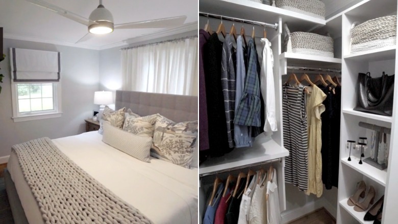
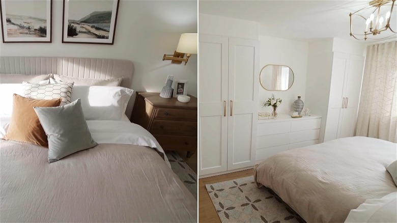
To make up for the minuscule ensuite, Farr absorbed the closet to the new bathroom, which allowed her to create a space big enough for a double vanity and shower. Since there was no more storage in the room, she instead created custom floor-to-ceiling cabinetry across an entire wall, giving them plenty of space to organize and display their clothes. She was still able to fit a king size bed, fitting every need into what was previously thought of as a cramped space. This was one of her best remodels because it showed how, with just a little bit of restructuring, you can have your dream bedroom.
A dingy attic room gets a refresh
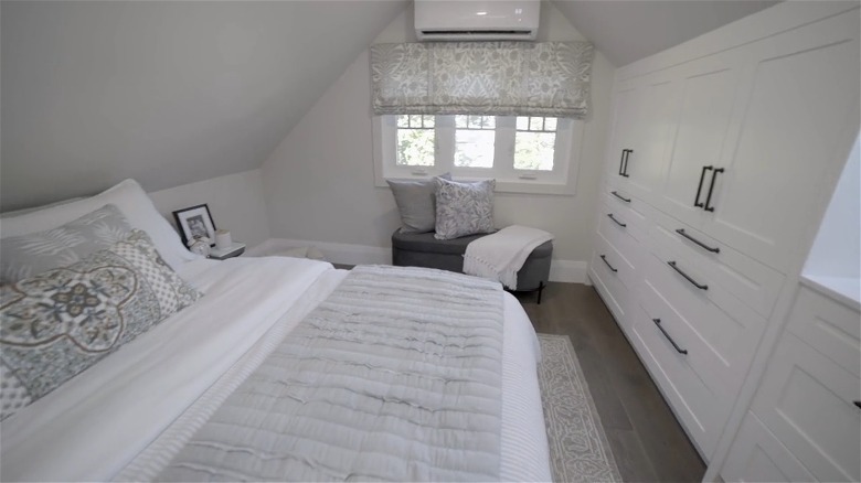
In Season 19, Episode 7 of "Love It Or List It," homeowners Luke and Jim bought a 1920s five-bedroom home 25 years ago, so it needed some renovating. Their main bedroom was on the third floor, which was a converted attic. Due to the sloped ceilings, there wasn't much space for a robust closet, so Luke was forced to disperse his large wardrobe throughout the other bedrooms of the house. His main wish was to have a closet big enough to house his entire collection in one spot, but he didn't think it was possible in their vintage home. As he said in the episode, he didn't think Farr could create more space where there just wasn't any.
But of course, Farr proved him wrong, which is why this is one of her best bedroom renovations. She added three dormers to create more overhead height, creating enough space for an expanded closet, ensuite bathroom, and main bedroom. There are different types of dormers, and Farr chose the gabled type. When you walked up to the third floor landing, you were met with a space that doubled as a walk-in closet. There was a built-in wardrobe in the small wall and a built-in shoe rack against the railing. When you opened the door, you entered into their bedroom, which now had a floor-to-ceiling wardrobe system installed across the entire wall thanks to the new raised height. It gave the couple enough room to store all of their clothes and accessories in one space.
A historic bedroom got flipped into a modern space
In Season 1, Episode 3 of "Tough Love with Hilary Farr," the HGTV designer helped renovate a small historic house for a military family to make it feel more like home. Jaclyn and Ryan, the homeowners, faced a significant challenge in their bedroom in particular. "This furniture is tiny and the bed is large and nothing seems to flow in this room," Jaclyn said in the episode, and Farr agreed. "There is no flow," she concurred.
While Farr couldn't make the space bigger, she was able to relocate the small closet in the corner of the room. By flattening it out and spreading it across the entire wall, she created more space for the bed and furniture. Not only that, but since it took up an entire wall now, the couple had double the storage space and no longer needed their three bulky dressers to store their clothing. "There is so much space. I feel like I want to be in this room," Jaclyn said.
A cluttered room got some organizational space
In Season 1, Episode 4 of "Tough Love with Hilary Farr," a couple who recently moved back to the States from Germany struggled to feel at home in their space. Michele and Tom moved into a historic home in New Jersey, and while it had good bones, it needed a lot of work. When Farr saw their primary bedroom — which was quite large — she decided the issue was flow rather than layout. "This is not a very functional room because you have things everywhere," she said. She specifically called out the old vintage furniture that Michele was attached to. "You have these old pieces of furniture taking up usable space that could solve your storage issues."
Michele shared that she took those old wooden pieces both to Germany and back to the States, so it was difficult for her to part with them. But part she did, and the room became more functional. Farr removed the bulky furniture, and since the room had so much useable space now, she cut into it to create a large walk-in closet. She also made the space more inviting by removing the one small transom window near the ceiling and replacing it with two large windows on either side of the bed to bring in the light. "We hated the window above, but I would never think to remove that and put full size windows in. It looks amazing," Michele said.
A boring bedroom transformed into a boutique suite
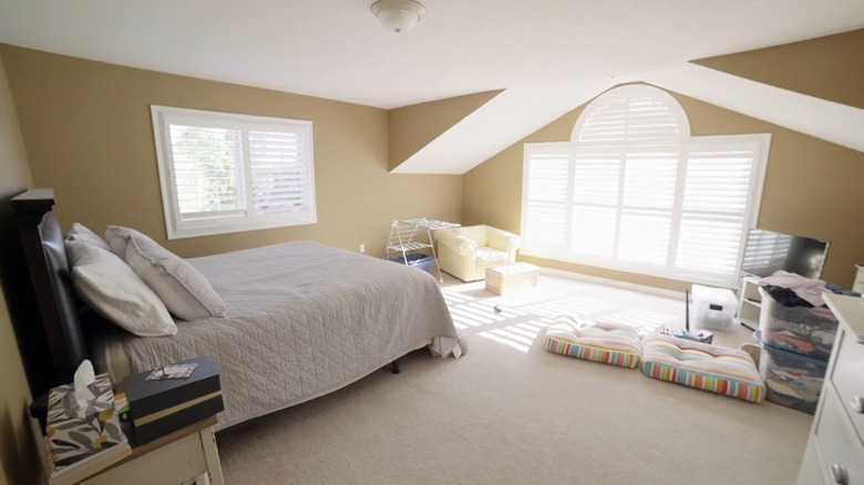
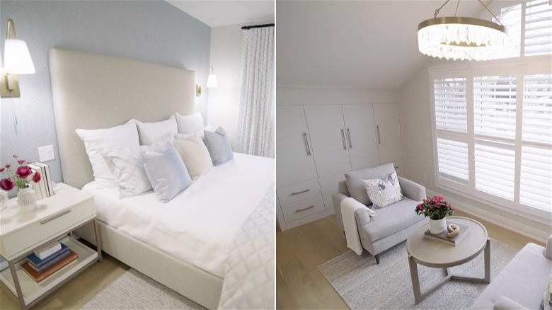
In Season 19, Episode 13 of "Love It Or List It," a couple wanted an upgrade after living in their house for almost two decades. Quincey and Michelle admitted that their primary bedroom was the biggest room in the house, but it wasn't functional because they didn't know how to use all of that space. Instead, all they had was a large bed, a lonely one-seat couch in the corner, a small TV pointed at their bed, and storage boxes strewn throughout.
Farr took some space from the bedroom to create a bigger walk-in closet with custom shelving, but the spacious wardrobe wasn't the only place they had storage. Farr also added custom cabinets on either side of the sitting room alcove, giving them more room to organize their things. What's most impressive is that she found useful ways to use such a large area. The alcove was not only an extra conversation room, but it was also an extra closet.

