Property Brothers: Steal Jonathan Scott's Color Palette For A Soothing Bedroom Design

The average person spends around one-third of their life asleep, yet for so many, the bedroom isn't a place of rest and reprieve — it's a place of struggling to fall asleep and stay asleep throughout the night. The National Council on Aging reports that about 30% of us struggle with insomnia and that about a third of us aren't getting enough sleep. The bottom line is that everyone could benefit from a good night's rest — and your sleeping environment plays a huge role in how well you're able to do so.
If you want quality sleep, it's essential to facilitate an environment conducive to stress relief, relaxation, and rest. Consider following the advice of Jonathan Scott, home renovation guru and co-host of HGTV's "Property Brothers." The interior design expert has lots of bedroom tips for better sleep, and one he shared with HGTV is that using a muted color palette in the bedroom can help homeowners create a soothing feel.
Certainly, the color of your walls, textiles, and decor is an important factor in the overall feeling you want to create in your bedroom. But if you're ready to follow Scott's advice, you might be wondering what exactly muted colors are and how they differ from earthy tones or pastels. We'll tell you — plus, we'll share some other tips on how to create a relaxing bedroom that will help put your mind at ease so you can catch those z's once your head hits the pillow.
Why Jonathan Scott recommends muted colors in the bedroom
Jonathan Scott is best known for his home renovations and makeovers on HGTV's "Property Brothers," where he's demonstrated time and time again his smarts when it comes to interior design. In designing the bedroom, one of his tips is to "use muted colors for a soothing feel." Scott shared some thoughts about one of his projects for an HGTV bedroom design advice video: "I decided to keep it in line with the mid-century modern feel of the home by using streamlined furnishings and also going with a more modern muted color palette, something that was soothing and just created a fresh inviting vibe."
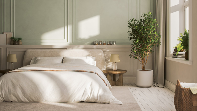
For those wondering what exactly "muted" colors are and why they're so soothing, the answer lies in how they're blended. Muted colors are the opposite of bright, striking, vivid colors and are created by adding monochrome or complimentary shades to a color to make them less saturated, greyer, or duller. But there's nothing dull about muted colors. By toning colors down, muted tones make a space softer, warmer, and evocative of tranquility rather than energy and activity. Similar yet not quite the same, pastel colors are pure colors that have been tinted with a lighter tone or white. And while earth tones encompass any shade inspired by natural, rich, brown colors including deep saturated reds and oranges, muted color palettes provide a neutral, sophisticated feel that's suitable for various interior design styles, all while maintaining grounding, soothing vibes.
The best muted tones and how to use them
For Jonathan Scott's HGTV project, he used a muted color scheme including warm natural wood furniture, pale sage green bedding, and mustard yellow accents to create a soothing sanctuary. But if you're wondering about the absolute best bedroom colors for a soothing vibe that fall into the "muted" category, the answer is pretty simple. The best muted colors for your bedroom are ones traditionally associated with calm such as blue, green, or neutral tones. On the other hand, stay away from bright and bold stimulating colors like red or orange, traditionally associated with energy and action. Even if you saturate these by adding other tones, color theory suggests that these are some of the worst colors for sleep, so you may want to opt for a muted pink or creamy coral beige instead.
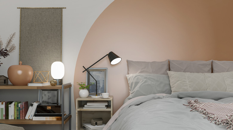
If you're a color lover wondering how to use muted colors without making the space feel dull or dreary, there are many ways to help your muted color palette feel soothing and visually stimulating. Our advice is to incorporate a variety of textures and accent pieces such as greenery, pottery, and art. Linen curtains, tufted bedding, sheepskin rugs, and tasseled pillows will add depth and interest to keep your space from feeling boring or flat. Also, don't forget to layer your warm lighting — using table lamps, floor lamps, string lights, or an overhead chandelier with a dimmer will enhance the muted colors while keeping the atmosphere serene.