Hilary Farr Shows Us A Clever Way To Use Color To Unify Your Home's Interior
You want the spaces in your home to feel connected as you move from room to room. However, giving each area its very own focal point and unique look, while creating a cohesive design takes some skill. It is easy to end up with pretty rooms in a stylish yet disjointed home or a unified space that is lackluster.
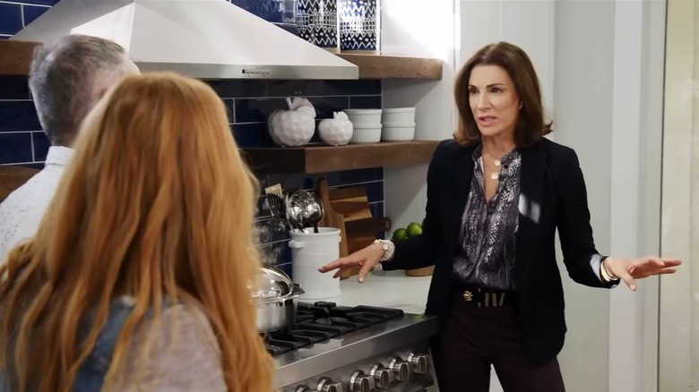
HGTV star Hilary Farr knows how to balance connectivity and style perfectly. On an episode of her show, "Tough Love with Hilary Farr," the interior design expert used color to unify her client's home by styling the fireplace and backsplash in the same vibrant hue.
Farr's design strategy is an easy tip to create a cohesive color palette for your home. Even if you don't have a fireplace or colorful backsplash (nothing wrong with white subway tile), you can use this color trick to marry your home's interior using other features and decor. You'll have a vibrant space that is cozy and cohesive.
Having the same pop of color can connect different rooms
There are different ways to connect areas in an interior design. You can use matching decor, materials, or in Hilary Farr's case, color.
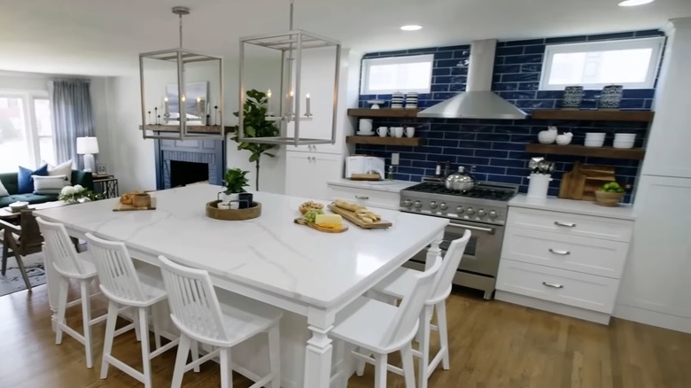
For this particular project, she used a rich deep blue as a bold statement throughout the design that unified the rooms in the open-concept space. The blue was featured in the glass tiles of the kitchen backsplash and paint for the living room fireplace. Similar shades of blue were also strategically incorporated with the accent pillows, curtains, centerpieces, and artwork.
Despite each area having its own focal point, the consistent blue creates cohesion instead of disjointing the rooms. The statement features work together instead of competing. It is a great way to use bold colors in a home, define space within an open concept, and create continuity.
However, it wasn't just the accent hue that Farr used to unify the design. She kept the primary colors in the living room and kitchen neutral, opting for a main spread of bright whites and grays for the walls, kitchen island, cabinets, and area rug. There was also a tertiary element of warm browns sprinkled in with the open shelves, mantel, coffee table, and flooring.
How to match color schemes in different rooms
Farr balanced all these colors perfectly and you can do the same in your home for a stylish, cohesive design. The key is using one color in different elements in each room. It can be the same color decor, furniture, or features. Remember, the deep blue in Hilary Farr's design was a vibrant pop. These accent shades are typically only 10% of the room's overall color, with the primary shade being 60% and the secondary color 30% of the room. You want to match the bold shade in different rooms to unify your home's interior.
Since picking your backsplash first is a kitchen renovation tip Farr swears by, you can use this feature as your starting point. Let the backsplash be a statement piece in the kitchen and carry its colors throughout other focal points in your home. For a perfect match, use the same backsplash tile on your fireplace, an accent wall, shower detail, or laundry room floor. This will create a connecting element in different areas of the home.
However, too much of the same pattern can feel repetitive and overwhelming, so you don't want to use it in more than two or three places. To avoid the chance of a monotonous pattern, stay true to Farr's design and go for paint that matches the backsplash instead of the exact tile. Then you can slap the color on trim, doors, furniture, decor, and other focal points in the room. It's a simple trick for a cohesive design that looks professionally styled.