Home Town: Erin & Ben Napier's Most Controversial Design Choices

Despite their beloved status among fans, even the wholesome stars of HGTV's "Home Town" have stirred up some controversy over the years. Ben and Erin Napier are known for executing charming renovations in their hometown of Laurel, Mississippi. From paint colors to architectural elements, the couple doesn't play it safe. Fans typically rave over their affordable restorations that are brimming with rusticity. However, there have been a few design choices that left viewers confused. Whether their makeovers leaned a little too quirky or uncharacteristically bland, fans haven't been shy about voicing their opinions.
While no decor theme can please everyone, there is a level of objectivity to design. If enough people are in agreement over a certain design choice, it's worth considering the praise or criticism. We've ranked Ben and Erin's most highly debated choices, based on feedback from the fans. We took a look at some of their most eyebrow-raising designs, and then ranked them depending on how much negative comments the risk garnered. As avid viewers of "Home Town" ourselves, these selected episodes have been picked to showcase the good, the bad, and most importantly — the controversial.
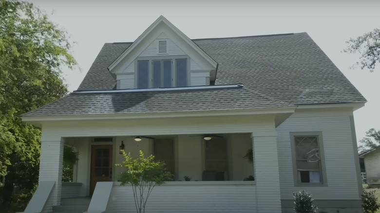
8. Sacrificing a red front door in favor of neutral tones
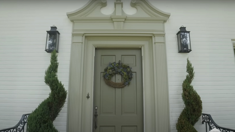
In Season 6, Episode 12, Erin and Ben upgraded the exterior of this home with new trim paint, symmetrical sconces, and fresh landscaping. Overall, most fans were pleased with the renovation results, which is why this lands as Number 8 on our list. However, a few viewers weren't sold on the idea of swapping out the red front door for a greenish taupe. One viewer commented on YouTube, "I'm sorry for the red door," which garbered 12 likes. Another fan replied, "Yes, it's quite boring now." Another chimed in: "I could see a vibrant blue. I think it would still work with all the green in the house."
It can be tricky to pick the right color for your front door. Luckily, there are solid studies that show which shades can increase resale value. A report by Zillow claimed that a gray-toned door can harm the future sales price. By adding a tinge of green, Erin and Ben may have avoided this neutral trap, but only time will tell. If you already have a vibrant front door, it may be tactful to embrace it rather than spend the money to conceal it. If you want to revamp it without repainting, take a cue from the "Home Town" couple and add elements like symmetrical potted plants and decorative sconces.
7. A split reaction on statement wallpaper
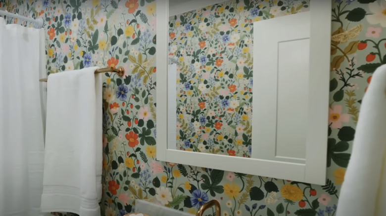
Erin and Ben are no strangers to making bold choices. In Season 7, Episode 9, they chose a loud, floral wallpaper for the bathroom. Several fans praised them for the joyful, playful upgrade, which is why this lands on Number 7. A fair amount of praise balanced the pushback. One fan commented on YouTube: "The bathroom wallpaper is so fun and pretty!!" However, there were others who expressed their distaste. One viewer shared, "Great result, although I prefer a more restful wallpaper in the bathroom." Another chimed in, "I'm a 'girly girl' but I don't like flowered wallpaper, curtains, bedspreads, couches, etc. ... it looks dated."
In spite of the backlash, wallpaper can be better than painting for a few reasons. It is super easy to keep clean and stain-free. However, you want to make sure the wallpaper you choose is water-resistant if you plan on installing it in a humid area like your bathroom. If Ben and Erin's floral pattern is too busy for you, there are more timeless botanical prints like this soft blush rose wallpaper from Etsy. You can also add a smaller splash of visual interest by covering only the bottom half of the wall with wallpaper. This will create a vintage-inspired look that doesn't feel overwhelming.
6. A yellow exterior that divided the masses
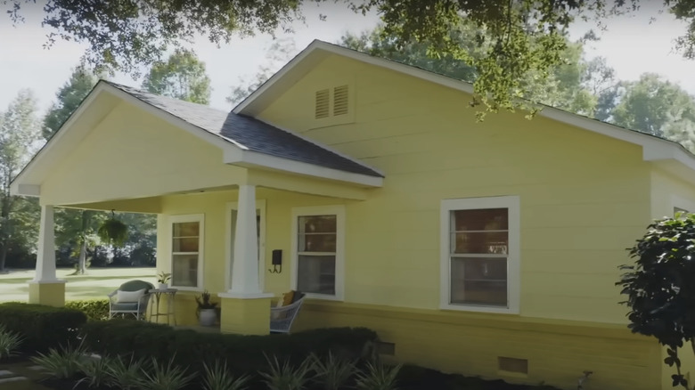
Ben and Erin made another bold color choice in Season 7, Episode 10. They painted the entire exterior of this home bright yellow. It was originally sage green, a very popular color among viewers. This arguably unnecessary change led to a lot of arguments in the comment section. Since this created a more visceral reaction among fans, it lands a spot higher than the funky wallpaper. The pushback in the comment section was a little more polarizing. Some YouTube users defended her choice, "Maybe I'm in the minority but I LOVE the new yellow exterior paint!" Her comment gained a total of 21 likes. However, many more fans rallied against the change, and one viewer's comment received 25 likes: "Very cute except for the yellow outside. Not my preference, it seemed nicer before." Another fan had a similar opinion: "I agree w/ a few others. I loved the sage green exterior, but it's their home."
While it might sound like a warm, welcoming color, there are multiple reasons you should avoid painting your house exterior yellow. Most importantly, you can isolate future buyers with a vibrant shade rather than a universally appealing, neutral tone. It's less costly and risky to save those bold colors for window or door trim. Erin and Ben have also proved that gorgeous exterior design requires meticulous and thoughtful landscaping. From your front yard to your porch, you can add color in multiple ways without covering your entire home in a controversial paint color.
5. A sleek yet immodest bathroom design
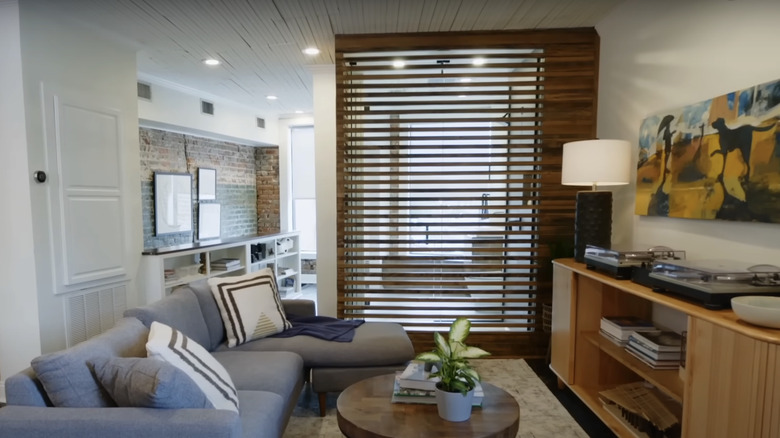
While many fans were impressed with Ben and Erin's ability to merge their typical rustic style with a modern loft aesthetic, there was one choice that ruffled a few feathers. In Season 6, Episode 10, they added funky wood beams to allow light to pass from room to room, but that also resulted in a lack of privacy. The toilet was still visible from the lounge space, leaving some fans scratching their heads. One fan commented on YouTube: "You have to be really comfortable with your guests to have a bathroom like that where anybody can watch you take a [poop emoji]." This comment received 8 likes. Another viewer also shared, "Thumbs down for see through toilet."
If you only have one natural light source, allowing sunlight to stream through interior rooms is key. While Ben and Erin succeeded at this challenge, the clear view into the bathroom was undeniably strange. To fix this issue, the duo could have opted for wooden blinds instead of beams. Another alternative is to install frosted glass that allows light to pass through while blurring the figures inside. To make their original choice work, sheer curtains could be hung to offer the option of enhanced privacy.
4. From true blue to white and bright
Because Erin and Ben are usually known for embracing their quirky style and avoiding more minimalist trends, fans were particularly upset after watching Season 8, Episode 6. The duo chose to repaint a charming blue exterior in a modern white hue. This lands on Number 4 on our list because painting things neutral usually elicits a heated outcry, garnering more negative feedback. Viewers felt that it hid the history and character of the home, something Erin and Ben typically avoid. One fan commented emphatically on this YouTube clip: "I just don't like the exterior painting ... white?! ERIN!!!! Why?" Another fan shared a similar sentiment: "I liked the blue on the exterior much better." One viewer said: "Personally, I preferred the blue color to the white. It made the house pop!"
While white is a foolproof exterior color that will stand the test of time, to the credit of the fans, blue can enhance a home if it is used correctly. While Ben and Erin chose to forgo the blue exterior in this scenario, they have painted homes blue in past renovations. For example, they used 6223 Still Water by Sherwin Williams to paint the Mohon House from Season 5. If an entirely blue home feels too daring for you, leave the trim and shutters bright white for a perfect balance.
3. Daring to keep the original kitchen flooring
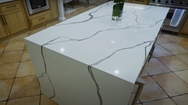
This controversial choice was about what Ben and Erin chose NOT to do! Although they were granted a large budget of $700,000 in Season 7, Episode 8, they chose to skip replacing the kitchen floor. The original flooring was made up of large, faux terracotta-style tiles with dark grout. More than a few fans were disappointed in this seemingly lazy choice. In fact, the entire YouTube comment section was flooded with criticism, which was why this landed in the Nuber 3 spot. One viewer's comment had 22 likes, reading, "That kitchen floor doesn't go at all, with the rest of the kitchen." With 11 likes, one fan commented, "I didn't really care for the floor in the kitchen with the design it clashes with the island terribly," and another fan added, "Wish they changed the floors." One user summarized many users' sentiments: "Awful kitchen floors."
Next Day Floors reports that replacing kitchen appliances and countertops can result in a ROI of 60-80%, and replacing flooring can reach up to 70-80%. While the rest of the kitchen received significant upgrades from Erin and Ben, the oversight on the floors could be a costly mistake. If you're looking for the perfect flooring to match marble-style countertops, try an equally modern material like these black-and-white tiles from The Home Depot.
2. A new build with a heavily debated striped awning
In Season 8, Episode 10, Erin and Ben took a brand-new approach: Deciding to ultimately demolish the old and dilapidated home in favor of a new build. While this decision was controversial enough, it was the front porch that had fans up in arms. She originally wanted to create an arched front porch but ultimately settled for a simple striped awning. The uproar was so intense, Erin Napier had to defend this unpopular "Home Town" awning on her Instagram, which is why this landed in Number 2 in our roundup. She explained that the original archway idea was simply too expensive to justify.
Maintaining a strict budget when renovating a home is no easy feat. You may have to alter or sacrifice your original vision once quotes start rolling in. While a simple patio canopy is one way to enhance your exterior doorway, there are countless other stylish options. A small portico is a slightly more expensive option but can make your exterior immediately look more high-end. You can also add a window above your door, also known as a transom. Finally, don't underestimate the power of light. From double sconces to an overhead lamp, your exterior door should be highlighted day and night.
1. A rare choice of red kitchen cabinets
Red kitchen cabinets are not necessarily a crowd-pleaser. However, in Season 7, Episode 18, Erin Napier made a controversial kitchen color choice and opted to douse her clients' cabinets in this daring shade. She explained her provocative choice on Instagram: "We ended this season of #HGTVHomeTown on a joyful note in an Americana color palette celebrating Jack's new US citizenship and Iris's love for patterns!" When a color has sentimental value — and you choose the right shade — you can justify unpopular design choices. However, some Instagram commenters weren't blown over, which is why this is their Number 1 design blunder. The criticism was much harsher for this makeover. One viewer wrote, "I thought this was the 'before' picture." One fan couldn't seem to see the red at all, asking, "Why do you always use so much green?" And another user added, "Yikes! On the kitchen! [sad face emoji]."
Red can be a gorgeous and trendy kitchen color under the right circumstances. If you're afraid that painting all of the cabinets will overwhelm your space, try painting just your kitchen island for a playful pop of red. You also don't have to select a bright, cherry red to add a touch of rouge to your cooking space. Incarnadine from Farrow & Ball is a beautiful shade of soft crimson, ideal for contemporary homes.