HGTV's Jenn Todryk Shares An Easy Décor Trick For Unifying An Open-Concept Space
Open-plan concepts are beautiful because they can make even the smallest house seem spacious. By removing walls and unifying rooms, you're able to reconfigure the home in whichever way is best for you. If you prefer the dining room to be in one section and the living room to be in the other, all you have to do is move furniture to make that happen. You don't need to tear down and rebuild walls to make your new layout a reality. While open-plan living areas can help with the flow and function of the home by allowing you to customize zones as your needs change, they also come with their fair share of downsides. One of which is that it can be hard to make the space feel unified rather than disjointed. However, HGTV's Jenn Todryk has an easy décor hack to bring harmony to a large area: All you need is matching curtains throughout the space.
In a home with dividing walls, you don't have to think about whether your living room furniture matches your kitchen banquette, but when there are no walls separating the space, the furniture has to somewhat flow. If you're struggling with making your mismatched pieces feel like they belong to one cohesive unit, add a similar thread in each space to give it some repetition. And the easiest way to do that is with curtains. Here is a closer look into how to decorate an open floor plan cohesively.
Jenn Todryk unifies an open floor plan with matching curtains
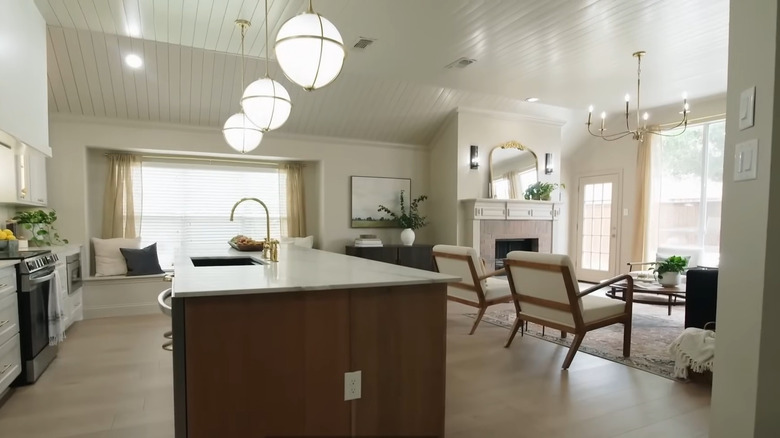
In Season 3, Episode 7 of "No Demo Reno," Jenn Todryk helped a daughter and her father who have spent the last six years trying to remodel her house. In the episode entitled "DIY Don't," the HGTV star swooped in to help finish the project. The space was already open-concept but it felt mismatched and disjointed. There was a lonely foosball table and no couches in the living room, and the kitchen featured pine cabinets with no hardware. In the redesign, Todryk created a creamy white kitchen with a large quartz island, which echoed the milky white and beige color tones in the adjoining living room. To make it even more apparent that these were part of one cohesive design, she used the same beige curtains in both areas.
"It's perfectly framed by these sheer curtains that I also used in the kitchen," Todryk said in the episode (via YouTube). "It really helps unify these two spaces." Since the eye registers the exact same fabric in those two areas, it will assume there is a connection. You can do this with just about any kind of repetition, whether it's color, a pattern, or even a texture. All of these options can help define an open-concept space.
How to recreate this in your own space
If you have an open floor plan that feels disjointed, help make your home look more unified by copying Jenn Todryk's trick. However, you can tweak it to best fit your needs. For instance, if you don't want curtains in the kitchen, opt for Roman shades in the same fabric or color as your living room drapes. In the episode, Todryk created unity by repeating a color and texture throughout the space — sheer beige. If you want to go the texture route, you can try adding faux fur in the living room and kitchen in the form of a shag rug and then island seat cushions. You can also do so via finishes. For instance, if you have metal brass table lamps in the living room, choose brass pendant lights over the island.
If you can't find a way to incorporate texture, try switching to patterns. If you have a paisley blanket thrown over your couch, see if you can find paisley hand towels (this Etsy shop sells ones for $20.98) to drape over your oven handle. Or if you have a vintage Turkish rug in your living room, see if you can find a similar style to put underneath the adjoining dining room table. Choose whatever best fits your particular aesthetic, and find creative ways to mirror it throughout the floor plan.


