Hilary Farr's Most Impressive Bathroom Transformations On Tough Love

Hilary Farr is proof that you should never underestimate the power of a bathroom transformation. While her "Love It or List It" renovations have been well-loved by HGTV fans, her solo show "Tough Love" has even more makeovers to admire. This program is all about Farr helping families adjust their homes to properly fit their lifestyles. She meets with homeowners who are in over their heads, with dysfunctional floor plans at the top of their tribulations.
If the main goal is to give your home a stylish and functional makeover, don't overlook your bathroom. Whether your master bathroom demands a major upgrade or your powder room needs a refresh, you can steal budget-friendly home upgrade tips from Farr. Not only are the visual transformations impressive, but she is brilliant at making use of space. Sometimes the home you own already has the potential to be your dream home; you just need to think out of the box. Give your bathroom a boost of elegant efficiency under the guidance of Hilary Farr.
Creating a powder room out of thin air
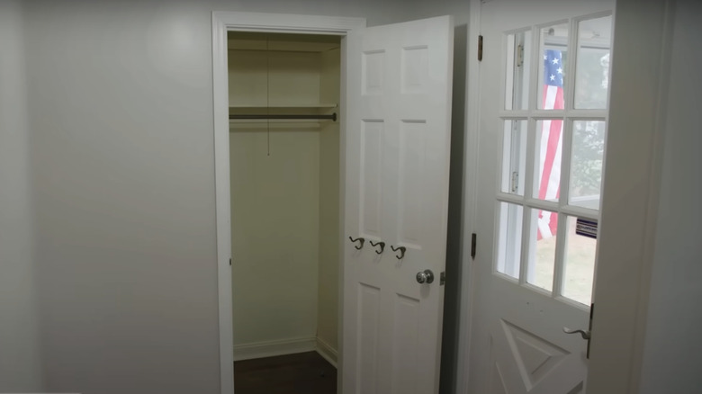
In Season 1, Episode 2, Farr helped a blended family rearrange their floor plan to better suit their new life together. One of Marshall and Francine's wishes was to have a guest bathroom on the ground floor. However, squeezing it into the already tight entryway would be a near-impossible task. Farr wasn't sure she'd be able to make that happen with everything else that had to be accomplished within their $65,000 budget. Even with the challenges, she came up with a brilliant solution in the end.
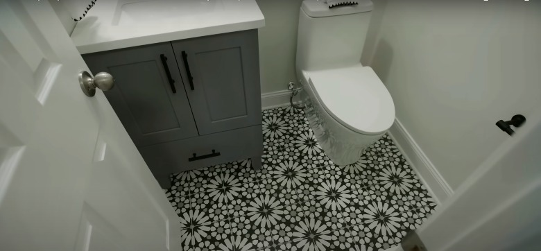
This is one of Farr's best renovations because it showcases her ability to reconfigure a floor plan and create rooms seemingly out of thin air. Although they had to lose the front hall closet to make room for a half-bath, the results were stunning. It may be controversial to lose storage space, but Farr came up with a solution for that as well. She added a closet off the living room to make up for the closet takeover. Stylistically, she designed the powder room with funky tile, quartz countertops, and black hardware. Although powder rooms are small, that doesn't mean they have to be lacking trendy touches. Tile is a great way to make use of the compact space. To get a similar look, consider these tiles from Wayfair.
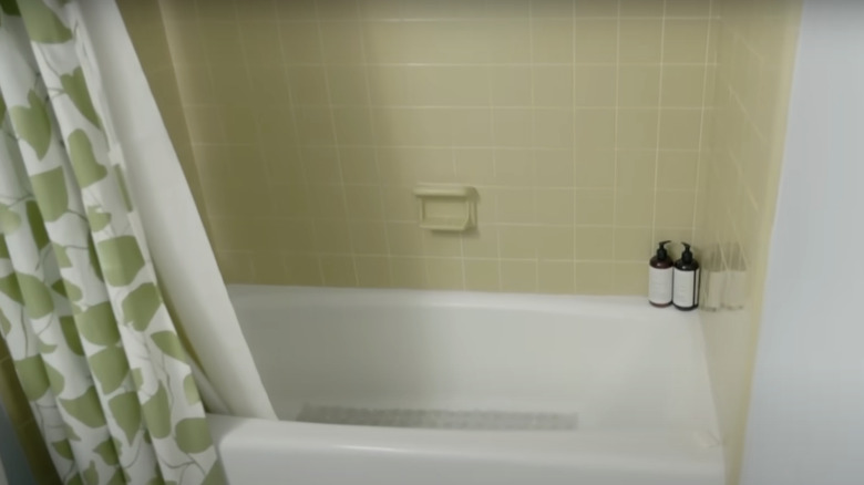
A marvelous mid-century modern upgrade
Farr worked to enhance an incredible mid-century modern home in Season 2, Episode 10. Although the house didn't need as much work as other projects, her goal was to optimize the functionality of the floor plan without sacrificing the retro charm. The original bathroom had a cramped shower with mustard yellow tile and a gold-framed door. There was also a single sink to be shared by the couple. Homeowner Lori described it as "dark and drab."
Farr didn't want to create a bland, modern bathroom for this playful mid-century home, and that's what makes this transformation so great! She made a controversial choice to add teal tile in the kitchen and the bathroom. Although the design was undeniably funky, the homeowners, Lori and Adrian, loved it. "This feels like a little spa!" exclaimed Lori. She continues, "The colors, too, really lighten up the space." Just like the previous home, this bathroom is another example of how the wrong bathroom tiles can date the entire room. You can still pay homage to the roots of your home while opting for something that feels more modern. Find almost identical tiles at Marble & Tile USA.
From retro and cramped to bright and beautiful
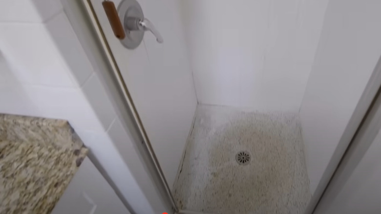
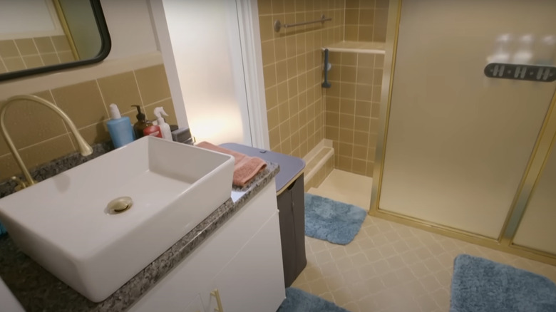
Season 2, Episode 6, featured another stunning mid-century property! Homeowner Claire clarified that she and her husband love a lot of elements of the home's original character, "We want to keep the spirit of that age in the home." However, the master bathroom was extremely claustrophobic. "It feels like a punishment," Claire explained. The coffin-like shower stall had well-worn terrazzo floors and vintage white tile walls. The granite countertops were clearly not original, and only made the space look confused and more cramped.
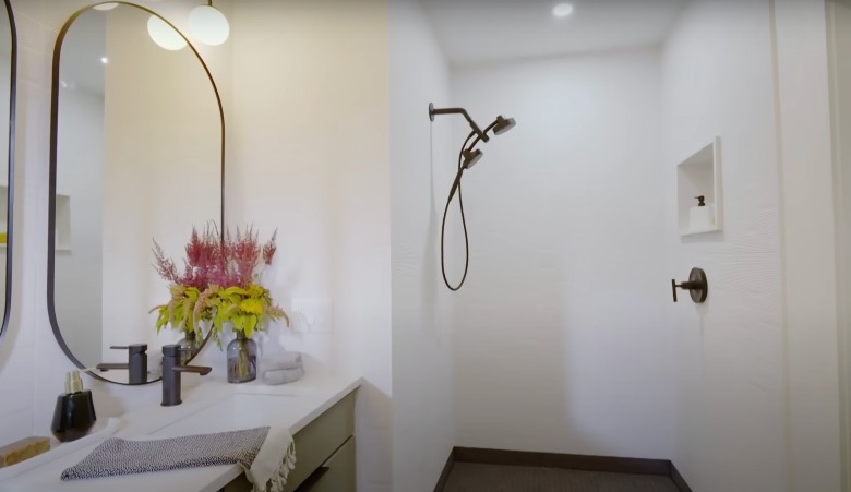
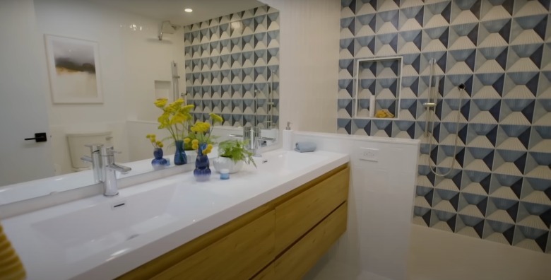
Thanks to Farr's magic, the impossibly small shower stall was replaced with an open, standing shower and a beautiful double vanity. "This is like a bathroom from a magazine!" Claire exclaimed in the final reveal. Farr created a perfect blend of past and present with several key features. She expanded the shower and added white tiles with texture. For the vanities, she incorporated green drawers with black pulls to match the matte black hardware throughout the space. Farr also hung two oval mirrors to emphasize the era while still maintaining a trendy space. Find similar mirrors on Amazon.
Adding character and space to a drab, neutral interior
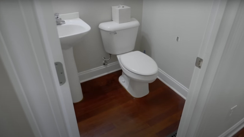
Homeowner Andy, of Season 2, Episode 8, had been battling colon cancer. This put a major pause on his and his wife Nichole's home renovation plans. Not only was their floor plan less than functional, but their home was drenched in a wash of grey tones. While they did have a half bath to begin with, it was bland and felt crowded. The neutral space had an old, pedestal sink crammed next to a simple toilet.
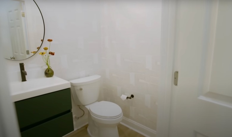
While Farr usually moves walls and plumbing to create larger spaces, this renovation is much more accessible due to its simple alterations. Farr gave their powder room a boost of style by adding playful patterned wallpaper. She also replaced the sink with a unit that doesn't touch the floor, creating the illusion of more space. A priceless bathroom design tip from Hilary Farr, a wall-hung sink can make a room feel larger without actually having to expand the space. Typically, square shapes are also more space-savvy than sinks with rounded edges. The modern sconce above the sink was also a great way to make a narrow space look stylish. You can shop a similar, starburst-style wall light at EK Chic Home.
A stylish and sleek mother-in-law suite
Season 2, Episode 3, featured homeowners Justin and Josh. They were already a family of four, and they were about to become a family of five with Justin's mother moving in. Farr chose to leave the upper floor as is and only renovate the lower level. Her goal was to create a comfortable and stylish in-law suite. Before the renovation, the bathroom had dated yellow tile and a tub/shower combo that made the bathroom appear extra-small.
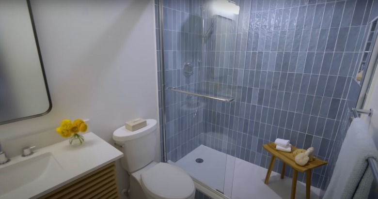
Not only did the end result look beautiful, but Farr also considered the safety and well-being of Justin's mother. She replaced the tub combo with a walk-in shower to for easy physical access and enhanced space. Blue tile added a pop of peaceful color and a large vanity provided plenty of primping space. Vertical subway tiles are a growing trend as designers are straying away from the classic horizontal look. The vertical layout offers a unique take on this tried-and-true style. In fact, Joanna Gaines uses the vertical tile trick to make rooms feel taller.
A pristine and private spa-inspired master bathroom
Another growing family was featured in Season 2, Episode 1. Antwanne and Teressa were prepared to be empty-nesters, but ended up having to house their niece, nephew, and mother-in-law. The biggest issue was the master bathroom, which offered little respite from the couple's busy life. There was only one sink and the tub and shower were shoved into a tiny nook.
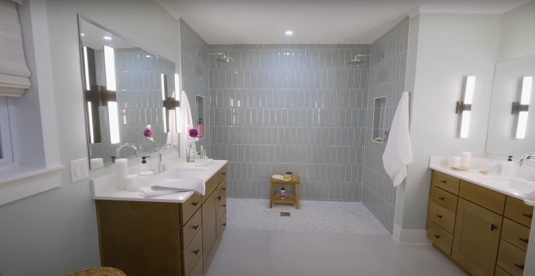
Door-less showers are shaping up to be a big design trend, and this bathroom is a stunning example. Farr removed the recessed tub and created a zero-entry shower with two showerheads. The lack of barrier created more space for two people to shower at the same time. She also added two vanities to offer both Antwanne and Teressa their own designated space. While it's easy to assume that the only two-sink solution is a double vanity, this renovation showcases the possibility to put a sink on each side of the room. If you don't have space to put two side-by-side, consider another area of your bathroom where you can incorporate a second sink.
Borrowing space to expand a luxurious master bath
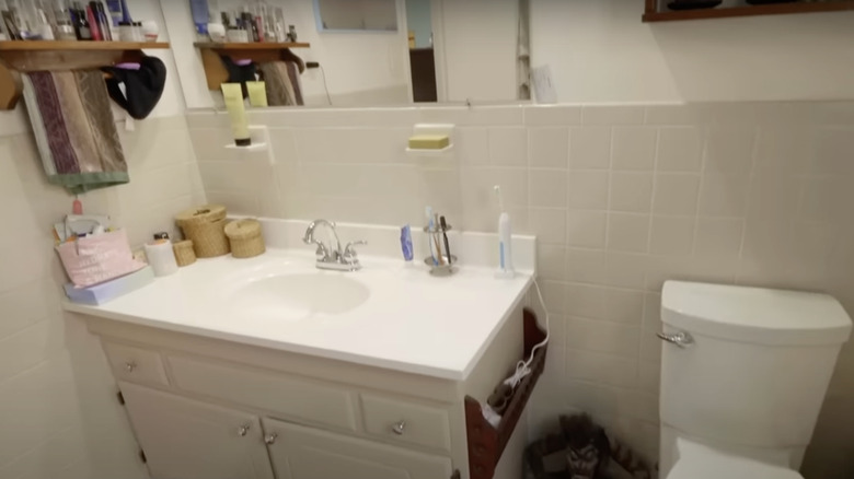
In Season 1, Episode 8, Farr took the chance of removing space from her clients' master bedroom. Although the couple was hardly using their original space, it was still a daring choice to steal square footage from such an integral room. Originally, their master bath had retro tiny tile flooring and beige ceramic wall tiles. It was also extremely small, with hardly enough room to walk between the shower and the single sink.
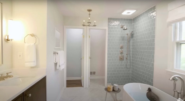
Everyone agreed the sacrifice was worth it when Farr revealed a huge, luxurious master bathroom. Not only did she include two sinks and a standing shower, but she granted the wife's greatest wish with a freestanding tub. While borrowing space from a bedroom is risky, there's nothing that can hurt your resale value more than a small master bath. In fact, Renofi calculates an average 56-64% ROI. Beyond Farr's brilliant ideas, you can turn your master bathroom into a luxury oasis with these renovation tips.
A crisp, clean master bath for a bright future
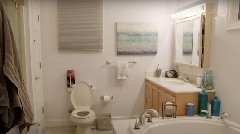
Tom and Michelle, of Season 1, Episode 5, had to make an abrupt move into their home. Over the 18 months that followed, they made little to no progress settling in. They expressed feeling overwhelmed with clutter and chaos in their 110-year-old home. While their original master bathroom did have a freestanding tub, the style looked dated and it was taking up way too much floor space. Plus, the shower was shoved into a tiny cubicle.
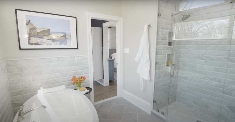
Farr reconfigured the entire space to turn the awkward layout into an unforgettable, bright bathroom. She expanded the shower cubicle, changed the location of the sink, and replaced the freestanding tub with a more modern variation. In addition, she swapped out all of the dated finishes in their master bath for a clean, sophisticated look. The use of light colors and modern materials allowed this couple to feel excitement, rather than stress, about their future in the home. One interesting element of Farr's remodel was the partially tiled wall in the corner around the tub. This visually delineates the bath from the rest of the space. You can also accomplish this by hanging art above your bathing area, installing shelves with bath products, or painting an accent wall.
An updated and upgraded historic barn bathroom
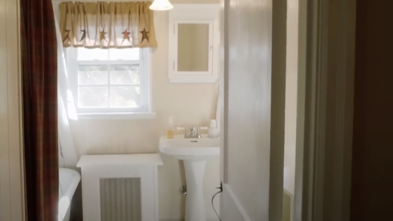
In Season 1, Episode 1, Kim and her two children lived in a stunning converted barn, originally built in the 1700s. Although the family loved their home and wanted to retain the original character, they admitted that it lacked functionality. While the original bathroom had vintage charm, it wasn't suitable for two children to share. In fact, the kids were used to using their mother's bathroom instead of their own. Farr knew she had to give them a bathroom they couldn't resist.
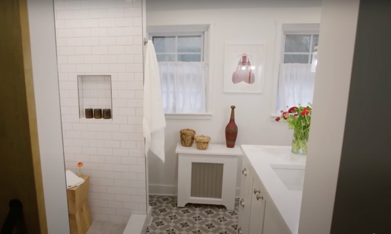
Although it was the first episode of the series, it's clear why viewers became hooked on the show. Homeowners often don't consider the visual and practical impact of renovating a child's bathroom. Farr transformed the children's bathroom into a modern, spacious retreat that still included pops of visual character. Because the children were reaching an age where a bathtub wasn't a necessity, a walk-in shower was a much more practical alternative. The end result was so great that Kim exclaimed, "I almost hesitate to call it the kids' bathroom, because I'm *this* close to using it for myself and making them continue to use my room." As your children get older, it's important to consider the best bathroom design for teens. In addition to modernizing the layout and finishes, you can add hints of visual interest through tile, wallpaper, and pops of color.