The Big Mistake You're Making When Choosing Living Room Wall Paint
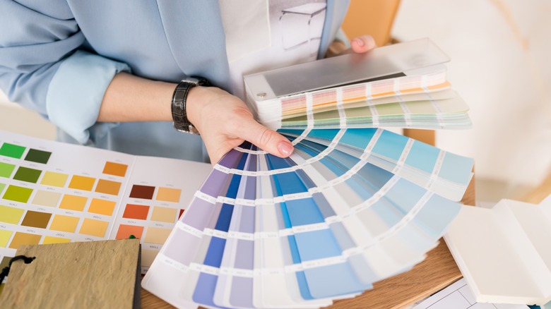
Choosing living room paint colors seems simple enough. You select a shade you love, sample it on your wall, and then buy a gallon or two of it. However, choosing a color based on which shade you like the most can lead to a common painting mistake – not considering what works best with the light levels in your room.
If you like a particular color in the hardware store but you have a shadowy living room, the color won't look the same on your walls. That's because the home improvement store is well-lit with bright fluorescent lights, but the shadows in your room will give it a cool tinge, completely changing its hue. Even if you paint a sample on your wall, the paper-sized square won't likely give you an accurate reading of how it will look on the entire wall. For example, a white color with a blue undertone might appear more icy then you'd like in a dark room without much sunlight.
To avoid worrying about changing undertones, you can instead stick to deeper shades in these spaces. They will only become richer as the light wanes, ensuring you're getting a similar vibe no matter what tint it takes on. This rule is best utilized for rooms with north-facing windows, which get the least amount of light, and east-facing windows, which get the most light during the morning. Here is a closer look at how to utilize this tip.
Use deeper paint shades for rooms that are more shadowy
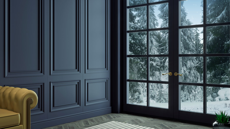
You might think that the best way to brighten a dark room is by painting it with light, bright colors. However, due to the lack of light and abundance of shadows, the airier paint can appear cool-toned and dingy, which won't make a very inviting space. Instead, try darker colors to keep the room true to your vision. "The amount of light in a room will affect the colors you use. Richer/deeper shades generally work best in darker, poorly lit spaces where pale shades can appear thin and watery," Russell Loughlan, a home renovation content creator, told Country Living.
By choosing rich, warm-toned hues, you'll feel enveloped and won't notice that the room isn't getting loads of light. So, what kind of colors does this entail? You can try a reddish-brown shade like Love Affair from Benjamin Moore, which gives off a faint pink tinge. Newburyport Blue is another bold pick from Benjamin Moore, coming across as a powdery navy. If you're looking for something earthier, try Lafayette Green, a rich dark green. Each of these can make a dark room much more inviting than a watery white color tinged with gray.
What to do if you don't like rich color
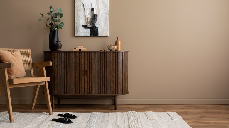
What if you don't like big and bold colors in your space? The good news is that you're not doomed to live a life without neutrals. In that case, you can instead choose a neutral with its LRV, or Light Reflectance Value, in mind. This scale measures the percentage of light bouncing off a surface, with 0 being pure black and 100 being pure white. Saturated, moody colors have lower numbers, while airier neutral colors have higher numbers.
So, if you like a particular neutral tone with a high LRV, look for a similar one in a deeper hue. For example, if your go-to hue is Edgecomb Gray with a LRV of 63, look to the slightly deeper shade Pashmina to create a cozier feel with its LRV of 44. It still provides you with a neutral backdrop while avoiding those odd shadows. If you'd like to balance the intensity of the hue, you can use a higher gloss paint finish to help reflect more natural light. Or, supplement your overhead ambient lights with floor and task lamps. This will allow you to see the beauty of the color more clearly.