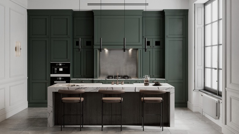
Joanna Gaines' Nature-Inspired Cabinet Color Is Setting A New Trend For 2024
Joanna Gaines has built an empire from her impeccable interiors that seamlessly and beautifully blend old and new elements. Branching out from the modern farmhouse style she was previously known for, she has been a trendsetter for the wildly popular new traditional, or modern heritage, design style by elegantly mixing traditional styling and character with modern amenities and decor. In her unique and thoughtful renovation of an old castle in Waco, TX, Gaines put her signature design blend of historic and modern elements to work, creating an inspiring, perfectly balanced interior.
In what she now calls the butler's pantry, Gaines reworked a sitting area to make more room for cooking and food storage for modern-day use. Restoring the original fireplace, millwork, and stained wood window, she updated the space with new marble countertops, hardware, appliances, lighting/plumbing fixtures, and a new layout of custom cabinets painted the most magnificent shade of dark blue-green. Whether or not this room single-handedly created a major cabinet color trend for both traditional and modern spaces for the year to come is unproven, but what we do know is that you absolutely need to take a page out of Joanna Gaines' book and head straight for the moody blue-green paint hues for your kitchen renovation or cabinet refresh.
Why this earthy dark blue-green hue brings calm and joy
Joanna Gaines is a master of crafting the perfect paint colors, as made evident by her enormously popular Magnolia Home paint line. Developing a collection specifically for this one-of-a-kind renovation, Gaines says, "I wanted to honor the history of the castle with rich, unique colors that would complement its grand and traditional aesthetic while still creating a timeless palette for any style of home" (via Magnolia.com). This is how the butler's pantry cabinet color came to be, beautifully named Cottage Grove. "A rich blend of navy and green, this color can take on either tone in different light, which makes it both dramatic and cozy all at once," says Gaines. This moody but not-too-dark hue perfectly straddles the line between blue and green, evoking images of that lovely place where lush forests blur into night skies.
This is exactly why this color feels so right — its connection to nature makes the hue feel grounded, serene, and full of wonder. Because it is so rooted in our everyday outdoor environment, the tone feels familiar and down-to-earth, meaning you are unlikely to get sick of it any time soon, a common hesitation when committing to a cabinet color for an entire kitchen. Earth tones like this moody blue-green are deep in our souls, which is precisely why Gaines used it to bring joy and calm to this stunning space.
Bringing your dark blue-green hue to life
So, will any blue-green paint hue do? The answer is an emphatic no! What makes this color so perfect, timeless, and serene is that it also has a generous amount of gray, making it more muted and subtle while still maintaining depth and drama. Always remember that a paint color will appear more saturated on the wall versus on a small paint sample, so be sure to paint a large test swatch to assess in various lights throughout the day before committing.
Once you have your exact hue selected, the key to giving it the same incredible presence as Gaines' butler's pantry is to surround it with materials and other colors that elevate it. Marble or white/cream quartz countertops complement the moody hue with contrast and help keep the space feeling light and airy. Warm wood tones, such as the stain color on Gaines' windows, are a classic combination with this color, bringing to mind groves of soaring evergreen trees. Metallic accents are also gorgeous with this shade, especially matte black, for creating a more modern space or gold/antique brass for adding more character to either a modern or traditional aesthetic, depending on the hardware profile. This dark hue, halfway between muted forest and navy, is the ideal cabinet color because it works so beautifully with all design styles — not to mention feels grounded and down-to-earth while still bringing a major mood. It's drama and calm all in one!

