One Groovy Decade's Colors Are Trending Again And Here's How To Get The Look
The 1970s are a retro décor era known for its distinctive design trends, including warm, earthy colors and soft rounded lines. These details were punctuated by ample plant life, lots of rattan, bold patterned wallpaper, and fabrics like deep-pile shag carpet and luxurious velvet. The color palette itself is a memorable one, featuring lots of browns, greens, muted oranges, and mustard yellows. While trends for many decades' primary colors come and go, there's been a recent rise in designer interest in the color palette of this particular decade, with experts like HGTV's Joanna Gaines touting the virtues of these fun retro shades. They are all over her Magnolia paint collection, where new additions include shades with a definite nod to the free-wheeling 1970s. These rich browns, deep blues, and subdued greens are excellent whatever your décor aesthetic is, be it retro or modern.
Gaines calls these colors "comfortable, timeless, and grounding" in a piece featured in Homes & Gardens, a feeling that many homeowners and others in the design world would seem to agree with, with new shades and design ideas popping up everywhere.
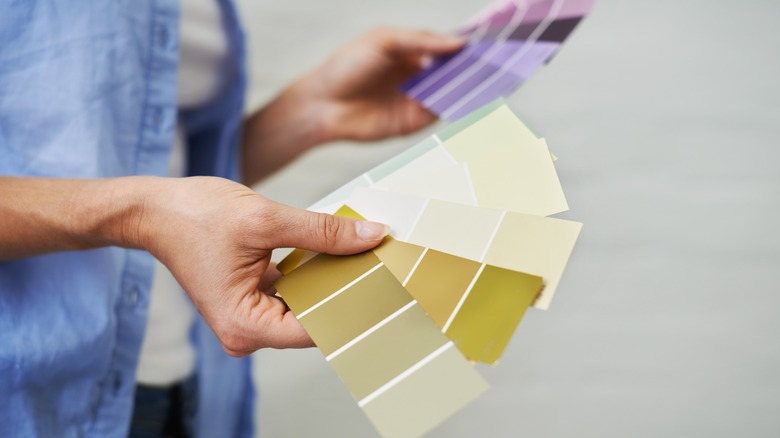
Popular shades from the 1970s
The key to the popularity of these fresh colors, which in the Magnolia line include shades like "Remote Trail," a new take on the ubiquitous avocado green of the 1970s, and "Cognac," a warm cocoa brown, is that the colors draw heavily from nature and earth tones. They evoke all of the elements, including plants, sky, stone, and water. As a result, they look stunning separately or together. They also feel soft and subdued, many muted with gray-ish or dusky undertones. The boldest Magnolia shade in the line, a deeper blue called "Superior" that evokes the Great Lakes, is warm and inviting and still has a softness to it, while the one true neutral, a gray called "Tranquil Waters," boasts a similar warmth and softness. The 1970s inspired shades are rounded out by "Juniper Tree," a soft crisp green that can almost pass as a neutral.
Other colors that give a definitive 1970s feel include mustard yellow and gold, burnt orange, deep teals, and shades like caramel and chocolate brown. These shades often look stunning when combined or in a monochrome color scheme, which layer different depths of a single similar shade together on walls, upholstered items, and furniture. Other great 1970s colors include dusty soft blues and baby pinks.
How to use retro '70s color in your home
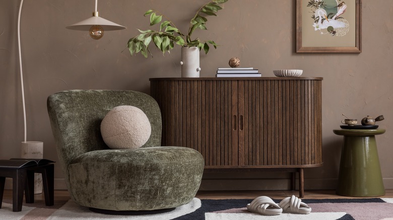
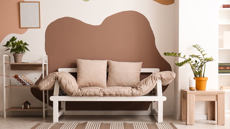
There are a multitude of ways to bring these amazing retro colors into your space in a modern way, including the most obvious — on the walls. To bring back the '70s, opt for a monotone room with one or two similar shades, like pairing lighter and deeper green or tan and chocolate brown. Or use them as a way to add a pop of subdued color to a room all in neutrals, like a crisp green or avocado green accent wall in an all-white or cream room. If you prefer to keep walls neutral, opt for colored furniture pieces, one of the hallmarks of the decade, like painted consoles, dressers, and desks in a deep avocado that immediately grants a fresh and organic feeling to the space.
The profusion of '70s-style patterns using these colors in various combinations is also very on trend, with bold and geometric wallpaper designs and fabrics pulling in these colors. For an iconic '70s look, add an accent wall in shades of green or brown, or opt for other great combos like mustard and teal, orange and gray, or pale blue and chocolate.