The Interior Design Rule Hilary Farr Ignores (And How You Can Recreate The Look)
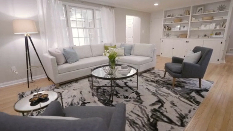
Home design rules are meant to be broken, which is why Hilary Farr doesn't mind going against common convention every now and then. Whether that's clashing colors or mixing finishes, if a space calls for it and it looks good in the end, why not go against the grain? In the case of Season 1, Episode 2 of "Tough Love with Hilary Farr," Farr decided to put a small couch in front of a window, which is usually seen as a design misstep. That's because people usually avoid blocking their windows with furniture. Not only does it not allow as much light in, but it can stop you from accessing the window entirely, or it can look wonky from the outside looking in. However, the HGTV designer didn't put a bulky couch in front of the picture window, blocking half of the pane. Instead, she did it with some careful planning, ensuring it didn't look odd to the eye.
Specifically, Farr ensured the couch cushions ended an inch or two above the windowsill. They didn't obstruct any of the view, and it still looked easy to access the window to open or close it. Because of this, the design looked natural rather than choppy. Do you have a window taking up valuable wall real estate? Here is how to put furniture in front of it without throwing off the room's feng shui, just like Farr.
Hilary Farr positioned a couch in front of a window without creating a faux pas
In this particular episode, Farr was tasked with renovating a quirky floor plan to make it more conducive for a family of four. Homeowners Francine and Marshall are a blended family with one daughter each, but their living room was designed in such a way that there was no proper place to put a TV. Both long walls had windows, while one of the shorter walls had a fireplace and the other had a built-in bookshelf. There was nowhere to anchor a couch. This forced them to put the TV in the corner between the window and fireplace, with the couch facing the larger picture window. The flow of the room was all off. "Because you have windows on each side, you've got a fireplace there, you've got another focal point over there — I can see why it's a struggle," Farr said in the episode. But she was also able to see the solution.
Instead, she put the couch in front of the larger window and the TV directly across, between the two smaller casement windows. "You get such a sense of space now," Farr said in the episode. This design works because the back of the couch hovers just an inch or two above the sill. The length of the couch is also as wide as the window frame, ensuring that the proportions work well. If the window was half the size, the scale would be off.
How to incorporate this styling in your own home
If you have a small window you want to put a couch in front of, there is still a way to do it. You can use window treatments to expand the size of the frame, flanking either side with thick curtains. This will add an extra foot on each side, allowing the couch to hover in front of it. However, a sofa isn't the only piece of furniture you can put in front of a window. Farr also likes to use a built-in storage bench, a genius space-saving technique in front of windows. It not only gives you an extra place to sit and relax, but doubles as a large chest.
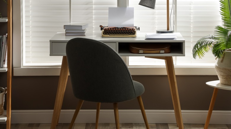
You can also put items like tables, chairs, buffets, and desks in front of panes. If these pieces are taller than the sill, a good workaround is to float the piece a few feet away. This won't make it appear like it's styled to be directly in front of it, and instead it will look like it's a natural part of the room. For instance, if you want your desk to look out to the outside, place it three feet from the sill to make it appear less awkward. Similarly, if your couch has a higher back, move it a foot or so away from the window to make the placement feel less choppy and more designed.


