Hilary Farr's Pro Tip For Matching Cabinets, Counters & Backsplash
Designing a kitchen seems pretty straightforward on your favorite HGTV show, but when it's time to do it yourself, it can be pretty overwhelming. What's most difficult is choosing the color scheme, as the rules may vary when designing a new kitchen. Specifically, this means deciding the colors for your cabinets, backsplash, and counter. Nowadays, you receive a small sample as big as a Post-it note, and you're supposed to choose your colors based on that. Gone are the days of walking through showrooms and seeing lifesize examples of the finished kitchens.
That might sound like a lot of work, but Hilary Farr has a trick that will help you envision your future kitchen better while using those small samples. And that is to lay them out how you will see them in the finished space.
"It's difficult with slabs, you're always looking at them like this," Farr said on "Tough Love with Hilary Farr," waving her hand up and down vertically. "But they're actually going to be here," she finished, moving her hand side to side horizontally. She had a quick fix for this though, and took the couple to a table where she arranged the different samples in the same way you would see them in the finished kitchen. "So we're going to put this all together so you're actually seeing horizontal and vertical," Farr continued. Here's a closer look at the tip.
How to arrange your samples to better visualize your kitchen design
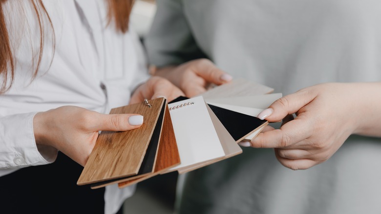
To help the homeowners better visualize how their finished kitchen would look, Hilary Farr skipped arranging the small samples on a flat lay and instead positioned them as they would appear in the space. That means the countertop slab was set down flat, the backsplash sample was propped on top of it vertically, and Farr held up the cabinet sample vertically over the backsplash tile. While she typically gravitates towards neutrals when choosing stunning kitchen finishes, errors can still be made in the color choices.
This tip will not only help you envision the space better but will also help you see if the colors go well together. Not only that, but it will also help you see if the undertones match. In the video, Farr mentioned the backsplash has a pinkish undertone, which is warm. That means it would be best if the counter and cabinet undertones were also warm, which they were. You would be able to quickly see if they weren't if they were arranged in this way, prompting you to choose another sample. While you can balance warm and cool undertones, it's sometimes tricky to do, which is why it's best to match them instead.