HGTV Stars Avoid These Living Room Design Mistakes At All Costs
Living rooms are often the centerpiece of the home. They're not only where you gather or relax after a long day of work or curl up with a movie and popcorn, but also a room where you can get truly creative. Depending on what kind of couch, coffee table, and rug you choose, you can get really innovative with your design. However, this creativity can sometimes go sideways and lead you to mistakes. If you feel like your living room just isn't working but you can't put your finger on why, it's time to turn to your most trusted HGTV designers to break down what to avoid. Everyone from Nate Berkus to Bobby Berk has tips on what to avoid in living room design, helping you navigate what looks good and what throws off the vision you're trying to achieve.
For instance, Shea McGee recommends avoiding furniture sets, as they make the space appear too matchy-matchy, giving off a showroom vibe. Instead, take the time to curate couches, seats, and chairs that are cohesive, but have a fun level of contrast to make the space feel more dynamic. On the other hand, Bobby Berk recommends avoiding couches that don't match the scale of the room, since the wrong size will make the space either feel too cramped or too cavernous. There are a lot of different things to consider, and these designers can point you in the right direction. Here is a closer look into the living room design mistakes HGTV stars want you to avoid at all costs.
Nate Berkus recommends staying away from flashy prints
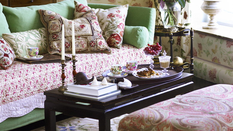
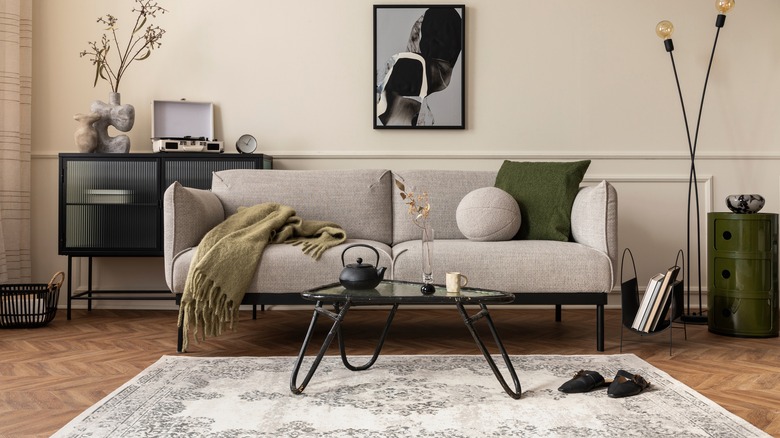
If you love to have lots of color in design, then you might be tempted to buy a large ticket item such as a couch or loveseat in a print. While that will help create a more maximalist space, Nate Berkus thinks you should avoid doing that. "Prints are tough on large-scale furniture — keep your sofa (and other large-scale items) to the basics," he told MyDomaine. "Linens and cottons in solids can be dressed up or down easily and tend to look expensive." Prints tend to get dated rather quickly (think of the chevron print of the 2010s), and replacing something as expensive as a sofa or a rug when the trends change can be a real strain on your wallet. If you can't afford to do so, you'll be stuck with a print you no longer like that acts like the centerpiece of the room.
Instead, focus on getting larger pieces in timeless, neutral colors and experiment with patterns in easily interchangeable accessories. For instance, if you want to experiment with cottagecore-inspired florals, buy throw pillows or vases in the provincial print. That way, once you tire of the trend, you can easily swap them out for something new. The same principal applies if you're drawn to a bold color. If red has really caught your eye, try introducing it through table lamps, knick-knacks, or side tables rather than committing to a red sofa or sideboard.
Shea McGee doesn't use matching furniture sets
Shea McGee has put transitional styling on the map, which uses traditional designs with a modern twist. It relies on classic furniture and decor, but one way she is able to make her living rooms feel charming rather than dull is by mixing and matching furniture. You won't catch her buying matching sets to complete a room. In fact, it's one living room furniture piece she avoids at all costs. In Season 3, Episode 3 of "Dream Home Makeover," McGee discusses the reasoning behind her living room design, revealing, "Every piece of seating has a different piece of fabric on it. Nothing actually matches. That's what helps keep things more interesting and not too fancy." Mixing and matching different colors and textures makes it look curated and thoughtfully designed rather than purchased straight from a showroom. The former makes it feel homey and more inviting, while the latter has a tendency to make it feel like an Airbnb.
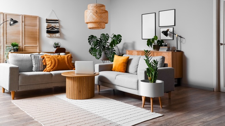
When it comes to mixing and matching furniture, a neutral foundation is your best starting point. Similar to Nate Berkus's advice, choose a couch, area rug, and coffee table that are relatively classic and neutral in shape and color. Then, you can add pieces from different aesthetics and eras, along with various textures, materials, and wood tones. To ensure a cohesive look, stick to a specific color palette, whether it's neutrals, warm tones, or cool tones.
Bobby Berk doesn't think you should ignore scale
There is a lot of living that happens in a living room, so it's important to invest in a comfortable couch. From watching TV, to catching up with friends, to eating dinner, none of those activities would be fun if you had a stiff or cramped couch. However, former "Queer Eye" designer Bobby Berk doesn't think you should pick your couch just based on its sinkability. "A lot of people, when they go to buy a sofa, choose one that is only comfortable. Yes, you do want one that is comfortable, but you also want one that works with the scale of the room," he said in an interview with Homes & Gardens. "If you have a room with lower ceilings, you don't want to buy a sofa that has a really tall back." This will make the space feel more cramped. Instead, choose one with a low back to make it seem like there is more space between the floor and ceiling.
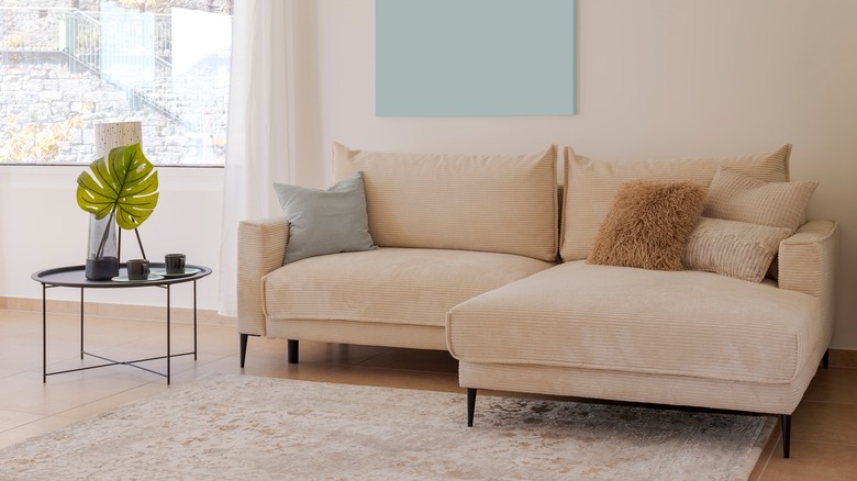
The same principals apply to small and large living rooms. If your space has high ceilings but small square footage, opt for a small two-seater sofa with a high back. Alternatively, if you need more space, choose a couch without arms to make it feel less bulky in the tight quarters. However, if you have a sprawling living room, you want to choose a couch that matches that scale. Opt for an L-shaped or U-shaped couch that can comfortably take up an appropriate amount of floor space.
Erin Napier doesn't think you should paint over historic trim
If you live in an old apartment building or have bought an older house, chances are your living room has some historic accents. From built-in bookcases to carved mantels to original wood trim, these antique finishes can add a lot of character to the space. However, it also might not be your cup of tea, in which case you might feel tempted to paint over it. But before you pick up a paintbrush, Erin Napier urges you to reconsider. In Season 7, Episode 3 of "Home Town", the HGTV designer warned against painting over original millwork, explaining, "Most people want to paint their historic trim. I think it's a huge mistake 90% of the time." Her husband, Ben Napier, seconded that, sharing, "Once you paint it, you can't go back."
Instead, find ways to incorporate it into your style. For example, if your oak trim is an orangey-honey stain, paint the walls a color that will complement that color and make it feel more modern. Blue-greens, bronzes, and grays with green undertones will all complement that particular shade, making it feel more contemporary. If it's a golden oak built-in you're dealing with, try updating the hardware for something more modern, like black matte handles. You can also transform how it looks by what you put on the shelves — fill the unit with modern, curated shelving accents and it won't seem old-fashioned anymore.
Erin Napier doesn't like painted wood furniture
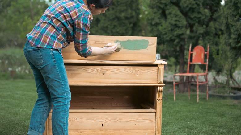
Similarly, Erin Napier also doesn't recommend painting furniture in your living room to make it feel more modern. It's a design mistake she avoids at all costs. And that's not because she doesn't like the look of white sideboards or navy end tables. Instead, she loves how grain adds pattern and texture to a room. "I hope we'll finally see people stepping away more from painted furniture and toward the warmth of natural and stained wood. The organic movement in wood grain is art!," she told PopSugar. Whether or not to paint wooden furniture is a divisive topic in the design world, where some believe it ruins artisanal and antique pieces, while others think it breathes new life into furniture that might end up in the dump otherwise. But Napier would advise you to put down the paintbrush and instead pick up a staining rag.
Whether the wooden piece has scratches or the stain is a color that doesn't work with your home design, you can still transform it by sanding and staining it. This will allow you to remove any scuffs and imperfections after years (or decades!) of use and will enable you to add a new hue that still lets the grain and texture through. For instance, while honey oak might seem straight from the '90s, white oak is currently trending and fits right in with transitional and farmhouse aesthetics. Rather than painting a dated wood black or white, consider staining it with a more modern finish.
Jonathan Scott avoids installing barn doors
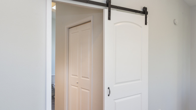
While Joanna Gaines might have put barn doors on the map with her farmhouse modern style, HGTV star Jonathan Scott would prefer not to see them in living rooms. "Barn doors have been overdone. They're perfect for certain solutions, but not for every solution," he told Good Housekeeping. They became popular around 2013 when, coincidentally, "Fixer Upper" aired. Since then, they have been used for everything from closets to bathroom doors to laundry closets. While Scott doesn't think they should be taken out of the rotation completely, he would prefer if they were earmarked for specific circumstances.
While he doesn't get into specifics, barn doors would be best utilized in small or cramped spaces where a swinging door would take up too much space. For instance, they would be perfect for a small pantry where a door would swing into valuable shelf space, a small office, or a tight laundry room. However, they don't have to be utilized in a living room since there is usually enough room for a door to swing open or closed.
Drew Scott doesn't think you should match your furniture if you have an open floor plan
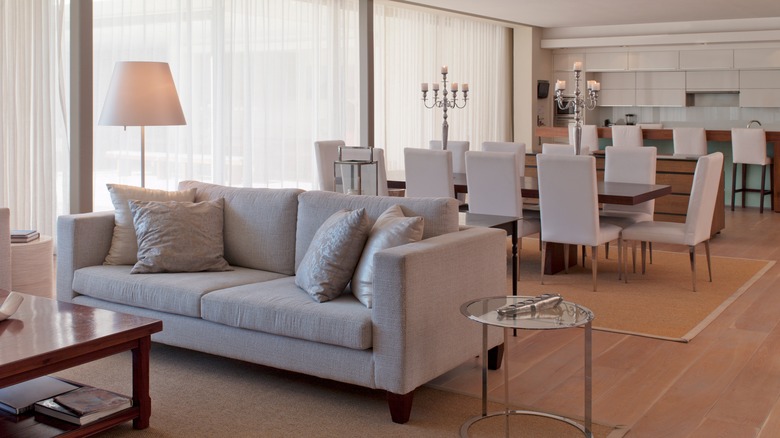
If you have an open floor plan, you might feel pressured to ensure that everything in the house matches. Since there are no walls to separate the different rooms, there is a higher chance that your furniture might clash if you don't coordinate the pieces, whether that's in style, wood tone, or era. However, Drew Scott doesn't think you need to take it quite that far. "People think you have to match things in open floor plans. Matchy-matchy is really boring," Scott told Good Housekeeping. "Find things that complement [each other] and even [introduce] some nice contrast throughout the space to bring more personality." Instead of being overly concerned with coordinating all of your furniture pieces, go in the opposite direction and create an eclectic mix to truly showcase what you like. After all, most people don't like just one design style — most like several different looks. Why not mix them together?
One effective way to make an eclectic mix look more cohesive in an open floor plan is by using fabrics and colors as unifying elements. This creates a common thread through the different "rooms," making it appear connected but not identical. For instance, if you have a boucle armchair in the living room, consider boucle counter stools in the kitchen and a boucle pillow on a chair in the dining room. The same goes with leather or fur. As for color, if you choose a color palette for the house, you can mix styles, eras, and textures without the space feeling disjointed. Instead, everything will feel harmonious and connected.
David Bromstad avoids too-small rugs
A rug can make or break your living room, but it's not just the style or color that you have to look out for. You also have to pay special attention to the size. Choosing one that is too small can throw off the scale of the room, making the space feel smaller than it is. In an interview with DIY blog Pretty Handy Girl, David Bromstad shared why this easy-to-make design mistake should be avoided. "When you are choosing a rug, it should be larger than the largest piece of furniture that you have going into the space. So, if you're using a couch that's going to be 8 feet wide. You should have an 8' x 10' rug, so you have some overlap," he explained. "My biggest pet peeve is when you have a rug and it's floating in the middle of the room. And it's a 5×7, the couch is 8 [feet] long and things aren't touching. The rug should be under each piece of furniture, at least by 2 inches." Doing this helps "ground" the furniture on the rug and make them feel like they're part of a unified collection.
To avoid making this common design mistake in your own living room, prepare to do some math before ordering a rug. Ensure it's at least 6 inches larger than your couch on each side, with 8 inches being the most ideal. To ground the rest of the furniture on it, you want at least 2 inches of rug underneath each piece, usually extending underneath the front two legs of furniture. Additionally, you want a minimum of 18 inches between each piece for comfortable maneuvering, but 30 to 36 inches would be better if space allows. These measurements will give you an idea of what size to order.
Genevieve Gorder doesn't like lights without dimmers
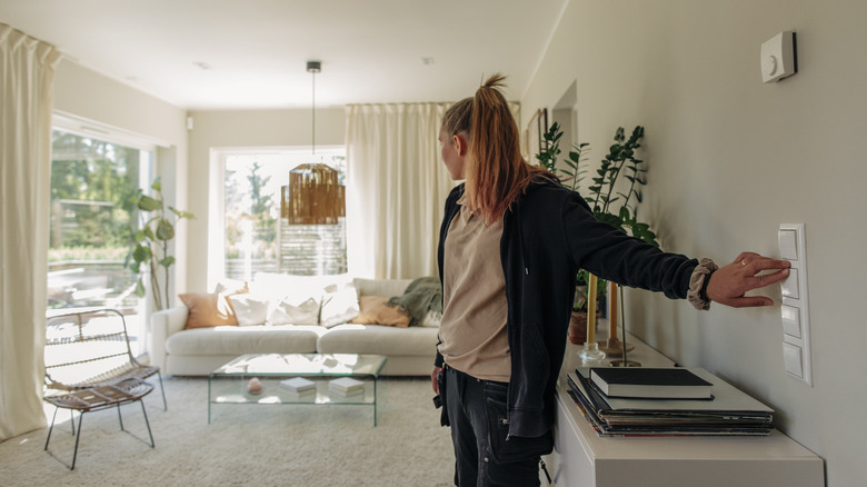
Most people have an overhead light and some table or floor lamps in their living rooms. While this is a sufficient amount of ambient and task lighting, HGTV star Genevieve Gorder would prefer you take it one step further and put it on a dimmer. Failing to do so is a design mistake she says to avoid. That's because a dimmer switch can dictate the atmosphere of the living room with a turn of a knob. "Every light needs to be on a dimmer; it needs to be controllable with mood and time of day. It shouldn't just be what you bought in the box on a switch," Gorder told House Beautiful. This allows you to crank up the lighting when you're doing a certain task, such as a hobby or reading, but dimming it low when you want to set the mood in the space, whether that's when watching TV or entertaining guests with cocktails.
To hire an electrician to install a dimmer in your own living room, it can cost anywhere between $80 to $200. You might get billed on the higher end of the spectrum if your switch was originally a three-way. In that case, the switch would need to be swapped with a three-way dimmer, which is a slightly more complicated wiring system. However, the plates and switches themselves cost anywhere between $10 to $50, depending on what design you get.
Hilary Farr doesn't like leaving your workstation out in the open
Since more and more people are working from home now, more spaces in the home are being utilized as makeshift offices. This is especially true if you don't have a spare bedroom to dedicate to your laptop and screens. Because of this, you might end up working in the living room for eight hours of every day. However, Hilary Farr doesn't think you should leave your workstation out. Instead, you need to blend it with the rest of the room in order to create some work-life balance. "Consider what your home office constitutes," Farr shared with HGTV. "Do you need a printer? Two screens? ... You need to be able to tuck it out of sight so it's out of mind."
To do this, consider creating an integrated workstation so it blends in with the rest of the room. That can be in the form of creating a wall of bookshelves where a desk is integrated into one of the nooks. That way, your screens and chair will blend in with the other items on the wall — such as books and knick-knacks — and won't feel front-and-center in the room. When you're done with your shift, you can simply slide your laptop and mouse into a drawer, turn off the screens, and reclaim your living room as a place to relax in.

