How HGTV's Jenn Todryk Makes An Add-On Room Feel Like It Was Always There
Building an add-on room to your house is a great way to increase the indoor square footage, up the value of your home, and make it more spacious and comfortable for daily living. But whether you add a bedroom, office, playroom, or sunroom, constructing an addition is not as easy as popping up a few walls and windows. There are many questions you should ask when considering a home addition and elements you'll need to walk through alongside your contractor and designer, including feasibility, how much it costs to build a bump-out addition, and, of course, how to seamlessly integrate the space into your home's existing style.
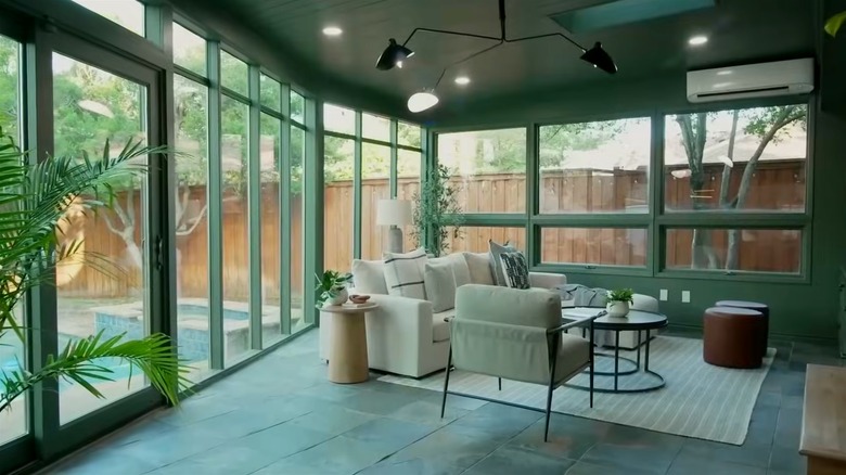
People make many mistakes adding rooms to their houses, and high on this list of errors is failing to consider the overall design of the add-on and investing a huge amount of money in a room that ends up looking incompatible and mismatched with the rest of the home. Whether you're considering an add-on, buying a home with one, or you already own one, HGTV's Jenn Todryk has a smart tip for helping you create a seamless feel. In Season 3, Episode 8 of "No Demo Reno," the designer used a shade of green from the slate floor tiles of the addition and drenched the walls, ceiling, and trim in the shade to create a cohesive look. Below, we break down this design hack and how Todryk utilized it in her clients' home, and share other tips to help you create an addition that looks like it was always there.
How to use Jenn Todryk's add-on design hack
"No Demo Reno" host Jenn Todryk is known for doing exactly what her series' name implies. On HGTV, she transforms lackluster houses into beautiful homes without swinging a sledgehammer, moving a wall, or engaging in any other form of demolition. Creating a cohesive look posed a unique challenge for Todryk in Season 3, Episode 8 of her series when she tackled an add-on sunroom that looked very obviously like an extension. The problem arose from the mismatched look of the natural brick wall and French doors that once served as the house's exterior and which contrasted harshly with the new light blue walls, white-trim windows, and white ceiling.
To combat this harsh contrast and create more visual unity, Todryk pulled a gorgeous shade of green from the existing slate tile and used it to color drench the walls, ceiling, window, and door trim. Todryk said (via HGTV on YouTube), "By painting it all kind of one dark moody color, and all of a sudden that very obvious exterior wall becomes a really cool feature wall." In another room, the dark green shade may have been a risky move, but the abundance of natural lighting from the large windows made it a perfect shade to add coziness and coherence to an otherwise awkwardly-designed add-on. The clients were wowed, with husband Grant saying, "Before, I really felt like this room was just kind of a junk room." Jennifer chimes in, adding, "It feels more grown up and intentional ... This color is amazing."
Other tricks for a seamless addition
Color drenching is a great way to create a cohesive look and feel in your add-on room. But besides reaching for the paint roller, there are other ways to seamlessly integrate your add-on. Another Jenn-Todryk-approved method is to use what was formerly an exterior wall as the backdrop for built-ins, as she did for Grant and Jennifer in this episode. The built-in fixtures create a more permanent and intentional feel to the room. Todryk also kept the theme consistent throughout the home, creating harmony between all the rooms and helping the add-on blend in. She created a cohesive color palette with shades of green, soft whites, natural wood textures, and gold hardware right through the home, not straying from this theme in the add-on.
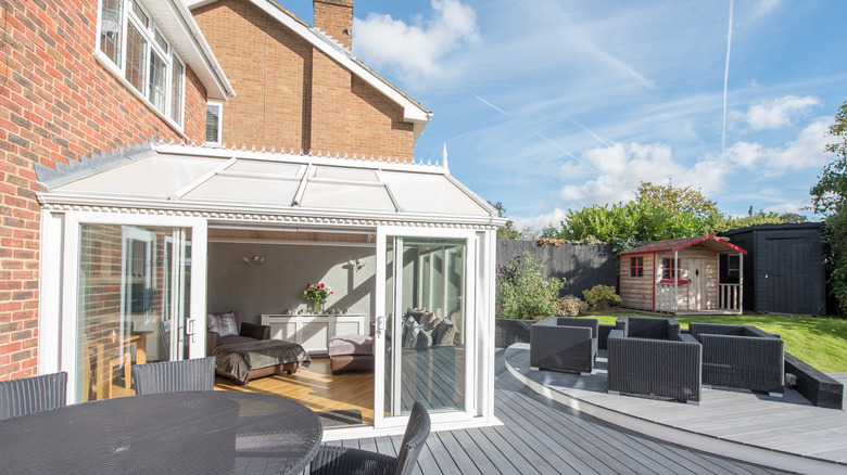
Another important factor you shouldn't overlook is how the exterior part of your addition looks with the rest of the house. As you do for your interior, your exterior materials and colors should match or complement the already existing structure of the home. Without this match, you could lose continuity and visual interest and even make your home less appealing to buyers. When attempting any kind of add-on room endeavor, it's also important that before you think about design — you consult your contractor to ensure the structure you have planned is legal in your area, feasible for your home, and a sound monetary investment. When it's been greenlit by your contractor as architecturally and financially sound, that's when the fun of design begins.


