7 Times Fans Were Left Unimpressed By HGTV Stars' Homes
We may receive a commission on purchases made from links.
These polarizing renovations are proof that HGTV stars are just like us! Everyone makes questionable design choices now and then, including your favorite HGTV personalities. While we are obsessed with watching them complete home makeovers on each of their respective programs, it's even more fascinating to witness how they choose to design their own homes. Although some HGTV stars have decorated their homes in a predictable aesthetic, others have made more unexpected design choices.
Thanks to home tours available on YouTube, fans have been able to weigh in on the interiors of many HGTV favorites. While there are always positive comments in support of their creative choices, other viewers have pointed out some major issues in their homes. Although everyone has a different opinion on what looks luxurious, we've highlighted the interior details that multiple fans have panned. Take note of these divisive choices so that you can avoid making the same mistakes in your own home.
Leanne Ford's bright and minimal all-white abode
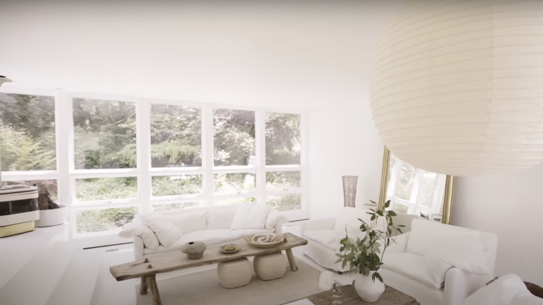
It's not exactly a surprise that Leanne Ford chose to decorate her home in an all-white style. Her typical aesthetic is simple, chic, and predominantly void of color. However, her own home takes this technique to a whole new level of minimalism. Ford received a host of positive feedback on her signature understated home, but the stark style was too bright and barren for several fans. @nigerianhurr90 comments on YouTube, "Too white for my liking but it's so pretty." @ajisenramen888 agrees, "I feel like I need snow goggles." @continuousself-improvement1879 adds: "I love the simplicity of it, but I would not want white floors. And I would add more colors and prints, like Santorini but boho."
Starting with neutrals is a great way to create a flexible base for your interior, but your color scheme should evolve from there. Even if you select a single statement shade, a splash of color can create a more welcoming space. Ford chose to add dimension through raw wood and pops of greenery, but there were no other noticeable pops of contrast. If you still want to maintain a primarily minimalist space, try adding dimension through patterned textiles or natural sources of color like fresh flowers.
Ben and Erin's calm and cozy country house
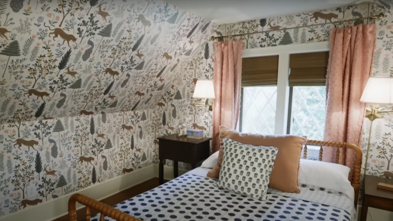
Known for their wholesome "Home Town" renovations, Ben and Erin Napier always add a touch of character to their homes. When it came to their own project, many fans praised Ben and Erin for creating a rustic space that felt true to their signature style. However, there was one room that garnered some negative buzz on YouTube. Some fans weren't too keen on the quirky upper-floor upgrades – particularly the loud wallpaper in the bedroom. @nylanelson8660 writes, "I liked the house Until I saw All that Hideous Wallpaper on the walls upstairs." @inolagranville7832 adds, "Well, let's be honest mothers of course are going to love the house and it is a beautiful house some of the choices of the wallpaper I'm not impressed with[...]"
While wallpaper can be a great way to add visual interest to a space, it's important to choose the right pattern. If Erin and Ben's selection looks too busy for your taste, go with a more classic option like this floral wallpaper from Amazon. You could wallpaper only an accent wall as opposed to the entire room as a less overwhelming alternative. Even if you prefer a solid color wall, don't write off wallpaper altogether. In fact, wallpaper can be superior to paint if your room needs an affordable refresh.
David Bromstad's subtle upgrades on his Tudor-style home
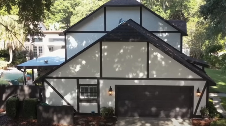
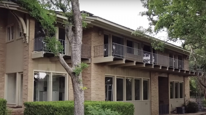
While most fans were pleased with the interior of David Bromstad's Orlando, Florida home, it was the exterior that they hated! According to some YouTube viewers, the modern, Tudor-style abode appeared tacky. @huitrecouture comments: "David's house is pretty ugly on the outside and could be very improved. At least do something with the cheap wood and weird beige stucco or whatever." @peggypeggy4137 agrees: "I really liked the inside of the house–but the outside needs some work. I'm sure he will get around to it."
Not only is the outside of a home important for curb appeal, but it can greatly affect resale. Revamping the exterior of a home can be pricey, but there are ways to change up the outside of your house for less. For example, explore the best front door colors to give your entryway an instant revamp. You can also improve the lighting outside your house by adding large, pendant overhead lighting or lining your front yard with pathway lights.
Alison Victoria's opulent factory-turned-home in Chicago
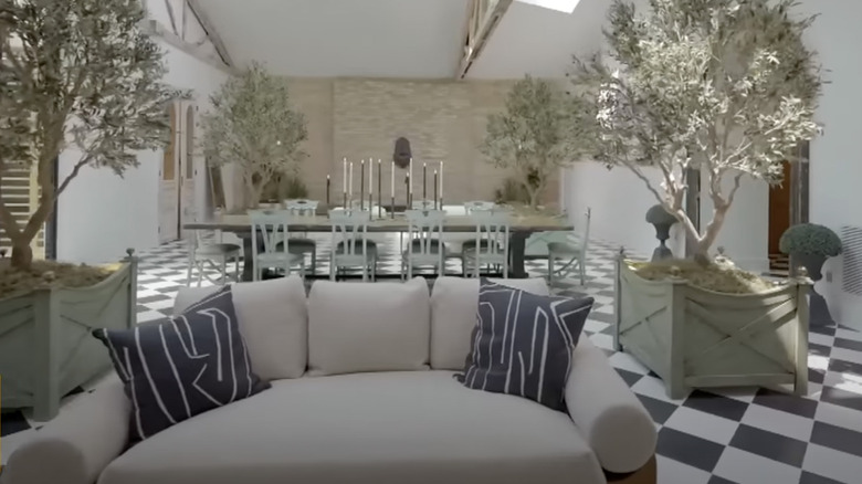
Alison Victoria transformed an old factory into a luxurious space for living and working. However, fans were split in deciding whether the end result was classy or gaudy. @warrenhenning8064 comments on YouTube: "The marble in the kitchen is ghastly. The house alternates between being gaudy, boring and ugly. If she wasn't paying to have stupid fireplace mantels imported from France, she wouldn't have liquidity issues during the project and minor overages wouldn't be a problem." @Arunfiable comments with a similar sentiment, "It's tacky :(" Other users reply in agreement, including @UR_Right24, "I agree," and @laurend8335: "Agree. It looks like an office building with no windows and no yard converted into a home....which is exactly what it is."
There's a fine line between luxury and gaudiness. While Victoria didn't go overboard with opulent decor, it was primarily the finishes that bothered the public. Stone surfaces like marble can look classy in the right setting, but it's more cost-effective to use an alternative like quartz with faint, subtle marbling. The other primary issue with Victoria's home was the lack of relatability when it came to her blown-out budget. Most homeowners can't afford to go above and beyond their ceiling, which is why sometimes it's better to select affordable materials and surfaces with a similar style. For example, explore these flooring materials that aren't worth the price – and discover the best options to choose instead.
Jonathan and Zooey's quirky, co-designed home
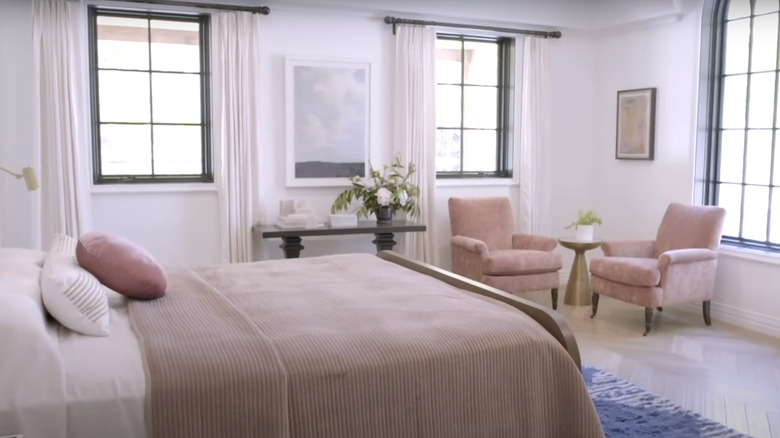
Jonathan Scott shares a home with his fiancé Zooey Deschanel, who was also responsible for the design of their interior. Some YouTube fans loved their blend of modern and vintage styles, but others weren't so impressed with the reveal, and it was because of more than just a single flaw. @WLdcxxv says: "Maybe it's just me but that bed doesn't look comfortable no matter the position you're in and the entire main suite bathroom included doesn't look cozy. I just really expected more out of Jonathan's new home and fails." @nicolafazio674 complains, "Too trendy, green and pink really?"@brightgreenleaves doubles down on the bedroom criticism with, "Why is your bed so small??"
These comments are proof that a cozy master bedroom is key when designing your space. While you don't have to stick to neutral tones, you can use timeless hues like sage, blue-grey, taupe, or cream to create a calming environment. Even if you don't have a large, plush bed, there are ways you can make your bed look more inviting. First, consider rearranging your pillows. They should take up approximately two-thirds of your headboard, and don't be afraid to mix shapes and sizes! Finish your space with a thick, fluffy comforter and a luxurious, textured throw.
Chip and Joanna Gaines' unsustainable lake house revamp
Chip and Joanna Gaines have had a fall from grace among some fans. While most everyone found their original "Fixer Upper" renovations charming and relatable, their current endeavors have turned off some former viewers. Rather than receiving negative feedback on the renovation itself, there was more criticism regarding their excessive lifestyle and wasteful design choices. Yahoo.com shares a quote from a viewer, "I don't like watching HGTV personalities renovating their own luxury 2nd or 3rd home. It looks like they're showing off." Realtor.com cites another fan comment regarding the duo's unnecessary waste: "That's sad about the glass. REPURPOSE maybe?"
In recent years, there has been a growing movement to salvage existing structural and decorative elements in older homes rather than tear them out. Although it used to be commonplace, and even praised, to flip a home in a contemporary style, the new name of the game is restore rather than renovate. This directly conflicts with Chip and Joanna's long history of transforming fixer-uppers. The ever-changing host of microtrends can also lead to renovations being unsustainable. To avoid falling into the trap of destroying your home's timeless features, try adding decor pieces that can be easily changed as your tastes change. Take a cue from these simple rental upgrades that won't permanently damage your home.
Tarek and Heather's daring dream house reveal
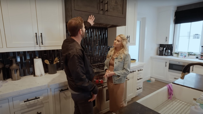
Tarek and Heather El Moussa's home reveal had a litany of criticism. Most notably, fans were underwhelmed by the basic design and compared Tarek's home to his ex-wife Christina Hall's stunning coastal digs. On her home tour, @royaltii_ comments: "Just came off the hills of seeing Tarek's new home and boy oh boy hers blew his out the water in terms of scale and design. I know it's not a competition but too much of a contrast to ignore." On Tarek and Heather's home tour, @jleigh404 comments: "A lot of the furniture and decor are outdated. Reminds me when I looked at staged new builds in 2017 – however to each their own!" Other viewers compared the interior design to Z-gallery – and not in a good way.
The overdose of black decor may have seemed trendy when Tarek and Heather began the design process, but the all-black look is already on its way out. When designing your home, choosing a blend of styles can help you avoid an outdated space. For example, Tarek and Heather's entire home had a dark glam, hotel-inspired style. If they were to incorporate a few warm and cozy touches throughout their space, they could retain their style while still making it stand the test of time. For example, swapping some black for navy, stark white for ivory, and adding a few pops of muted color would give the home more depth and interest. Switching up lighting is another key to a cozier interior.

